It used to be that you had a choice of a half-dozen “pre-cooked” design styles for your stories, with a limited selection of font pairings for headings and text. Now, you have literally millions of colors from which to choose for the various components of your stories. We’ve also chosen somewhat fewer than a million fonts—including scores of Google fonts—that you can mix and match, as well as providing options for other elements, including quote blocks, dividers, and buttons. Our theme builder enables you to give your stories a distinctive look and feel, and to better align with your organization’s branding.
With this newfound freedom comes some risk. While the sky is the limit for creation of beautiful new designs, there’s also the potential for missteps, especially in your color choices. We thought it would be helpful to provide some tips to keep in mind as you go about customizing your stories’ graphic styling.
First and foremost: color
Choosing good color combinations will give your story a distinctive look and feel. Color can help establish a mood for your narrative — but inappropriate color combinatations can be distracting.
First, briefly, some basics. Think of color as having three characteristics: hue, saturation, and value.

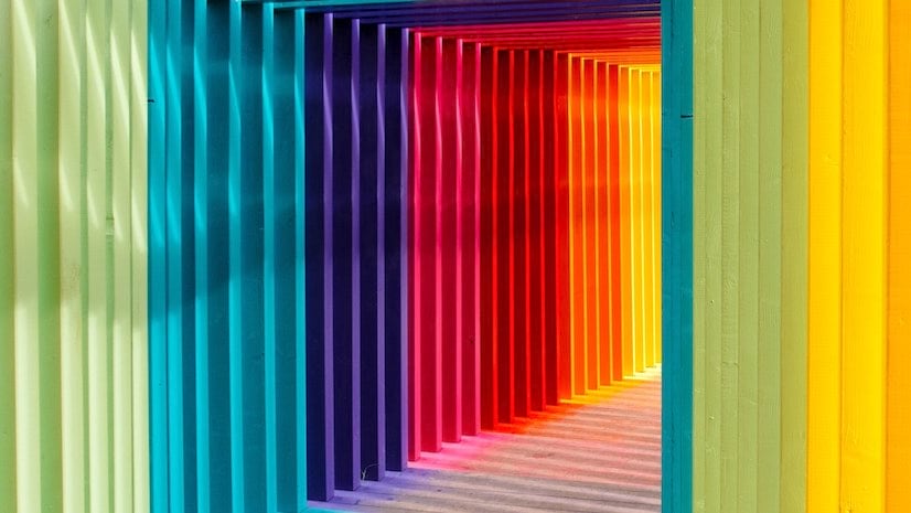
Hue is the familiar rainbow: red, orange, yellow, green, blue, violet — and the gazillion shades among them.

Saturation is how color-soaked a hue is. At one extreme the color is utterly vivid; at the other, all color has been squeezed out.

Value is about brightness. Imagine staring at a green wall while you dim the lights.
The key for me is saturation — the color characteristic that people tend to consider the least. I’m a big fan of desaturated colors, especially for backgrounds. Think about enjoying a scenic view on a hazy fall day: distant hills are less vividly-colored than nearby trees. It’s called atmospheric perspective. Using desaturated colors for your backgrounds adds depth to your story, and ensures that your text and media occupy the foreground.
Colors evoke subtle but powerful subconscious associations. A story about aging populations should avoid colors that might look appropriate in a kindergarten classroom. Color also helps establish a mood. For instance, choosing a black background for a celebratory tale is probably not the best way to go. Make your color choices consistent with your editorial message.
With these thoughts in mind, let’s go to the theme builder. To get there from within the ArcGIS StoryMaps builder:
- Create or open a story
- Click Design in the header
- Next to the Theme heading, click Manage
- Click + New Theme (or on a custom theme you’ve worked on before) to open the theme builder
- Choose which of the six standard themes to use as the base for your custom theme
It’s possible to start with any of the story elements: color, typography, buttons, etc. I think it’s best, though, to start with Color: Story background. Since the background is ubiquitous throughout your story, all the other elements need to harmonize with it. You can choose one of our suggested Basic colors; you can also use a color picker and copy the hex code for the color you’d like to use.

Let’s say I’m creating a story about coral reefs. I’m inclined to choose a tropical/maritime color for the background. But unless I dial the saturation way back, my background is jarringly gaudy. The color on the right might look dull next to the bright blue, but it’ll be much easier on readers’ eyes in the context of my story.

By the way, future versions of the theme builder will include a color picker. For now, simply do a Google search for “color picker” and you’ll see one immediately. You can adjust a hue slider, then pick brighter, darker, more saturated, and less saturated colors within a single “family” of hues. Copy the hex code and paste it into the Custom color field in the theme builder. Notice above how the two colors are in the same hue “family” but are picked from different spots (white circles) within it.
Go ahead and choose black or white for the Header color (all of these choices can be modified later, of course). Let’s come back to the Accent colors later.

Now open the Typography controls in the theme builder. You can choose colors for Title and headings and Paragraph text. It’s best to be conservative here, especially with paragraph text. Choose colors from within the same family as the background color. Maintain high contrast to maximize readability. Experiment with different values and saturations. In this example I stuck with the default black for paragraph text, and chose a color with medium value and medium saturation.

Let’s return to Colors: Accent color. ArcGIS StoryMaps have several elements that use accent colors, including buttons, dividers, and decorative elements on quotes. You can be a little more aggressive in your accent color choices, sticking either to the same color family or choosing a hue that’s complementary to it (that is, toward the opposite side of the color spectrum).

Do not try this at home: Picking colors from throughout the spectrum (left, above) isn’t a good way to go. The example on the right is better in that regard, but the contrast among the elements is way too low. Using light type against dark backgrounds is fine, as long as you’re restrained in your choices. In general, dark text against a light background is more readable than light against dark. You’ll want to avoid stark white type against a pure black background — that makes for too much contrast, and is hard on the eyes. Light gray text and/or a very dark gray background is preferable.
By the way, there are good contrast checker tools on the Web, including this checker, and this one.

One thing to keep in mind whenever you’re making color choices is to accommodate readers who are color blind. A number of online resources can generate simulations of how your design might look to people with various forms of color blindness (above).
Want to learn more about color? There are lots of resources online; these two blogs, How to choose color schemes for your infographics and How to pick more beautiful colors for your data visualizations, both provide lots of useful advice.
Second item: fonts
Designers tend to have strong feelings about fonts — myself included. One of my favorite IPAs (Bell’s Two-Hearted) uses one of my least favorite fonts on its labels. I drink it anyway, but try to avoid eye contact. We’ve worked hard to choose fonts that are less likely to give offense, and that, for the most part, work well both for display (titles and headers) and for running text (paragraphs, bullets, etc.).
I’m focusing here on the fonts that we’ve directly incorporated into our pre-set themes. Thanks to our addition of the Google fonts library, you now have hundreds of font choices. See my Making Smart Type Choices for ArcGIS StoryMaps post for more.

The combination, on the left, of Avenir Next (sans serif) and Noto Serif is attractive and readable. Mixing sans serif and serif fonts is generally fine, especially if they have some contrast in weights. It’s also fine to use the same font throughout. Some might regard the all-Noto-Serif treatment (right) to be a bit dull; others, myself included, like the consistency and the fact that it doesn’t call too much attention to itself. All these design elements should serve your story, not dominate it.

Here’s another sans-serif/serif combo, this time using Klint as the display type option. Klint is a good choice for titles and headers, but for my taste it’s a bit too stylized for paragraph text. But that’s just my opinion; others — even on my own team — will likely disagree.
I haven’t bothered to show mixes of two serif fonts or two sans-serifs together. This isn’t a hard-and-fast rule, but mixing two fonts that are visually similar is generally not a good idea. Unless there’s a good degree of visual contrast between your fonts, your choices may seem random or accidental.
We suspect we’re going to get a lot of requests for additional fonts. We’ll do our best to accommodate your entreaties, but will need to weigh your requests against the risk of creating a confusing plethora of choices. We may face legal and/or technical issues with some fonts as well.
Third: buttons, quotes, and separators

We’ve giving you three choices each for these additional story elements. Which you use is entirely up to you, of course. Just keep your audience in mind, and try to maintain a consistent mood within your theme. That full-width, two-rule separator, for instance, has a more formal, journalistic feel than its alternates.
If you’ve been using our tools for a while, you know that we’ll continue to refine and enhance the theme builder, as we’ve done with our immersive blocks and other features. Most of the future improvements will no doubt be based on your feedback, which we eagerly seek and earnestly value. Please let us know what you think of our theme builder — and please avoid those garish background colors!

Hi. Is there a way to transfer a story map theme from one organisation to another? Or more specifically from our ArcGIS Online account to our Enterprise account? Thanks