
When a map starts feeling slow, many organizations instinctively reach for the infrastructure checklist. Does the:
- Server need more memory?
- Database needs more CPU?
- Whole system needs a redesign?
This approach is tempting because it seems straightforward. However, starting at the infrastructure level is often the most expensive route. And it might not even be the most effective if the rest of the system hasn’t been tuned first – sometimes the system is not struggling because it lacks capacity. Rather, the map itself might be using system resources to do work that nobody actually needs.
Before assuming the system infrastructure needs to scale up, consider first how the map is designed to scale. One great place to start: the layer visibility range settings in your map. Layer visibility ranges define the scales at which a layer should draw. When layers remain visible at all scales, feature density grows rapidly as users zoom out and the map becomes more difficult to interpret, but the consequences extend beyond the user experience. More features must be queried, transmitted, rendered, and processed. That increases workloads on services, databases, networks, and client applications.
In one of our test studies, those settings were shown to have a measurable impact on both user experience and system utilization. Layer visibility ranges are often viewed as a cartographic tool for reducing visual clutter and improving map readability at a given scale. And while they certainly help users focus on information that matters, they also have a significant, measurable impact on system performance. In some cases, a simple visibility range adjustment can improve responsiveness (and end-user productivity) without adding a single CPU core.
Putting visibility ranges to the test
A while back, we published Evaluating Impact of Visibility Range on System Performance and User Experience, a test study examining how map extent and visibility range configuration affect system performance and user experience. We performed this test in response to recurring customer situations where we observed examples of suboptimal map configuration and wanted to better understand how those configuration choices affected performance in practical workflows. The study compared optimized versus poorly configured maps running on otherwise equivalent ArcGIS deployments using realistic Network Information Management workflows. However, the lessons learned in this study apply regardless of your organization’s workflows.
The goal was to quantify how visibility range decisions affect both system utilization and end-user experience.
The tests used workflows that reflect common operational activities, including creating services, updating assets, phase management, electric tracing, viewing assets, and summarizing assets.
The study established a design load and then evaluated system behavior under increasing multiples of that workload. This approach makes it possible to compare how optimized maps performed against maps with only one misconfigured layer, and how each configuration used resources as user demand increased.
Let’s check out the key takeaways from the test study
Finding #1: Better user experience
Regardless of system utilization metrics, users ultimately care about responsiveness. In our test studies, we capture and measure this through what we call “workflow execution time” – or how long it takes a user to do a given workflow – compared against a known baseline of how long it should typically take.
The tests showed that maps with even just one poorly configured layer caused users to spend significantly more time waiting during key workflow steps, such as opening an ArcGIS Pro project. In that example, the step took 4-5 times longer with poorly configured maps than with optimized maps, as shown in the chart below. The effect became especially noticeable in viewing workflows, where execution times increased dramatically under heavier loads.

This shows us how even one layer can have a measurable improvement to the user’s ability to complete real workflows.
Finding #2: Lower system utilization
Finding #1 shows what users experience when executing workflows in a map, Finding #2 shows what the system is doing behind the scenes. Poorly configured visibility ranges ultimately make workflows slower because of how they increase the amount of work the entire ArcGIS system must perform. Optimized maps reduce that unnecessary workload by limiting what gets queried, transmitted, rendered, and processed at each scale.
You can see in the system charts below that the poorly configured maps generated roughly twice the resource utilization on key infrastructure components – particularly at the database tier. The diagram on the left shows the database server with percent CPU utilization (orange) below 20% and a few disk spikes (gold). The diagram on the right shows CPU utilization consistently above 20% with spikes up to 80% and heavy disk utilization.

The system impacts extend beyond the infrastructure tier, from the following results we can see the impact on ArcSOC utilization as well. You can see from the charts below that with the suboptimal configuration, ArcSOC utilization increases significantly. On the hosting server in particular, you can see the chart shows the ArcSOCs reaching the maximum regularly throughout the test period. When all ArcSOCs are busy, we can assume that users are experience service wait times as they wait for resources to become available.
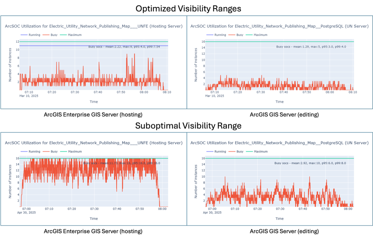
The lesson is straightforward: optimizing the visibility range for even one service can have significant positive impacts across the system’s tiers. Before investing in additional infrastructure, it is often more effective to optimize services and applications.
Finding #3: Performance and usability improve together
Optimizing for system performance doesn’t always have to come with increased infrastructure costs or a loss of helpful information for users.
When visibility ranges are configured appropriately, users see the right information at the right scale, when it is meaningful and actionable. At the same time, the system avoids rendering and processing features that do not add value at that scale. The result is better usability and better performance working together, without forcing a compromise between user experience and system efficiency.
Using new capabilities to find visibility range issues
With ArcGIS Pro 3.7, you can use the new Analyze Map Pane, which helps you identify drawing performance, display, and usability issues while authoring maps and scenes. You can use the Messages tab as seen below to identify layers that draw across all scale ranges and highlight other issues that may contribute to unnecessary drawing or visual clutter.
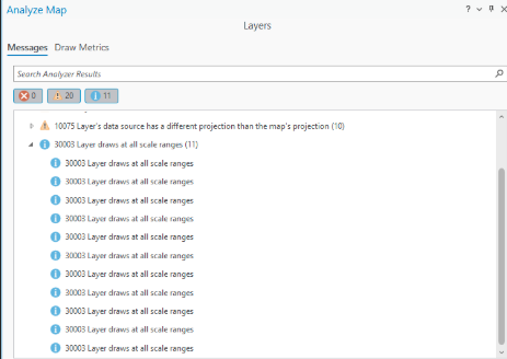
This is quality-control step is here to help you before a misconfiguration impacts users. By reviewing drawing performance, display, and usability messages early, map authors can identify layers that may create unnecessary system demand before those issues reach web maps and users. If you want to learn more about this tool, please visit this blog: Evaluating Your Map’s Drawing Performance: The Analyze Map Pane
Conclusion
Visibility ranges may seem like a small configuration detail, but our test results demonstrate they can have a significant impact on user experience and resource consumption across an entire ArcGIS system. As those customer situations suggested, suboptimal map configuration choices can affect performance in practical workflows. The study showed that even one poorly configured map increased workflow execution times, ArcSOC utilization, service wait times, and infrastructure utilization compared to otherwise identical systems using optimized visibility ranges. So, before investing in additional infrastructure, consider these recommendations:
- Think of visibility ranges as a performance optimization, not just a cartographic setting.
- Draw only what users need and can meaningfully understand at a given scale.
- Include app, map and service configuration in system performance reviews.
- Review the full stack (workflows, apps, services, data, and infrastructure) before assuming infrastructure needs to scale.
- Use ArcGIS Pro’s Analyze Map messages to identify layers that draw at all scale ranges before assuming the answer is more infrastructure.
- Treat map configuration as part of system architecture, not just cartographic design.
- Use ArcGIS Pro’s Analyze Map messages in your practice before sharing a map to identify potential drawing performance issues
Related resources
- Architecture Center Test Study: Evaluating Impact of Visibility Range on System Performance and User Experience
- Detailed Test Results: View Test Methods and Results
- ArcGIS Pro Documentation: Analyze Map pane
- ArcGIS Technology and Innovation Resource Catalog
Do you have ideas for how we can improve our resources in the future? Please share your thoughts with us!
➡️ You can also find our full catalog of test studies and blogs here
➡️ If you have questions or want to keep the conversation going, consider joining our LinkedIn group


Article Discussion: