No two maps work the same. An experienced map builder or scene sketcher realizes this every time they encounter a performance issue. Specifically, how a map draws in ArcGIS Pro depends on that map’s complexity, network connections, and more. This blog showcases how to find drawing issues in whatever map or scene you create.
New to ArcGIS Pro 3.7, the Analyze Map pane finds known issues in maps and scenes that may contribute to slowdowns in drawing performance. Similar to the Prepare window in ArcMap, the Analyze Map pane also includes a multitude of enhancements and powerful metrics that pinpoint exactly where and why performance slowdowns happen. While it’s tempting to blame technology for every slowdown, sometimes the decisions we make while authoring maps lend toward a slower experience. The Analyze Map pane is worth considering, even if you believe everything’s working perfectly.
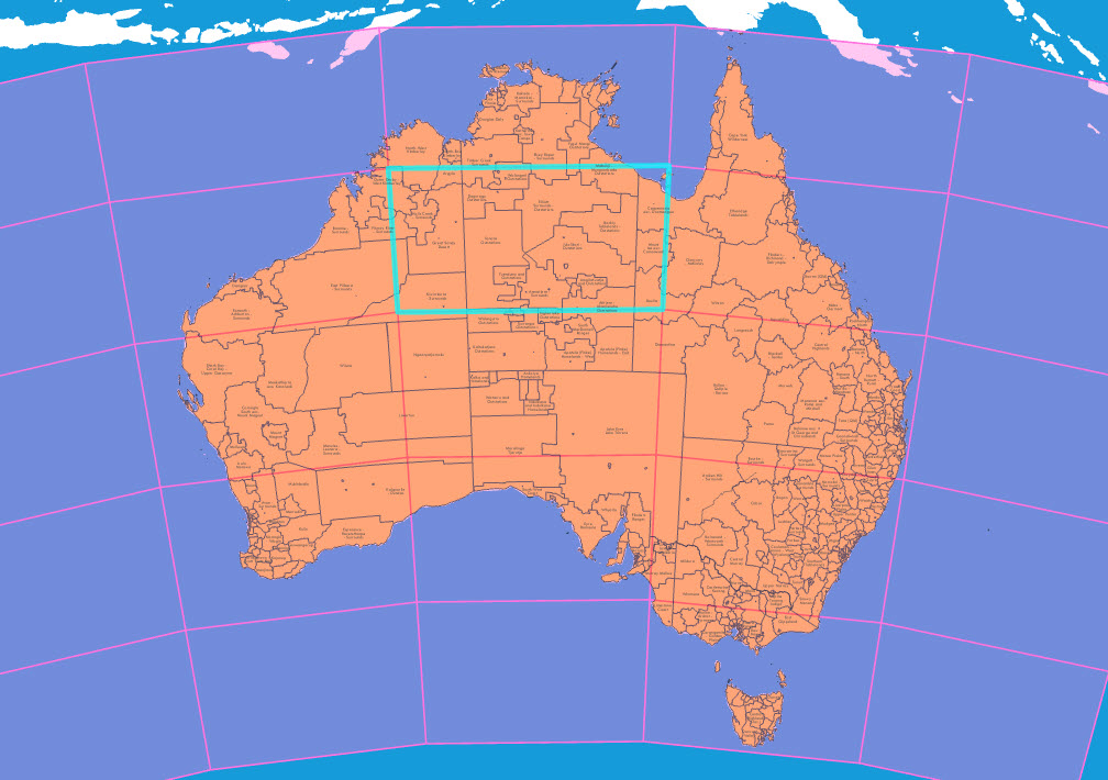
Let’s go through how it works. First, open a project with a map or scene in ArcGIS Pro (3.7 or later). For this example, I opened an Australian indigenous regions map designed for Esri’s 2025 User Conference. It has not been optimized in any way to improve its drawing performance.
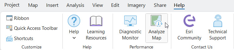
Under the Help tab in the ribbon, click Analyze Map. You can also right-click a map or scene in the Contents pane and choose Analyze to launch the Analyze Map pane.
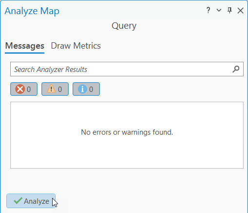
If you’ve never used the pane before, it’ll open to a blank Messages tab. It has a search bar, a blank window that states no errors or warnings have been found, and an Analyze button. Click the Analyze button at the bottom of the pane, and watch what happens.
Your map will be analyzed – and much like a layer or map to be shared on the web, the analyzing process is searching for potential problems. The blank window populates with issues raised by the analysis, and these issues may keep your map from drawing as fast or efficiently as possible. When the process is complete, you can review the messages in the pane by clicking each one. If no warnings or errors are found… great job! Your map passes this first test with flying colors.
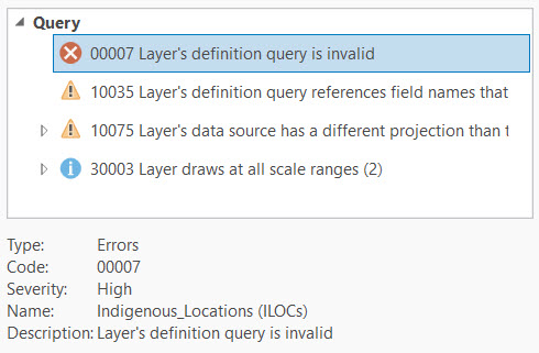
Some issues are more important to address than others. Errors indicate issues that actively contribute to problems in your map and should be addressed as soon as possible. Warnings are important, but technically optional for fixing. In the image above, it seems that my Indigenous Locations (ILOCs) layer has an invalid definition query. It also doesn’t have a spatial index set, and its data source uses a different projection than the map. I’ll need to fix some of these issues.
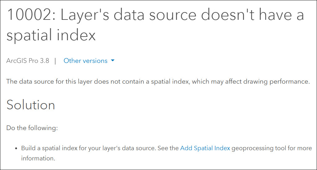
Informational messages are a bit different; it’s important to know about them but addressing them is optional. The third message in the above list—”Layer draws at all scale ranges”—is a common one. It’s important to build a multiscale map if you are frequently interacting with your map or viewing it at different scales. If you’re unsure how to fix a problem, double-click the message to open its help documentation. Read through the list of suggested solutions and choose one that works best for you.
Draw Metrics
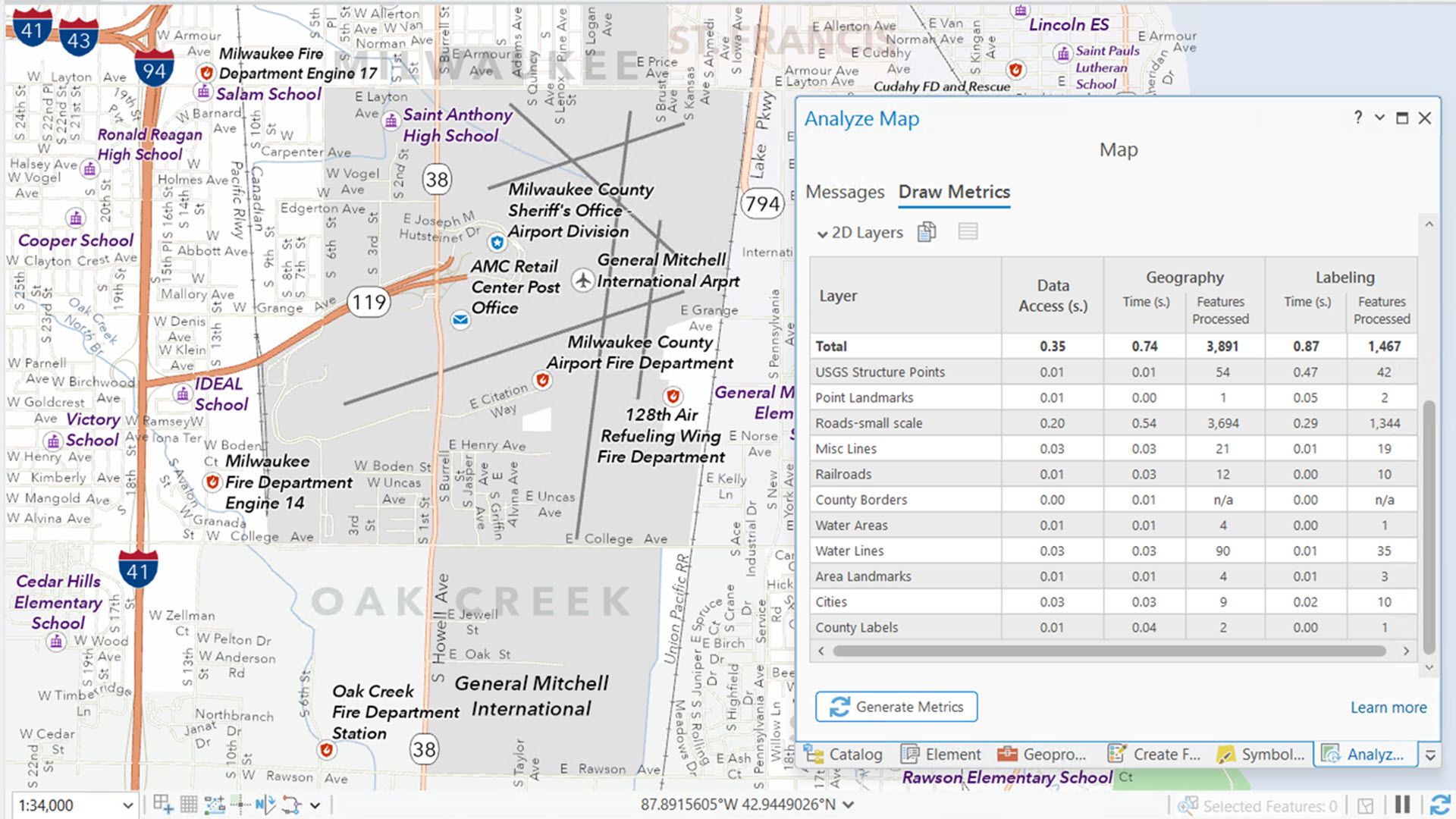
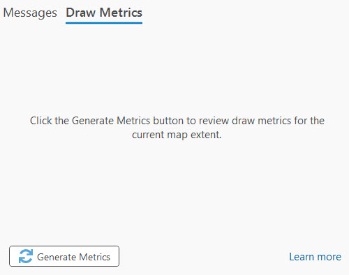
Now, you may have noticed there is a second tab in the Analyze Map pane called Draw Metrics. We’re about to dive deeper, so hang tight! The drawing metrics are tabulated time- and feature-based statistics about the content drawn in your map’s current extent. Go ahead and click the Generate Metrics button at the bottom of the pane.
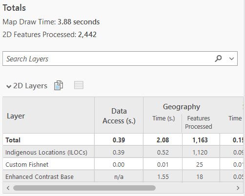
Your map redraws, and nothing appears in the pane until the map finishes drawing. When drawing completes, the tables and their numbers, times, and totals are your metrics. You’ll see one or more metrics tables organized into 2D Layers, 3D Layers, elevation sources, or surfaces; these are your result’s subcategories.
Depending on the content of your map’s current extent, the tables can be overwhelming. So, let’s start by focusing on the Totals section. The Map Draw Time is the total time it takes from the moment you click Generate Metrics until the last feature or tile draws in the view. 2D (and sometimes 3D) Features Processed is, generally speaking, a total count of features in your current extent. My map is not complex, and the draw time of 3.88 seconds is reasonable, but it could be better.
If you’re dealing with 3D data, you may see other types of metrics, like 3D Memory Usage. While primarily useful for reading GPU consumption in scenes, 3D Memory Usage also considers 2D data.
Let’s look at the tables now. In my 2D Layers table, the first column, Data Access, reports a total (in seconds) for each applicable layer. Data Access time tracks how long your map takes to search for and retrieve the data from its source, so if the connection is slow or the amount of data being served is too large, this number may be high. If the draw time total is longer than you want it to be, you can sort this column (or any other column in the table) to find a culprit. In this case, my layers are served in an adequate amount of time—phew!
The next column, Geography, is split into Time and Features Processed counts. These sub-columns report a metric for each layer in my map. In this case, Geography represents the symbology and visual effects in my map. If one of these metrics seems abnormally high, it’s worth looking into that area further; it may be contributing to a slowdown.
For example, note how the Enhanced Contrast Base layer takes the longest to draw despite containing only 18 features. I can turn this layer off until I truly need it or look for a way to improve its speed. That second and a half adds up over time.
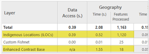
Note how the table continues beyond the width of the pane. There’s much more to cover, and it’s easy to be lost in the metrics. If you want to learn more about a particular metric, and what performance issues associated with it you can rectify, review our help documentation.
Coming Soon
In my next blog post, we will work through a more realistic scenario. We will review the Analyze Map pane, fix any errors or warnings, and capture drawing metrics from before and after making those fixes. My colleague and I aim to show how taking these measures can improve performance. Stay tuned for that, and until then, happy mapping!




@Greg Lehner
You are aware that if the “Draw Metrics” / “Generate Metrics” tool is started with a Layout opened where the Map used in it is activated using the “Activate” option in the ribbon of Layout, that the tool then hangs and never finishes? (ArcGIS Pro 3.7.1)
Also, the “Cancel” button will in that case not allow you to cancel the hung process, you need to kill Pro to get out of this situation.
“Draw Metrics” only seems to work currently if you have a Map open, not a Layout with the layout activated using “Activate” (although the “Draw Metrics” option will get enabled as soon as you “Activate” the Layout).
Hi Marco, thanks for reading and communicating a potential software defect. Drawing metrics are designed with the active map or scene view in mind; it is not intended to be generated on activated (or inactive) map frames. Consider that you are drawing multiple map frames or layout items on a layout, each with their own drawing time and feature counts – learning and analyzing the individual metrics for a single map frame on a layout would not be as useful.
That being said, if you are interested in generating draw metrics for activated map frames, please call Esri Technical Support and communicate you have an enhancement request.