Effective decision-making starts with a simple question: who are we trying to reach, support, and engage?
ArcGIS Business Analyst Pro helps you answer this question with data-driven precision using the Target Marketing workflow, and when paired with ArcGIS Tapestry data as an input, the results become even more actionable.

In this article, we’ll walk through:
- An overview of target marketing strategy
- What the Target Marketing workflow accomplishes
- Why ArcGIS Tapestry is an ideal segmentation dataset for this analysis
- How to interpret and use the workflow outputs to drive smarter decision-making
This article is the second in a series aimed at diving into the world of ArcGIS Tapestry using ArcGIS Business Analyst Pro, an extension to ArcGIS Pro. If you missed it, check out ArcGIS Tapestry in Business Analyst Pro: The basics for an overview of how to access and visualize ArcGIS Tapestry in BA Pro.
What is target marketing?
The Target Marketing workflow in Business Analyst Pro is designed to help you identify, understand, and prioritize your most valuable customers and the areas where they live. The expression “birds of a feather flock together” describes the tendency for individuals who share similar traits, interests, values, or backgrounds to live near each other. For this reason, if you know where a typical customer lives, you are likely to find more like them nearby.
Target marketing has four core components:
- Analyzing your existing customers by starting with known customer locations or using a survey profile that aligns with your business.
- Profiling customers using demographic or segmentation data by evaluating how they are distributed across Tapestry segments compared to the baseline market area.
- Classifying segments into strategic groups – Core, Developmental, Niche, and Monitor – based on how strongly they appear among your customers and how large a share of your base they comprise.
- Extending insights beyond current customers by showing where similar audiences live, even if they aren’t customers yet.
Essentially, instead of marketing to everyone, the Target Marketing workflow helps you focus on the audiences most likely to engage, convert, and stay loyal.
What does the Target Marketing workflow accomplish?
The Target Marketing workflow creates output layers that allow you to visualize concentrations of high-potential populations and households, identify underserved areas, and inform marketing, site selection, and expansion strategies.
Imagine you manage outreach for a network of community health clinics in Los Angeles, and you’re looking to understand how you can both fill gaps and better meet the needs of communities within your current scope.

By looking at the segment composition and geographic distribution of your core audience, you can identify where you may be underperforming within your existing trade area – in other words, segments you aren’t yet reaching effectively. You can also expand your reach by searching for other areas where those same segments are concentrated, effectively replicating success in additional markets.
Explore Target Marketing workflow output layers
For this example, you can use the Target Marketing layer outputs app below to explore the output layers from the Target Marketing workflow.
Open the layer list to choose which layers to display and drag the slider to swipe between different layers. To learn more about each layer, expand the relevant section below.
For an in-depth walkthrough of the Target Marketing workflow, check out the article Drive customer growth with target marketing in ArcGIS Business Analyst Pro.
Target Marketing layer outputs
▶ Click to learn more about the Target layer
The Target (Core) layer shows zip codes that align with your core target Tapestry segments, representing the top markets for loyal customers with significant opportunity.
When performing the analysis, you can view which segments are in (or out) of your Core group by opening the layer’s attribute table. In this example, your Core ZIP codes contain high concentrations of the City Strivers, Downtown Melting Pot, Family Extensions, Trendsetters, and Welcome Waves segments.
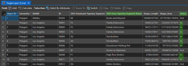
Once you know which segments are in (or out) of your Core group, you can leverage the characteristics associated with these segments – for example, how they tend to consume media – to develop more informed outreach strategies.
Customer profiles can also be weighted by variables, such as total sales, transaction counts, or visit frequency. This allows you to differentiate between frequent visitors and high-value customers, adding another dimension to your targeting strategy.
▶ Click to learn more about the Target Penetration layer
The Target Penetration layer shows the proportion of people (or households) in each ZIP code that belong to your Core target segments, relative to the total population in the ZIP code. For reference, these Core target segments were previously shown as “in” or “out” in the Target layer map.
It’s important to note that if you’ve chosen block groups as your base geography, penetration values will be either 0 or 100 (with no values in between), as there is only one segment associated with each block group. For geographies larger than block groups, such as ZIP codes, each ZIP code may be associated with multiple segments, allowing you to have penetration values that fall between 0 and 100.
In the mobile health clinic example, you can use the Target Penetration layer to quickly identify which areas have the highest concentration of your target population, helping you prioritize where to allocate clinic resources to maximize your community impact.
Note: The segmentation base – households or total population – should match your business model. For example, retailers typically use households, while total population may be more appropriate for healthcare and public sector analyses.
▶ Click to learn more about the Target Group layer
If you think you’ve seen this color scheme before, you have! The Target Group layer output uses the colors that classify the Tapestry segments in the four-quadrant analysis chart into either Core, Developmental, Niche, or Monitor targets. Polygons in the selected geography level receive the target’s shading if the predominant segment is one of the segments in the target.
In this scenario, the Target Group layer allows you to visualize the distribution of your targets across the market area. This layer is helpful in painting a broad geographic picture, and output layers like Target Penetration and Market Potential provide a more granular look at what’s happening within each ZIP code.
▶ Click to learn more about the Market Potential layer
The Market Potential layer is based on the calculation of the penetration rate for each segment in your Core target compared to your customer locations in the customer layer we used for the analysis. It provides insight into what your expected customer numbers could be per geography (ZIP codes, in this example), which can give you an idea of the potential demand for your product or service.
In this scenario, the Market Potential layer could help you understand where the highest need areas are located and may benefit from increased clinic frequency or extended operating hours.
If the profile used a volume attribute, such as sales or how many times a customer visited a location, the layer will also include an expected volume calculation. Again, this is based on the underlying Tapestry segments and the population count that makes up those segments in the market area compared to your customer layer. For more information about assessing market potential, see Analyze Market Potential output
▶ Click to learn more about the Market Area and Gap Analysis layer
The Market Area and Gap Analysis layer uses the segments that make up Core and Developmental targets to show the calculation of the gap between expected customers and actual customers based on the customer data layer.
In this scenario, ZIP codes shaded in white show a gap between expected and actual customers. These are areas where we are not yet capturing the expected amount of individuals from your Core and Developmental segments in these areas, highlighting potential opportunities for growth.
For more information about assessing the market area gap, see Analyze Market Area Gap output.
Where does ArcGIS Tapestry fit in?
ArcGIS Tapestry is one of two local datasets that form the foundation of the Target Marketing workflow in Business Analyst Pro. For U.S.-based analyses, the workflow uses Tapestry data. For Canada-based target marketing analyses, the workflow will use PRIZM data.
At the input level, you define two key components:
- Customer profile – Built from your customer locations or survey data, this shows the Tapestry segments represented by your existing customers.
- Market area profile – Built from a defined geographic boundary, such as a trade area, drive-time area, or administrative boundary, this represents the overall segment composition of the broader market.
The market area defines the baseline, or expected distribution, of segments that make up your market area. When compared with your customer profile, this can tell you which segments are over- or under-represented among your customers. In other words, this comparison indicates how well you’re reaching customers in your area based on what would be expected given the segment composition.
If you are using an existing market area profile, the tool will indicate which Tapestry system it was built with (for example, Esri Tapestry Segmentation or ArcGIS Tapestry), ensuring consistency across datasets. In cases where you may not have detailed customer records, survey data can be used to approximate a customer profile, making this workflow flexible even when direct customer location data is limited.
How do I interpret the results?
Using Tapestry segments as a unique lens to your market area provides insights that you might not have discovered before.
Four-quadrant analysis
The four-quadrant analysis provides a visual comparison of segments based on how much of your market area they comprise and the rate at which you’re attracting them. Each segment is plotted based on two measures:
- Percent composition – How much of your customer base belongs to a given segment
- Index – How strongly a segment is represented among your customers compared to the market area baseline
It’s important to note that a sky-high index on a segment with a tiny percent composition is noise, not a signal worth pursuing. This is where the four-quadrant chart comes in, allowing you to focus your attention where it’s most applicable to your goals.
With this analysis, segments fall into one of four groups:
- Core – Segments that make up a large share of your customers (high percent composition) and are highly overrepresented compared to the market area (above average index values). These are your most loyal and reliable customers, forming the foundation of your business.
- Developmental – Segments that are strongly represented among your customers (high percent composition) but make up a smaller share of your total base (low index values). These represent growth opportunities as audiences that respond well but haven’t yet reached their full potential.
- Niche – Segments that comprise a noticeable share of customers (low percent composition) but are not significantly overrepresented compared to the market (above average index values). They contribute to your base but are not uniquely tied to your brand.
- Monitor – Segments with low representation and low composition. These groups may be less aligned with your offerings or require more targeted strategies if pursued.

These distinct groups divide your market into areas that contain your best customers, individuals who you have not reached yet, and individuals who are harder to reach but could still be loyal customers.
This view can help identify segments you may not yet be reaching, but that make up a considerable share of your market area. Once you’ve identified these groups, the ArcGIS Tapestry infographics dashboard can be used to explore the characteristics and consumer trends associated with each segment in more detail.
For more information about customer and market profiles, four-quadrant analysis, and targets, see How Target Marketing Works.
Geographic analysis
Since Tapestry is created using so many different datasets to paint this picture of your market with unique segments, those data points can be used to understand what makes your Core, Developmental, and Niche targets different.
The Target Marketing workflow allows you to map where your Core and Developmental segments are located. All the output layers of the Target Marketing workflow are built using ArcGIS Tapestry and display different calculations and summarizations of this data.
To move from analysis to strategy, you can run reports directly from the Target Marketing workflow. To learn more about reports, see Target marketing reports.
What can I do with the output of the workflow?
Target Marketing supports a wide range of strategic decisions, including:
- Refining marketing campaigns
- Prioritizing outreach territories
- Informing site selection and expansion planning
- Improving equity in service delivery by identifying underserved populations
By understanding how ArcGIS Tapestry plays an integral role in the Target Marketing analysis workflow, you can translate customer data into a meaningful, location-based strategy. The result is focused targeting, stronger engagement, and decisions grounded in real community insight.
But the strategic planning doesn’t have to stop there: the output of the Target Marketing workflow can be used as an input to several other analyses that can tell you even more about your customers and highlight additional opportunities.
In the third part of this series, we’ll dig into Target Marketing as an input for performing a suitability analysis, building a Huff Model, and creating a territory design solution.


Article Discussion: