Infographics in ArcGIS Business Analyst Web App are an interactive and visually compelling way to communicate facts, maps, and other indicators. We can share our ArcGIS Business Analyst infographics through an interactive dashboard: ArcGIS Dashboards.
Wondering what is ArcGIS Dashboards, why and how to use it within ArcGIS Business Analyst? This is the right place! This blog article should answer all those questions and more.
What is a dashboard?
ArcGIS Dashboards create interactive visual displays that present data in an easy-to-read format. Sharing valuable information in a dashboard through beautiful infographics is a simple and engaging experience that brings data and maps to life.
We can create and share the data and maps directly from within Business Analyst in only a few simple clicks. Dashboards can be shared as a single URL with our organization and groups as well as to the public for easy access.
Now that we know “what” dashboards are and “why” they are a great way to share important information, let’s learn the fun part, “how” to use them in Business Analyst.
How can we make a dashboard in Business Analyst?
We will begin by defining sites to include in our dashboard. For this example, we’ll use census subdivisions around the city of Toronto to better understand the diversity of the people that live in each area and their distinct demographics and behaviors.
Step 1: Define the study area
In Business Analyst Web App, use the Data source drop-down menu to select Canada. Zoom into the city of Toronto.
To select census subdivisions around Toronto, you can use the Select geography tool to select from areas on the map.

Step 2: Create a dashboard
Now that we have our sites, we can get started creating our dashboard. Click Share results and ArcGIS Dashboards.

First, we need to choose the type of dashboard to use. There are two options:
- Many sites → Same infographic—This option shows data for many sites through a single infographic.
- One site → Different infographics—This option shows data for one site through multiple infographics.
Let’s use Many sites → Same infographic.
Now we can select a dashboard layout. There are two options: Side Layout and Main Layout. We can click the preview button to see what each option looks like.

For this example, let’s use Side Layout.
Now we can add the sites we recently created around the city of Toronto.

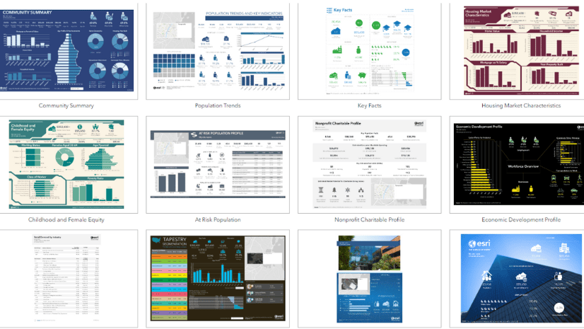
The last step to creating our dashboard is to select an infographic. Since we are using the Many sites → Same infographic dashboard type, we only need to select one infographic. Click on the Select infographic drop-down menu to view the list of available infographics. We can choose from the Esri standard infographics, our own custom infographics, and shared infographics.
In this case, let’s use the PRIZM Profile infographic.

Now we can add a name to our dashboard and optionally share it with other users in our organization. And that’s it! While the dashboard is being created, the status appears at the bottom of our map.

We can continue using other workflows while the dashboard is being created.
Once the dashboard is ready, we can open or edit it in ArcGIS Online.

If we click Edit, we’ll be able to modify the dashboard. The editing mode shows us the dashboard as well as a toolbar and configuration menu.

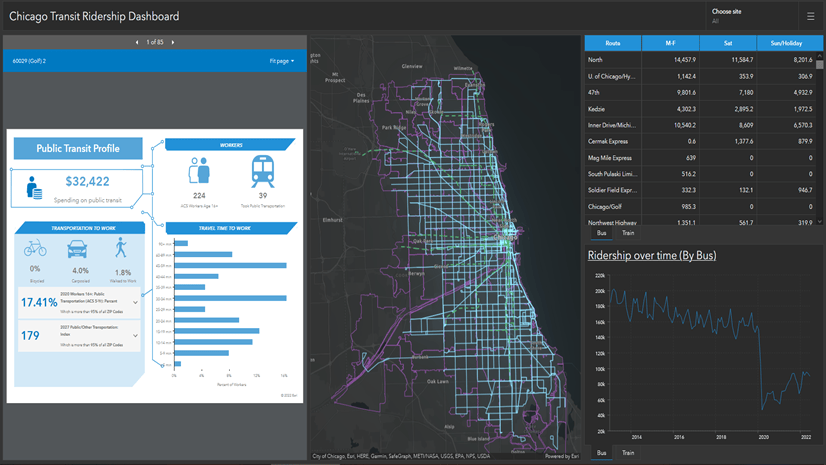
If we click Open, we can view the dashboard. The dashboard appears in another tab in our browser. The infographic has the same interactive elements we’re familiar with, like hovering over panels to see charts with additional information.
To see each site, we can use the arrows or select from the list or map. If we select a site from the list, its geographic area is highlighted and zoomed in on the map.

We hope you enjoyed learning how to create a dashboard. Let’s close with a review of the most frequently asked questions about sharing dashboards within ArcGIS Business Analyst Web App.
Frequently asked questions
1. Can I choose multiple infographics at a time?
Currently, you can choose one infographic for up to 500 sites.
2. Will there be more layouts in the future?
We expect to add additional layout options, so please send us your suggestions.
3. Can I use other workflows in the application while the dashboard is being created?
It takes a few moments for the dashboard to get created; but no time for a coffee break, because you can use other workflows in the meanwhile.
4. Where can I find my dashboard once created?
The dashboards you create in Business Analyst Web app are not saved in your project, but you can access them by signing into ArcGIS Online. You will find the dashboard under Content > My Content > BA – My Maps.
5. How can I share my work with the outside world?
By default, your dashboard is not shared with anyone. You can choose to share the dashboard URL directly with others.
6. Are there any associated layers with the dashboard?
Every dashboard has a Feature Layer (hosted) and Web Map items associated with it. The three items share the same name for easy identification. All three items are saved in your ArcGIS Online account under Content > My Content > BA – My Maps.
7. How can I delete my dashboard?
The associated Feature Layer and Web Map must not be deleted because they are required for the dashboard to function as expected. Therefore, delete protection is enabled by default. If you want to delete a dashboard, you will need to disable delete protection in ArcGIS Online under View item details > Settings.
8. How is sharing a dashboard different from the batch export of infographics?
Batch export is also a great option for sharing infographics with your organization! With dashboards, all relevant information can be seen on a single screen providing you with a comprehensive at-a-glance view for up to 500 sites by simply clicking on a site. Dashboards also provide easy access to view cohesive maps for related sites.
9. What is the credit consumption for my dashboard?
Some workflows in Business Analyst consume credits. To create a dashboard, ten credits per dashboard + 0.01 credit per site are consumed.
For example, if you run a dashboard with five sites, that is ten credits, plus (0.01 * 5) to equal a total of 10.05 credits. No additional credits are used for viewing a dashboard or the infographic within the dashboard.
10. What other resources are available for a new user?
Business Analyst Web App has in-app resources for you to browse. Just click Resources on the workflow pane!

For example, watch a video to see a demonstration, follow the guided tour, or visit the help documentation for more information.
This article uses ArcGIS Business Analyst Web App Advanced to share an infographic using a dashboard.
This article was originally published on June 7, 2021, with the title “Sharing Infographics in ArcGIS Dashboards from ArcGIS Business Analyst” by Anna Kishore and Donna Buhr. It has been updated.

This is an awesome feature!! Do you know when it’ll be available in Enterprise?
Hi, I just attended a session at the 2024 UC and this functionality was highlighted. We have Business Analyst but I do not currently see the option in Enterprise 11.1. Is this only available on ArcGIS Online? Will it be available in Enterprise 11.3?
Might want to mention this is only available with an Advanced BA License.