Maps can be a beautiful medium to show patterns in data, but what about the attribute tables that power them? Could tables play a bigger part of the storytelling? Could table records be color-coded in line with the map, allowing you to discover trends, differences, potential problems, or outliers? Could the color of the records sync with the color of the map features?

The answer to all these questions: Yes! Here’s how…
A fantastic analytical workflow, benchmark comparisons, has been enhanced in the May 2025 release of ArcGIS Business Analyst Pro to improve the way organizations make sense of their sites and data. As part of this upgrade, we’ve implemented an interactive Results pane to include a color-coded table view, as well as familiar views for a histogram, bubble chart and scatterplot, and a summary of statistics.
Benchmark comparisons, at their most basic level, allow you to compare features on the map using variables and site attributes. The updated workflow stays true to this fundamental purpose—but adds an impressive array of comparison methods and styling options to take the comparison further. There are now three distinct ways of styling your comparison; the following methods provide different ways to visualize your data:
- None
- High to low
- Top and bottom
- Above and below benchmark

Let’s dive into an example. The image below shows Kent County, Michigan school district boundaries loaded as my sites in a benchmark comparison. I’ve included a combination of demographics (variables) from Esri and school performance markers (site attributes) from MI School Data. Once I’ve got my comparison variables and site attributes in place, I click Apply. Note: There is no data prep magic here, I simply did some manual data entry to add the school metrics from mischooldata.org’s Compare Tool into my districts layer.
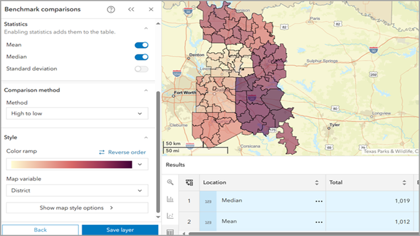
By default, the table is displayed as a “None” comparison method, which is essentially a simple data enrichment with no styling applied to the map or table. One issue here is that no immediate data patterns are emerging. There are lots of numbers in many categories, but I need a better way to tell the story of this data.

I switch over to the Comparison Methods tab in the workflow pane and, when I apply the High to low method, comparison visuals appear this time. The table is now illuminated with color-coded indicators containing a rank in each field. The color-coded indicators change color relative to the site’s position in the data distribution, and the map features sync with the same color. This creates a visual connection between the table and map, allowing for greater data exploration. This is really cool!
For instance, by sorting on the Absent Rate field, Grand Rapids Public Schools ranks highest among all districts (1 of 22), and I can see where other markers and demographic variables rank among nearby districts. Scanning down the line of variables, I notice that this school district also ranks quite low for median household income (18 of 22).

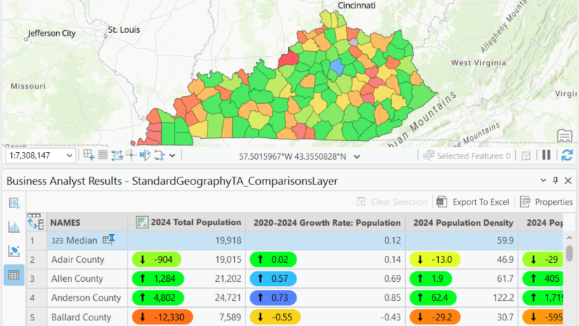
To learn more about my observation of a potential correlation between absenteeism and median household income, I’ll switch the comparison method. Applying the Top and bottom method allows me to compare the outermost data records more prominently. The color-coded indicators group the records by rank or by percentile, such as top/bottom 10 sites or top/bottom 20% of all sites. Below, I can view the top five districts by chronic absent rate and reveal that these same districts are the bottom five districts for median household income.

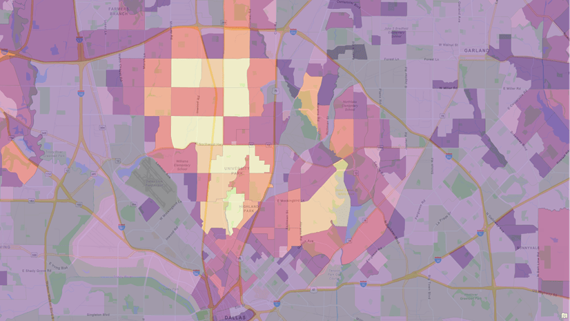
Now to engage in some benchmarking, the Above and below benchmark method allows me to identify which districts fall above or below a geographic feature (such as your home district or a top-performing district) or a statistic (such as the mean or standard deviation of all districts in Kent County).
Below, I’ve set the benchmark to the mean value of all districts. By setting the map variable to median household income, the color-coded indicators in the table gradually change color away from this record and also contain the percent difference values from the mean. This shows that the East Grand Rapids school district has a median household income that is 96% higher than the average of all districts in the county. While the colors on the map appear a bit random, by sorting the data in the table, the diverging color scheme shows the relative changes from the benchmark value.

To highlight another Results pane view that is now included in the workflow, switching to the bubble chart allows me to analyze the same data against a regression line. Here I am showing how chronic absent rates relate to median household income. In this case, it is a negative relationship where the absent rates increase as wealth decreases. The larger the bubble, the more students in the district.
Both the table and bubble chart views are a good starting point in this site analysis. Next I might go further and analyze the data with spatial statistics methods like Geographically Weighted Regression or Generalized Linear Regression.

While these two districts are geographically adjacent, benchmarking and comparing the districts through these enhanced views reveal data patterns that were previously not possible.
In this article’s example scenario, sites are school district boundaries, and their site attributes are values collected by state education agencies. Sites can be any geographic boundary, such as 3-minute drive-time trade areas around your grocery stores. Site attributes in this case could be indicators about the location, such as square footage, rent, parking spaces, daily traffic counts, etc. Benchmark comparisons can be applied to any industry for any topic.

Love the quick/intuitive color connection between tabular and spatial info. Is this only available in BA? Seems super useful in all kinds of contexts. Kudos!
+1 this. I would love this to be a standard in attribute tables. Feels similar to working in AirTable.
@Marissa Kulkarni I agree these “tags” are similar to categories in Airtable or labels in Github. In our case we’re showing numeric differences and rankings. Conceptually they could be implemented to show categories or priority, etc. I’ll connect with @Kory Kramer about this ArcGIS Pro idea.
Hi Doug – thanks for reading! At the moment, yes these color-coded indicators are only in Business Analyst. Specifically the Benchmark Comparisons workflow, which is available in the ArcGIS Pro and Business Analyst Web App offerings.