As part of the October 2025 release, ArcGIS Business Analyst Web App has a new advanced analysis workflow: nearby analysis.

Nearby analysis evaluates points of interest (POI) within a site’s area. The results include the total number of points, points per 1,000 households, and the distance from the nearest point to a site. These calculations can be used to understand hyper-local markets and competition. Depending on your industry and location, different calculations may be more pivotal. For example, in highly dense markets, proximity to competitors might be the most important factor for site selection.

What is nearby analysis?
Nearby analysis is a new Business Analyst Web App Advanced workflow that can identify points of interest and businesses around selected points. Start by adding your point-based sites, choose a list of points, and then symbolize each point by type of business.
Point lists are collections of points of interest. You can use Esri-provided point lists (Featured point lists) such as Restaurants, Healthcare, Parking, and Grocery Stores. Additionally, you can use points from custom layers (Web layer point lists) or create your own point list.

The results of this analysis appear in the Results pane as a summary and tables. If you’re using Data Axle as your data source, the point details table will show attributes like employee count and square footage. The site summary table shows the nearby analysis calculations, consisting of the distance, total count, and density of points for your sites. The site summary measures are typically used in retail analysis for site selection and market competition evaluation. For example, high point density means more competitors within the area.

Using nearby analysis to explore Quick Service Restaurant demand
Let’s use nearby analysis to explore Quick Service Restaurant (QSR) competition. QSRs are food establishments that prioritize convenience, such as Starbucks, Chick-fil-A, and Domino’s Pizza.
In this blog article, you are a Charlotte-based neighborhood QSR looking to grow your brand in the nearby suburbs. Your target market is developing suburban areas, with residents likely to drive to restaurant locations rather than walk or take public transit.
Create your sites
Let’s create three sites using 10-minute drive times around the outskirts of Charlotte. In nearby analysis, sites must be point-based. Your sites can be measured using rings, drive times, or walk times. You can use an assortment of site areas; they don’t need to all use the same area type.
For this walk-through, use the Search map tool to create sites with 10-minute drive times within Gastonia, Concord, and Monroe. The pin for each site represents the city center. The drive time calculates the area around the city center that can be reached within 10 minutes.

When your sites are added, they immediately appear on the map.

Add your sites to nearby analysis
Now you can use the sites you just created in your nearby analysis. In this workflow, you can select from your recently used sites, sites currently on the map, or sites from any project. Click + Add sites and select your sites around Charlotte to add them to the analysis.

Your sites are added to the analysis! Now you can add your points of interest (POI).

Add a custom point list
To add points of interest to the map, you can browse a curated collection of POIs in featured point lists, like Restaurants and Gas Stations. Or you can create your own point list, which is essentially performing a points of interest search. If you have web maps and layers with point-based sites, you can add these to your analysis, too. For this walkthrough, you’ll make a custom point list.
Click + Add point lists and select + Create a point list. Click the search field and select the Advanced search option. We are looking for quick-serve restaurants, so we’ll add two conditions to map restaurants using a primary NAICS code with the specialty Limited Service. Limited Service is a restaurant category with limited or no table service, such as ordering at a counter instead of tableside with a waiter.
Add the following advanced search conditions:
- Primary NAICS is any of the following 72251117 (Restaurants)
- Specialty contains Limited Service

When you save your custom point list, it appears on the My point lists tab. Use the check box for this list and click Apply to add it to the nearby analysis.

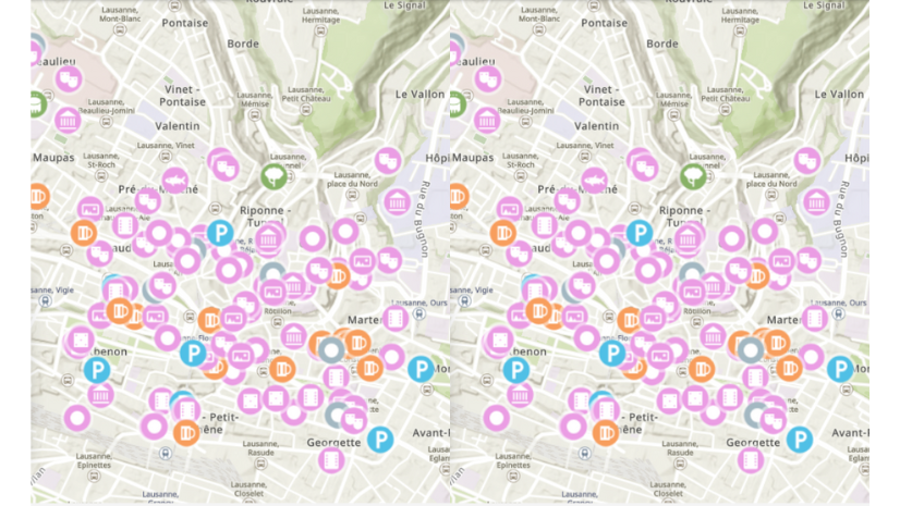
Your points are mapped within your sites’ areas.

To complete the workflow, click Next. Your results appear on the map and in the Results pane. (Your point icons may be different than pictured depending on your preferences.) The Results pane features a summary, point details table, and site summary table.
Explore the results
Let’s explore the results! There is a summary, point details table, and site summary table. The summary and site summary table detail the nearby analysis calculations (distance to the nearest point, the total count of points, and point density). The point details table shows attributes (like employee count and square foot minimum) for each quick serve restaurant location.
Summary
You can use the summary for a quick overview of the results. This includes the total number of point locations, a scatterplot, and the nearby analysis calculations. The scatterplot visualizes the relationship between the distance to the nearest point and the density of points. Typically, you’d expect that where you see higher point density, you’d also see points closer to the city center. This is shown in the example with the results for Monroe.

You can use the nearby analysis calculations in the summary to understand how the sites compare to one another.
- Count of points—Gastonia has the most total quick serve restaurant (QSR) locations (72), whereas Monroe has the least (37).
- Distance to nearest point—Monroe has QSRs close to the city center (0.44 miles), whereas Concord has no QSR within 1.43 miles of the city center.
- Points per 1,000 households—Monroe has the highest point density (3 points per 1,000 households), whereas Concord has the lowest point density (1.92 points per 1,000 households).
Another way to look at this is that Monroe has the fewest restaurants and has the closest distance to the nearest point and highest point density. So, even though there are fewer points in the area, there are more restaurants per household with shorter distances. A lower count of points may look on the surface like a less competitive market, but using distance and point density calculations you can evaluate market demand more comprehensively.
Point details table
The point details table is similar to the results table when you use POI search and lists point attributes. It provides granular, location level information on each of the records. You can use attributes to understand the market performance of competitors in the area, like analyzing sales volume to understand potential revenue.

In addition to point attributes, there is a nearby analysis-specific measure included in the table: distance (in miles). Distance (in miles) is the straight-line distance between the nearest point and the city center. It would be more useful if this measured the distance between the nearest point and your new location. For example, proximity to competition is important to gain customer traction, with a shorter distance between your location and a competitor being valuable for customer convenience and accessibility. Once you decide which city you want to expand into, try re-running the analysis with sites representing specific rental properties that you are considering.
Site summary table
The site summary table displays the nearby analysis calculations for each of your sites, providing a quick, high-level summary of key information. It is exportable to Excel.

The nearby analysis calculations provide insight into hyper-local markets. Quick serve restaurant customers typically value the distance to closest location the most, but in suburban settings may drive further for a restaurant more in demand. You could also use these measures to understand the market share. Point density (the number of restaurant locations per 1,000 households) can be interpreted to understand the market’s demand; more restaurants may indicate more local demand but also saturated competition.
In conclusion
In this article, you learned how to use the new nearby analysis workflow in Business Analyst Web App to understand the quick serve restaurant market in a few suburbs of Charlotte. The results show that the three suburbs (Gastonia, Monroe, and Concord) each have different qualities.
- Gastonia has the highest number of restaurants close to the center of the city.
- Monroe has the fewest restaurants while also having the most restaurants per 1,000 households.
- Concord has the longest distance from the city center to a QSR and the fewest restaurants per household.
Depending on your business criteria, you could explore spending potential in Concord to see if it is an untapped market, add your name to the mix in Gastonia with a location closer to customers, or compare your business against local competitors in Monroe.
This workflow will continue to be developed to improve your mapping and analysis experience. Let us know what else we can do by sharing your ideas in the comments section below or posting on Esri Community.
This article uses Places data from Data Axle and basemaps provided by Esri.
This article uses ArcGIS Business Analyst Web App Advanced.


Article Discussion: