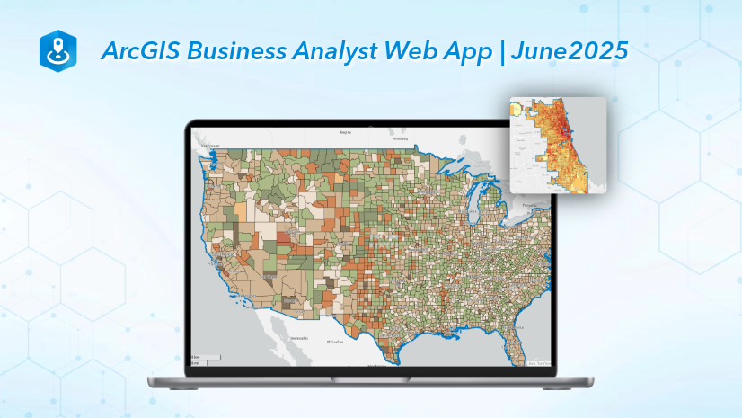
As part of the June 2025 release, ArcGIS Business Analyst Web App has a new capability in the points of interest (POI) search workflow: point data aggregation.
The POI search workflow queries point data, also known as place data, to plot locations on a map. For example, use the POI search workflow to map hospitals in Colorado. Each hospital location is a point added to the map.
It can be difficult to understand patterns in the data from only looking at points on the map. The new point data aggregation capability summarizes points to standard geographies, hexagons, or sites. In the image below, the hospital locations are summarized from pins to color-coded polygons representing counties. Counties with a higher number of hospitals are shaded red while counties with a lower number of hospitals are shaded pale yellow. The patterns in the distribution of the count of hospitals are clearly illustrated using color-coded county polygons.

To define the point data aggregation, do the following:
- Select a geography (like sites, standard geographies, or hexagons) and choose a level of detail.
- Choose an attribute like the number of points, employee count, or sales volume.
- Depending on the attribute, select the calculation type like count, average, sum, minimum, or maximum.
In this blog article, we’ll use POI search to map grocery stores in Phoenix, Arizona, to assess where there may be food deserts. Food deserts are areas where typically low-income and vulnerable populations have inadequate access to affordable groceries. Using the POI layer, we’ll enable aggregation to visualize the point layer as color-coded block groups. At first, we’ll analyze the count of grocery stores for each block group to see the patterns of store distribution. Then we’ll analyze the maximum sales volume of grocery stores to see which locations have the highest sales revenue and may inform where food deserts exist.
First, make sure that the Esri 2025 data source is set.

To start the workflow, click Create maps and select Points of interest (POI) search.
 search.")
Set the area of interest
For this analysis, let’s set the area of interest to Phoenix, Arizona. The city of Phoenix created the 2050 Local Food Goals to address the limited community access to healthy food. There is a known issue of food inaccessibility, with 43 identified food deserts in the area. We can create a map of grocery stores to identify exactly which block groups have critically unmet food needs.
Click the Geography section to expand it and enter Phoenix into the search field. Select the Phoenix City, AZ (Place) result.

Perform a search
Let’s search for grocery stores. Make sure that the POI data source is using Data Axle. To start the search, click the Enter keyword, category, etc. field and click the Category tab. Check the Food & Grocery Stores category to add it to the query and press Enter to perform the search.

The results automatically populate on the map and in the Results pane.

Explore the Results pane
The Results pane includes a summary, histogram, and table. On the Summary tab, there is an overview of all point locations for the area of interest.
Enable aggregation
To see the patterns in where grocery stores are distributed, use the new point data aggregation capability. In the Point data aggregation section, turn the Aggregate point data toggle button on.

Aggregation summarizes point data into sites, geographies, or hexagons. Let’s use standard geographies with block groups as the level of detail with the default calculation, Number of points. In this case, the number of points is the number of grocery stores in each block group. The results are populated on the map and in the Results pane.

The color-coding on the map indicates the number of grocery stores for each block group. For example, dark orange indicates a higher number of grocery stores and pale yellow indicates a lower number of grocery stores. This shows patterns in where the businesses are distributed.
The areas with dark orange block groups, signifying the highest amount of grocery stores, surround Phoenix Sky Harbor International Airport and Phoenix-Deer Valley Airport. Typically, airports are not located in densely populated areas. To assess this assumption, run a color-coded dot density map of population density. The areas with dark orange polygons, indicating high numbers of grocery stores, do not necessarily overlap with areas of high population density (indicated by many dots).

Returning to the point data aggregation results, explore the Results pane for detailed information, including the following:
- The Summary tab shows a summary of the results, including the total number of block groups, the average number of grocery stores per block group, and the top five and bottom five block groups.
- The Histogram tab shows a histogram of the results. This data visualization shows that there are more block groups with a low number of grocery stores compared to the number of block groups with a high number of grocery stores.
- The Table tab lists the block group and the number of points within that block group. Individual points are not listed in the table when aggregation is enabled.

Aggregation uses calculations to summarize the point data. By default, our map color-codes each block group to represent the number of grocery stores within that area. We can customize the calculation by choosing an attribute and calculation type.
Change the aggregation calculation
Let’s change the aggregation calculation to use the maximum sales volume, which shows the highest revenue for a location in an area. Click the Calculation drop-down menu. For the Sales Volume attribute, select Maximum for the calculation type.

The map and Results pane automatically update. Now each block group is color-coded to represent the maximum sales volume of a store within that block group. This can be used to understand how block groups compare to one another in terms of maximum sales volume, which may inform where food deserts exist. If a block group has a store with an extremely high maximum sales revenue, that store could be over-performing because there is a lack of competition in the area and potentially inadequate food access for neighboring residents.

This example has shown how we can enable aggregation to summarize the locations of grocery stores in Phoenix, Arizona, using the number of grocery stores and maximum sales volume. To analyze whether vulnerable communities have adequate access to grocery stores, we could create a bivariate color-coded map of population density and poverty and assess if any highly populated vulnerable block groups are served with enough affordable grocery options.
Conclusion
This blog article describes using the new point data aggregation capability in the points of interest search workflow. We welcome your feedback! Please use the feedback option at the bottom of this blog article or post on Esri Community.


Article Discussion: