With the 300.0 release of ArcGIS Maps SDKs for Native Apps, we’ve enhanced our color ramp and color map options to make data visualization more convenient and customizable. This includes support for rendering both raster data, and results from the new spatial analysis APIs in your apps.
In this release, you can now:
- Render your data from a choice of ten new preset color ramp types for faster app development
- Customize your own color ramps with a linear gradient or weighted color ramp option for enhanced continuous data interpretation
- Directly map colors to values with the enhanced color map functionality for precise discrete data classification
These enhancements build directly on the existing Native Maps SDKs color ramp and color map rendering patterns, making it easy to integrate these new data visualization options into existing applications.
In this blog post, I’ll walk through what’s new and show how the same concepts apply whether you’re rendering rasters or analysis output.
The examples shown throughout this blog post use Flutter Maps SDK for the code snippets, but the same rendering concepts apply across all Native Maps SDKs.
Continuous data rendering options with new color ramp options
Continuous data, such as elevation or temperature, represent a range of numeric values that transition smoothly rather than belonging to fixed classes such as with discrete data. The enhanced ColorRamp API options allow you to visualize these numeric ranges with preset and customizable gradients of color. This makes it easier to:
- Render continuous datasets with smooth, meaningful gradients for your app’s audience
- Emphasize patterns, trends, and subtle variation in the data
- Build apps where users can adjust how rasters or analysis output are rendered
You can set a color ramp to a StretchRenderer, PercentClipStretchParameters (to use in a StretchRenderer), or a BlendRenderer and set the renderer to a raster layer. You can also set a color ramp to a field analysis created with a continuous field function in the new spatial analysis APIs with a StretchRenderer.
New preset color ramp options
In this release, we’ve added ten new preset color ramps that provide developers a quick and convenient starting point for presenting data for common continuous dataset use cases.
Why ten? We decided to add a carefully curated selection to the three existing (and slightly outdated) color ramp presets that the API already provided. We began by selecting five color ramps commonly used in ArcGIS Pro (bathymetry, temperature, heatmap, surface and precipitation), and then added five more that specifically cater to color-blind users. These accessibility-friendly options are from the “cividis” family of color ramps (cividis, viridis, magma, inferno and plasma), which were carefully created by the broader scientific community.


To apply a preset color ramp in code, simply choose one of the PresetColorRampType enums, such as in the following example using viridis.
- First, create a
StretchRendererfromMinMaxStretchParameters. - Then create a
ColorRampwith aPresetColorRampType.viridisas the first parameter, along with the size parameter.- The size parameter refers to the number of steps in the complete resultant gradient
- Set the renderer on the raster layer, and add it to the map’s operational layers to display it in the app.
 rasterLayer.renderer = StretchRenderer(
   stretchParameters: MinMaxStretchParameters(
     minValues: [0], // min elevation value
     maxValues: [873], // max elevation value
   ),
   gammas: gammas,
   estimateStatistics: estimateStatistics,
   colorRamp: ColorRamp(type: PresetColorRampType.viridis, size: 256),
 );

map.operationalLayers.add(rasterLayer);
These new preset color ramp options provide an easy on ramp (no pun intended…!) for developers who want fast, sensible visualizations without spending time designing a color ramp from scratch. And the code required to set it up is minimal. But for those developers who want more color options beyond these ten new options – read on!
Custom color ramps for precise control
Preset color ramps are often enough, but not always. Many datasets benefit from visualization that reflects their thresholds or analytical/cartographical intent or even that match an app’s design. To support this visualization, we’ve introduced two new ways to construct custom color ramps, giving you finer control when you need it and a way to use any and every color combination you can dream up!
New Colors constructor
The new ColorRamp.fromColors constructor lets you create a color ramp where the given list of colors are blended evenly across the full data range, i.e. a linear gradient between colors. This is ideal for clean, minimal visualizations in evenly distributed continuous datasets where no specific range needs emphasis, such as with elevation or temperature datasets.
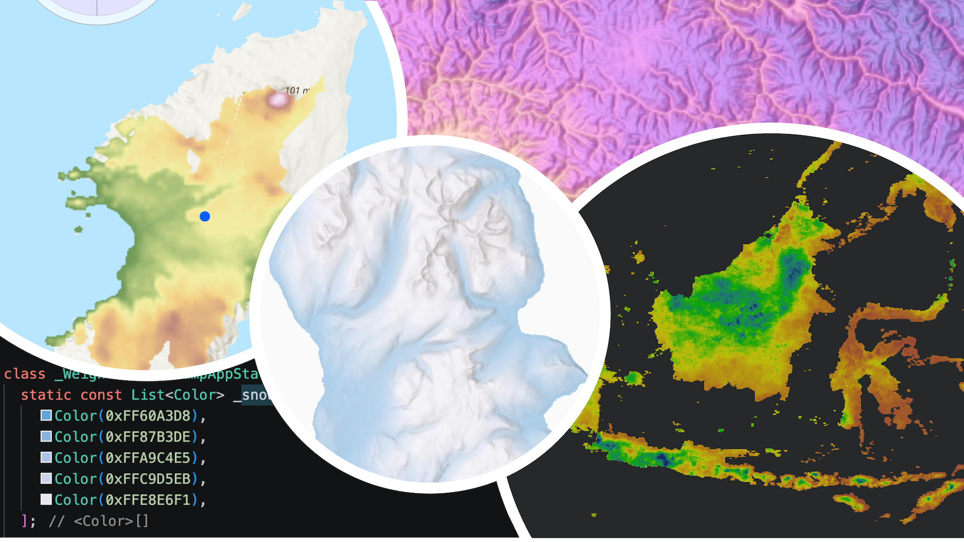
In the example app below, using a digital terrain model of the Isle of Arran, Scotland, I’ve used the “snowy mountain” color ramp, copied over from the Javascript Maps SDK color ramp library – well worth a browse if you haven’t come across this before! This allows me to render the data such that there is a consistent, even gradient from sea level (blue) to peak elevation (white).

To set up a custom color ramp from colors in code:
- First, create a list of colors.
- Then, use the
ColorRamp.fromColorsconstructor to create aColorRampfrom the colors. - Use the color ramp in the colorRamp parameter on the
StretchRendererconstructor. - Then set the renderer to the raster layer, and add the raster layer to the map’s operational layers to display the data.
const snowyMountain = [
    Color(0xFF60A3D8),
    Color(0xFF87B3DE),
    Color(0xFFA9C4E5),
    Color(0xFFC9D5EB),
    Color(0xFFE8E6F1),
  ];

final colorRamp = ColorRamp.fromColors(
      colors: snowyMountain,
      size: 256,
    );

    var stretchRenderer = StretchRenderer(
      stretchParameters: minMaxStretchParams,
      gammas: gammas,
      estimateStatistics: estimateStatistics,
      colorRamp: colorRamp,
    );

    rasterLayer = RasterLayer.withRaster(raster)
        ..renderer = stretchRenderer;

    map.operationalLayers.add(rasterLayer);
New ColorStops constructor
Using ColorRamp.fromColorStops, you can define individual colors and their relative positions along the ramp. This allows you to emphasize specific value ranges (such as temperatures near freezing), create non-linear gradients with weighted color stops, and help draw a user’s eye to a specific data range.
This approach is useful for contextual rasters or when you want specific ranges to stand out visually. For example, in the app below, I wanted to draw attention to the areas of higher ground in the digital terrain model of the Isle of Arran, Scotland, using the same “snowy mountain” colors as in the fromColors approach. In this app, I’ve created a simple slider that updates the color stops so I can fine tune where I want the lighter elements of the color ramp to highlight the upland terrain.

To set up a custom color ramp from color stops in code:
- First, define a list of colors.
- Then, create a list of
ColorStops, using the colors created and assigning a position to each.- The position parameter determines where each color is anchored along the ramp, and controls how the colors are distributed across it. Colors are smoothly interpolated between consecutive stops, such that each position defines a transition interval. Closely spaced color stops produce rapid color changes, whilst wider spacing yields smoother gradients.
- Then, create a
ColorRampusing theColorRamp.fromColorStopsconstructor. - Use the color ramp in the
colorRampparameter in theStretchRendererconstructor. - Finally, set that stretch renderer to the raster layer before adding it to the map’s operational layers for display.
final snowyMountainColorStops = [
      ColorStop(color: snowyMountain[0], position: 0),
      ColorStop(color: snowyMountain [1], position: 0.1),
      ColorStop(color: snowyMountain [2], position: 0.2),
      ColorStop(color: snowyMountain [3], position: 0.3),
      ColorStop(color: snowyMountain [4], position: 0.4),
    ];

final colorStopColorRamp = ColorRamp.fromColorStops(
      colorStops: snowyMountainColorStops,
      size: 256,
    );


var stretchRenderer = StretchRenderer(
      stretchParameters: minMaxStretchParams,
      gammas: gammas,
      estimateStatistics: estimateStatistics,
      colorRamp: colorStopColorRamp,
    );

rasterLayer = RasterLayer.withRaster(raster)
      ..renderer = stretchRenderer;

 map.operationalLayers.add(rasterLayer);
Discrete data with enhanced Colormap renderer
Categorical datasets such as land cover, classifications, or masks require explicit value to color mapping.
The enhanced Colormap renderer API now allows you to directly map data values with specific colors. This makes it easier to:
- Render discrete datasets correctly
- Maintain consistent styling across datasets
- Build apps where users can adjust category colors dynamically
You can apply a colormap (via a colormap renderer) directly to a raster layer renderer property or to a field analysis created with a discrete field function in the new spatial analysis APIs.
New constructor for Colormap with values and colors
In the app below, I’ve used a land cover dataset covering the Isle of Rum, Scotland, and rendered it with a Colormap, so that each value is mapped to a color (for this I’ve chosen random colors from the “flower field” and “mother earth” color ramp from the Javascript Maps SDK color ramp library). This enhancement means that developers can now easily design apps that allow users to select a pixel value from the dataset and update its color on the fly, demonstrated in the app below.

To create a Colormap in code:
- First, create a map of integers (containing the pixel values for the classes in your data) and colors.
- Then, create a
Colormapusing theColormap.fromValuesAndColorsconstructor with it. - Then create a
ColormapRendererwith the colormap and apply the colormap renderer directly to the raster layer.
final colorMappings = {
    1: Color(0xFFEBDC78),
    2: Color(0xFFB4DE63),
    3: Color(0xFF98DB5D),
    4: Color(0xFF7AD85A),
    5: Color(0xFF5AD45A),
    6: Color(0xFF30C78B),
    7: Color(0xFF10A9BA),
    8: Color(0xFF1181DF),
    9: Color(0xFF1A5CFA),
    10: Color(0xFF2E4AF4),
    11: Color(0xFF5834D4),
    12: Color(0xFF841BAC),
  };

final colormap = Colormap.fromValuesAndColors(colorMappings);
rasterLayer.renderer = ColormapRenderer.withColormap(colormap);
map.operationalLayers.add(rasterLayer);
Color ramps and color maps in the new spatial analysis APIs
These color ramp and color map enhancements also work seamlessly with the new spatial analysis APIs, introduced in 300.0 of Native Maps SDKs.
There are two ways in which results from the analyses (such as map algebra or viewshed analysis results) can be visually presented:
- The first, by exporting the result as a raster in .tiff format, and then rendering that raster on the geoview via the raster layer renderer – the same approach as shown in the previous sections of this blog.
- The second is by rendering the results of the analyses through a
FieldAnalysisin anAnalysisOverlay. Color ramps are designed for use with continuous field data in mind (e.g. elevation) whereas color maps are designed with discrete field data in mind (e.g. land cover).
Color ramp rendering of continuous data in an analysis overlay
This means, for example, that you could use the new spatial analysis APIs to carry out a viewshed analysis. Then, instead of displaying the results as a traditional visible/not visible color block, you could render the areas visible to the observer as a surface preset color ramp. This approach allows the user to not only calculate areas visible from a viewpoint, but to also quickly visualize the topography of the surrounding area visible from their viewpoint. An example of this is shown in the app below, using an elevation dataset covering Iona, Scotland.
Note: You can also display the results as a pair of colors that display visible and non-visible portions – you can see an example of this in the Show interactive viewshed with analysis overlay sample. The example in this section of the blog is to illustrate the use of color ramps in an analysis overlay from an analysis result.

To render the results of a viewshed analysis with a color ramp in code:
- First, create an
AnalysisOverlayand add it to the map view’s collection of analysis overlays. - Then, create a
StretchRendererwithMinMaxStretchParametersand aPresetColorRampType. - Then create a new
FieldAnalysis.withContinuousFieldFunctionfrom the viewshed function.- The
ViewshedFunctionis responsible for calculating the result of a viewshed calculation from a given observer position – see the Show interactive viewshed with analysis overlay sample for more details on viewshed and field analysis. - The viewshed function at this point would return a continuous field containing values of either 0.0 for not visible, or 1.0 for visible. But since we want to visualize the viewshed result as a surface color ramp for areas that are visible, using map algebra, multiply that viewshed function by the original elevation surface values (stored in another continuous field function).
- The
- Set the renderer to the FieldAnalysis renderer parameter.
- Add the analysis result to the analysis overlay’s list of analyses to display it on the map.
final analysisOverlay = AnalysisOverlay();
mapViewController.analysisOverlays.add(analysisOverlay);

var stretchRenderer = StretchRenderer(
      stretchParameters: minMaxStretchParams,
      gammas: gammas,
      estimateStatistics: false,
      colorRamp: ColorRamp(type: PresetColorRampType.surface, size: 256),
    );

 final viewshedAnalysis = FieldAnalysis.withContinuousFieldFunction(
      function: viewshedFunction.multiplyByOtherField(elevationContinuousFieldFunction),
      renderer: stretchRenderer,
    );

analysisOverlay.analysis.add(landcoverViewshedAnalysis);
Color map rendering of discrete data in an analysis overlay
You can also render discrete data with a color map in a field analysis with the new spatial analysis APIs. In the example app shown below (again from Iona, Scotland), an observer wants to know what land cover categories they’d be able to see from their vantage point. You can do the same viewshed calculation as before, but, instead of rendering the result via a field analysis created with a continuous field function to give a sense of the topography, you can render it in a field analysis created with a discrete field function to display the land cover classes visible using map algebra. To see map algebra operations in action, check out the Apply map algebra sample.
This is a particularly powerful use case for e.g. ecologists interested in surveying a particular habitat (such as a sky lark survey over heathland) or for educational purposes, such as geology students looking for a vantage point to sketch a geological unit of particular interest.

To use a ColormapRenderer in an analysis overlay in code:
- First, create a map of integers and colors (as described earlier in this blog) and use it to create a
Colormap.fromValuesAndColors.and - Then create a
ColormapRendererfrom the color map. - Then, in the
FieldAnalysis.withDiscreteFieldFunctionconstructor, set the viewshed function to the function parameter, and the color map renderer to the field analysis’s renderer property. - Add the analysis result to the analysis overlay’s list of analyses to display it on the map.
final analysisOverlay = AnalysisOverlay();
mapViewController.analysisOverlays.add(analysisOverlay);

final colormap = Colormap.fromValuesAndColors(
      colormappings,
    );


final landCoverColormapRenderer = ColormapRenderer.withColormap(
      colormap,
    );

final landcoverViewshedAnalysis = FieldAnalysis.withDiscreteFieldFunction(
      function: landCoverViewshedFunction,
      renderer: landCoverColormapRenderer,
    );

analysisOverlay.analysis.add(landcoverViewshedAnalysis);
In summary
Whether you rely on familiar preset ramps from across the ArcGIS system, choose accessible defaults, or design your own custom color ramps, our goal is the same: giving you control to provide the best mapping experiences to visualize your data.
With 300.0, Native Maps SDKs make it easier to:
- Quickly visualize raster and analysis data
- Maintain visual consistency across the broader Esri system
- Customize rendering when your data or audience requires it
Now it’s your turn!
Now that you’ve learned how to use color ramps and color maps in Native Maps SDKs, the possibilities for visualizing your data are endless and we can’t wait to see what you build! Here are some links to help get you started.
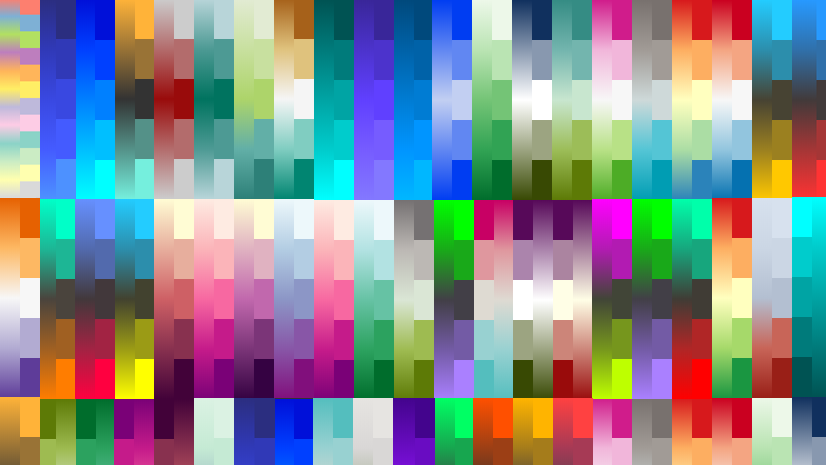
The color ramp library available on the Javascript Maps SDK developer documentation is a fantastic resource for browsing color ramps and copying their hexadecimal or RGBA values into your own code. You can read more about the color ramp library and how to use it in the Better colors for better mapping ArcGIS Blog post. There are hundreds of color ramps there for developers to improve their mapping experience. I’ve also found ColorBrewer to be a useful resource for picking a color scheme appropriate for my data.
To learn more about the new spatial analysis capabilities, and the raster API, check out our new spatial analysis documentation along with the raster data guide. To see more color ramps and color maps in action for the spatial analysis APIs, check out the Show interactive viewshed with analysis overlay sample and the Apply map algebra sample.
We’d love your feedback!
Is there a preset color ramp type that you’d love to see? How will you use the new Colormap and ColorRamp functionality now available in the raster and new spatial analysis APIs in your apps? Let us know on Esri Community ! We love hearing from you and your feedback helps us continue to improve our SDKs for you.
We hope you love creating apps with the new color ramps and color map rendering options, and we look forward to seeing what you build.

Commenting is not enabled for this article.