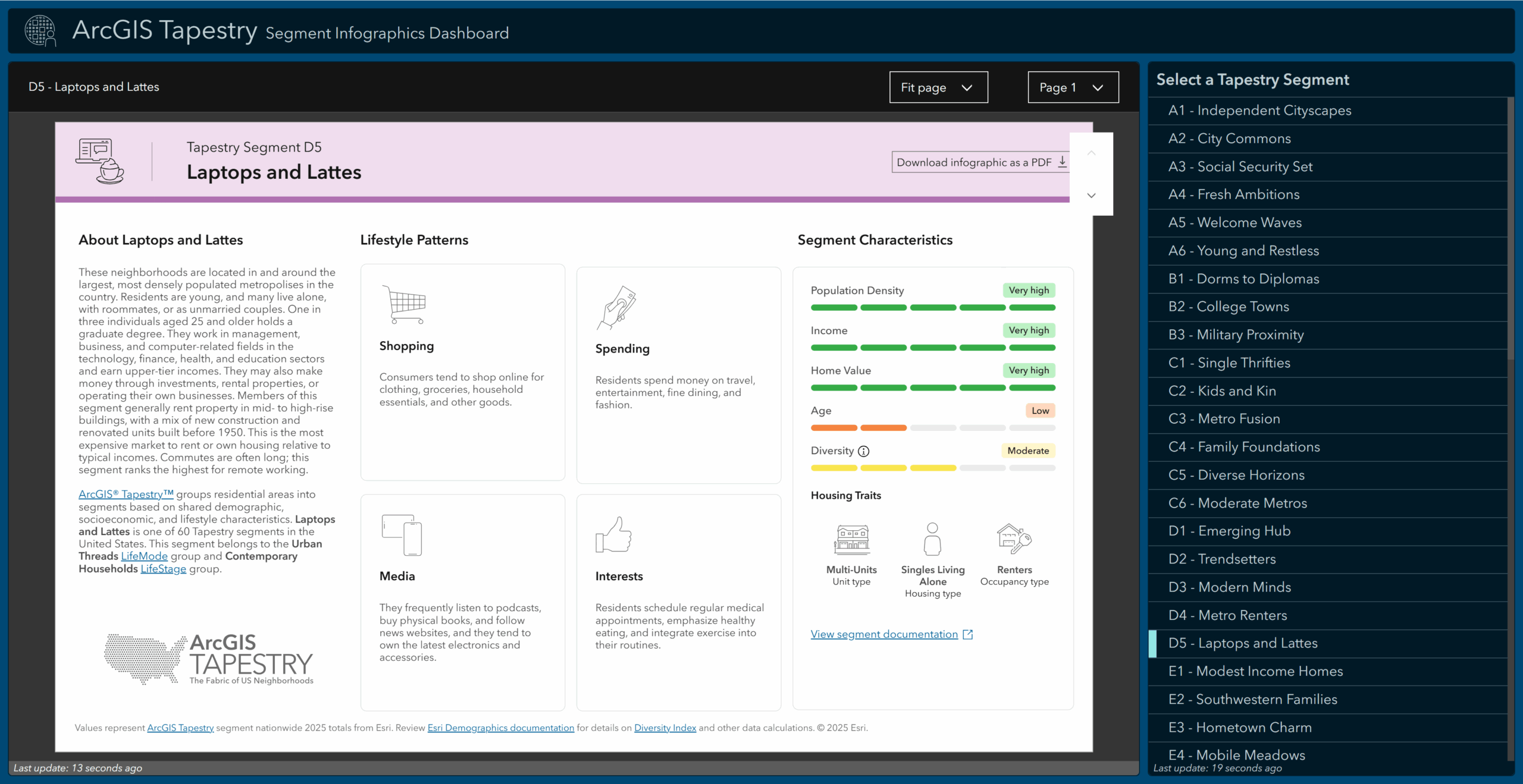
The new ArcGIS Tapestry Segment Infographics Dashboard offers a quick, visual way to explore each ArcGIS Tapestry segment, making complex demographic and lifestyle patterns easier to understand at a glance. In addition to the documentation, you can now see key characteristics, trends, and distinctions associated with each segment brought to life through clean, intuitive graphics.

Built for interpretation and presentation, the dashboard is designed to help compare segments and understand high-level patterns using visual summaries. You can also download individual segment infographics as static PDFs when needed.
The dashboard can be accessed from the ArcGIS Tapestry overview and Introduction to LifeMode groups documentation pages, the ArcGIS Data page by clicking the ‘Tapestry Infographics Dashboard‘ button, or you can open the dashboard directly using this link: https://links.esri.com/arcgis-tapestry-dashboard.
The interactive dashboard allows you to view a 4-page infographic for each of the 60 ArcGIS Tapestry segments. Choose a segment from the Select a Tapestry Segment panel or use the Next feature and Previous feature buttons to navigate between segments.

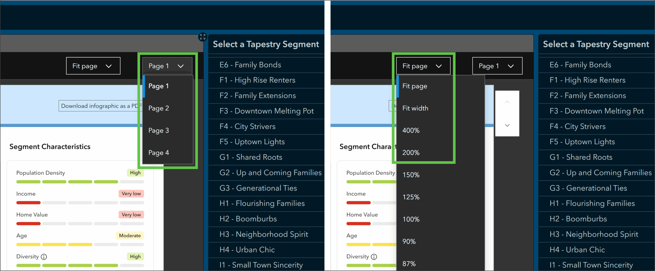
To navigate between pages of the infographic, click Next page or Previous page, or click Page 1 and choose a page from the drop-down menu. To change how the infographic is displayed, click Fit page and choose an option from the drop-down menu.

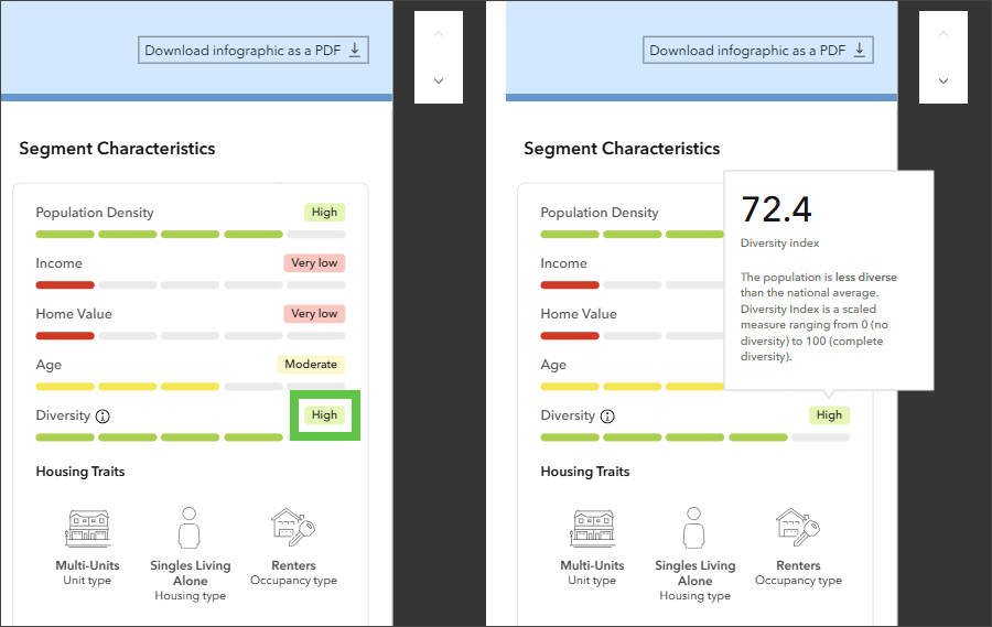
The first page highlights Lifestyle Patterns and Segment Characteristics using clean iconography and short descriptions. Visual bars indicating low to high values for Population Density, Income, Home Value, Age, and Diversity allow you to compare these metrics across segments more efficiently. Hover over the low to high indicators to view the numeric values associated with that indicator along with comparisons to the national average.

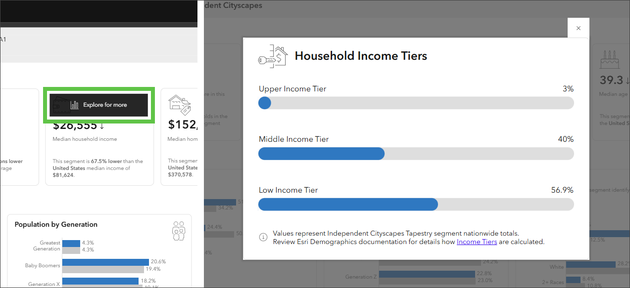
Several metrics include a comparison to the national average, making differences in demographic characteristics immediately visible and easy to interpret or explain to stakeholders. As you page through the infographic, hover over a panel and click Explore for more to view a chart providing greater detail about that indicator or related characteristics.
Additionally, hover over a variable name or value to learn how it’s defined and how to interpret it along with information about the vintage and data source. In addition to a more interactive, analytical experience, these details ensure accuracy and help answer common questions about the underlying data.


In the Demographics section on page three, hover over an icon and click the Settings button to view additional options for displaying the data. Under More options, click View table to view the data as a table instead of as a chart. From the table view, hover over a column header to change how the data is sorted. Click the Settings button again to view additional options for configuring the table or click View chart to return to the chart view. You can also access side-by-side charts that show how each segment compares to national values across key categories.

To view the documentation for the segment shown, click View segment documentation. To download an infographic as a PDF, click Download infographic as a PDF.

With the new infographic dashboard, exploring ArcGIS Tapestry segments is engaging and intuitive. By turning detailed data into clear visuals, you can identify patterns, make comparisons, and take informed action. Whether you need to analyze markets or plan outreach, this streamlined view helps you move from data to decision-making with confidence.
For more information about ArcGIS Tapestry, see What’s new in Tapestry or visit the ArcGIS Tapestry documentation.
For feedback or questions about the dashboard, please email demographics@esri.com.


Article Discussion: