While other products such as Map Viewer and ArcGIS Pro continue to evolve their charting and visual analytics capabilities, I know there are many ArcGIS Insights customers who need to migrate complete pages or reports to another platform before the product termination next year.
There is no “one size fits all” solution. The choice of product and method will depend on content, customer preference and need. Some of you might come up with a bespoke in-house solution such as recreating your pages and any new ones in ArcGIS Experience Builder, using message actions and triggers to control interactions and ArcGIS Notebooks to add custom tools. Some might seek out an alternative provider.
Those of you with simpler workflows may be able to transition your work into one of our “out of the box” offerings using one of the two methods I’m going to outline below for ArcGIS Dashboards and in a sister article for ArcGIS for Power BI. Each product has its own help documentation and getting started pages, but I’m going to introduce and explain them with Insights in mind.
ArcGIS Dashboards
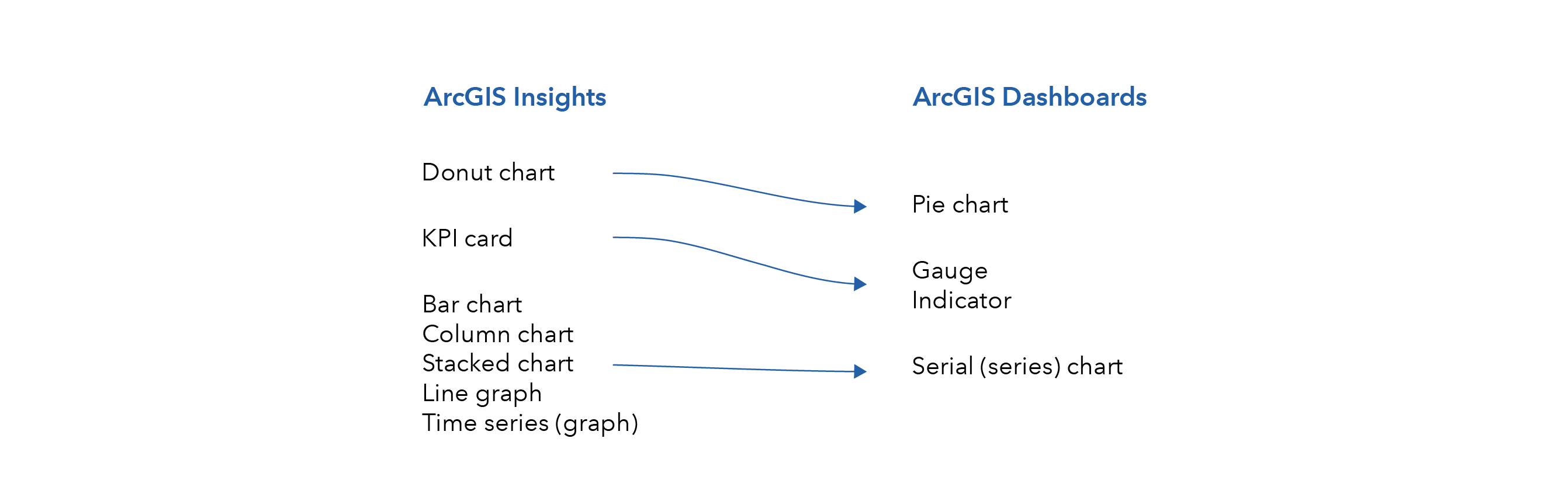
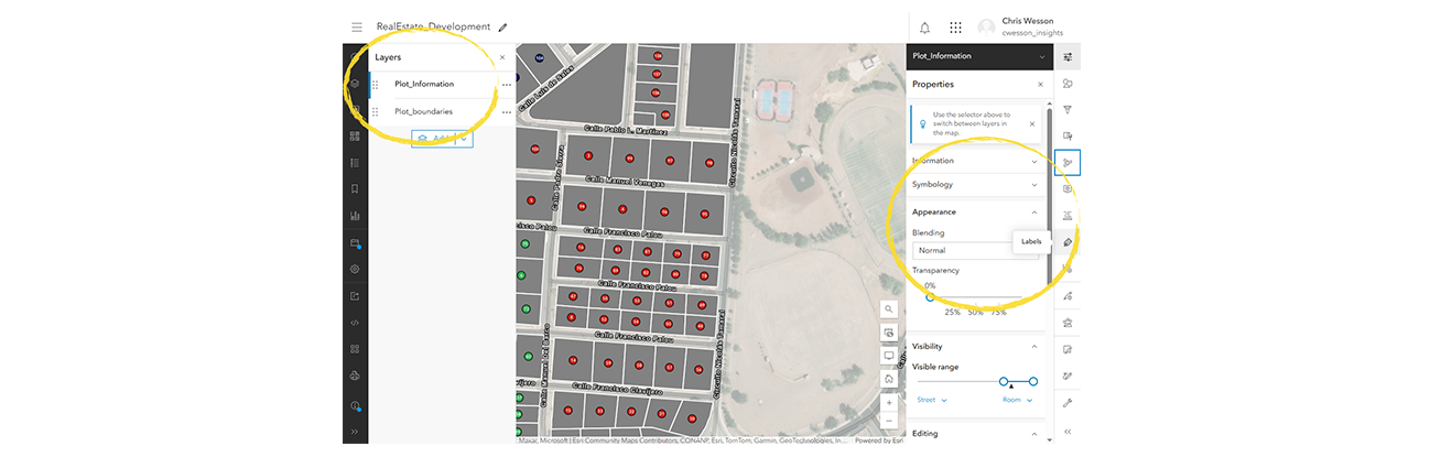
If the main component of your previous work was a visual display of data, i.e., as maps and charts, without needing to make further use of the analysis tools, then Dashboards could be for you. As the name suggests, it is a product for making dashboards. Although the depth of the geovisual analytics functionality differs from Insights, it is easy to set up and use and offers a lot of card or chart customization. As well as maps it offers pie charts, gauges and indicators, and series charts. Just like Insights, there is an edit mode as well as a view mode, and interactivity exists between the items on the page.
Unlike Insights, you cannot construct your map or load local data in Dashboards. You can also not perform queries directly on non-Esri databases. Dashboards accesses all data through Portal, either ArcGIS Online or Portal for ArcGIS Enterprise. If your Insights workbook was already using portal-hosted data or services then you’ll have no problems, otherwise you will need to first publish your source data to portal.
To maximize interactivity, I recommend putting all your data attribution on to your spatial layers and sharing that to portal as a web map. You can also upload zipped file geodatabases and other files such as Excel/CSV as tables. You’ll see the difference later as I’m going to keep some data separate in a file geodatabase.
Step 1: Recreate Insights maps
To add a map to Dashboards, it must be saved as a web map in your portal. To recreate an Insights-like map, load the same data layers into either ArcGIS Pro or Map Viewer. Both processes are very similar, as described below.
In ArcGIS Pro, open the Map ribbon and all data import options can be found under Add Data.
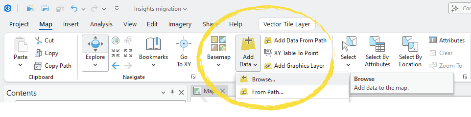
Import your dataset(s) and join any data you want the “map card” to be able to control. From the Contents pane on the side of the screen, right-click a layer to access set up for symbology, labels, pop-ups, and more.

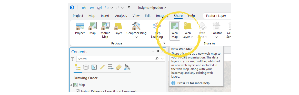
Create the map as you wish it to appear and from the Share ribbon you can share as a Web Map which will be saved into your portal. Be sure to use the Exploratory configuration to maintain interactivity and its safest to use a Map Viewer font. Note: If using OBJECTID for labels, then use a duplicate field as the conversion to online likes adds a prefix.
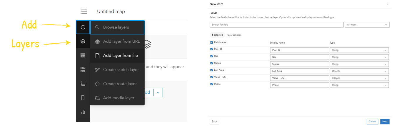
In Map Viewer, you can add hosted layers from your portal via the default Layers tab.
Alternatively, by clicking on the Add (+) tab and Add layer from file, you can add data from a standalone file, a cloud sharing service, or a zipped file geodatabase – for which you will need to choose Create a hosted feature layer and add it to the map, confirm or update the fields types for the layer and, once you click Create and add to map, it will become hosted in your portal and added to the dashboard.
Next, open the Layers tab from the side menu and click on each layer to open up the ability to edit layer symbology, labelling, pop-ups, and more. For geodatabases, expand it out to see the layers within.
Once you’re happy with your map, you can click on Save and Open, followed by Save as. This will save it as a web map in your portal.
Step 2: Publish any other data
Sometimes you may have data that needs to be kept separate from your spatial geometries. For Dashboards this will have to be first published to Portal. So, in my example, as well as the web map, I saved my data as a file geodatabase, zipped it up, and uploaded it to my portal.
On adding the data, ensure you select the correct file type, and choose the “… and create a hosted feature layer” option.
Step 3: Building our workbook as a dashboard
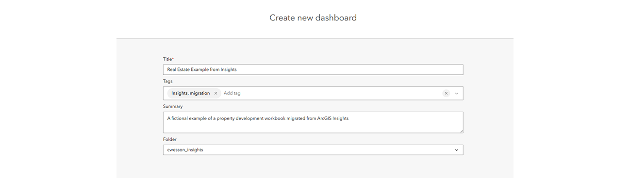
Open Dashboards from the portal menu, just like you would Insights, and click on Create dashboard and fill in the title and metadata.
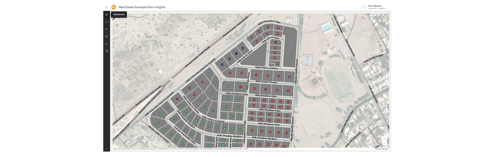
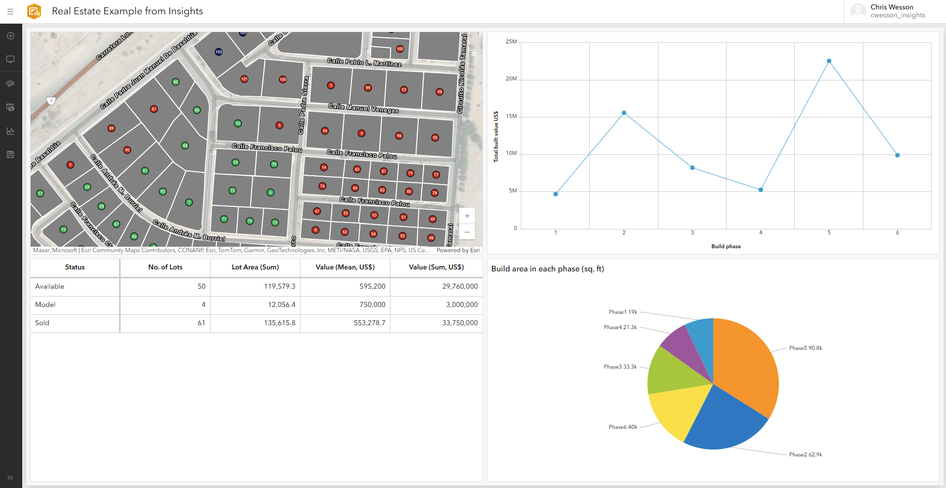
Dashboards is quite a simple concept but may at first appear slightly alien to Insights users. The cards, known as elements, always fill the page, so a single card will appear “full screen” and 3 elements will split the screen into 3 with no gaps.
Click on the “+” button to add an element, choosing from the types listed in the chart above. For the map you are taken to your hosted maps to choose one (you can accept default settings).
Let’s add my map to the dashboard. You can follow along with your own datasets.
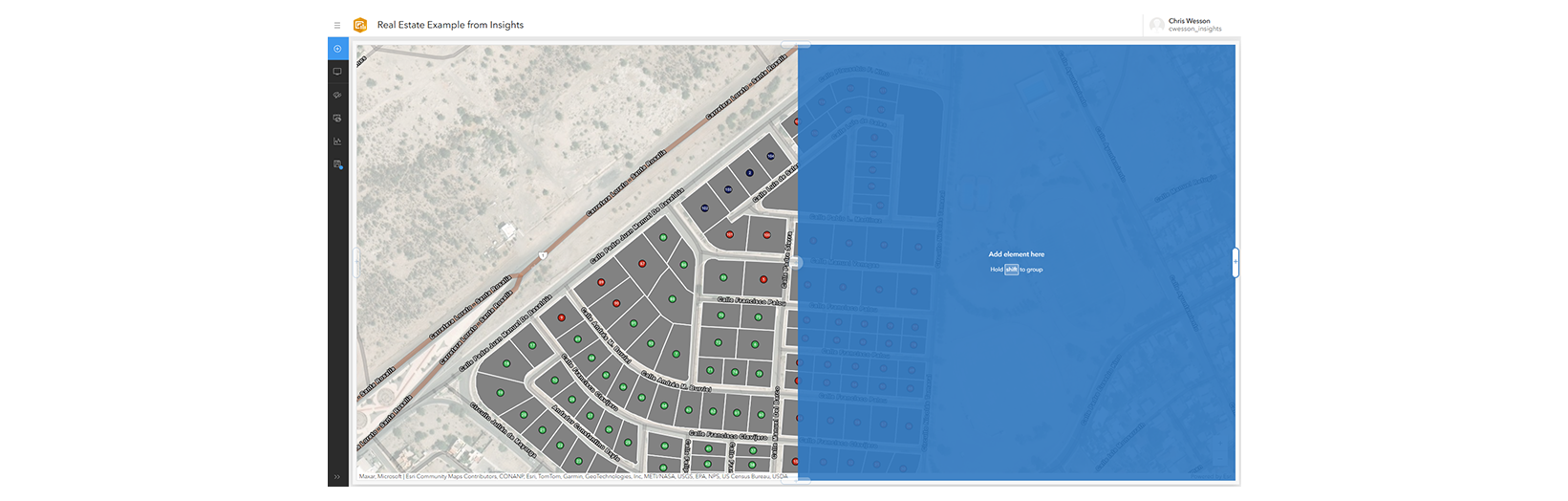
Once you have added your first element, there is a button in the sidebar to add more. Click on this and several “+” icons appear on the screen. Choose the direction or position to where you want to add the next element.
I’m going to choose to the right of the map.
For all other charts there are two options: Browse all layers lets you choose your data from Portal and is the easier click and select method.
Just like the map, I am then prompted to choose a host of settings. Let’s take an example of a line graph of build phase versus total built value in dollars.
If I choose Phase as my category field, and for statistic choose Sum with the Field of Value (US$), then I end up with a preview of a column chart.
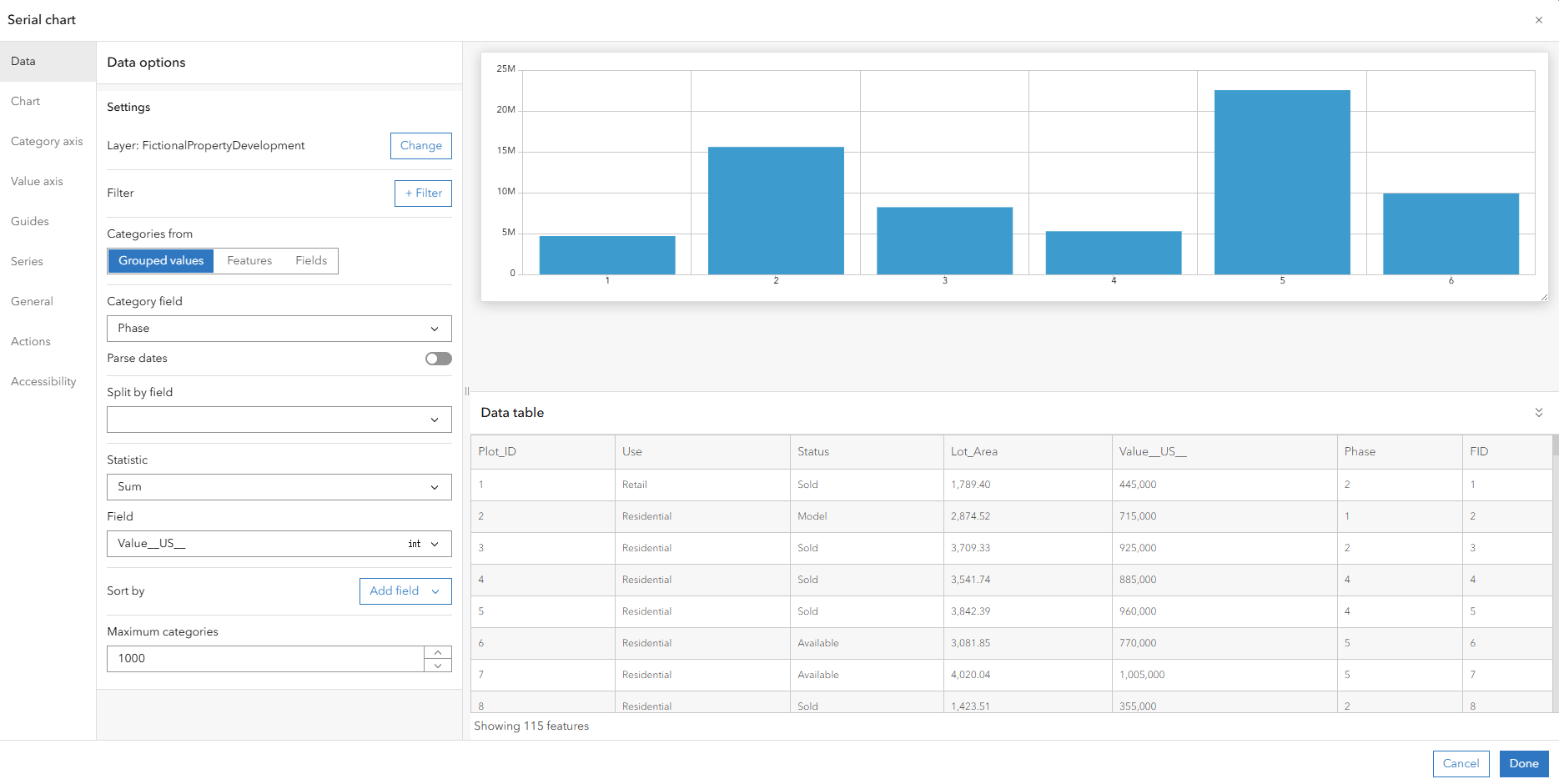
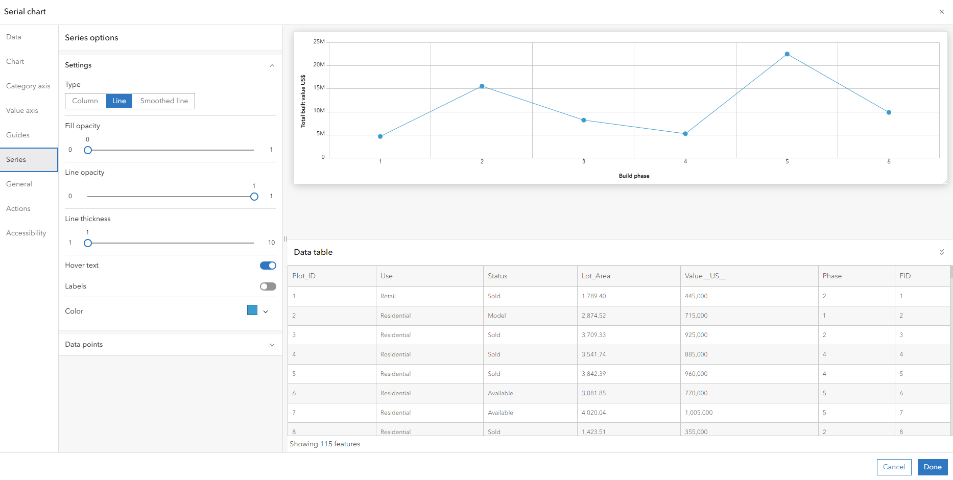
To change this to a line chart, I simply go to the Series tab and change the Type from Column to Line. Make any other changes you want (e.g., I also added axis labels) and click Done to add it to the dashboard.
Continue to add further elements such as tables or other charts just as you had set up in your Insights workbook.
Alternatively, New data expression allows you to use the Esri language Arcade to build your data from an existing data source, e.g., querying a subset of the data, or creating a new variable calculated “on the fly” from the data. This is also where you will be able to create any in-app table joins, summary groupings, or call feature services (using Arcade expressions). Esri Community is a good place to look for examples.
Once you have all of your elements on the page, you can rearrange them. Remember they will fill the screen so you cannot drag around a grid like in Insights. Instead, click on the ellipses (…) in the top corner, choose Drag and then dock it to its new location. The new location must always be either the full width or height of the page or sharing half of the space currently occupied by another element. It takes some getting used to but soon becomes intuitive.
Step 4: Set up interactivity between elements
While you can’t join data tables in Dashboards, you can use a common field (from the same dataset) to set up filter interactions between cards. The set up is slightly more complex than in Insights but that offers you a lot more control and customization.
In my example, I’m going to hover over my pie chart element, find the ellipses (…) and click on Configure and then on the dialog that appears, choose Actions, and expand the Filter dropdown.
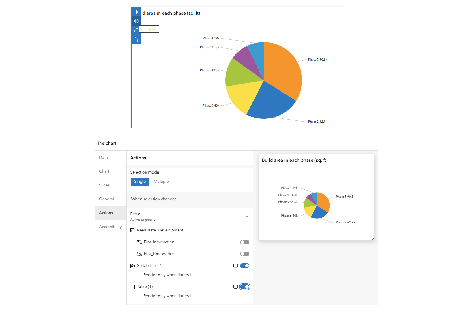
You will see I have the ability to ask the pie chart selections to filter any other instances of this data on my page, e.g. I have asked it to filter the data no the serial chart and the table but not on the map. Try it out on your own data.
Note if the driver is a map element, then from the map configuration there is also an option for highlighting with a “flash”. You’ll find this under Layer actions when you click on a layer.
That’s really about it. I’d just add that Insights-like date fields are now also available in Dashboards, although the equivalent of an Insights summary table can only be grouped on a single field.
ArcGIS for Power BI
Read this sister article for details.
ArcGIS Pro & Map Viewer
ArcGIS Pro users can link charts, tables and maps together which in ArcGIS Pro appear as separate windows but do interact with one another*. They can also be shared statically as a layout and data refreshing is easy.
*Selections on charts update the row count in ArcGIS Pro rather than update the selected features on maps and tables, so not quite the same as Insights.
ArcGIS Online customers can do likewise in Map Viewer. Data can be prepped in ArcGIS Pro and shared as a web map, or data can be added to a basemap in Map Viewer and all set-up done there. Charts selections do show on the map in Map Viewer. The main catch with shared web maps is data updates. Within ArcGIS Pro refreshing databases or Excel files is easy, but unfortunately to share as a web map, only permanent joins (using the Join data tool) are supported. This is fine if you already had all of your data on your geometries, but I know some Insights customers who like to keep them separate.
Others
Theoretically you can access your ArcGIS Online or ArcGIS Enterprise data directly from Tableau which has the advantage of accepting multiple geometry fields. However, when I downloaded the latest desktop trial that method kept returning a driver error, so you may have to contact Tableau for help with that. Many other data analytics applications exist, e.g. ArcGIS Enterprise users can use ArcGIS Pro to link their data to Google BigQuery to then use Google Looker or Looker Studio for their visualization.
ArcGIS AllSource may also be a good option for customers with network, link and time analysis, albeit more like ArcGIS Pro and targeted at intelligence for uniformed services.
Hope this has provided some help and technical guidance. For more advice on transitioning please reach out to your Esri account manager or Esri Support. For advice on migrating data from Insights, please see this blog post.


Commenting is not enabled for this article.