While other products such as Map Viewer and ArcGIS Pro continue to evolve their charting and visual analytics capabilities, I know there are many ArcGIS Insights customers who need to migrate complete pages or reports to another platform before the product termination next year.
There is no “one size fits all” solution. The choice of product and method will depend on content, customer preference and need. Some of you might come up with a bespoke in-house solution such as recreating your pages and any new ones in ArcGIS Experience Builder, using message actions and triggers to control interactions and ArcGIS Notebooks to add custom tools. Some might seek out an alternative provider.
Those of you with simpler workflows may be able to transition your work into one of our “out of the box” offerings using one of the two methods I’m going to outline below for ArcGIS for Power BI and in a sister article for ArcGIS Dashboards. Each product has its own help documentation and getting started pages, but I’m going to introduce and explain them with Insights in mind.
ArcGIS for Power BI
Power BI is a Microsoft product that is easily accessible to existing Microsoft account holders and includes Esri’s ArcGIS for Power BI embedded within the application. Using the combination of products, Insights users might not find quite as much spatial analysis or manipulation, but users can replicate many of their final Insights reports – albeit a very different user experience that may take a significant amount of effort.
Our ArcGIS for Power BI tool allows us to create maps in Power BI directly from feature layers (or web maps) hosted in our ArcGIS portal. However, this link only exists on the map card and so the data cannot be used on any other chart types (visualizations) in this way.
The way I suggest getting around that is to use another data source for the other charts and ensure you have a common field to join it to the map data with.
Step 1: Preparing data for maps
Like Insights, ArcGIS for Power BI allows you to build a map within the Power BI application by bringing in layers. If these are spatial layers from databases such as SQL Server, then you can drag the geometry field to the Location field for your map. I’ll show this later.
If your spatial layers are in an Esri format then you’re going to want them to be hosted on your portal. Open your ArcGIS Online or ArcGIS Enterprise portal in a web browser and go to the Content ribbon and click on New item.
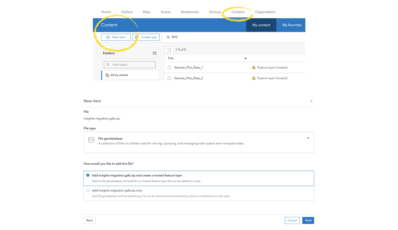
Be sure to update the file type to the correct one (if necessary) and choose the option “…and create a hosted feature layer”.
Step 2: Loading data for other charts
Using my example I’m going to show you two alternative routes. Firstly, to load data from a non-Esri format. I’m going to load information about my real estate development plots from an Excel spreadsheet, but it is the exact same workflow for say a non-Esri database.
The second method I’m going to show is using data from your portal-hosted feature layers. Hopefully they are examples you can follow to apply to your own data and scenario.
2a. Non-Esri format data
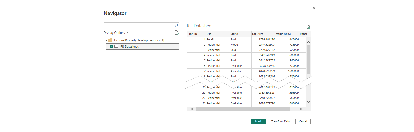
Click on Get Data and navigate to your data source.
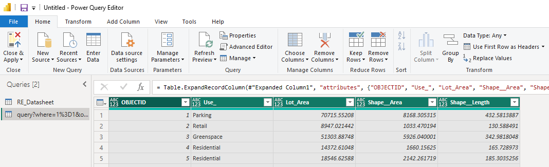
Doing so brings up the Navigator dialog where, in my example, I choose the sheet from Excel I wish to use, and then I usually choose Transform Data which opens the table in Power Query Editor allowing me to check the field types, etc. are how I want them.
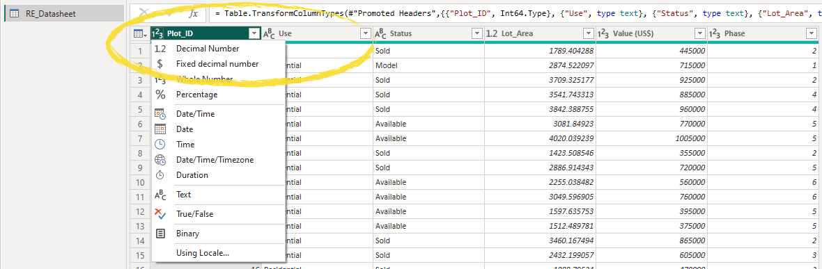
To change a field type, click on the icon to the left of the field name. To delete columns, right-click on the field name and choose Remove. For anything more, I suggest watching the middle section of this quick overview video. Any non-spatial table joins you had set up in Insights, you can replicate through Power Query as explained here. Once you’re happy choose Close & Apply.
You will notice the sheet from Excel appear in the Data pane.

2b. Esri format data
In Portal, go to the item page of the feature layer you would like to use. Click on the individual geometry layer you are going to use. Under Overview, copy the URL from the Details section.
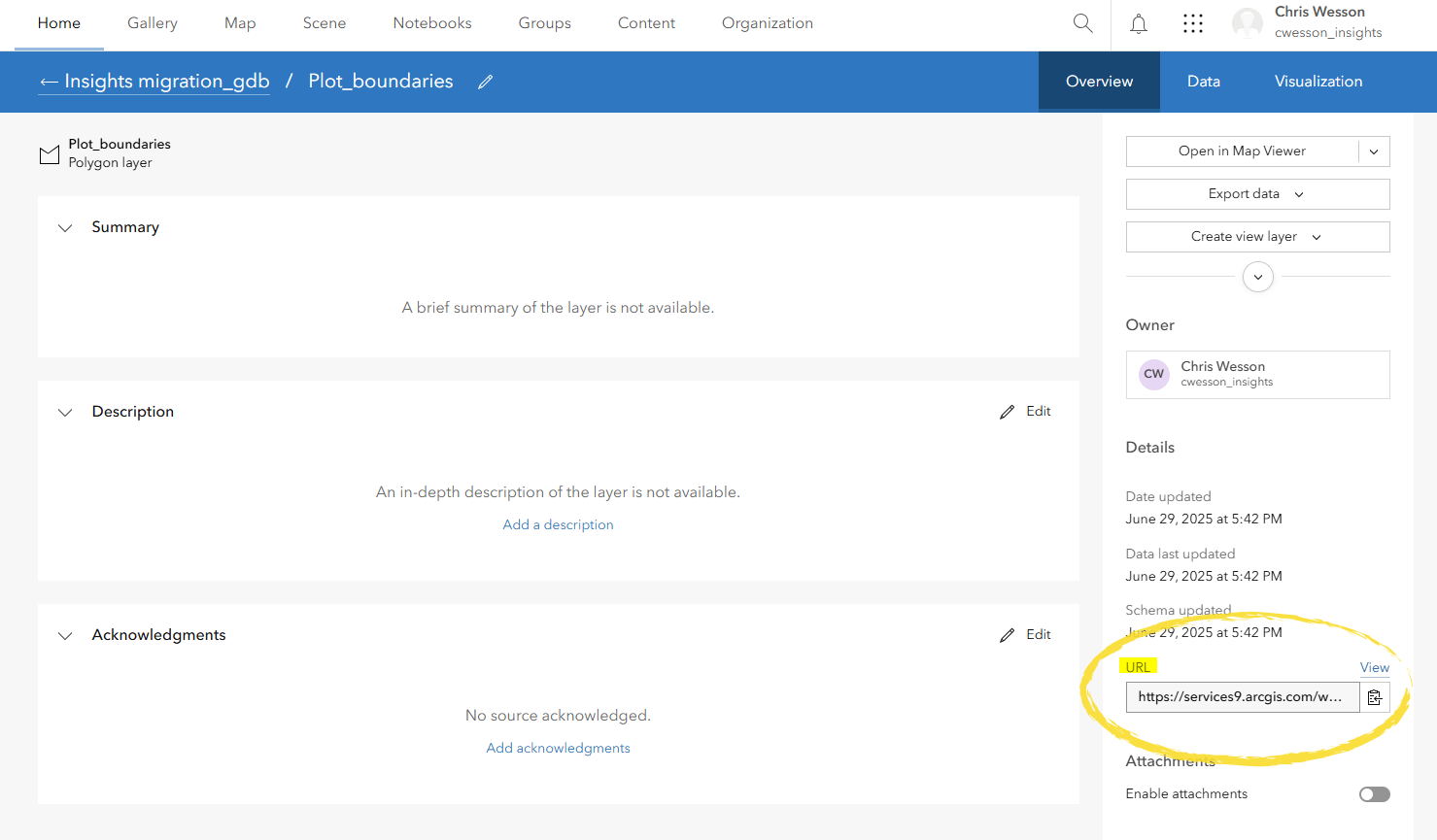
Paste the URL to Notepad, then add the following string immediately after it:
/query?where=1%3D1&outFields=*&returnGeometry=false&resultRecordCount=0&f=json&
Then, back in the browser, above the URL box, click on View to bring up the ArcGIS REST Services Directory. Right-click on the link at the top that says JSON, and open in a new window.
From the new browser tab, find in the URL the word “token” and copy both that and everything after it. Back in Notepad, paste this onto the end of the string.
Here is what I ended up with but yours will be different:
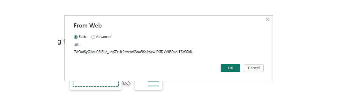
https://services9.arcgis.com/w8AGTW5wROSghRmG/arcgis/rest/services/Insights_migration_gdb/FeatureServer/0/query?where=1%3D1&outFields=*&returnGeometry=false&resultRecordCount=0&f=json&token=3NKHt6i2urmWtqOuugvr9QFWOUqtxoeoO7bxJGShWoHW8wFKTAfnospQwSXKJYUAPOSKYL72Feq-bXw5CKS6ZPrWm1XOusO-yn_lluCwoia5cPrv_5nFH8bOBzsZ8eh1UN0Q_BCZvxIOn3VHcyhLfeIFtxSVKmEztWGZXRw_H_3B7AOatSyQIIouCfkEIJc_uoXZcUz9lweorS3nu5Ks4wewJ9GDVV6S9kql17X00k8.
Return to Power BI and from the Home ribbon, click on Get data, and choose Web. In the URL box, enter the full string from Notepad.
Note: The first time you will need to set up and authenticate the connection. Connect to ArcGIS Online or ArcGIS Enterprise using the Basic option with your regular portal username and password and choose to connect at the highest (root) level.
This should bring up the Power Query window that Power BI uses when importing data.
Scroll to the far right of the table and in the features column, click on List.

In the Transform ribbon, select To Table and when the dialog appears, click OK.
Next, click on the Expand button to the right of the Column1 fieldname and uncheck Use original column name as prefix, click on Load more to remove the warning, then select OK.
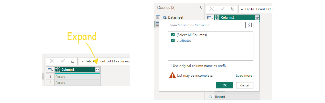
Now select the Expand button again, once again ensure checkbox remains unchecked and the list is complete (using Load more) and OK again.
All your fields from your feature layer should now be visible. Correct any incorrect data types by clicking on the icon to the left of the appropriate fieldname.
Click Close and Apply. If you get a message saying that a fieldname was not found, it could be that your token has updated. To fix this, go back to that step and start over.
You should now see your data with all fields in the Data pane on the right-hand side of Power BI.

Much of the above is explained in this excellent video resource from Esri Canada.
Step 3: Creating a map card
In the Visualizations pane, click on the ArcGIS for Power BI widget to add it to the page. You can make it slightly bigger so it’s easier to see and work with.
Sign in and create your map card by either loading a feature layer directly from Portal by clicking on “+ ArcGIS Data” or for non-Esri format spatial data by dragging fields such as geometry or lat/long from the Data pane to the corresponding boxes in the Visualization pane.
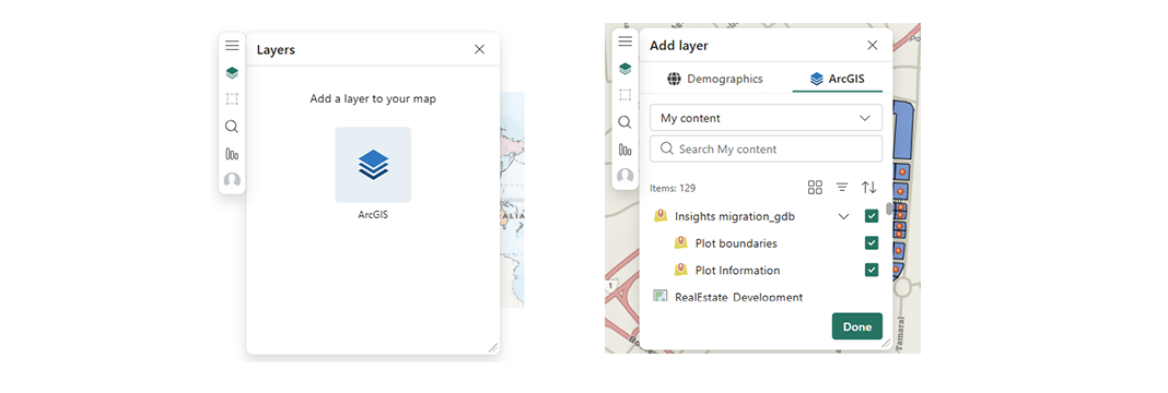
In my example, I clicked on Layers, then ArcGIS, expanded my hosted file geodatabase, and checked the boxes for both my plot boundaries (polygons) and plot information (points) in the order I wanted them to draw, and clicked Done.
The two layers are added to the map, and I can also choose to change any of the symbology, style, and labelling options. These settings are designed by Esri so they should feel more familiar to you.
Note: Because I used a file geodatabase, the Symbology options are limited to Location or Heat map. I cannot use Unique values for example. Had I used hosted feature layers or layers from a hosted web map, then I would have more symbology options as well as the advantage of retaining any previous styling, e.g. from ArcGIS Pro or Map Viewer. Refer to the Dashboards sister-article to see how to create a web map.
Step 4: Creating other charts
Go to the Visualizations panel and select the type of chart to add to the page.
Then drag from the Data panel the fields you want to use on that chart into the correct well where it says, “Add data fields here”.
In my example, I have chosen a Line chart and I drag my field Phase to the x-axis and Value to the y-axis. Using the dropdowns on those fields you can change the statistic used, etc.
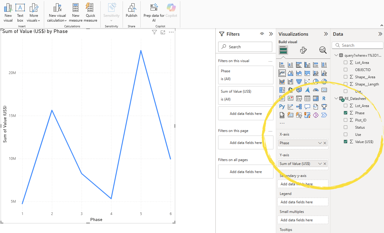
You can then move and resize the card(s) just like in Insights.
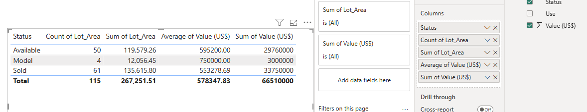
I then did the same for the table and the donut chart.
To get a count as a field if you don’t have a bespoke one, you simply drag across any field to the Columns well and change the statistic to count.
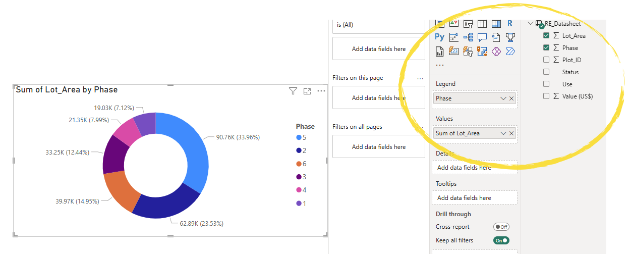
For the donut or pie chart, I drag Phase to the Legend field – this is the field that will determine each segment category. Then I drag Lot Area (sum) for the values to give me the total development area for each phase.
Finally, I clean up the appearance, titles, and so on. Note that for each card, you can click on the second tab in the Visualizations panel to update the styling. For some of the cards, depending on chart type, the third tab in Visualizations allows you to add trendlines, error bars, and even forecasting.
Step 5: Creating a join
In Power BI, joins work the opposite way round to Dashboards. Rather than the map controlling the interactions on the other charts, in Power BI the other charts drive what you see on the map. Unfortunately, neither has the complete two-way interaction you get with Insights. Each map card can have one join to the other data. Like Insights this can be based on one or multiple fields.
Select the map card, and in the Visualizations panel drag the join layer from the Data panel into the Join layer well. You can base the join on up to 5 fields. I used one field in mine, Plot_ID, and changed the statistic to unsummarized.
This brings up a message on the map card to Create a join layer.
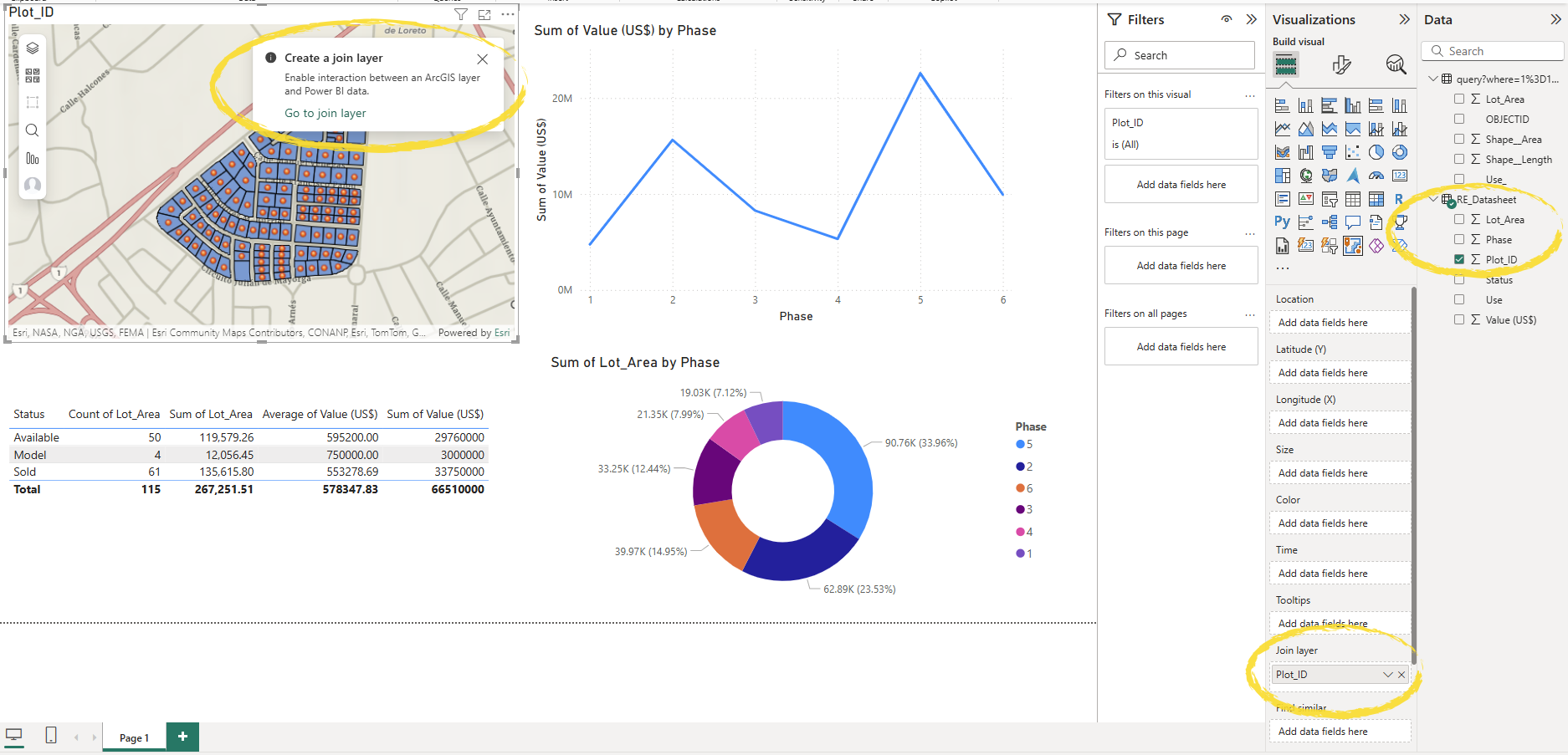
Click on Go to join layer, choose the map layer that will participate in the join as the Target layer, then select the join fields, scroll down and choose between filtering and highlighting as the default interaction. Click Create join.

Save the document. Power BI has a lot of other functionality we haven’t covered here. The objective for today was simply to recreate a basic Insights page. On the topic of basic Insights functionality, Power BI also has page filters and allows multiple pages within a workbook. There’s also drive times, demographic variables, and so on.
Finally click Publish on the ribbon to share to the web with others in your group or organization. You will need a Power BI Pro license to share with others.
ArcGIS Dashboards
Read this sister article for details.
ArcGIS Pro & Map Viewer
ArcGIS Pro users can link charts, tables and maps together which in ArcGIS Pro appear as separate windows but do interact with one another*. They can also be shared statically as a layout and data refreshing is easy.
*Selections on charts update the row count in ArcGIS Pro rather than update the selected features on maps and tables, so not quite the same as Insights.
ArcGIS Online customers can do likewise in Map Viewer. Data can be prepped in ArcGIS Pro and shared as a web map, or data can be added to a basemap in Map Viewer and all set-up done there. Charts selections do show on the map in Map Viewer. The main catch with shared web maps is data updates. Within ArcGIS Pro refreshing databases or Excel files is easy, but unfortunately to share as a web map, only permanent joins (using the Join data tool) are supported. This is fine if you already had all of your data on your geometries, but I know some Insights customers who like to keep them separate.
Others
Theoretically you can access your ArcGIS Online or ArcGIS Enterprise data directly from Tableau which has the advantage of accepting multiple geometry fields. However, when I downloaded the latest desktop trial that method kept returning a driver error, so you may have to contact Tableau for help with that. Many other data analytics applications exist, e.g. ArcGIS Enterprise users can use ArcGIS Pro to link their data to Google BigQuery to then use Google Looker or Looker Studio for their visualization.
ArcGIS AllSource may also be a good option for customers with network, link and time analysis, albeit more like ArcGIS Pro and targeted at intelligence for uniformed services.
Hope this has provided some help and technical guidance. For more advice on transitioning please reach out to your Esri account manager or Esri Support. For advice on migrating data from Insights, please see this blog post.


Article Discussion: