Not every map needs extensive tools and analysis. Sometimes you simply want to show the best, biggest, highest, or most visited locations and let your audience focus on what stands out.
Countdown is a purpose-driven ArcGIS Instant App for ranking, comparing, and highlighting features. With minimal configuration, you can turn existing map data into a countdown or leaderboard list that helps users quickly see what rises to the top. Whether you’re showcasing the most visited parks, comparing housing affordability, ranking counties by population, or highlighting top-performing assets, Countdown provides a focused experience built around the ranking.
Turn Data into a Ranked Experience
At its core, Countdown ranks features using a numeric field you choose.
Simply select the layer and numeric attribute that should drive the ranking, and Countdown automatically orders the features from highest to lowest (or lowest to highest). The result is an interactive list that updates as users navigate through the app.
This makes Countdown an excellent choice for:
- Taylor Swift Eras concert ranked by attendance
- Cities ranked by housing affordability
- Waste management of petroleum facilities
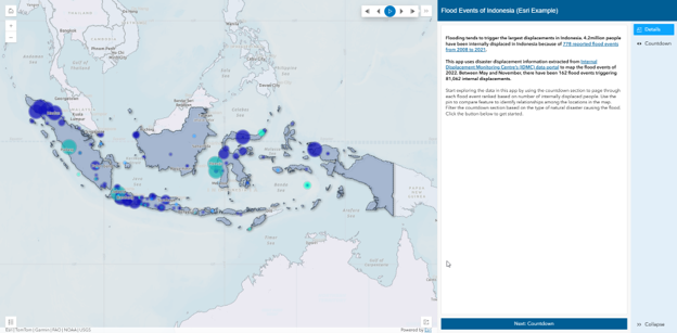
- Displacements caused by flooding
- US Cities impacted by rising sea levels
- Most visited National Parks in the US
Rather than presenting users with a map full of features and asking them to determine what stands out, Countdown surfaces the rankings immediately.
Put Ranked Features in Context
A ranking tells you where a feature falls on the list, but the map provides important geographic context. As users move through the ranked list, the corresponding feature is highlighted on the map and its popup appears in the panel. Want to compare features? Pin popups on the map to keep multiple features open at once, making it easy to compare their information side by side as you explore the rankings.
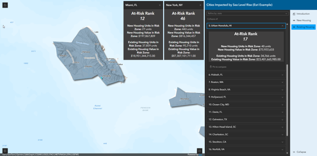
Together, the ranking, popup information, and map help users understand not only where a feature ranks, but where it is and how it compares with other features.
Build a Countdown app: Key Decisions
One of Countdown’s strengths is how quickly you can go from an existing map to a focused ranking experience. Let’s look at the key decisions behind the International Housing Affordability example app and how they shaped the final app.
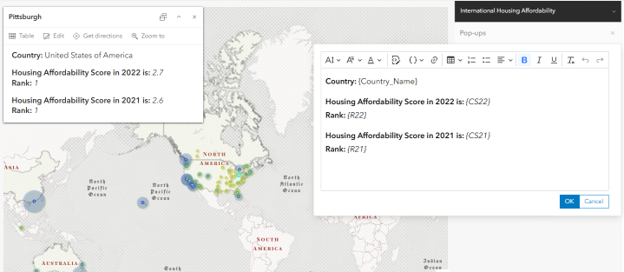
- Great web apps often start from the map. Countdown prominently displays popup content from the ranking layer, so the map is a great place to start. For the Housing Affordability app, we configured the popup to emphasize the affordability ranking and score, giving users the most relevant information as they move through the list.
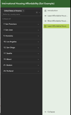
- Decide how to present the rankings. Countdown provides two ways to present ranked features. A countdown list presents the ranking as a paged experience, letting users move through the ranked features one at a time. A leaderboard presents the ranked features together on a single page, making it easier to scan the list and compare results.
For the Housing Affordability app, we wanted to highlight both ends of the data, so we created countdown lists for the least and most affordable areas. We also added a leaderboard showing 25 features, making it easy to scan more of the least affordable locations at once. Lists are created in the Countdown section.
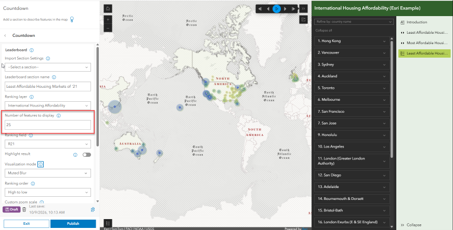
- Emphasize the ranked features. Visualization modes can help ranked features stand out from the rest of the map. For this app, we used Drop Shadow + Gray for the countdown lists and Muted for the leaderboard. The right choice will depend on your basemap and layer symbology. Visualization modes are configured within each countdown or leaderboard section.
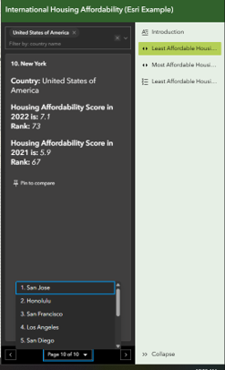
- Help users refine the rankings. Filters give users another way to explore the ranked data. In a countdown list, applying a filter generates rankings based on the filtered features. For example, selecting a country in the affordability app updates the countdown to show rankings for that country. Filters are configured in the countdown or leaderboard sections.
A leaderboard filter instead refines the features already represented in the list. Filtering the top 25 least affordable cities to the United States, for example, shows only the U.S. cities represented within that list.
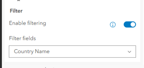
Filters are configured in the list section for each list.
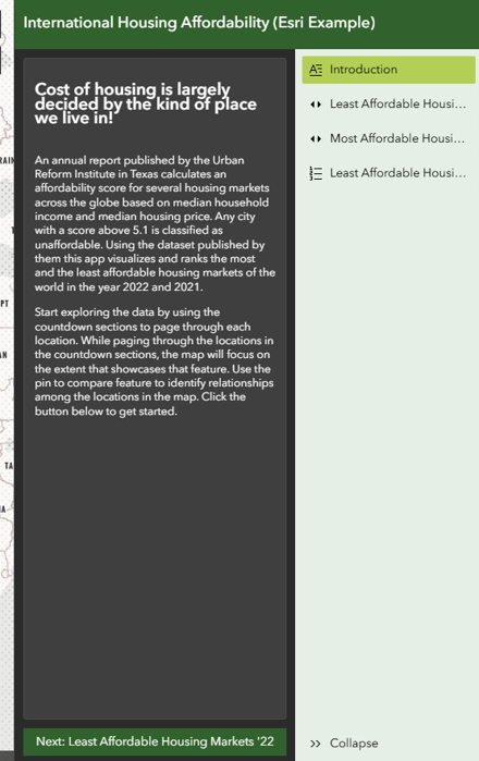
- Give users context. For the affordability example, we wanted to introduce the app, explain the data source, and define the affordable score. When the app opens, it starts on the details panel. Giving users this context up front helps them understand what they’re looking at before they begin exploring the rankings. The details section can be configured in the Countdown section by editing the default details panel or adding a new one.
- Finish with the look and feel. Finally, we styled the app to match the symbology chosen when creating the map. Instant Apps offer a variety of preset themes, plus options to create your own to match your organization’s branding. Theme and mode options are configurable in the Theme and Layout section.
Start Building Your Own Countdown
Countdown stands apart from other Instant Apps by focusing on ranked data. Instead of building complex workflows, authors can quickly configure a layer, select a ranking field, and publish an engaging experience that highlights ranked features and helps audiences understand the results at a glance. Whether you’re creating a top ten list, a leaderboard, or a showcase of featured locations, Countdown makes it easy to turn geographic data into an ordered, interactive experience.

Article Discussion: