
In July, I had the opportunity to present at the Esri User Conference alongside my fellow colleague Ashley Kuhn for the ArcGIS Maps for Adobe Creative Cloud: Building Engaging Graphics session. With hundreds of creatives in the room, our goal was simple: pull back the curtain and show how a designer like me uses the ArcGIS connector for Adobe Illustrator to turn geographic data into stunning visual assets for events and conferences.
At Esri, we have a super-talented Creative Lab team that brings maps to life in ways that are both beautiful and meaningful—whether for conferences, presentations, graphics, or promotional materials. We often collaborate closely with our GIS colleagues, starting with data-rich maps in ArcGIS and refining them in Illustrator using ArcGIS Maps for Adobe Creative Cloud. This extension helps our teams work together effectively, bridging the gap between GIS and design teams. The result? Visuals that not only look stunning but also tell powerful, data-driven stories.

During the session, I showcased a step-by-step process on how to navigate the extension, find and visualize data, and finally export out the map. Once in Adobe Illustrator, we walked through the process of simplifying and recoloring the map.
Once done, it was time to assemble the poster. To do this, I put together a library of design assets. This included a collection of illustrated vector shapes — pulled from the UC 2025 art kit— a few color swatches, logos, and the event theme “GIS—Integrating Everything, Everywhere”.
Let’s break down that process step-by-step.
Task 1: Creating a map with ArcGIS Maps for Adobe Creative Cloud
As a graphic designer, the first step is to find high quality maps. To do so, I opened Adobe Illustrator and navigated over to extension to open up ArcGIS Maps for Adobe Creative Cloud. Inside the extension, we are greeted by the Mapboards and Compilations window to preview my map. The mapboards window allows you to navigate the globe to find your desired location and then draw out the boundaries of the map you want to work within.
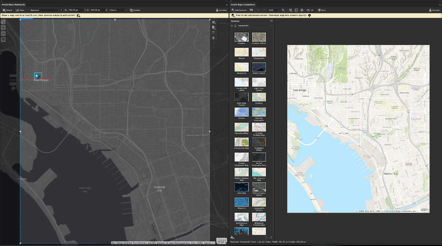
Once this is drawn, I can move over to the Compilations window. Here, I get a preview of my map, which currently will be using a default basemap. Depending on the mood or necessities of my map, I can change this basemap from a wide selection of options. For my purposes, I chose the Dark Theme Navigation basemap.
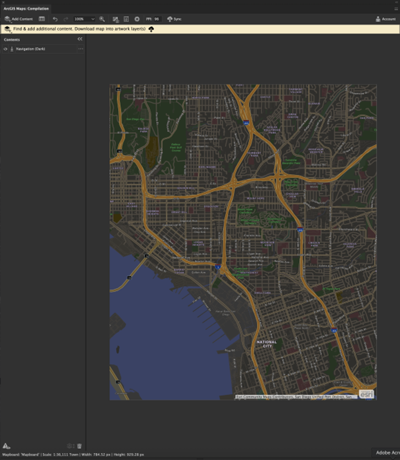
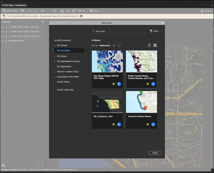
Now that I have a good foundation, I wanted to give a bit more visual texture to my map. To add data to my map, the extension can bring in publicized data from ArcGIS Online and the Living Atlas. After doing some searching, I added a couple of data sets. One of transit and public transportation spots, and a second data layer of traffic zoning. These two data layers will serve me as two different maps for my poster design.
There are a few styling options that I can do to the data, within the extension. I can hide elements I may not find useful, change the color of data points and increasing the size of each point. For more details, check out this help topic for compiling and styling maps. Now, I’m ready to export.
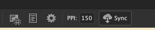
Exporting is a simple process with only a few buttons to interact with. You can choose to edit the resolution of your map, to a higher or lower DPI (dots per inch). Once you are happy, you simply click on the Sync button at the top navigation bar. This will prompt you to give your map a name, and the syncing process will begin.
Task 2: Styling in Adobe Illustrator
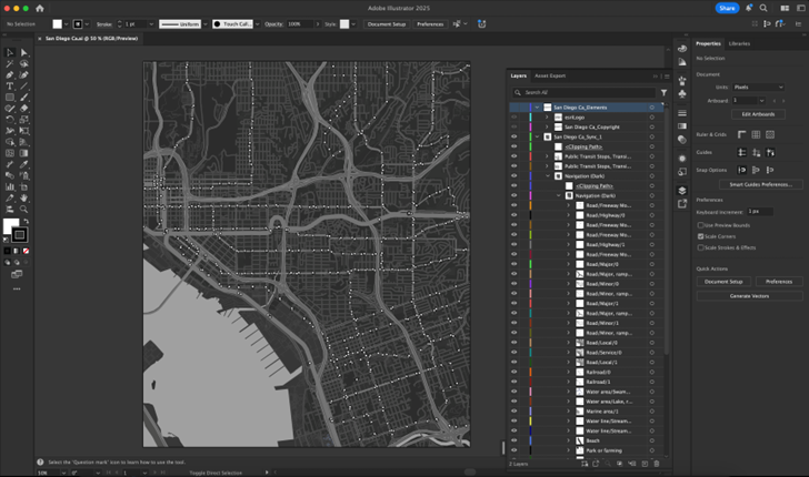
Our map is ready, and we’re now working in Illustrator. The extension syncs the map and its contents as artwork and organizes it in Illustrators layers panel using meaningful layer names. This gives me full control over all the vector shapes, where I can adjust color, remove shapes and simplify the graphics to build up a clean design for making the poster. The style changes remain localized to the Illustrator file and don’t impact any GIS data, allowing me the creative freedom to build the visual without disrupting any GIS processes.
To start, I remove all street name labels, city labels and highway symbols. This will make it look cleaner.
Next, I applied a global color change to make it easier later when assembling my poster. For now, I will make the overall map in greyscale by simply selecting all shapes (Command + A) and then going to Edit > Edit Colors > Convert to Grayscale.
Once the cleanup and recoloring are complete, this map is ready. I repeat the exact same process for two additional maps, which I’ll also clean up and recolor to grayscale before incorporating them into the final poster layout.
Task 3: Poster Assembly
Prior to the live demo, I prepped a separate Illustrator file containing art assets like event key art, color swatches, typography and logos. I created this to reference back to and pull elements individually as I put together the poster.
To begin the poster, I first needed to create a brand-new Illustrator document. I set it to a standard 24”x 36” poster size. With this document open, and my art asset document open, I started composing the final poster design.
One of the key components for the poster design was to incorporate the maps I created. For this I wanted an impactful “GIS” to take up most of the space of the poster. My plan was to use each of those letters to house the maps I exported from the extension. So, one by one I imported the maps into my poster document and by selecting one letter, along with one map, I can force the map into the letter by Clip Masking them together.
I repeated this same process with the remaining 2 letters and used this stylized “GIS” as the center piece of the poster.
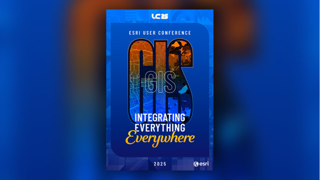
The rest of the design involved copying over key art frame assets and drawing a few new rectangle shapes for the background art. For this design I was also able to sample color from swatches in the asset document to ensure alignment brand approved harmonized color scheme. Since all the art – map and key art – was in native Illustrator vector form, I was able to leverage Illustrators layering tools with appearance workflows like Recolor and Transparency to create a campaign specific poster for the conference.
Presenting at the User Conference was an incredible opportunity to connect with fellow creatives and showcase how ArcGIS Maps for Adobe Creative Cloud empowers designers to bring geographic data to life. From map creation to poster assembly, the workflow we shared demonstrates how intuitive and flexible the extension is for producing visually compelling graphics. Whether you’re designing for a conference, campaign, or client pitch, this extension bridges the gap between GIS and design.
If you’re interested in learning more about the extension, check out last year’s presentation or explore the resources below to start building your own map-inspired designs.
Explore our resources:


Article Discussion: