ArcGIS for Microsoft 365 continues to make spatial analysis more accessible directly within everyday business tools, with new enhancements across Excel and SharePoint that simplify how users explore, edit, and communicate location-based data. In Excel, updates make it easier to visually interpret data through attribute-based color styling, confidently edit and manage spatial data, and perform advanced coordinate and projection workflows, without leaving the spreadsheet. At the same time, improvements to the shared mapping experience across Excel and SharePoint introduce more dynamic time-based animation and flexible labeling, helping users better understand patterns over time and highlight the right information at the right scale. Together, these updates reduce complexity, improve data clarity, and help users make more informed decisions using location data in the tools they already use.
Don’t have time to read the blog? Watch this video for a quick overview:
Quick Links
New mapping experience in ArcGIS for Excel and ArcGIS for SharePoint
ArcGIS for PowerPoint (beta) EAC
ArcGIS for Excel
Improve data interpretation in Excel through attribute-based color styling
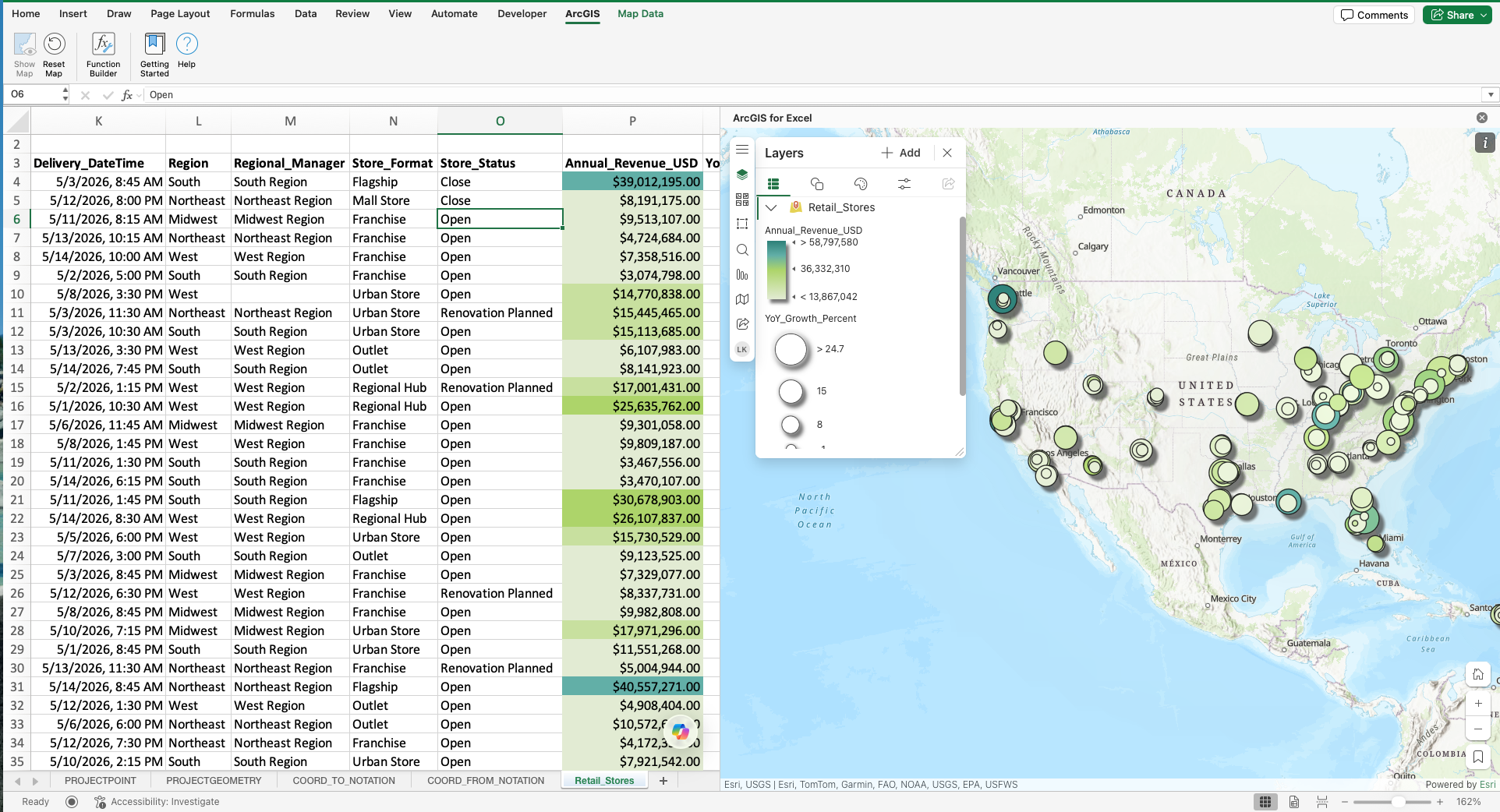
This new enhancement now lets users apply color styling directly to their Excel data based on selected attribute values. By choosing an attribute from their dataset in ArcGIS for Excel, users can automatically apply distinct colors to cells, making patterns, categories, and differences in your data instantly visible. This update helps users visually interpret their data without complex formulas or manual formatting. By tying color directly to meaningful attributes, users can quickly highlight insights, reduce misinterpretation, and improve decision‑making directly inside Excel. For example, a public works analyst managing infrastructure inspections can color‑code inspection records based on condition (Good, Fair, Poor). Immediately, stakeholders can identify at‑risk assets, prioritize maintenance, and align discussions around the most critical issues, without leaving Excel or manually formatting spreadsheets.
More control and confidence when editing data in ArcGIS for Excel
ArcGIS for Excel now gives users greater control over how they edit feature layer data with three new data‑editing management options:
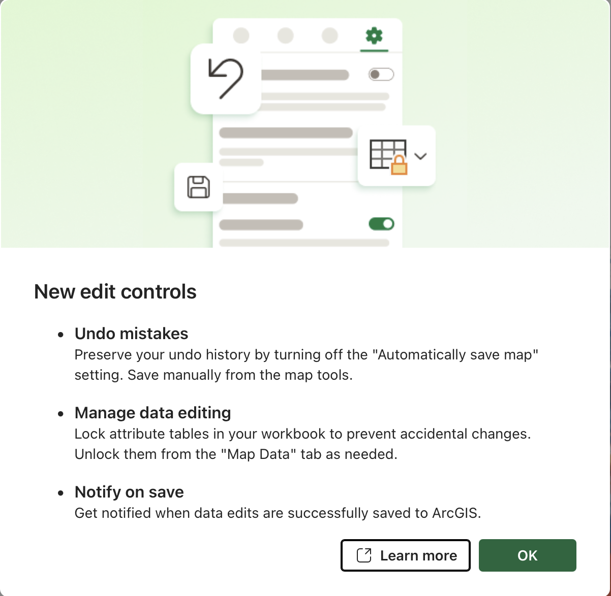
- Undo Support and Manual Save – Users can turn off automatic saving of edits to feature layers. This allows users to make multiple changes, undo previous edits as needed, and save all changes to ArcGIS only when they’re ready using the Save button.
- Feature Layer data Locking – Users can now lock feature layer data to prevent accidental edits when they only want to view or explore the data. Editing can be re‑enabled at any time by unlocking the layer from the Map Data tab.
- Edit Save Notifications – A new notification setting informs users when edits are successfully saved to ArcGIS, providing clearer feedback and confidence that changes were applied.
These enhancements reduce the risk of unintended changes, especially when working with authoritative or shared datasets. Users can confidently review data, correct mistakes using undo, and control exactly when changes are committed, making ArcGIS for Excel a safer and more reliable environment for spatial data editing. For example, a utilities analyst updating asset records, such as pipe diameter, material type, or installation year can turn off automatic save while making multiple edits across rows. If a value is entered incorrectly, the analyst can undo the change before saving. While reviewing data with stakeholders, the analyst can lock the feature layer to prevent accidental edits. Once review is complete, edits are saved deliberately, with a confirmation notification ensuring changes are recorded in ArcGIS.
Simplify coordinate and projection workflows with ArcGIS geometry functions
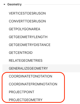
ArcGIS for Excel now includes new ArcGIS Geometry functions in the Function Builder, powered by ArcGIS Geometry Services. These functions allow users to convert, project, and translate coordinates and geometries directly within Excel-without external tools or scripting. The new functions include:
- ARCGIS.COORDINATETONOTATION – Converts X,Y coordinates into well-known coordinate notations (such as Degrees Minutes Seconds or UTM) based on the specified conversion type and spatial reference.
- ARCGIS.COORDINATEFROMNOTATION – Converts well known coordinate strings into numeric X,Y values based on the supplied notation and spatial reference.
- ARCGIS.PROJECTPOINT – Projects numeric X,Y coordinates from one spatial reference to another.
- ARCGIS.PROJECTGEOMETRY – Projects full geometries (Esri JSON) between spatial references.
These functions bring advanced spatial operations directly into Excel, enabling users to standardize coordinates, work across spatial references, and prepare data for mapping or sharing-without leaving their spreadsheet. This is especially valuable when working with data from multiple systems that use different coordinate formats or projections. For example, an emergency management analyst receives incident locations from field teams in Degrees Minutes Seconds (DMS) format, while internal systems require decimal degrees for mapping. Using ARCGIS.COORDINATEFROMNOTATION, the analyst converts the coordinate strings into numeric X,Y values. The points are then projected to a local spatial reference using ARCGIS.PROJECTPOINT, ensuring the data aligns correctly with authoritative layers in ArcGIS. All conversions happen directly in Excel, streamlining data preparation and reducing errors before analysis or sharing.
New mapping experience in ArcGIS for Excel and ArcGIS for SharePoint
Simplify time-based analysis with dynamic time animation
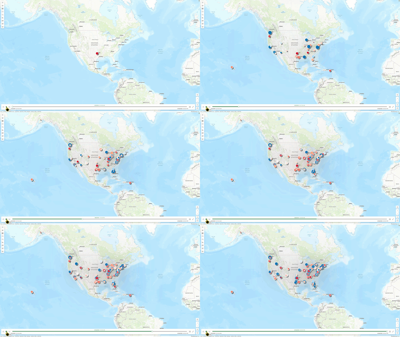
ArcGIS for Excel and ArcGIS for SharePoint now offer enhanced, more dynamic time animation controls for time‑enabled datasets. Users can select the time field to animate, choose how data appears over time, define the time interval, and control the animation speed to match their analysis needs. New animation options include:
-Animation modes:
- Show data in intervals
- Show data progressively
- Hide data progressively from end
-Configurable time intervals to control how much time advances per step
-Adjustable animation speed to slow down or accelerate playback
These enhancements give users finer control over how temporal patterns are explored and communicated. Whether users want to analyze trends as they evolve, compare changes across periods, or emphasize the most recent data, dynamic time animation makes it easier to uncover insights and tell a clearer story. For example, a transportation analyst reviewing traffic incident data with a numeric timestamp field can animate incidents over days or weeks using interval animation to observe daily spikes. Switching to progressive animation allows the analyst to see how incidents accumulate over time and identify high‑impact corridors. By adjusting the interval and speed, the analyst can quickly explore long‑term trends or slow the animation for presentations, turning static time‑based data into an intuitive, visual narrative.
Highlight the right information with flexible multiple layer labeling
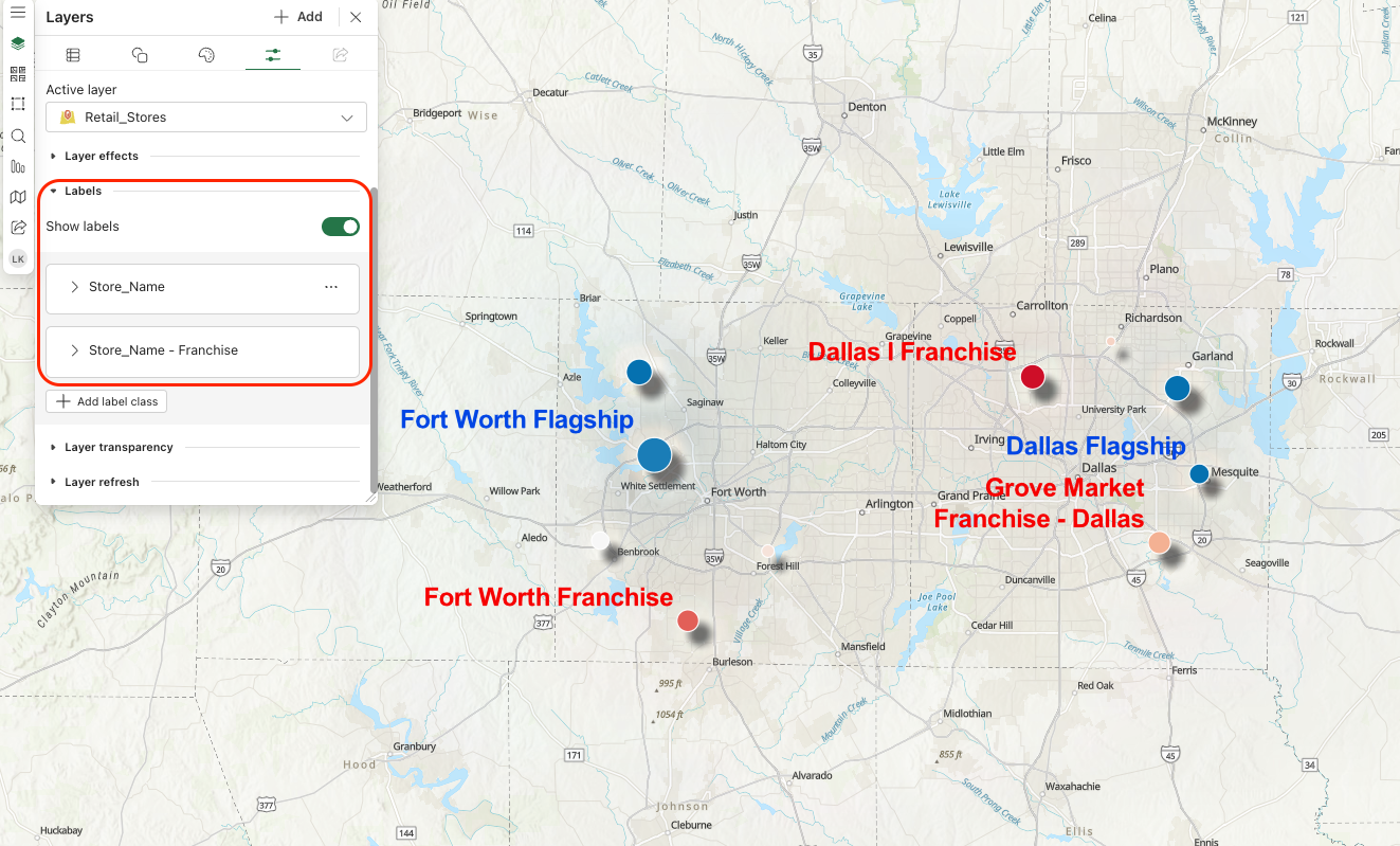
ArcGIS for Excel and SharePoint now allows users to configure multiple labels for a layer in Layer Properties. Users can create multiple label classes, apply label filters using queries built from their dataset attributes, customize label style, and define visible ranges so labels appear only at specific zoom levels. Not all features need to be labeled the same way at every scale. Multiple label classes give users more control over how information is displayed, helping users highlight the right attributes for specific conditions. With attribute‑based label filters, custom styling, and zoom‑dependent visibility, maps become easier to read, less cluttered, and more effective for communicating information in ArcGIS for Excel and SharePoint. For example, A facilities team manages a map of buildings, parking areas, and service locations in SharePoint. They configure one label class to show building names at smaller scales for a high‑level campus view, and another to show room counts or maintenance zones only when users zoom in. Using label filters and visible ranges, they make sure the map stays clean at a distance while revealing more detailed information when needed.
ArcGIS for PowerPoint (Beta) EAC
Join the ArcGIS for PowerPoint Early Adopter Community to bring the power of mapping directly into your presentations. As an early adopter, you’ll get access to beta features, product updates, and best practices for creating clear, location-driven stories in Microsoft PowerPoint. ArcGIS for PowerPoint (beta) makes it easy to add dynamic, presentation-ready maps without leaving your slide, helping you communicate trends, plans, and performance with greater clarity. Your feedback will play a key role in shaping the experience and ensuring it meets real-world needs.
Additional Resources
These updates across ArcGIS for Excel, Teams, and SharePoint focus on giving users clearer control, stronger data integrity, and smoother spatial workflows, so teams can analyze, manage, and share geographic data more confidently within Microsoft 365.
To get the most out of these capabilities and stay updated, explore our additional resources, including the Esri Community pages for ArcGIS for Excel, ArcGIS for SharePoint, and ArcGIS for Teams, as well as the ArcGIS for Microsoft product page.

Article Discussion: