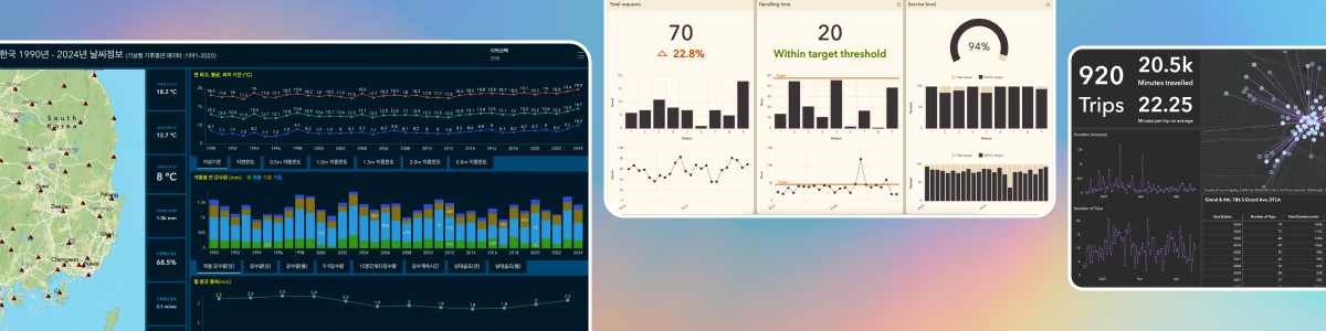
The magic of ArcGIS Dashboards has always been rooted in how it empowers users to present information with data in intuitive and versatile ways.
When it comes to temporal data, there’s never a shortage of insights to draw or stories to tell. At work, we map project milestones on a calendar and track progress with KPI metrics to help the team align goals and deliver on time. To navigate nature’s challenges, we closely monitor each storm’s evolution across time and space to assess impact and enhance preparedness. In urban environments, we measure and analyze traffic volume over time to gain a better understanding of travel patterns, peak hours, and more, allowing us to further optimize infrastructure planning and management.
Until recently, the traditional Date field was the only supported field type in ArcGIS Dashboards for storing temporal values, where each date value must have an associated time value, and vice versa. That meant even if your data only cared about the date (like a project milestone) or just the time of day (like a bus schedule), you had to work around a full date-and-time format. The Date field is not time zone aware, either, which made things even trickier if your data came from multiple time zones.
With our June 2025 update, ArcGIS Dashboards now respects the true intent of your temporal data—whether it’s a simple date, a recurring time, or a globally synchronized timestamp.
What’s new
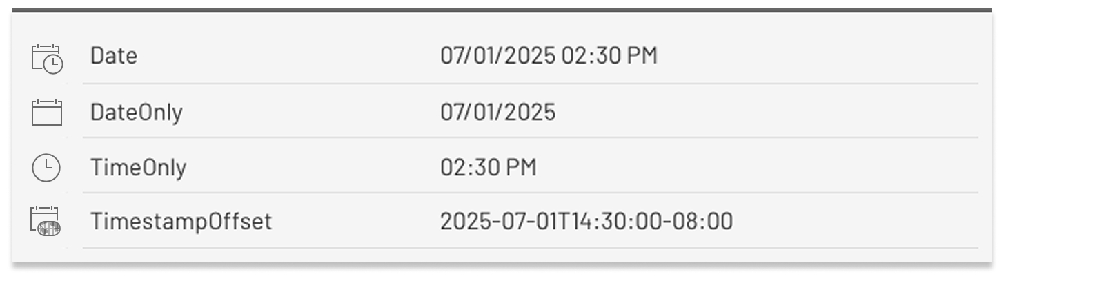
You can now work seamlessly with three new temporal field types in ArcGIS Dashboards:
- Date only – perfect for when the day matters, but not the time.
- Time only – ideal for identifying time-of-day patterns across multiple dates.
- Timestamp offset – essential for global operations and cross-time zone systems.
If your data sources have one or more of the new field types, then this recent addition, although seemingly subtle, could make a difference to your dashboarding experience by simplifying workflows and unlocking creative possibilities.
If your existing dataset does not come with any of the new field types, you can still be part of this elevated dashboarding experience—check out this blog post for a step-by-step guide on how to add and calculate fields in ArcGIS Online based on the new field types.
With this article, the goal is to give you an idea of what kind of things have been made easier, neater, or simply no longer impossible in ArcGIS Dashboards. Here are the links that you can use to jump right to any section of interest:
- Represent date or time information in optimal formats
- Aggregate by date to visualize daily variations and trends
- Filter data based on a specific time or time range
- Handle cross-time zone data with confidence
Represent date or time information in optimal formats
When tracking events that occur on specific dates without considering the exact time of day, representing your data in a DateOnly format makes it easier to read and understand.
In the example below, a hospital uses a table to show patient admission and discharge records in their dashboard. Previously when the date values had to be stored in the traditional date-and-time format, the table would appear cluttered and misleading. Or to avoid confusion, workarounds such as storing the date values as strings or enabling advanced formatting would be required, which takes additional effort only to introduce risks to data quality and usability. Now the hospital can simply capture the event dates using DateOnly fields and directly use those fields for display.

In addition to the DateOnly field, the TimeOnly field also works well in a table element. You can easily display uncluttered, precise time-of-day values in a tabular view as needed in your dashboards.
Aggregate by date to visualize daily variations and trends
When dealing with time-series data, grouping values by date, month, or year can help make it easier to identify patterns, anomalies, and correlations. Below is a snapshot of a dataset containing fine particulate matter readings. Particles less than 2.5 micrometers (PM2.5) in diameter can penetrate deeply into the lungs and body, posing health risks like respiratory and heart issues, especially for children, the elderly, and other sensitive individuals.

Have there been any significant differences between the two sites? Were there any specific days in the past month when a mitigation plan would’ve been advised? Answers to questions like these can be made easier using a serial chart that summarizes the measurement results daily for each site. The Grouped values option is used to generate the chart. With the June update, the DateOnly field is available to select as the category field. The average PM2.5 reading per day is calculated, and the data points are split into two series: one per site.

By aggregating the data by date, we can easily identify a spike in PM2.5 level on July 5th, which can be attributed to the fireworks during the July 4th holiday celebrations. By comparing the daily average of the two sites within the same chart, the difference between the two on July 5th becomes evident. This may prompt us to investigate the reasons behind it, which could provide valuable insights for future air pollution mitigation efforts in certain areas.
Please note that with the June 2025 update, Date, DateOnly and TimestampOffset fields can be used as the category field on a serial chart. TimeOnly fields are not yet supported.
Filter data based on a specific time or time range
Air quality monitoring can help call attention to existing air pollution and provide actionable insights for mitigating associated health risks. Using the same dataset from the previous section, we can filter by time-of-day to get more insightful statistics.
Children are more vulnerable to poor air quality than adults. Should schools in this region be more mindful of air quality and plan outdoor activities more judiciously? Displaying statistical summaries in a group of indicators may help answer this question.

The recently-added support for TimeOnly field type in ArcGIS Dashboards allows us to seamlessly configure a filter condition based on a specific time or time range — given that most schools hold outdoor recess in the morning and during lunchtime, let’s filter by the period of 9:30 AM – 1:00 PM to extract a more focused and representative data sample.

Now let’s take a step further and regenerate a serial chart based on the filtered dataset. Surprisingly, this chart looks a lot different from the previous one — the average PM2.5 level during the school outdoor time appears to be more volatile over time compared to the whole-day average, with a potential weekly cyclical pattern. Despite the peak on July 5th in one of the sites, the average PM2.5 level during our defined period on that day was actually not that concerning.

We won’t dive deeper in this example, but with your real-world dashboards, you are always encouraged to stay creative and push the limits to uncover more interesting and meaningful insights with your data. A static snapshot of the air quality monitoring data was used in this example for demonstration purposes. If you have real–time data streaming that feeds your dashboard, then visualization showing time-specific summary statistics or variations over time may feel even more powerful—and so will the new capability to filter data based on a TimeOnly field.
Handle cross-time zone data with confidence
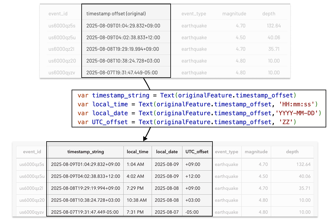
With the traditional Date field, you may have found it challenging if you are collecting or processing time-based data from locations that span multiple time zones. The Timestamp offset field offers a straightforward solution to this challenge by storing information about the time offset from UTC (coordinated universal time) alongside local date and time values in the format: YYYY-MM-DDThh:mm:ss±OffsetFromUTC. It unambiguously represents an exact point in time, reflects the correct UTC difference at the time of the event without any daylight-saving related confusion, and allows for cross-time zone datapoints to be combined for further analysis.
With the recent update, ArcGIS Dashboards now supports timestamp offset fields. Note that ArcGIS Dashboards currently offers two options for displaying time:
- Device time zone: Converts all datetime values to the browser’s time zone.
- Specific time zone: Allows the dashboard author to set a fixed time zone for all time-based dashboard elements.
This means that when your data includes a timestamp offset field, the dashboard will display the time values using the configured time zone, not the original offset. If visually preserving the original offset is important to you, here are a few workarounds to consider:
(1) In your data source, include the raw timestamp offset values as an additional string field for displaying in tables, lists, and map pop-ups. If your data source is a hosted feature layer, you can accomplish this by calculating values for a field from the item page.

(2) Leverage arcade data expressions to transform your data and extract further information about local time and UTC offset from the timestamp offset field. For example, with the global earthquake data, you can:
- Use Text() function to convert the Timestamp offset values to a string field so its display format won’t be affected by the dashboard time zone settings.
- Leverage the format parameter in Text functions to return from the original timestamp specific parts that represent the local time, the date of the local time, the local time zone offset from UTC, etc.
Summary
With the support of DateOnly, TimeOnly, and TimestampOffset field types in ArcGIS Dashboards, we aim to provide you with greater control over your temporal data. This update can be leveraged for cleaner data display, simplified data aggregation, easier filtering and conversion, and more. It’s not just about integrating new field types—it’s about enhancing data modeling efficiency and improving user experiences. By aligning your dashboards with the structure of your data, you can minimize clutter, enhance clarity, and make your data insights more actionable.
We are excited to keep working on new enhancements that can help level up your dashboarding journey. We look forward to seeing how you bring your time-aware data to life in an innovative way.


Article Discussion: