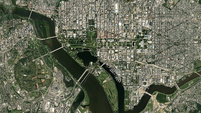
It started with a question: Where are the inequities in transportation? We immediately realized that GIS could help identify, map, and analyze communities experiencing transportation disadvantage.
The United States is a big country, and home to more than 330 million people (plus millions of visitors) who need to get around it. Facilitating that mobility is no mean feat, and it’s Amy Nelson’s job as the Geospatial Information Officer (GIO) at the U.S. Department of Transportation to leverage GIS and other geospatial technology to help the agency successfully keep America moving.
A major component of USDOT’s mission is transportation equity — the idea that all communities and members of those communities must have their transportation needs met by the systems that are available to them. Currently, the agency is working to achieve that goal on multiple fronts; for instance, through its participation in the federal government-wide Justice40 initiative, a directive that 40 percent of federal investment in climate, clean energy, and sustainability should flow to communities that have been underserved and underinvested in. The Reconnecting Communities and Neighborhoods program, which allocates funding to projects across the nation that seek to remediate the damage caused by 20th-century development projects like highway construction, is another example of USDOT’s commitment to transportation equity.
Recently, Amy sat down with Esri’s StoryMaps team to talk about these programs and why GIS is crucial to their implementation. The following conversation has been edited for brevity and clarity.
Note: The interviewee’s participation in this interview is for informational purposes only and is not intended to create the appearance of an endorsement of Esri, Storymaps, or other products or services by the U.S. Department of Transportation.

Q. Can you please tell us a little bit about your background?
A. I earned a Master’s degree in GIS in 2001, and came to USDOT as the GIS Manager for the Pipeline and Hazardous Materials Safety Administration in 2006. I got to know the GIO, who was looking to write DOT’s first GIS Strategic Plan in 2016. I was asked to detail to his office due to my experience as a technical writer. I co-authored that plan and became the Deputy GIO in 2019, and was promoted to the GIO last year.

Q. What does your work at USDOT entail? What does it mean to be a GIO?
A. Being an effective GIO starts with a vision. GIOs aren’t necessarily the best GIS analysts, developers, or data scientists in an organization. Hopefully, they can see the organization at a higher level and use subject matter expertise as well as relationships and good management practices to develop a vision, strategic goals, and an implementation plan to achieve them.
The first few years of my work as the Deputy GIO were focused on implementation of the Geospatial Data Act. Towards that end, I worked my existing relationships with GIS managers in our divisions to understand their current practices, develop and implement standards and workflows that made sense, and identify “component GIOs” who were my first contacts for requirements implementation and data calls.
I also formalized a GIS Task Force, which responds to incidents. Prior to this task force, we had a loose coalition. For about five years, we relied on the goodwill of long-serving GIS subject matter experts to help with incident response, but because of the importance of these products, we now have a team roster, work plan, standardized products, and designated leaders. This is a good example of relationships at work.

Q. Can you talk a bit about the concept of transportation equity, why it’s important, and what the DOT is doing to achieve it?
A. DOT is committed to reducing inequities across our transportation systems to ensure that communities benefit from the safe, efficient, and sustainable movement of people and goods. DOT believes that transportation policy can transform economies, connect people to opportunities, and empower underserved communities to build generational wealth for the future.
The Geospatial Management Office’s support of this initiative started with a question: where are the inequities in transportation? We immediately realized that GIS could help identify, map, and analyze communities experiencing transportation disadvantage. In addition to a Justice40 story, DOT created the Equitable Transportation Community Explorer. The ETC Explorer is an interactive geospatial application that uses 2020 Census Tracts and data to explore the cumulative burden communities experience, as a result of underinvestment in transportation, in the following five components: Transportation Insecurity, Climate and Disaster Risk Burden, Environmental Burden, Health Vulnerability, and Social Vulnerability.


Q. How does the DOT use GIS and geospatial information to support its mission, including transportation equity goals?
A. Transportation data is a natural fit for geospatial analysis and visualization. Some examples include:
- The FAA uses GIS as the backbone of emergency operations. Analysts incorporate spatial analysis and custom modeling to identify gaps in mission service areas and to optimize resource allocation.
- The Federal Railroad Administration (FRA) modernized its rail freight monitoring and analysis tools with geospatial network analysis.
- The National Highway Traffic Safety Administration (NHTSA) maps fatal crashes and performs spatial analysis to identify zones of concern on interstate highways.
Our transportation equity goals are tied to the Biden-Harris Administration Justice40 Initiative to confront and address decades of underinvestment in disadvantaged communities. At DOT, Justice40 is an opportunity to address gaps in transportation infrastructure and public services by working toward the goal that at least 40% of the benefits from many of our grants, programs, and initiatives flow to disadvantaged communities. The ETC Explorer is our geospatial tool which allows those interested in funding opportunities to map their proposed project area and see what percentage of affected communities are disadvantaged, and, we hope, maximize the benefits of their proposed project to disadvantaged communities.


Q. You’ve created stories with ArcGIS StoryMaps around both the Justice40 initiative and the Reconnecting Communities program. Can you tell us about the process and technique of using place-based storytelling to communicate these initiatives to a larger audience?
A. We try to reach a large variety of people with our products, which is one reason that I wanted to speak to this [ArcGIS blog] audience!
We felt the material was relatable for a large portion of the population. An example is the Reconnecting Communities story. Many people remember when transportation infrastructure [divided] their community or that of a friend or relative, with lasting impacts. We told these stories from the point of view of our spotlight community projects, anticipating that people would be engaged by stories that reminded them of these experiences.
We also engaged the audience by reminding them of the role of transportation in daily life, saying “Without our impressive network of roads, we would struggle to get to work, visit friends and family, or receive the goods we need. But, as we go from point A to point B, we don’t often think about what these roads replaced, where they were located, or the economic, environmental, or public health disparities our roads have created.”
[In terms of the stories themselves], we ensure that the vocabulary level is appropriate for a wide audience and shy away from technical terms that aren’t suitable for laypeople. We strive for a snappy tempo in our products, where a text block is followed by an interactive map, compelling photo, or 3-D visualization of a proposed project. We incorporate historic photos and drawings to encourage the audience to think about the timespan of the projects and how a community’s history affects its transportation opportunities today.

Q. What challenges did you face when putting these stories together?
A. One of the challenges we faced was the quick turnaround time between when the spotlight communities were selected and when the story launched. Another was a learning curve in creating 3D scenes of these communities showing the proposed projects. But now, we’re on a roll with the 3D scenes and are finding other projects at DOT that would benefit from this type of visualization.


Q. Do you have any additional advice or thoughts for other agencies or organizations?
A. I found that writing a GIS Strategic Plan has benefited DOT in multiple ways. The GIS Strategic Plan provides a comprehensive overview of GIS at DOT, and the accompanying implementation plan gave us the basis to ask for the staff and budget we needed to accomplish our strategic goals.
First, while I was the Deputy GIO, I partnered with FAA geospatial subject matter experts to interview people in our components who use geospatial technology or who are leaders driving the direction of the organization. We had a policy that individuals would not be quoted and that helped create an atmosphere where people could be honest about what was working and what wasn’t.
Most importantly, we didn’t let the plan gather dust on a shelf. We review our strategic goals and objectives every three months and update what we’ve accomplished, so we don’t forget about the goals we set.

This featured storyteller interview was prepared as a part of the May 2024 Issue of StoryScape℠ | Revealing a better path.
For more interviews and articles like this one, be sure to check out StoryScape℠, a monthly digital magazine for ArcGIS StoryMaps that explores the world of place-based storytelling — with a new theme every issue.
_______________________________
The cover image is from a 3d web scene in the 2023 reconnecting communities story.


Article Discussion: