ArcUser
Winter 2012 Edition
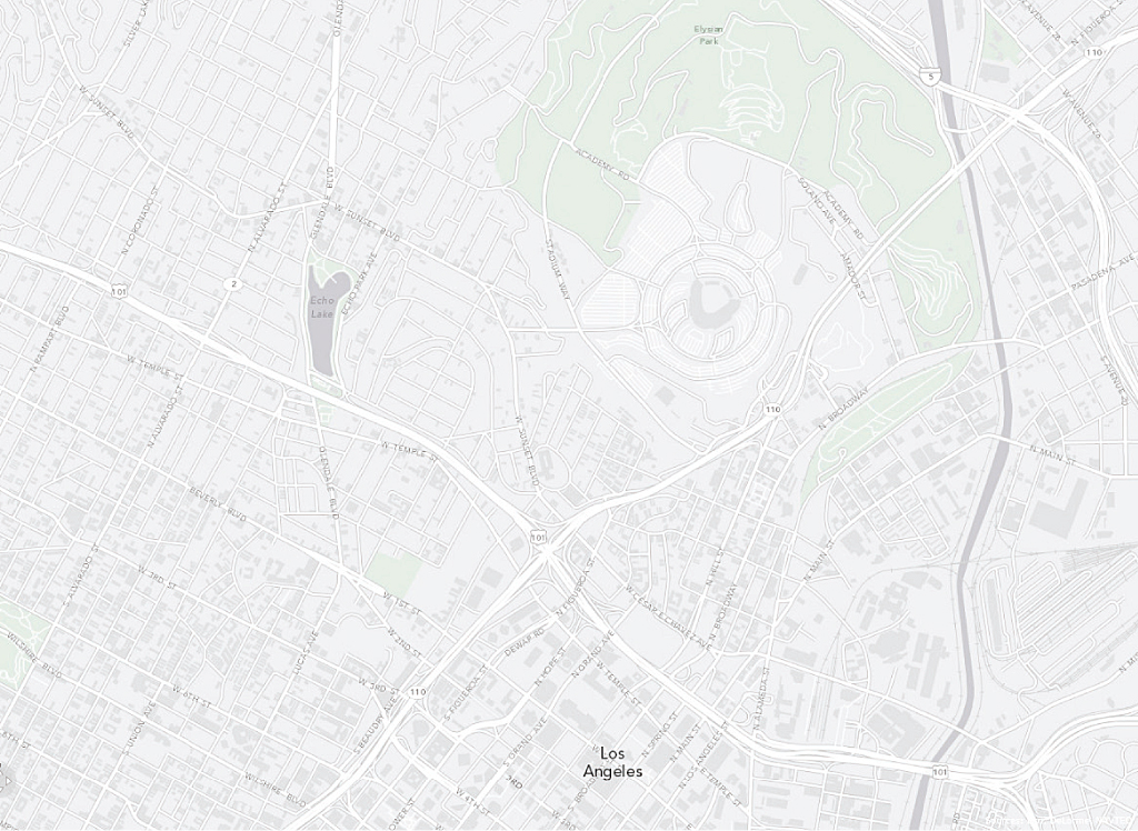
At larger scales, the Light Gray Canvas map reveals more features, including roads, parks, and labels on water bodies, and feature labels appear along with building footprints (in some cities).
Less Is More
With the new Light Gray Canvas map
This article as a PDF.
The new Light Gray Canvas map, available in ArcGIS Online in the basemap gallery or in ArcGIS Explorer Online, provides a neutral, uncluttered background that is extremely useful for displaying economic, demographic, behavioral, health, and other data. Limiting the amount of information displayed by the basemap ensures it is not competing with the map's operational layers for visual attention.
"People process visual imagery so efficiently, and this basemap helps ensure your map's story is in plain view," said Jim Herries, a cartographic product engineer at the Esri Mapping Center. "Your map's theme becomes something that resonates with people who know the area but also will be informative to people who don't know the area."
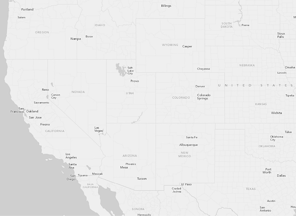
At smaller scales, the basemap provides a contextual backdrop but limits features that compete for readers' attention.
Basemaps are moving toward the minimalist style of information graphics popularized in magazines, newspapers, and other media. Online mapping demands that basemaps provide a backdrop for user data. These operational layers deliver the map's message. Basemaps should support that communication by not distracting the map reader. This basemap, which uses a soft, light gray color for land and darker gray for water, was specifically designed to emphasize thematic data, symbolized using bright colors, so the map's story is easily discerned.
At small scales, the Light Gray Canvas basemap contains the bare minimum needed to provide a contextual backdrop. Streets, buildings, labels, topographic features, and imagery that can vie for readers' attention are limited or omitted. At larger scales, it reveals major roads and big parks and then labels on the roads and parks. At 1:9,000, the largest scale, additional roads, water bodies, parks, and feature labels appear along with building footprints (in some cities).
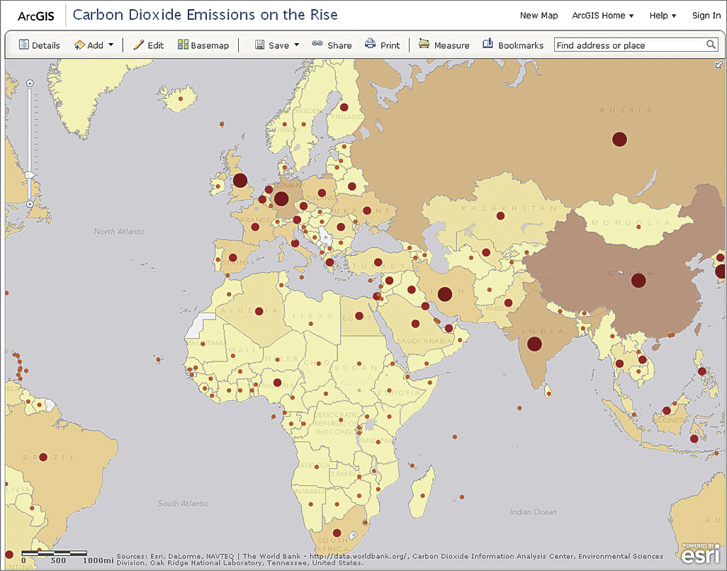
This map, created by Allen Carroll of Esri, displays the dramatic rise of CO2 emissions around the world between 1960 and 2007. The World Bank data used stands out dramatically on the Light Gray Canvas map.
The Light Gray Canvas map supports the basic design principles of figure-ground organization and visual contrast. Its monochromatic color palette promotes visual contrast, and the map creator has more color options without fear of clashing with colors in the basemap.
"The basic idea behind canvas maps is that less is more. You have something clean to work from," said Mamata Akella, cartographic product engineer at the Esri Mapping Center and design lead on the Light Gray Canvas map project.
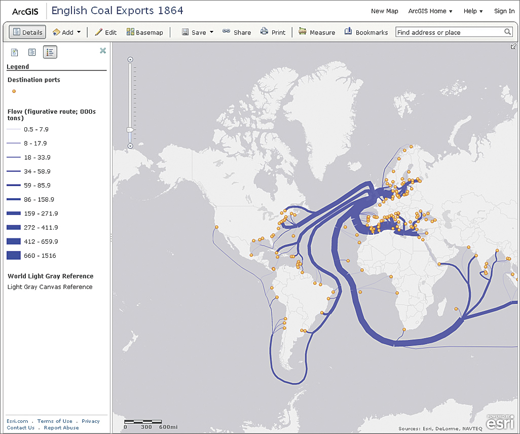
This web map, English Coal Exports 1864, traces coal exports from England to ports around the world. Esri cartographer Ken Fields used route widths to represent approximate coal tonnages, which stand out against the subtle gray of the basemap.
For more information on cartographic design principles, see "Make Maps People Want to Look At: Five primary design principles for cartography" in this issue. Also read the blog posts "Esri Canvas Maps Part I" and "Part II" on the Esri Mapping Center website.