July - September 2007
July - September 2007 |
||||||||
|
|
||||||||
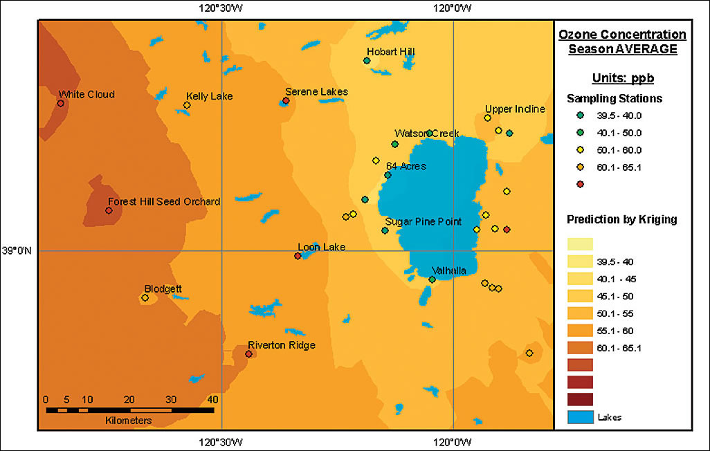
The transparency and purity of Lake Tahoe's water has been deteriorating since the 1950s, partially due to increased deposition of nitrogenous air pollutants. Forests in the Lake Tahoe watershed have also suffered from stresses such as drought, overstocking, and elevated concentrations of phytotoxic air pollutants, mainly ozone. Ozone, one of the most damaging air pollutants, has strong toxic effects on human health and vegetation and is most indicative of photochemical smog. One of the main questions for scientists and forest managers in this area is whether air pollution (specifically ozone) is generated locally or is migrating with the prevailing westerly winds from California's Central Valley, an area known for high levels of air pollution. A study to determine the origin of ozone found in the vicinity of Lake Tahoe was undertaken by the Forest Service and Esri. Initially, ambient ozone concentrations were measured using a network of 31 sampling stations established by the United States Department of Agriculture (USDA) Forest Service Pacific Southwest Research Station scientists from the Riverside Fire Laboratory in Riverside, California. Looking at the Original NetworkKnowledge of the central Sierra Nevada Mountains, both the general patterns of ozone distribution and the westerly wind pattern in this area, led to the positioning of several monitoring points on the western slopes of these mountains. Most monitoring stations were located inside the Lake Tahoe Basin. Three elevation transects were set to measure ozone concentration at different altitudes to learn if these concentrations could be correlated with elevation.
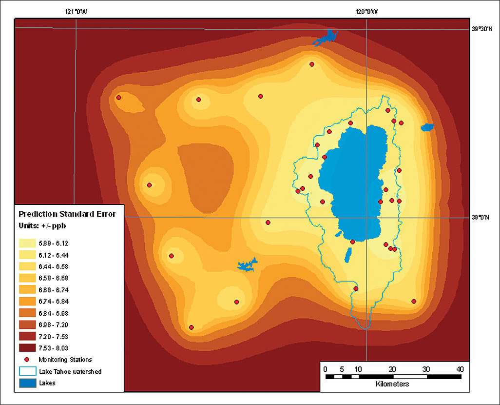
Prediction maps of ozone concentration were generated using Geostatistical Analyst. Because no strong correlation was detected between ozone and elevation, cokriging could not be applied. Most maps of ozone concentration showed a noticeable trend. The main range of the Sierra Nevada Mountains apparently blocks the transport of ozone from the Central Valley, located to the west of the study area. This helps explain why no correlation between ozone concentration and elevation was detected. Monitoring stations located at similar elevations but on opposite sides of the main range reported significantly different ozone values. Looking at ErrorA map of prediction standard error was created using the same kriging method and parameters that were used to generate ozone prediction maps. The bright yellow colors indicated areas where the prediction standard error for the existing network of 31 monitoring stations was low or, to state it another way, the level of confidence in the results was high. Dark brown was used to symbolize areas of low confidence. No prediction is certain and every measurement is subject to error. It is necessary to analyze the prediction standard error surface to understand the reliability of the results. Estimating the critical value of the standard error is beyond the scope of this article. It is sufficient to say that, since geostatistical surfaces are continuous, setting a precise value for a threshold for the certainty/uncertainty of a prediction, though highly desirable, was not feasible, as it depended on many potential contributing factors. Typically, a transitional zone of disputed/conditional reliability is determined. To exam the reliability of the established monitoring network's results, a threshold value was carefully estimated and it was determined that only 63 percent of the study area was estimated with reliable accuracy.
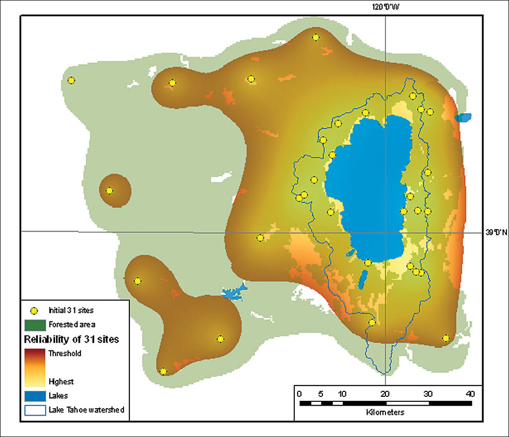
Making the Network More ReliableBecause the reliability of geostatistical analysis depends on having a sufficient number of appropriately distributed sampling stations, monitoring activities commonly encounter problems caused by networks of sampling points that are not sufficiently dense. GIS can be applied to optimize a monitoring network. In this case, it was used to improve the reliability of the ozone concentration predictions. Models of ozone concentration and models of prediction standard error of ozone concentration were generated to determine locations where new sampling stations were most needed. These stations could be added until the surface of prediction standard error for the entire study area was below a given threshold or until the project budget was exhausted—whichever came first. This article provides an overview of how Geostatistical Analyst was applied to that end rather than a detailed description of each step taken. The initial network of 31 points were improved using a model that was created in ModelBuilder. This Automated Network Densifier model incorporated new options in Geostatistical Analyst that were introduced with ArcGIS Desktop 9.2. Two ozone prediction maps were generated and compared. The methods and parameters used to generate the one with higher accuracy were applied to create maps of prediction standard error. Several supplemental points were sequentially added to the network at the locations showing the lowest reliability. To graphically demonstrate the increasing trustworthiness of the predictions, based on the growing number of monitoring sites, maps of the variability of the prediction standard error used the same color symbology.
Using the Default ParametersThe study used ozone concentrations obtained for the month of July because during that month ozone concentrations are usually highly elevated and have greater potential for both harmful health effects and damage to forest vegetation. Using the Geostatistical Wizard, a tool in Geostatistical Analyst that leads users through the process of creating a statistically valid surface, a prediction map was created for the ozone concentration. It was generated by applying the default options for ordinary kriging. The resulting map indicated that the spatial distribution of ozone in July over the study area had a west-east trend (i.e., a high concentration in the west, a low concentration in the east, and continuously changing intermediate concentrations in between). While the map generated using default values was acceptable, it is always more desirable to produce distribution maps of a given phenomenon as accurately as possible. Geostatistical Analyst has many methods and options. Expertise and experience are required for optimally generating a more reliable geostatistical surface. It is necessary to customize methods and parameters for each dataset to create a surface more reliable than the one generated by default values. Modifying Default ParametersFor the ozone dataset, the following kriging parameters were applied.
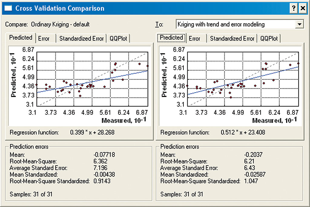
The new layer generated from these parameters was named Kriging with trend and error modeling. The resulting surface was smoother, yet more detailed. It showed more features of ozone distribution in addition to those generated using only the default parameters. Despite noticeable differences, the Kriging with trend and error modeling surface visually resembled the previous one. Which surface was more reliable? Geostatistical Analyst has special tools that help the user select the best surface. These tools are accessed by right-clicking the newly generated geostatistical surface in the table of contents and selecting Compare from the context menu. Performing DiagnosticsThe Cross Validation Comparison dialog box compares five prediction error parameters. All error parameters, with the exception of the Root-Mean-Square Standardized, should be as close to 0 as possible for the most accurate output. For the Root-Mean-Square Standardized parameter, the result should be close to 1. In this example, four out of five of the error parameters indicated that the surface created by applying both trend and error modeling was more accurate. The most critical indicator of prediction accuracy, Root-Mean-Square Standardized, also indicated that the surface created using trend and error modeling was the winner. Obviously, additional prediction standard error surfaces could be generated using different sets of parameters. After selecting the most accurate surface, the spatial distribution of the reliability of that layer (or in other words, the levels of uncertainty in the generated surface of ozone concentration) can be determined by creating a prediction standard error map. This map was generated using exactly the same parameters that were used for the latest prediction map. From the Method Summary interface, the methods and parameters that were used to generate the most accurate geostatistical surface were saved to an XML file for use later in the process. The same symbology was used—bright yellow color for the areas of highest reliability and dark brown for areas of lowest reliability. This prediction map showed that areas at the map edges and in the central part of the study area had low prediction reliability. To improve the reliability of the ozone distribution surface and determine whether there was a significant ozone-generating source in the vicinity of Lake Tahoe, more sampling points were needed. The project's budget allowed for six additional measurement stations for the next season. Locations of new monitoring points were chosen to improve the overall reliability of the geostatistical interpolation by sampling at the locations within the study area where reliability was the lowest. In addition, all supplemental points had to be located within the forested portion of the study area. Locations for the new points could be selected manually in ArcMap based on the criteria previously stipulated. Alternatively, locations could be selected using an automated method—a model. Part of the ArcGIS geoprocessing framework, ModelBuilder provides a graphic environment for creating, running, and saving models. Introducing a model would reduce subjectivity, make the selection of the prospective locations reproducible, and make the rules transparent. The Automated Network Densifier model created for this project generated an enhanced monitoring network by adding supplemental points at the locations where they were most needed to reduce the overall prediction uncertainty. The prediction standard error geostatistical surface, the input data for the model, was updated at each iteration as the model appended one additional sampling point to the current monitoring network. The model could be run once to indicate where the most crucial missing point was located. It could also be run for a specified number of iterations to generate as many additional points as the project's budget allowed or until a variable was no longer equal to a predetermined condition. For example, it could be run until the maximum standard error of prediction for the study area was less than the largest acceptable potential error of prediction. The new points were sequentially placed at the location of the largest current potential standard error of prediction. The Automated Network Densifier model takes five input data layers:
This model does not account for proximity to roads or access restrictions because adequate data for these factors was not available. Assuming the project budget allows for several monitoring stations to supplement the initial network, six iterations of the model were run and the locations for six new sampling stations were determined. The geostatistical surface of the standard error of prediction resulting from the sixth iteration was displayed together with the relevant vector version of the isolines of prediction standard error.
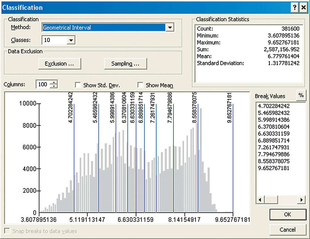
The points added to the network can be more easily seen by turning off the newly created layers in the table of contents and looking for the discrepancies between the geostatistical layer and the isolines of prediction trust. Because the supplemental points had to be located within the forested area, displaying the forested area grid as a semitransparent green polyon made it easier to understand why these locations were chosen. As expected, increasing the density of the monitoring network decreased the standard error of prediction for the entire study area. To better measure the increase in reliability caused by adding supplemental stations, the output geostatistical surfaces of prediction standard error generated by the model were converted into rasters with the same color schema. In ArcGIS 9.2, users can now apply the Geometrical Interval classification to both rasters and geostatistical surfaces simply by right-clicking on the layer, choosing Properties > Symbology, and using the Classification option to change the classification to Geometric Interval. This method was applied to the output grid from the final iteration of the Automated Network Densifier model with the number of classes set to 10 and a yellow to dark red color ramp. Comparing the prediction standard error surface generated based on the initial 31 stations with the surface that used all 37 stations illustrated how the level of certainty of the prediction improved when the final grid was rendered using the same color symbology. The prediction standard error based on the original number of stations was displayed with the additional stations. The surface of prediction standard error based on 37 sampling points was considerably brighter, signifying that the prediction of ozone concentration based on the enhanced network would be more reliable. Without going into numerical details, the network of 37 stations can provide enough sampling data to significantly improve the trustworthiness of prediction over the entire study area. Whether the six additional stations for this network were sufficient to meet a minimum acceptable threshold of reliability is beyond the scope of this article. The final result seems to confirm that the Automated Network Densifier model can improve the network design process during the second stage of sequential sampling. (See the series of maps produced for this project.) The proposed method appends the supplemental sites in a reasonable manner. It adds new points where they are most effective in enhancing reliability. With the model, as each new point is added, the improvement in the network can be observed. About the AuthorsWitold Fraczek is a longtime employee of Esri who currently works in the Application Prototype Lab. He received master's degrees in hydrology from the University of Warsaw, Poland, and remote sensing from the University of Wisconsin, Madison. Andrzej Bytnerowicz is a senior scientist with the USDA Forest Service Pacific Southwest Research Station in Riverside, California. His research focuses on various aspects of air pollution effects on forest and other ecosystems. He received his master's degree in food chemistry from the Warsaw Agricultural University, Warsaw, Poland, and doctorate in natural sciences from the Silesian University in Katowice, Poland. ReferencesArbaugh, M. J., P. R. Miller, J. J. Carroll, B. Takemoto, and T. Procter. 1998. "Relationship of Ambient Ozone with Injury to Pines in the Sierra Nevada and San Bernardino Mountains in California, USA." Environmental Pollution, 101, 291–301. Fraczek, W., A. Bytnerowicz, and M. Arbaugh. 2003. "Use of Geostatistics to Estimate Surface Ozone Patterns." Ozone Air Pollution in the Sierra Nevada: Distribution and Effects on Forests. Elsevier, 215–247. Gertler, A. W., A. Bytnerowicz, T. A. Cahill, M. Arbaugh, S. Cliff, J. Kahyaoglu-Koracin, L. Tarnay, R. Alonso, and W. Fraczek. 2006. "Local Air Pollutants Threaten Lake Tahoe's Clarity." California Agriculture, 60, No. 2, 53–58. Goldman, C. R. 2006. "Science: a Decisive Factor in Restoring Tahoe Clarity." California Agriculture, 60, No. 2, 45–46. Krupa, S. V., A. E. G. Tonneijck, and W. J. Manning. 1998. "Ozone." In Recognition of Air Pollution Injury to Vegetation: A Pictorial Atlas, R. B. Flagler, ed. Air and Waste Management Association, Pittsburgh, Pennsylvania. 2-1 through 2-28. Esri. 2001. ArcGIS Geostatistical Analyst: Statistical Tools for Data Exploration, Modeling, and Advanced Surface Generation, an Esri white paper. |