
More Best Practices
In the Fall 2014 issue of ArcUser magazine, I presented best practices for data acquisition and management and project setup. In this issue, I present tips and tricks related to creating a more useful table of contents (TOC). These practices were developed through many years of production mapping in earth sciences, public safety, and other disciplines.
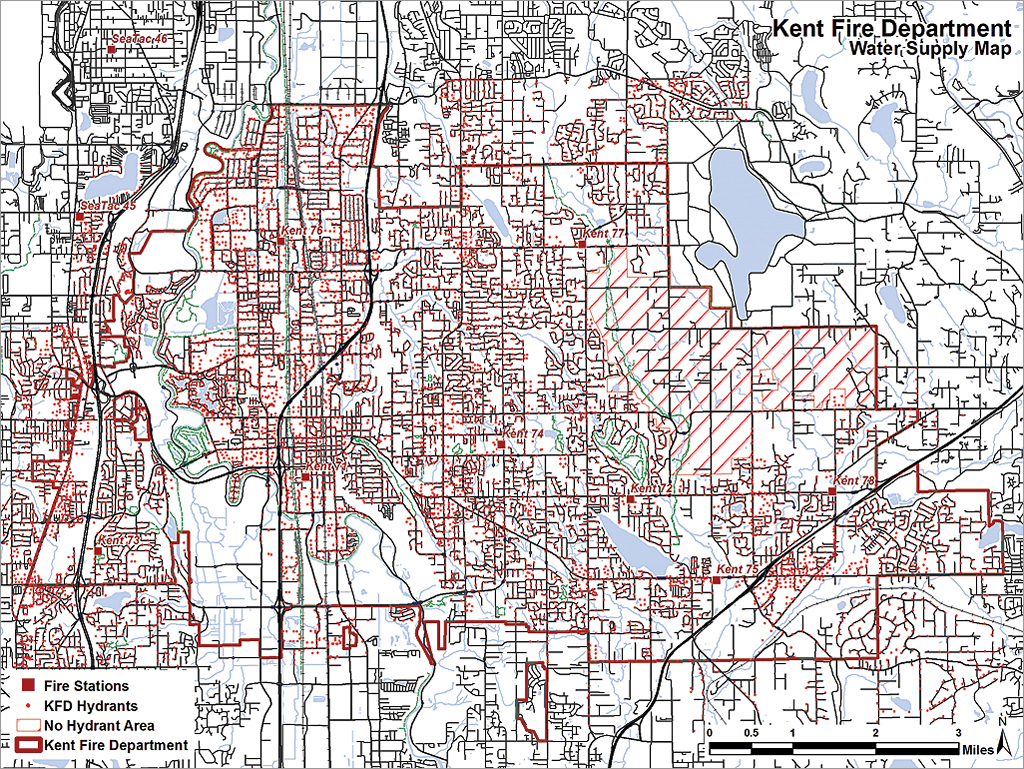
Rather than a tutorial, this article shares shortcuts and insights and does not require a training dataset. Illustrations were made using examples from a wall map developed for the Kent Regional Fire Authority (KRFA), Kent, Washington. The data has been simplified and standardized for public display and future training purposes. Much of this data will be used in the Esri Fire GIS University program, which will be rolled out in Redlands, California, in late January 2015.
This article focuses on better ways for organizing the TOC in ArcMap. The tips range from ones for starting new projects to ones for improving map output. I hope these tips provide valuable suggestions and insights that will help you standardize workflows, incorporate best practices, and promote the creativity that leads to the making of meaningful maps.
Data Frame Fundamentals
When you open a new ArcMap document, by default the program creates an empty dataframe named Layers.
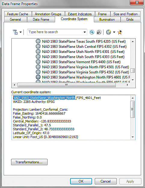
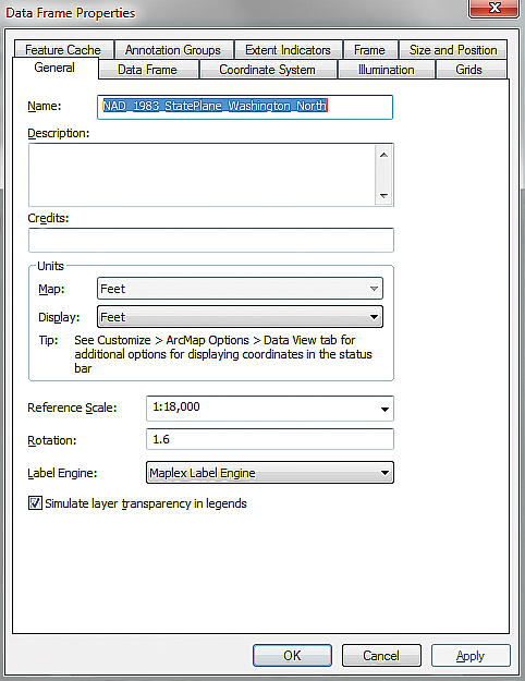
Immediately rename the data frame to something more meaningful. If you are in production mode, consider renaming the data frame to specify the coordinate system. It will serve as an excellent reminder while you build your map.
The first data loaded in the data frame that has projection information will define the coordinate system for the data frame. When adding the first data layer, verify that it is projected and correctly defined in the coordinate system that you want to use.
Open data frame properties and confirm the coordinate system is correct before continuing.
Data Layers: What’s in a Name?
ArcMap uses the actual name of the source data unless an alias has been defined. It will use that name in the map legend, in the Layer file, and in an exported PDF file that has been created with layers.
Immediately provide a layer name that uses descriptive, friendly terms. You may have noticed that I typically don’t recommend using spaces and other nonalphanumeric characters in file names. However, customized data names in the TOC is an instance in which I bend this rule (even for Layer files).
However, avoid unusual ASCII punctuation characters. Forward and backward slashes, algebraic operators, the “at” (@) symbol, the ampersand (&), and many other characters do not behave well in legend fonts, Layer file names, and other uses. Even though space and character string length is often important, don’t hesitate to spell out or use standard alphanumeric abbreviations. Following proper TOC naming protocols gives users a head start understanding the information the map is conveying.
Layouts, Bookmarks, and Scale
Once you’ve added data to the TOC and defined the primary areas of interest in the map, consider creating scaled bookmarks to allow quick and consistent access to important map locations.
When I start a new map, I work primarily in Data View, but before long, I start imagining how the map might look as a printed or graphic export or in a layout. Since ArcMap allows only one layout per ArcMap document, I choose the preferred output media and size for each map, and I create an appropriate layout. When I need to create output in multiple formats, I clone a finished map and create new layouts by naming each copy of the map document so I can quickly identify its content and format.
Once I have established a specific layout, I define scale-dependent bookmarks that quickly return to important areas. These bookmarks are in Layout View and include the proportional scale in the bookmark’s name. Bookmarks are another area where I bend the naming rules by using spaces, upper- and lowercase text, and even a few odd characters such as colons (e.g., Station 74 Detail 1:10,000).
Points, Lines, Polygons, and Rasters Too
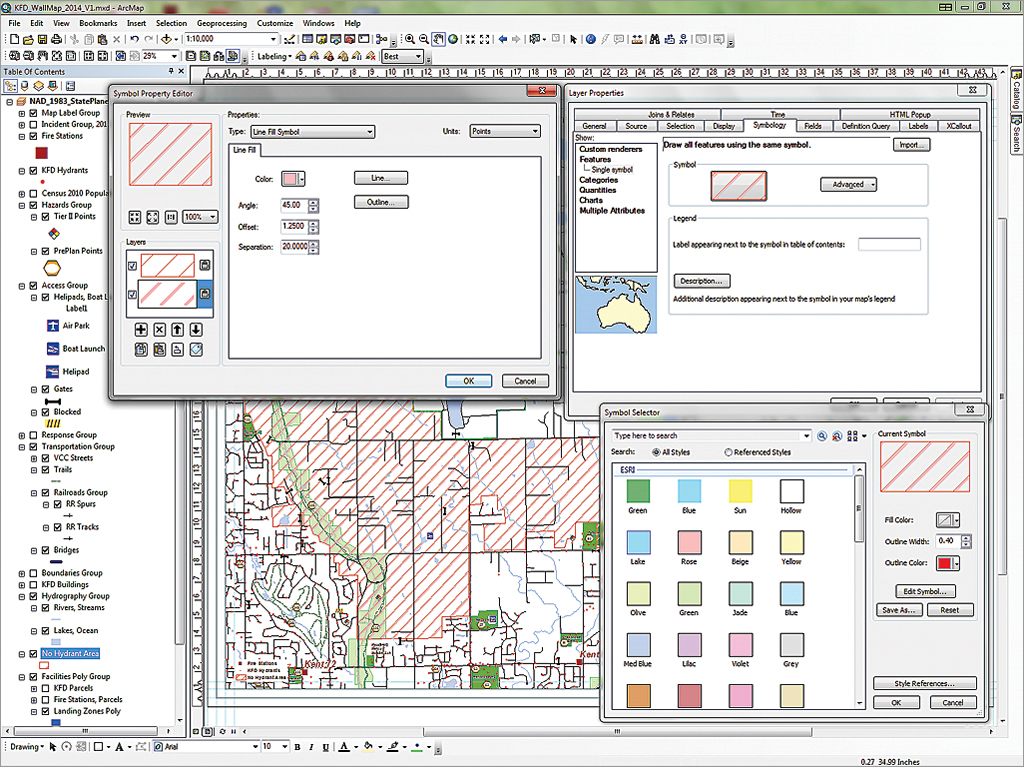
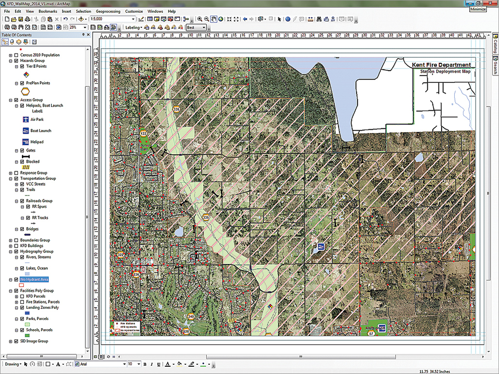
I’m often surprised by people who organize data in the TOC without considering the effect of data stacking on display. Data layers in the TOC draw from bottom to top, so there is potential to hide point and polylines under polygons and rasters. Watch data organization in the TOC carefully. Keep rasters and imagery near the bottom of the TOC, below all vector data. When arranging vector data, try to keep point layers at the top, above all polyline layers. Position polygon layers at or near the bottom, below points and polylines but above rasters.
If you need to place a polygon boundary at or near the top of the TOC, consider rendering it as an outline without any fill. You can also apply partial transparency to one or more polygon or polyline layers. Experiment carefully with transparency to obtain the desired result. Partially transparent layers in a map are automatically displayed as a lighter color that simulates transparency. A word of caution, however: If you export the map as a layered PDF product, ArcMap will render the transparent layer and layers located below it in the TOC as a single base layer named Image. To retain unique layers in a PDF output, consider using colorful patterned fills instead. Experiment with map output until you obtain desired results.
Overloaded TOCs and Layer Groups
The tendency to load too much data into a single TOC is a common problem for students and professionals alike. If all the data layers added to a map are not visible in the TOC display, the map can be confusing. There are several ways to avoid overstuffing a TOC.
The first option is to create a second data frame with its own TOC for specific tasks such as editing, image georeferencing, or geoprocessing. It’s much easier to navigate menus and pick lists when the TOC is not overburdened. This is especially important when editing. Include only the data necessary to perform editing tasks. This reduces the possibility of damaging, compromising, or even accidentally selecting data that should not be modified.
One way to streamline a TOC is to selectively organize related data into a Group Layer. By using a Group Layer to organize related data layers, those layers can be quickly accessed, repositioned in the TOC, turned on and off, and even removed as a single entity. The layers in a Group Layer draw in the same order in which they are positioned in the Group Layer, so consider the type of data in each layer and how it will be displayed. Groups containing mixed points, polylines, and polygons can be problematic. I often use Group Layers to organize tiled raster images such as orthophotography.
Be careful when repositioning data in the TOC. It’s quite easy to accidentally drop a data layer into the incorrect Group Layer and then lose track of its location. When repositioning a single layer immediately below an expanded Group Layer, collapse the Group Layer before moving the data. After defining a Group Layer, consider saving the entire Group Layer as a single Layer file so it can be quickly loaded into another map or data frame.
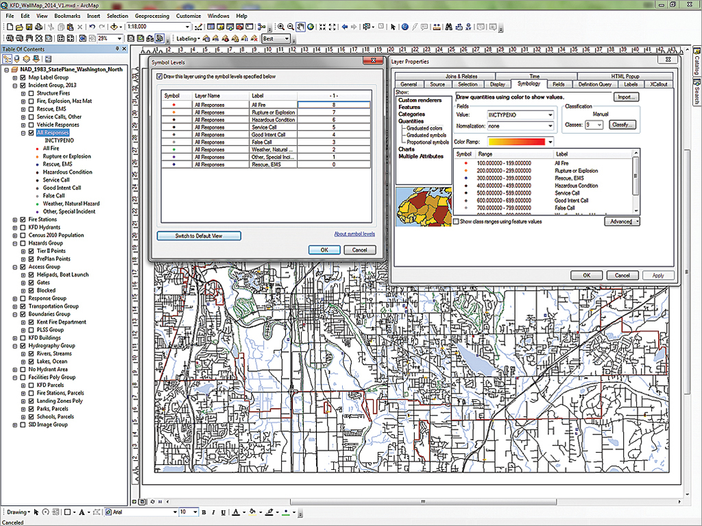
Definition Queries or Symbol Levels or Both?
Sometimes it is important to filter thematic data so information can be displayed in a preferred order within a layer. For example, in a fire service map, incident data is usually coded by response type that includes not only fires but also incidents such as explosions/ruptures, hazardous substances, rescue/emergency medical service (EMS), service calls, and false alarms.
In a year, approximately three-quarters of the calls at many agencies are directly related to rescue/EMS. Many of the remaining response calls are service calls and public assistance calls. Calls to respond to fires, explosions, and HazMat incidents make up a small percentage of the total number of calls.
Incidents are often mapped for a 12-month period. During that period, an agency may have responded to 10,000 incidents. When rescue/EMS responses are mapped, they tend to overwhelm all other calls. To show the relationship of fire-related incidents to all calls, it is important to filter and/or stack fire calls so they are displayed on top of medical and service calls. Two methods can be used to separate the fire calls from the larger group, or at least make them more visible.
The traditional approach to refining point data is to create subsets of focus points and display them above other points in the group. In the fire example, all fire, explosion, and HazMat points are filtered using a definition query that employs a standard numeric code to display these points preferentially. Service and other calls are also segregated numerically below fire calls but above rescue/EMS calls. The subsets are typically grouped in this order. Inside the Incidents Group, subsets will draw in order and response types may be displayed and modeled individually.
To show all incidents with fire responses on top, use symbol levels to reorganize the display order in a thematic legend so important points plot on top regardless of their position in the point list. Before symbol levels were available, records were sorted in an x,y table to emphasize primary points, then the points were posted in the sorted order. Symbol levels have simplified this process considerably. For more information on symbol levels, read and work the tutorial “Displaying points: Using symbol levels to optimize point display” in the Summer 2012 issue of ArcUser.
PDF, PPT, and Document Tricks
Many of the best practices concepts presented in this article aid in the creation of high-quality digital output. However, many maps are not designed for immediate paper printing. Instead, they are embedded in or attached to a digital product, such as a Microsoft PowerPoint file, for review, presentation, and digital dissemination.
The ArcGIS PDF export utility provides a high resolution, low cost way to disseminate maps, graphics, and text. Through careful organization of points, lines, polygons, rasters, and text labels, you can produce very powerful, intelligent, portable products using only core Esri ArcGIS software.
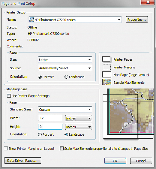
Often, clients ask me to prepare a map with a 4 x 3 aspect ratio without margins for use in a report or PowerPoint presentation. Save your project with a new name that includes “4 x 3.” Use Page Setup to resize the data frame to 12 x 9 inches and shrink the map to fit the full frame. Create new guidelines and adjust the font size and position of all text and cartographic objects. Modify the Reference Scale to avoid resizing point symbols and attribute-based labels. Use scale-defined bookmarks to pinpoint areas of interest on the map for multiple exports.
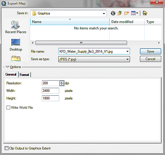
I typically export map graphics as JPEGs, although some clients prefer layered PDF files. The names of these graphic files include the subject, extent, and scale. The JPEG files are static, but the layered PDF files allow the end user to carefully adjust labels and layer visibility before capturing a snapshot to export to PowerPoint. The important export concepts include creating the 4 x 3 landscape layout and using predefined Bookmarks that return you to exactly the same map extent and scale for future graphic export.
Summary
GIS best practices are a moving target. I continually develop new and better ways to perform mapping and analysis tasks efficiently and accurately and make a better map. Try them out and incorporate them into your workflows as you see fit.
Acknowledgments
Thanks again to the Kent Fire Department for continually challenging me to develop new and innovative ways to create and deploy maps and spatial data. Thanks to all my other data development, mapping, and modeling friends, associates, and students. Without your continued input, ideas, and critique, I could not develop, document, and teach these concepts.