“Arcade is magic!”
That was the reaction of Sari Ladin-Sienne, the chief data officer for the City of Los Angeles after viewing a demonstration of ArcGIS Arcade by Esri staff at a cross-departmental meeting last May.
ArcGIS Arcade is an expression language that transforms data on the fly to create meaningful labels, symbology, and pop-ups. This is especially useful when working with live feed data and layers that are owned by someone else. Arcade can save hours that would otherwise be spent updating or processing data.
Like the functions in Microsoft Excel, Arcade can take existing data and create new information on the fly, performing operations that range from simple calculations, such as addition or multiplication, to complex If-Else statements or For loops.
Traditionally, to change data, you must own the layer or make a copy of it, rather than modify the data in the source layer. If you owned the data or a copy and you wanted to symbolize the data based on a new attribute, you would add a field, calculate it, and verify the results. Although sharing layers that are centrally maintained by an organization reduces duplication of work, members of that organization can be stymied when they want to modify data in a layer that they do not own.
Ladin-Sienne and the other 30 data leaders in that meeting have been instrumental in optimizing the city’s data, which is maintained in and shared from the Los Angeles GeoHub. Arcade meets the city’s data transformation needs and is a data processing time saver.
Whether you are part of a large organization, like the City of Los Angeles, or you are a one-person shop, you can use Arcade in ArcGIS Online and ArcGIS Pro to modify layers to best serve the needs of your project. The Arcade expression builder looks the same whether you are creating expressions for your pop-ups, labels, or symbology.
The following scenarios highlight how Arcade can enhance ArcGIS Online maps. The first scenario is a beginner level example of labeling; followed by an intermediate example about symbology; and finally, an advanced scenario with pop-ups.
Create the Perfect Label
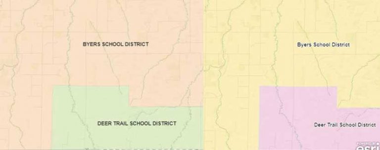
A county GIS analyst in Colorado (let’s call her Monica) needs to quickly create a map of school districts for a meeting that will be held in a couple of hours. Her county’s ArcGIS Online organization content contains a school districts layer, but the names of the school districts are all capitalized so the labels display as BYERS SCHOOL DISTRICT instead of Byers School District. She prefers mixed case to uppercase because it makes the labels easier to read. However, she won’t have time to ask the person who made the layer to change the field, let alone have the time to download the data, edit the field, and rehost the layer.
Monica just learned about the power of Arcade to edit labels on the fly and tries it out on the school districts layer. She opens the Arcade editor by choosing Label Features and choosing Custom Expression, located at the bottom of the drop-down list. She uses the Proper function, which sets the first letter of each word to uppercase and the rest to lowercase, to create this expression,
Proper($feature.NAME)
which transforms BYERS SCHOOL DISTRICT to Byers School District.
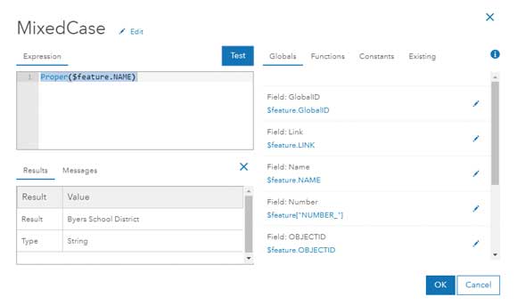
With just one Arcade expression, Monica saved hours of work and is now ready to go to the meeting with a more polished map in hand.
For extra credit, if Monica wanted to provide more information, she could use Arcade to concatenate (string together) multiple fields into one label. For example, if she wanted to include the enrollment numbers for each school, she could create a label like “Byers School District – 2,570 students.” The following Arcade expression would accomplish this:
Proper($feature.NAME) + “ – “ + $feature.STUDENTS + “students”
Style the Map Your Way
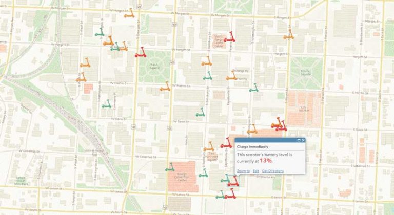
A city worker in North Carolina (let’s call him Steven) is tasked with ensuring that all electric scooters that the city rents maintain a charge of at least 50 percent. Steven sees a layer in his city’s ArcGIS Online organization website that shows the current locations and battery levels of scooters throughout the city. Right now, it’s simply a map with lots of dots, but he’d like the map to highlight which scooters need an immediate charge, so he is going to use Arcade to style the map to highlight which scooters need immediate attention.
Unfortunately, the layer’s battery level field (battery_level) is stored as a string, or text, in the layer. Steven could ask the data’s owner to fix this in an upcoming update, but he knows that will take weeks. To do anything meaningful in the map, he must first convert the string field to a number field using the Number function in Arcade.
Number($feature[“battery_level”])
This is where things get interesting. He has been asked to make things very clear on the map, so Steven creates three categories—Charge Immediately, Charge When Possible, or Fully Charged—that are based on a numeric field that indicates the battery level.
var battery = Number($feature[“battery_level”])
When (battery < 50, “Charge immediately”,
battery >= 50 && battery < 90, “Charge When Possible”,
“Fully Charged”)
〈 Listing 1
The code in Listing 1 is read as “When the battery level is less than 50, return Charge Immediately, when the battery level is between 50 and 90, return Charge When Possible, and for all other values return Fully Charged.”
These categories did not originally exist in the data, but with just a few lines of Arcade, Steven now has a map that is useful and will help him become more efficient with his time.
As a bonus, when the dataset updates with new scooter locations and battery levels, the Arcade expression incorporates the new information on the fly, so Steven does not need to manually recalculate values. For this reason, Arcade is especially useful with live feed data and datasets that update frequently.
Make Your Layers Talk to Each Other
A crime analyst at a police department in New York State (let’s call her Connie) calculates the number of crimes that occur in each patrol car beat zone. Every time the data updates—which is every week—she must repeat her analysis and hardcode the total number of crimes within each zone.
The new FeatureSets option in Arcade lets two layers reference each other. Connie would like to use FeatureSets to make the police boundaries layer “talk” with the crime points layer to calculate the number of crimes in each beat.
To do this, she adds an Arcade expression to the pop-up that counts the number of points in each polygon, which is shown in Listing 2.
//This is where the polygon layer (police beats) makes a “call” to the point layer (crimes)
var crimes = FeatureSetByName($map,”RPD – Part I Crime 60 Days – RPD Part I Crime – Last 60 Days”)
//Counts the number of crimes that intersect with the police beats layer
var countCrimes = Count(Intersects($feature, crimes))
//Return the result of the variable created in the line above
return countCrimes
〈 Listing 2
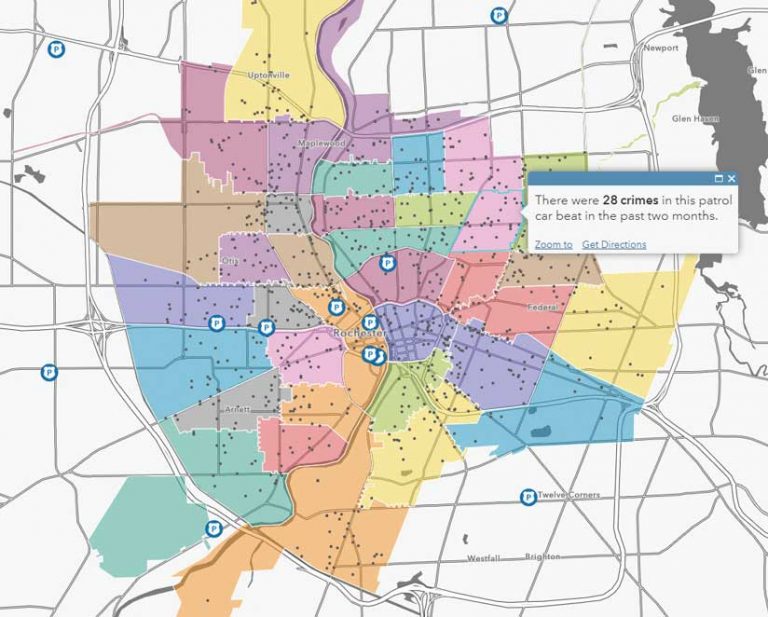
The first line makes a “call” to the crime point layer in the web map. The second line counts all the crimes that fall within, or intersect, the patrol car beat. The last line returns the variable created in the second line. To make her pop-up even more meaningful, Connie can determine the distribution of the various types of crime using another Arcade expression that is shown in Listing 3.
//This is where the polygon layer (police beats) makes a call to the point layer (crimes)
var crimes = FeatureSetByName($map,”RPD – Part I Crime 60 Days – RPD Part I Crime – Last 60 Days”)
//Filters the field Statute_Text to a specific type of crime and calculates the sum
var larceny =Count(Intersects(Filter(crimes,”Statute_Text LIKE %larceny%’”),$feature))
var aggravatedAssault = Count(Intersects(Filter(crimes,”Statute_Text LIKE ‘%assault%’”),$feature))
var burglary = Count(Intersects(Filter(crimes,”Statute_Text LIKE ‘%burglary%’”),$feature))
var motorVehicleTheft = Count(Intersects(Filter(crimes,”Statute_Text LIKE ‘%vehicle%’”),$feature))
var robbery = Count(Intersects(Filter(crimes,”Statute_Text LIKE ‘%robbery%’”),$feature))
var murder = Count(Intersects(Filter(crimes,”Statute_Text LIKE ‘%murder%’”),$feature))
//Returns a breakdown of crime types in each police beat
return “Larceny: “ + larceny + TextFormatting.NewLine +
“Aggravated Assault: “ + aggravatedAssault + TextFormatting.NewLine +
“Burglary: “ + burglary + TextFormatting.NewLine +
“Motor Vehicle Theft: “ + motorVehicleTheft + TextFormatting.NewLine +
“Robbery: “ + robbery + TextFormatting.NewLine +
“Murder: “ + murder
〈 Listing 3
Now, when the crime data updates, Connie’s meaningful pop-up will automatically update with the new aggregation. Arcade has saved Connie hours of work and has freed her time for additional analysis work.

Try Your Hand at Some Arcade Magic
Arcade is a powerful tool that is used especially when you do not own the data or when the layers are updated frequently. You can use Arcade to edit labels, symbology, and pop-ups. For more information on Arcade, visit esriurl.com/LearnArcade.
About the author