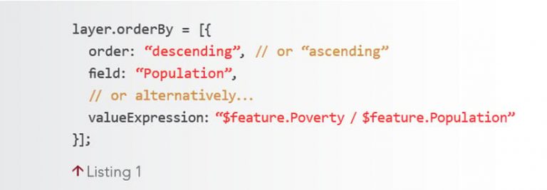
The September 2021 release of version 4.21 of the ArcGIS API for JavaScript introduced the ability to use field values to control the drawing order (or sorting) of overlapping features. Feature sorting is configured on the orderBy property of the FeatureLayer, CSVLayer, GeoJSONLayer, or OGCFeatureLayer. Controlling feature sort order is important if you want to establish a clear visual hierarchy of overlapping features within the same layer. An example is shown in Listing 1. Sorting features can be useful when you want to
Render small symbols on top of large symbols so that all (or most) of the data can be seen at a glance.
Display features with large symbols on top of small symbols to hide irrelevant features.
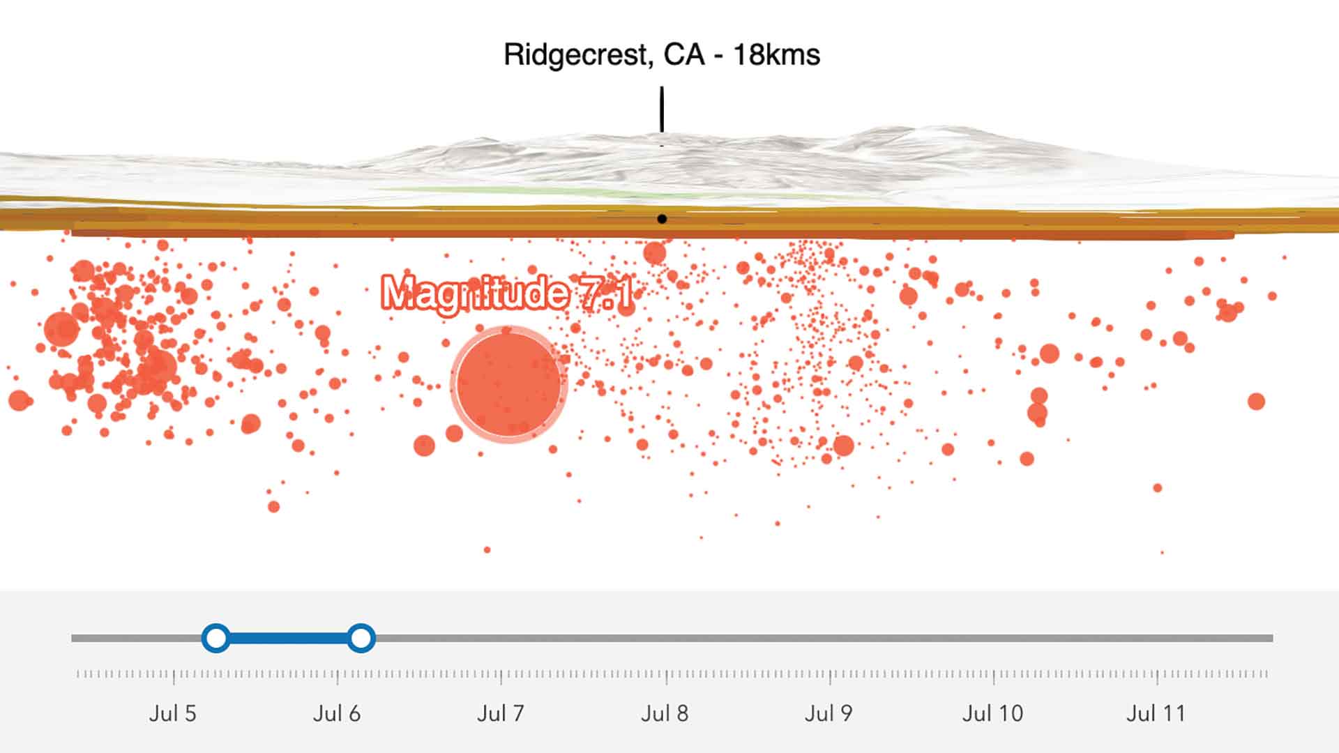
Use a date field to ensure more recent features are drawn on top of older features.
Let’s explore a few examples showing how drawing order can be applied.
Annual Average Daily Traffic
The first example visualizes the annual average daily traffic (AADT) on Florida highways. This is a graduated symbol map of polyline features where the value of the AADT field determines the width and color of the symbol, and layer.orderBy is set to null. By default, features are rendered in the order they are received by the client. Visually, feature order in this default scenario may appear random. Notice that some smaller features, such as ramps and surface streets, are rendered on top of the high-traffic highways.
Ascending Order
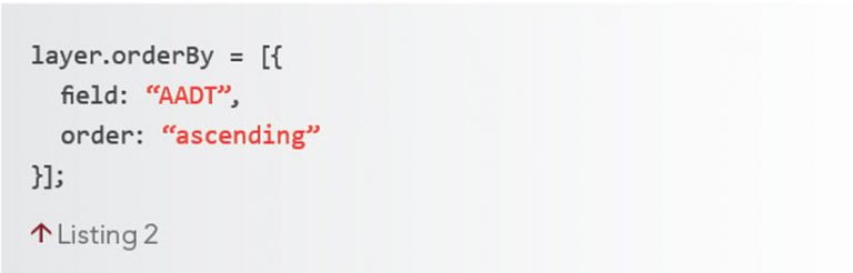
By controlling feature sort order in proportional symbol maps, you can establish a clear visual hierarchy. In many cases, seeing all the data at once is preferred. To maximize the amount of data in view, order features with small values on top of features with large values. This is done by sorting features based on the field used by the renderer in ascending order, as shown in Listing 2.
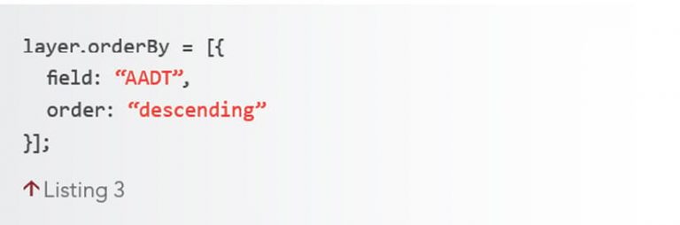
Descending Order
Perhaps you want to achieve the opposite scenario and render large features on top of small ones to ensure that they are always the most prominent. This is accomplished by setting the order property to descending, as shown in Listing 3.
Above and Below Visualizations
You can leverage ArcGIS Arcade expressions for visualizations of diverging data by ordering features based on symbol size. Sorting by data value is different from sorting by symbol size. The orderBy property currently does not allow sorting by symbol size, but because small symbols typically represent small values, and large symbols represent large data values, using orderBy will usually produce a visualization that appears to order features by symbol size.
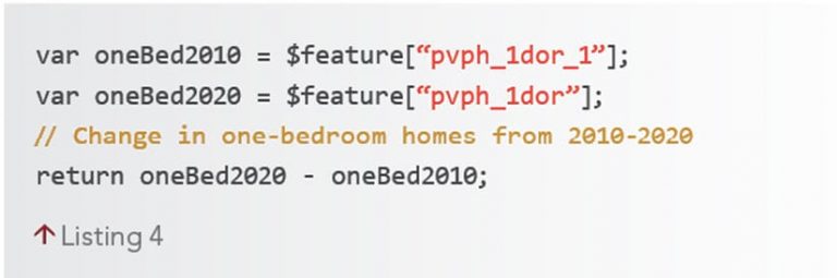
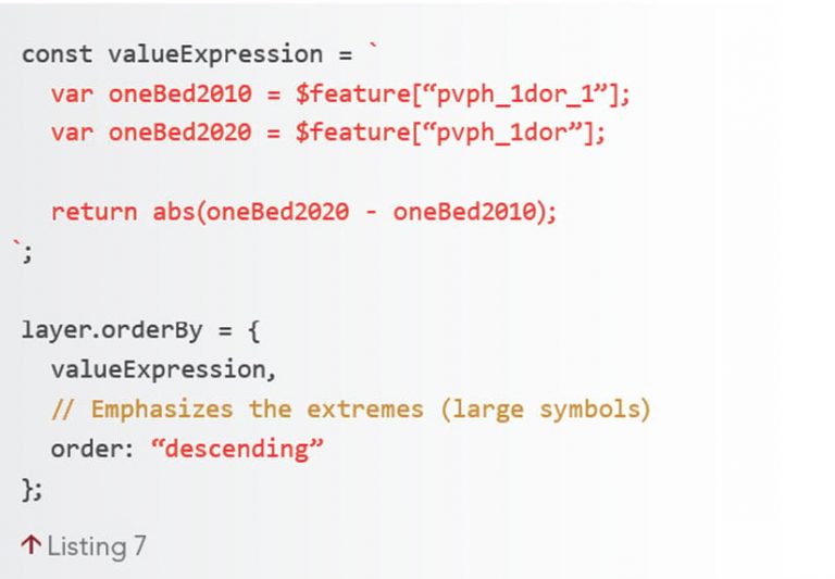
However, this doesn’t apply to graduated symbols that represent data above and below a meaningful middle value. For example, the expression in Listing 4 calculates the change in the percentage of homes built with one bedroom in 2010 versus 2020.
Notice how the smallest symbols represent values close to a center value, and the features with very small or very large values have large symbols.
Look at how Listing 5 sorts the layer’s features based on an ArcGIS Arcade expression that matches the renderer.
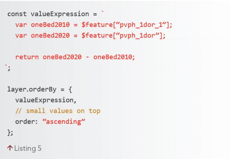
All features in the red “below” category dominate the map because they represent negative values. If we flip the order to descending, then the features in the “above” category will be given more importance. Since the goal is to see both above and below patterns clearly, both visuals fail.
Use Arcade to Generate a Sequence That Orders by Symbol Size
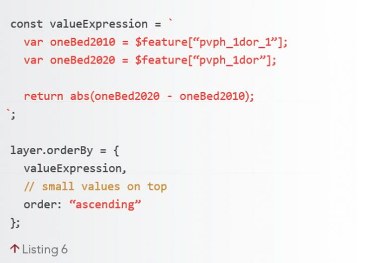
To sort by symbol size in any above and below visualization, take the absolute value of the difference between the rendered value and the middle value (or inflection point).
Abs(fieldValue – midValue)
In expressions that calculate change over time, the middle value is always zero, so just take the absolute value of the final calculation, whether it represents total change or percent change, as shown in Listing 6. Now all small symbols render on top of features with larger symbols.
While this rendering makes it easier to see more points, the extremes communicate where the most change happened in the given time frame. To show this information, keep the modified expression and switch the order to descending, as shown in Listing 7.
When configuring feature display order in ArcGIS Online, sorting by using an ArcGIS Arcade expression is not an option available in the UI. However, use ArcGIS Arcade to sort features by calculating a new field with an expression and selecting that field in the UI.
Now the map clearly communicates that there was generally a larger decrease in one-bedroom homes, though some municipalities still had a significant increase.
Alternatives to Visualizing Overlapping Features
The orderBy property helps establish visual priorities. However, prioritizing feature order isn’t necessary or relevant in some cases. For example, using opacity to see through a stack of features clearly communicates relative density.
Alternatively, depending on feature density, hollow rings can be easier to read than opacity. If displaying all features isn’t required, consider alternative methods, such as clustering or heat maps, for visualizing overlapping and dense datasets.
About the author