Data-driven maps answer questions about location data, such as Where? What? How much? and When? Data-driven maps often tell a story from a single data snapshot. For example, a map using 2020 United States Census data will only reflect the state of the US population on April 1, 2020.
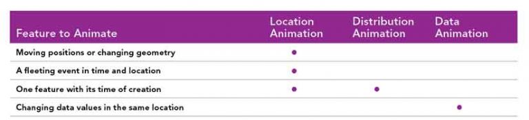
However, data-driven animations can provide a broader perspective. They can let you see how data changes over time. Animations go beyond answering the basic Where? What? How much? When? questions for a single time frame to answer questions such as
- How did the city grow to be the size it is today?
- How fast is the planet warming compared to 50 years ago?
- What will the population of the planet look like in 20 years?
With the ArcGIS API for JavaScript, you can create dynamic and interactive data-driven animations that fall into three categories:
- Geometry animation
- Distribution animation
- Attribute animation
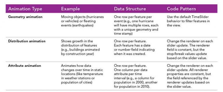
Each category is characterized by a specific data structure and code pattern for stepping through the animation sequence. Use cases, the data structure, and the code pattern are provided for each category.
Geometry Animation
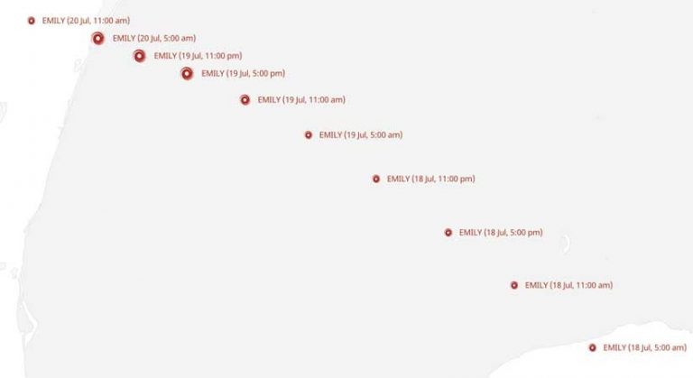
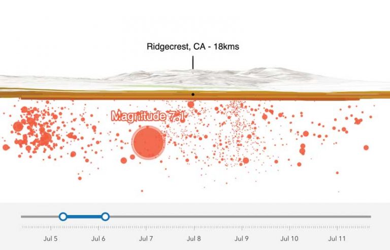
This category animates by filtering feature visibility. A geometry animation visualizes features that change position or geometry over time. A hurricane’s location over time, a fire perimeter’s morphing boundary, or the route of a vehicle shown as a point moving along a path are examples of geometry animation. This type of animation can also be used to represent fleeting events, such as earthquakes, that happen in a single moment in time but usually occur clustered with other similar events.
Data Structure
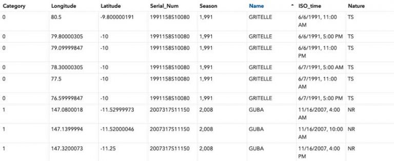
The data used in a geometry animation represents the map’s subject (e.g., hurricane) as one or more rows in a table, each containing a unique geometry and time stamp. In the hurricane example, one hurricane may have 20 or more associated features, each at a different location and time.
Code Pattern
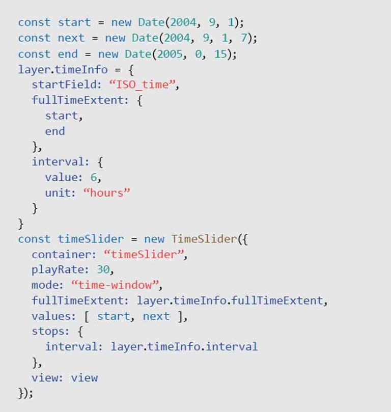
To visualize features that change location over time, you must filter features in the layer view based on a predefined time interval and update that filter on each animation frame. Fortunately, the TimeSlider widget does all the heavy lifting for you in this scenario. All you do is provide the slider with a reference to the view where the animation will take place and set the time information on the layer or its associated service, as shown in Listing 1.

When the user clicks the Play button on the slider, the slider manages the filtering based on the slider thumb positions. In the hurricane app, clicking Play updates the layer view with a series of filters that makes each hurricane appear as if it is moving along a path.
In this animation, the renderer (or style) of the layer is fixed. An animated GIF represents each location of each hurricane. Each icon’s size is scaled based on the hurricane’s category number, as shown in Listing 2.
Distribution Animation
Distribution animations visualize the distribution of features as they accumulate over time by changing color break points or stops. Unlike geometry animations, this technique does not involve moving features. It simply shows where and when static features are added to the map. It is a good technique for visualizing increases and decreases and showing if change happens rapidly or slowly.
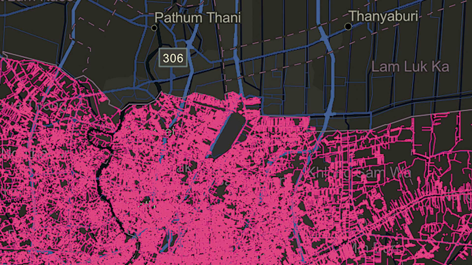
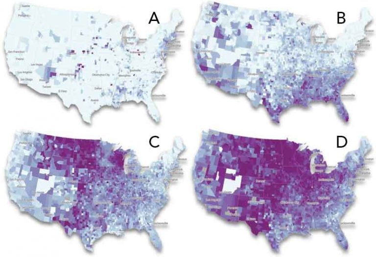
For example, you can use this method to show the growth of a city by animating when buildings were constructed since its founding. You can use color to highlight the rate of growth of features that persist and are not fleeting (like an earthquake).
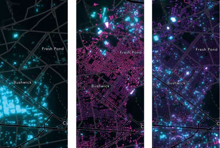
The example in Figure 4 visualizes not only when New York City buildings were constructed but also how rapidly they were built each year. As the slider advances from year to year, building color changes. Each building flashes bright blue at the year it was constructed. It gradually fades to a dark purple color as the current time in the app continues to advance. More blue areas indicate faster growth. More purple areas indicate slow or no growth.
Data Structure
This animation style works well when you have a layer or table in which each feature represents one object in the map, such as a building, as shown in Figure 4. Each feature is represented with a single, static geometry and includes a date field containing the date or order in which the feature was created. Alternatively, each feature can have a number field that contains a year or sequence number.
Code Pattern
Rather than accumulatively filtering data to show the growth of features, the code for the app shown in Listing 3 first loads all data in the browser and assigns it a style that will update on each animation frame.
The animation begins with 1880, the oldest year in the dataset. For each animation frame, the baseline year is updated so features matching the year on the slider are highlighted, and a function is called to update the color stops of the layer based on that year. Note that the reference to the date value (i.e., CNSTRCT_YR) and the colors in the renderer remain constant. However, as the current year changes, all color stops are offset from the updated year by constant intervals of 10 and 50 years. The constant increment in stop values results in a smooth animation. The interval between stops must remain constant throughout the animation.
Attribute Animation
Attribute animations change a renderer’s data or attribute value. In these animations, features have fixed locations and are animated using the change in the layer’s attribute value over time. For example, you could use this technique to animate the following:
- Temperature change over the course of a day in a layer representing weather stations
- Change in the number of COVID-19 cases from day to day in a layer of counties
- Climate change using data in a gridded layer in which each feature represents a location with temperatures that have been recorded for more than a 120-year period
Data Structure
Attribute animations require that each feature is represented by a single row in a table with multiple columns containing the value of an attribute recorded at different time stamps or intervals. Typically, each column name reflects the variable and the time or date at which it was recorded (i.e., one field per variable per time interval).
For example, to animate temperature anomaly data for a gridded layer, each record in the layer would have a geometry along with a column containing the anomaly value for each recorded year. If you want to animate a large amount of data, this can result in very wide tables. As an alternate technique, if the interval is constant between values, you can store multiple values as a pipe-separated list within a single column. You could then parse the required value using an ArcGIS Arcade expression.
Code Pattern
To animate a changing attribute in static geometries, you must update the layer’s renderer on every animation frame (any renderer can be used in this animation scenario). The attribute animation technique is distinctly different from the distribution animation in that you must keep all renderer break points, stops, and other properties constant in the animation, except for the reference to the data value.
It is extremely important to keep a renderer’s properties constant so you can easily compare change in each feature between frames. For example, if you changed which value a specific color represented, the animation would be unreadable and communicate nothing to the audience.
In this animation technique, each animation frame calls a function that gets a reference to the renderer. This function then matches the slider’s year or date with a corresponding field in the layer and sends that new field name back to the renderer. This slight change to the renderer will refresh the map, updating the visualization to represent the new set of data values.
Because all data values are encoded on the vertices of features in the GPU, you can simply reference the next value in the sequence to create a smooth animation with very fast performance (up to 60 frames per second).
Conclusion
With the performance and drawing improvements in the ArcGIS API for JavaScript over the last few years, you can now create smooth, dynamic, interactive, and performant data-driven animations with data you own in feature layers, CSV, GeoJSON, and OGC layers. If you’re not sure which animation technique is right for you, look at Table 1.
Summary
Table 2 summarizes each technique, data structure, and coding pattern for creating the animation in the ArcGIS API for JavaScript.
About the author