Today, services, web maps, and open data in the cloud put data at your fingertips.
But there’s much, much more to it.
Using online layers enables anyone to explore and create additional maps directly from these layers, with no download required. Working with these layers is exciting because this data can potentially answer so many questions.
ArcGIS Living Atlas of the World contains high-quality layers to help you get started making the maps you need to fuel your information products. This instant access to useful layers enables frictionless new ways to explore and map more effectively. For example, each of the American Community Survey (ACS) layers in Living Atlas can be used by thousands of ArcGIS users who want to make specific maps that answer their unique questions. A single layer can often power many maps.
Labor Force Participation by Age, which uses ACS data, is a new topic Esri has added to ArcGIS Living Atlas. Each age group is broken down into:
- Everyone who worked in the past 12 months
- Those who worked full-time, year-round in the past 12 months
- Those who worked less than full-time, year-round in the past 12 months
- Everyone who did not work in the past 12 months
This one layer can be the source for several policy maps on labor force dynamics. The maps referenced in this article will give you a taste of some ways you can configure maps to fit your specific needs. Using a whole range of functionality within ArcGIS Online, I made four policy maps from the layers for this one topic. Each map answers a different question that illuminates multiple aspects of this topic.
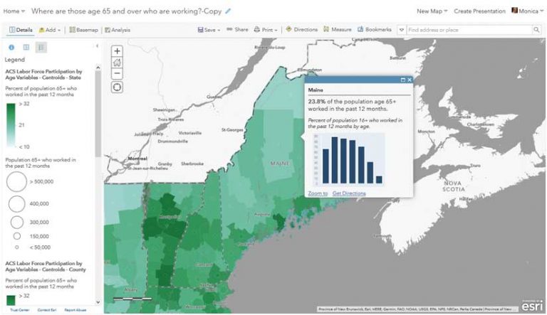
Where Are People Aged 65 Years and Over Who Are Still Working?
The map in Figure 1 combines the boundary and centroid versions of the ACS Labor Force Participation by Age variables data, using the symbology from both to get a textured look that communicates percentages and counts. While age 65 is commonly thought of as retirement age, many people aged 65 and over still work for a variety of reasons. For example, the map in Figure 1 shows that 23.8 percent of Maine’s population who are aged 65 years and over are still working.
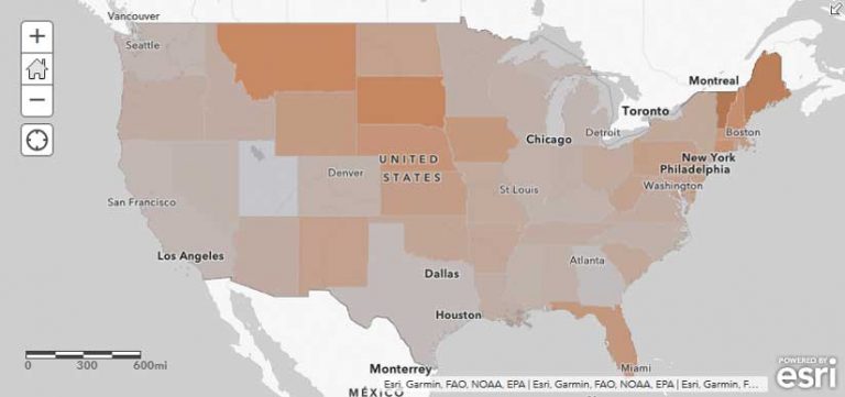
How Many Workers Are Aged 65 Years and Over and Likely to Retire Soon?
Let’s change the question slightly and ask, What share of the working population is aged 65 years and over? View this multiscale map, illustrated in Figure 2. The Social Security Administration tracks this measure, as the ratio of workers to retirees has been falling over the past few decades due to an aging population. Some communities are feeling this effect more than others and are even experiencing a shortage of workers. Maine, for example, has a high percentage of its current workers that are aged 65 years and over. Figure 2 uses ArcGIS Arcade to map a value that is slightly different from the value in the previous map.
A good policy map makes locations in need of intervention clear. One simple way to do this is to use a color ramp that really emphasizes the areas with high values through a gray-to-color ramp, such as this gray-to-orange ramp map in Figure 2.
As a starting place, these color ramps only give the darkest color to values one standard deviation above the average of the data values. You can easily adjust this by dragging the handles, entering in your own breakpoints, and even inverting the color ramp as appropriate. Using a gray-to-color ramp helps de-emphasize places with lower values by symbolizing them with a color that is closer to the color of the basemap. Maine and other states with older working populations really stand out on this map.
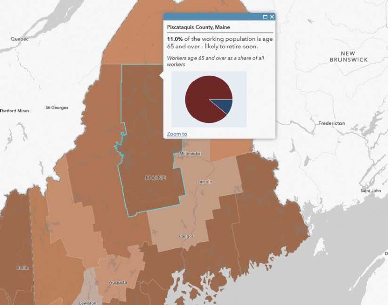
By symbolizing each level of geography, as shown in Figure 3, someone viewing this map can drill down into the county and tract levels to see exactly where Maine will have a shortage of workers soon.
Where Are Teens Working Full-Time, Year-Round?
When looking at the pipeline of future workers, an obvious group to map is youth. Many communities are interested in building the capacity of their youth population in terms of workforce training. Knowing where to target these efforts helps them allocate scarce resources. One subgroup to consider targeting could be teens who are currently working full-time.
The map in Figure 4 uses pop-ups to provide additional context for counties and tracts by displaying the percentage of working teens in that county or tract in relation to the percentage of teens working statewide. For example, the percentage of working teens in Hardin County is above the percentage of working teens statewide, but it is below the percentage of working teens in Chambers County.
The state’s percentage is being calculated on the fly, using an Arcade statement containing a FeatureSet function that calls to the state-level layer in this map, as shown in Listing 1.
Listing 1
//get the state’s fips code from the first 2 digits of the county’s and tract’s fips code
var state_fips = left($feature.GEOID,2)
//connect to state-level layer in the map
/* ACS Labor Force Participation by Age Variables – Boundaries – State */
var state_data = FeatureSetById($map, “ACS_Labor_Force_Participation_by_Age_Boundaries_8020”)
var match_key = “GEOID = @state_fips”
var state_match = first(filter(state_data,match_key))
var state_rate = round(100*(state_match.B23027_004E/state_match.B23027_002E),1)
//return state_rate
var pop_up_text = when(
(100*$feature[“B23027_004E”]/$feature[“B23027_002E”])>;state_rate, “above”,
(100*$feature[“B23027_004E”]/$feature[“B23027_002E”])<;state_rate, “below”,
“no different from”
)
return pop_up_text + ” the state average for ” + $feature[‘State’] + ” of ” + state_rate
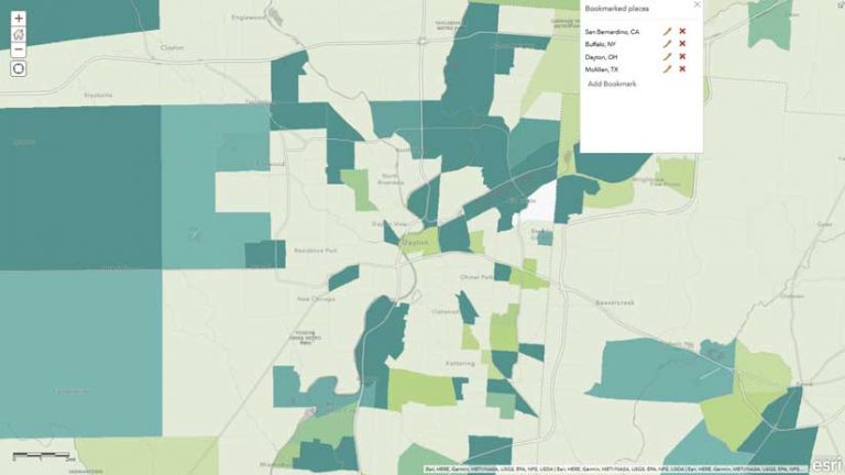
This map also uses bookmarks to guide the viewer to other areas of interest for this topic.
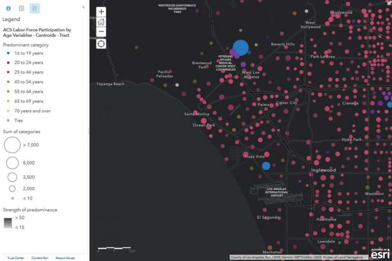
In What Age Group Does Part-Time Work Predominate?
This final example in Figure 5 maps the predominant age groups working part-time, as well as the count of part-time workers, and depicts them by size. This map uses the centroids version of the layer, rather than the boundaries version.
Many people work part-time over the course of their careers. People who voluntarily work less than full-time include students, parents with young children, people with other family commitments, and seniors who work bridge jobs to ease into retirement. Some may want to work full-time but can only get part-time hours. Others may have seasonally worked full-time hours, but not year-round.
This map uses a more advanced mapping style than the simple high-to-low ramps that the other three use. Predominance maps are great for showing which group in a category is most common. Sequential predominance is useful when those categories have a natural order and the category is symbolized with a sequential color ramp.
These four maps are just a few of the many maps that could be made from this layer. Some other maps could answer questions such as:
- Where are those 70 years of age and over who are working full-time, year-round (likely out of necessity)?
- What is the teen employment rate?
- What percentage of workers worked part-time last year?
- Where are people aged 25 to 64 years—the peak-working-age population—not working?
The best part about these maps is that, since they are powered by ACS layers in Living Atlas, they will be refreshed every year when the US Census Bureau releases the new ACS data. Just check your map and make any adjustments to symbology based on the new values. No more building maps from scratch each year!
Labor Force Participation by Age is just one of many ACS topics in Living Atlas. Each of the 39 topics can answer all kinds of policy questions. There are dozens of other ACS layers to explore in Living Atlas. For example, the boundaries and centroids layers on Health Insurance Coverage Variables could answer questions such as:
- Where are the uninsured?
- What is the most predominant type of health insurance coverage for children?
- Where do people have Medicaid/other means-tested public coverage?
Let enhanced metadata help you while you are mapping. If you are unsure what any field means, simply click the information button (i in a circle) to the right of the long field description in the Map Viewer.
What Policy Maps Will You Make from ACS Layers?
Map the whole nation or apply a filter to the layers and make a custom map about your community. There are so many possibilities for policy maps from ACS layers. They can vary based on the questions you address, the way you style your map, or the configurable app or ArcGIS StoryMaps story you pick.
To get inspiration, browse the American Community Survey Atlas gallery, peruse the Learn ArcGIS lessons on policy mapping and take advantage of the resources on the Esri Maps for Public Policy site.
What opportunities to intervene and strengthen your community will your maps highlight?