In 2020, the University of Richmond, the Science Museum of Virginia, and Esri worked together to examine the environmental legacy of redlining policies from the 1930s. This collaboration was born out of new research, by the Science Museum and the Digital Scholarship Lab at the University of Richmond, that examined the environmental disparities related to redlined neighborhoods.
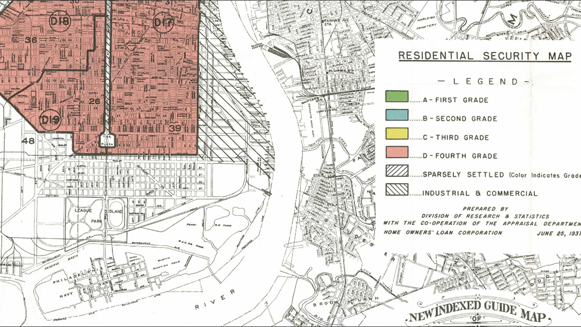
Redlining is the practice of discriminating against residents of an area based on race or ethnicity through systematic policies that deny financial services—especially mortgages—that are applied based on location. The Home Owners’ Loan Corporation (HOLC) was created in 1933 to increase homeownership as part of the New Deal. HOLC mapped neighborhoods and assigned grades to areas based on perceived lending risk factors that included racial and ethnic composition. Redlining has had adverse effects on these neighborhoods that can still be seen today.
Researchers in this collaborative project found that environmental factors, such as heat islands, had a striking relationship to HOLC grades. They joined forces to elevate this undertold story and explore this relationship further by performing geospatial analysis on environmental data layers in relation to HOLC grades. These collaborations allow researchers and museum staff to raise awareness of the legacy of redlining.
An ArcGIS StoryMaps story, The lines that shape our cities,
that profiles the research done by this team. It explores how redlining policies from the 1930s have left an environmental legacy that is visible in cities today. The story identifies four cities—St. Louis, Missouri; Montgomery, Alabama; Fort Wayne, Indiana; and Oakland, California—that haven’t received major redlining coverage and performs GIS methods on data from these cities to see how environmental characteristics like tree coverage, impervious surfaces, topography, and heat islands relate to HOLC grades.
As part of this ArcGIS StoryMap story, the team wanted to create a color-based metric for characterizing two different neighborhoods in Montgomery, Alabama. The workflow used to devise the metric is described in this article.

Units of Analysis for RGB Imagery
One of the first challenges in exploring each neighborhood was determining the appropriate unit of spatial analysis. While the original HOLC grade polygons were logical containers, they didn’t provide a way to look at the range or variation in tones within each neighborhood. To remedy this, a more granular, regularly tessellated grid, was used so a resolution approximately twice the size of a standard city block (200 meters by 200 meters) was adopted. Essentially, this created a low-resolution, very large pixel version of the source imagery.
Unfortunately, this tessellation approach introduced some problems with the unpredictable shape, size, and orientation of HOLC neighborhood polygons. While exploring ways to get around the alignment issue, the answer became obvious. Why use a regular grid to approximate the size of a city block when the physical barriers of the street network could be used to generate actual city blocks? Individual blocks in a city tend to be homogeneous in land use and vegetation cover, so it made sense to use blocks as the unit of analysis. This block-based analytical approach was applied to several other cities.
Extracting and Summarizing Imagery Bands
The National Agriculture Imagery Program (NAIP) collects four band (multispectral) imagery during the active agricultural (“leaf on”) season for the United States. The first three bands contain red, green, and blue values in the RGB color spectrum. These were used to calculate the mean values among the pixels inside each block. The analysis used the following workflow:
- The Raster Function Extract Band function was used to separate the NAIP imagery into band 1 (red), band 2 (green), and band 3 (blue) rasters.
- Street lines were clipped out from the HOLC boundaries and then merged with the line version of each HOLC polygon.
- Using the Feature to Polygon tool, polygons were created from these lines to generate polygon blocks and add a uniqueID.
- The Zonal Statistics as Table tool was run using the Mean statistics type for the red, green, and blue single-band rasters, within each uniqueID block zone.
- Each mean RGB value was joined back to its polygon block. Three new average color value fields (red, green, and blue) were populated.
- A text field was added to store the list of the average RGB values for use as a polygon color fill using the format: rgb (R, G, B).
- A new field for Brightness was added and calculated. This field contained, which is just the mean (of the mean) of the R, G, and B bands for each block. This was used in the legend to order the blocks in each ID according to their relative brightness.
- The Identity tool was run on the polygon blocks against the original HOLC polygons to reattach the HOLC grades (A, B, C, D) and individual holc_id values (A1, A2, B8, D4).
With an RGB attribute value associated with each block polygon, polygons could be symbolized.
Symbology Using Mean RGB Color Values
The attribute containing the average RGB color values for each block can be read directly in ArcGIS Pro and used to color polygon fill for each block.
- A single symbol or the block polygons were selected.
- In the Vary Symbology by Attribute tab of the Symbology pane, Allow symbol property connections was enabled.
- In the Primary Symbology tab, the database icon for the polygon fill was clicked and then the attribute containing the rgb (R, G, B) string value was selected and applied.
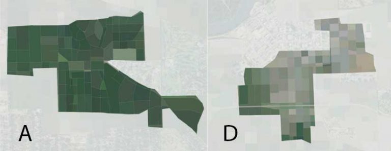
Summarizing block colors in a neighborhood is an interesting way to “fingerprint” the range of colors seen in the imagery and their variation. There was a stark contrast between the lush, dark greens of an A-rated neighborhoods compared to the light grays and browns of a D-rated neighborhoods.
As a final, easy-to-read summary of the color palettes for each HOLC neighborhood, the RGB values for A and D study areas were sorted by brightness, from low to high, to create a custom semi-continuous color ramp. This color ramp was inspired in part by the color analysis in the September 2, 2020 New York Times’ article “The True Colors of America’s Political Spectrum are Gray and Green.”
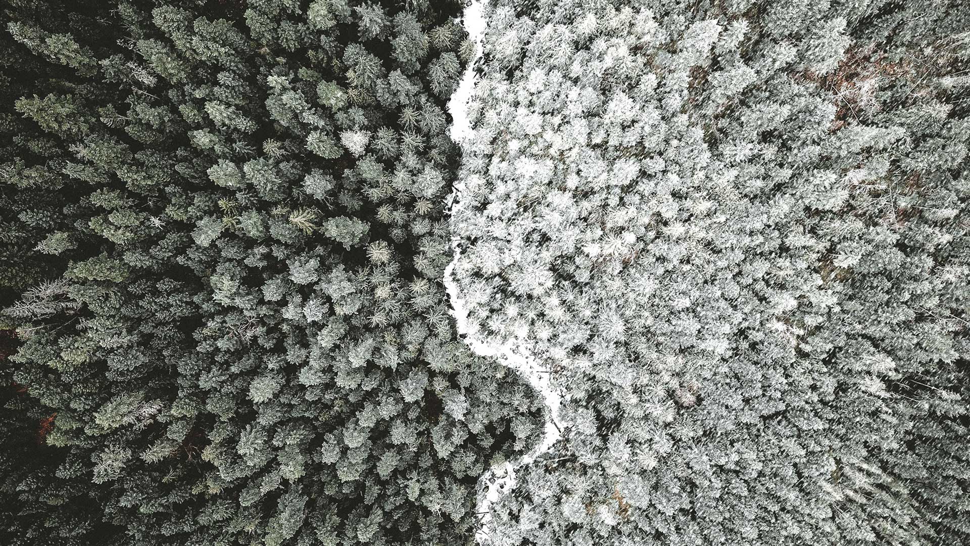
Tree Height Analysis
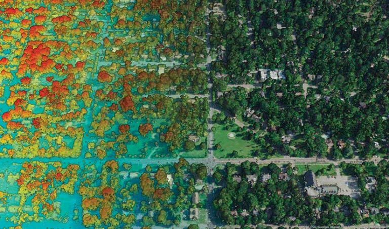
Lidar data has become more readily available nationwide through the US Geological Survey 3D Elevation Program (3DEP). It is a great source for extracting and modeling 3D features that can include bare-earth terrain models, buildings, trees, and power lines. Lidar data helped researchers gain a better understanding of the differences between tree cover in HOLC neighborhoods.
The first goal was creating drone-like flyover animations to juxtapose the presence of trees in different HOLC grades, from a bird’s-eye view. This required RGB information in the point cloud to render 3D points so that they appeared as a continuous surface. If RGB information isn’t present, lidar data can be colorized and transformed using NAIP imagery in ArcGIS Pro. Read “Fun with Colorizing Lidar with Imagery,” an Esri Community post, to learn how to easily create a 3D basemap that adds real-world context to projects.
Classifying Trees
While the project lidar data for the City of Montgomery was already classified for vegetation, unclassified lidar can be classified to extract vegetation information using the 3D Basemaps solution . This ArcGIS solution provides a set of tools and workflows to classify tree points in a lidar point cloud using deep learning. This solution provides new utility to existing lidar datasets, particularly for high-resolution environmental analysis.
By filtering out just the vegetation returns, researchers created a digital surface model and hillshade from lidar, providing a quick visualization of the tree distribution in different HOLC neighborhoods. To dig a little deeper, the next step was looking at tree heights and counts for each HOLC grade.

Extracting Tree Heights
To put a metric on average tree heights in the different HOLC grades, the 3D Basemaps solution was used to extract individual tree points from the lidar. In this workflow, a normalized digital surface model was created, which represented the height of objects above the ground. From this surface, the solution uses hydrologic tools to detect reverse sinks, which represent the center (top) of each tree and include individual tree height attributes. These points can then be visualized as realistic 3D models or analyzed. In this case, lidar was used to determine the average tree heights, comparing grade A and grade D HOLC neighborhoods.
While some individual neighborhoods had greater height differences, the averages across all HOLC grades showed a consistent relationship between HOLC neighborhood desirability and tree height. This reenforces neighborhood descriptions from the period, which often use words like shady or wooded for A grades. Almost 100 years after these neighborhood descriptions were written, these environmental disparities persist.

Sharing Analysis
After processing the imagery and lidar data for the project and reflecting on the results of analysis, the next step was communicating these results. Researchers wanted to embed a video in the ArcGIS StoryMaps story that would take viewers on a visual journey, using Esri tools and the data resources that are publicly available to dive deeper into understanding how vegetation has created very specific color palettes that can be correlated to the HOLC grades.
The team began by storyboarding scenes, writing the narrative, identifying transitions, and then putting it all together. Video editing was done with Camtasia software. During the editing process, care was taken to keep the same look and feel as the The lines that shape our cities, ArcGIS StoryMaps story, by maintaining the same overall structure and using a similar font and graphics. By keeping the video file size under 50 MB, the video could be hosted in the story—no small feat despite the use of lidar imagery.
The authors hope that this article prompts you to not only read The lines that shape our cities, but also to apply this analysis in your own neighborhood or city and question why your hometown looks the way it does. You can use this workflow to find answers.
About the authors

Emily Meriam

Ross Donihue