Our ancestors studied the stars with nothing more than the naked eye and found patterns that stimulated their thinking and shaped their understanding of their world and the one beyond. As science and technology improved, observatories with powerful telescopes became places to gather to study the cosmos.
Today, we can use Urban Observatory, a hands-on, interactive exhibit powered by GIS technology, to turn our eyes toward Earth and study the patterns of our cities—how we work, move, and live.
This popular interactive mapping exhibit will return in July to the Esri User Conference (Esri UC), with new cities such as Bogotá, Colombia, and Atlanta, Georgia, added to the mix of metropolitan areas you can compare and contrast. The number of cities in Urban Observatory will increase from the 10 cities during its debut at last year’s Esri UC to about 50 cities at this summer’s conference.
Through the comparative language of maps, Urban Observatory tells the story of our global community of cities and reveals similarities and differences not apparent using other means.

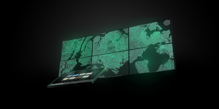
This next generation of the Urban Observatory exhibit increases the power of comparison, using a detailed collection of maps that organizations around the globe provide. The showcase includes touch screens, multimedia content and maps hosted in the cloud, and advanced-display technology. The exhibit will be in the Map Gallery in the San Diego Convention Center July 14–18, 2014.
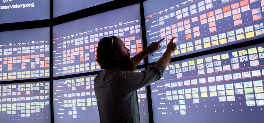
When you visit the exhibit, you can stand at an interactive touch screen set up in front of a wall of maps and choose which sets of cities and themes you want to see and compare. The metro areas include cities such as Abu Dhabi, United Arab Emirates; Milan, Italy; Perth, Australia; Tokyo, Japan; and US cities including New York, New York, Chicago, Illinois, and Honolulu, Hawaii. You can then compare maps that show population density, commercial and industrial land use, new development, predominant occupations, traffic, open space, and housing density, for the cities.
Using the touch screen, you can choose one theme such as population density and compare that in up to three cities or select three themes such as youth population, open space, and housing density and compare those in one city.

At last year’s Esri UC, people only could see Urban Observatory run through pre-scripted comparisons of information for the cities. But this year they’ll get a “museum-quality interactive experience,” said Cassidy Bishop, design lead for the exhibit at Esri. “In the exhibit, you can not only sit back and enjoy watching the show but also get up, walk over, and select the information and cities you want to compare.”
Through these maps, visitors can peer into the world’s leading cities to gain an intuitive, true sense of interrelated systems.
Cities such as Medellín, Colombia; Victoria, British Columbia, Canada; and Washington, DC, USA, recently joined the observatory, contributing several maps.
Urban Observatory is open to contributions from all cities. Click the Participate link at www.urbanobservatory.orgto get started, then build your first map. “We have shared a set of easy-to-use tools that allow any city, or anyone representing a city, to run a simple tool against existing data and produce a simple map,” said Shane Matthews, geographer on Esri’s Urban Observatory team. “Most people find it takes about 30 minutes to make one of these maps—the tools provide the recipe, and the city provides the ingredients.” The tools and short video are available online.
Once a city contributes a few maps, Esri provides many additional themes for that city from the ever-growing living atlas of maps available in ArcGIS Online.

“In ArcGIS Online, we have a living atlas of maps from which we can deliver additional map themes for each participant city,” said Jim Herries, another geographer on the Urban Observatory team.
“Sometimes I think of Urban Observatory the way we think about Internet music services like Spotify and Pandora . . . Instead of music in specific genres, we offer engaging maps about specific themes that help you understand cities better,” said Herries.
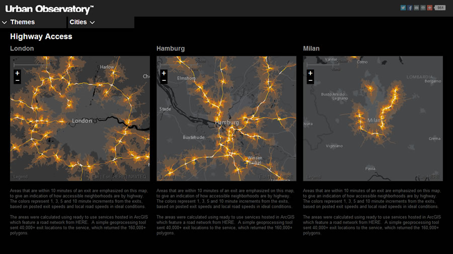
New map themes in the observatory allow comparisons of cities’ Highway Access maps using global street data from the GIS data provider HERE, Predominant Occupations maps from Martin Prosperity Institute, and ParkScore maps from The Trust for Public Land. Each of these maps was developed using ArcMap in ArcGIS for Desktop, then published as map layers in ArcGIS Online.
Urban Observatory is accessible online, anytime, at www.urbanobservatory.org.
