When making a map in ArcGIS Pro, you may want to customize your legend. This could be by modifying text such as the title or labels; adding graphic elements like arrows; or adding a caption to note, for example, the data source. Enhancements like these can make the legend more comprehensible and informative.
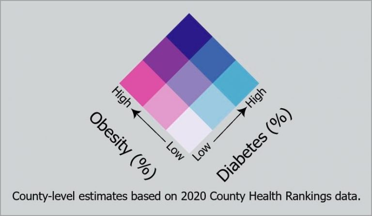
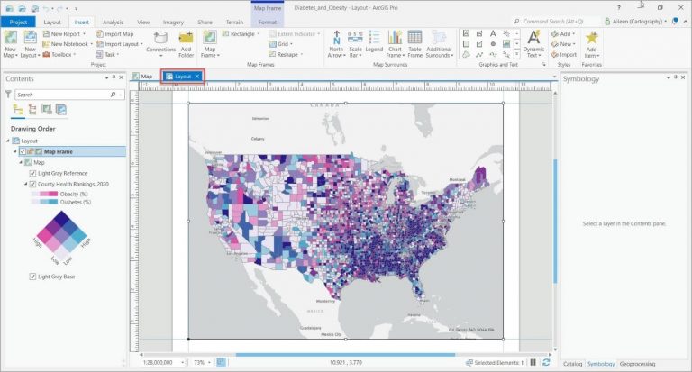
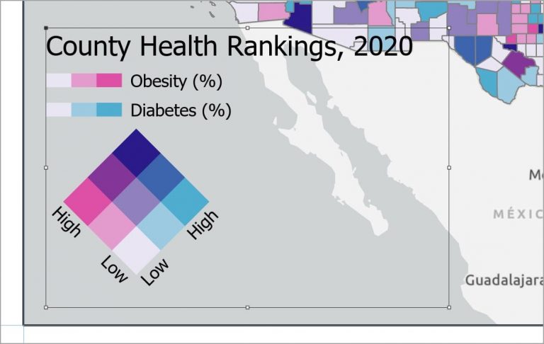
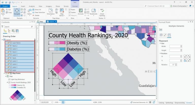
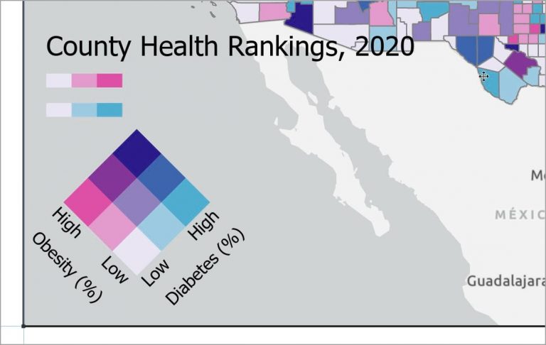
This tip describes how to use ArcGIS Pro to make the legend, shown above, for a bivariate colors map.
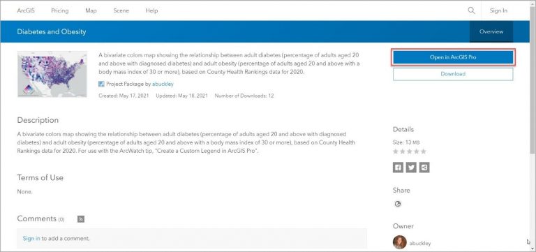
Step 1: Open a web browser and go to this ArcGIS Online item.
Step 2: In the item page that opens, click Open in ArcGIS Pro.
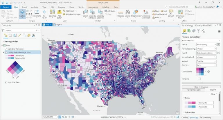
Step 3: In the Contents pane, click the County Health Rankings, 2020 layer to see the symbology used to display this layer.
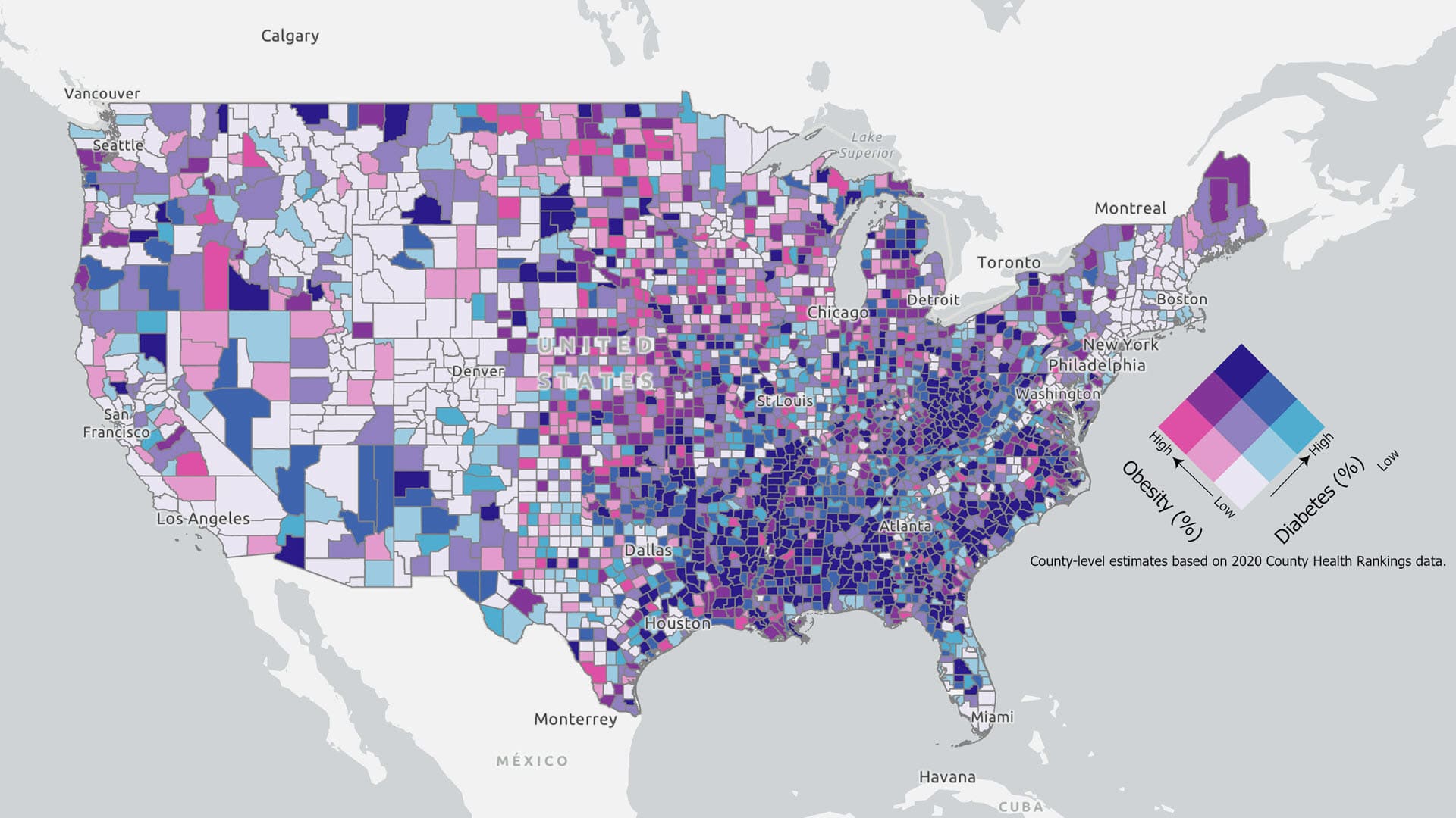
The map above shows data in the 2020 County Health Rankings layer, available in ArcGIS Living Atlas of the World. Blue shows the percentage of the adult population aged 20 and above with diagnosed diabetes, and pink shows adults aged 20 and above with a body mass index of 30 Counties. Purple shows locations with both diabetes and obesity.
Step 4: Click the Layout tab to see the layout that has been created for this map.
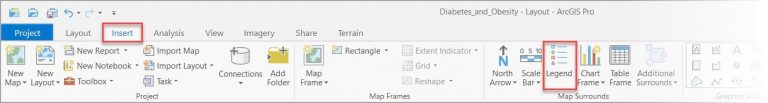
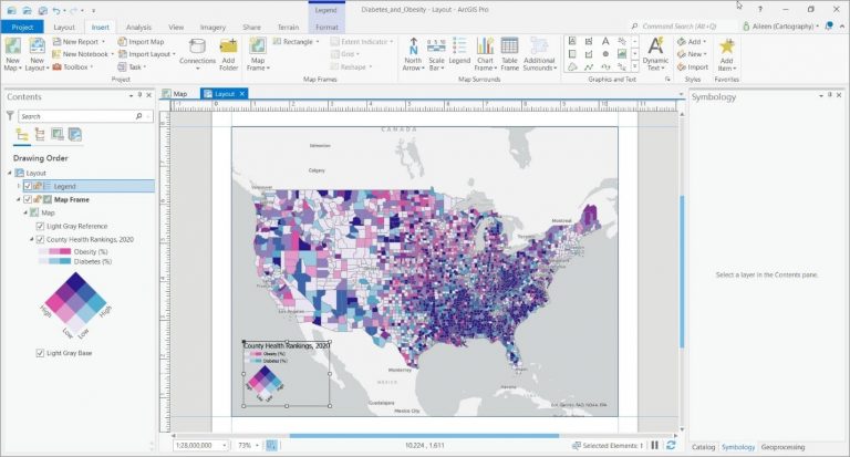
Step 5: On the Insert tab, in the Map Surrounds group, click Legend.
Step 6: In the empty space at the lower left of the layout, place your cursor where you want to define the upper left extent of the legend, then click and move the cursor to the location you would like to use to define the lower right extent and release the mouse button.
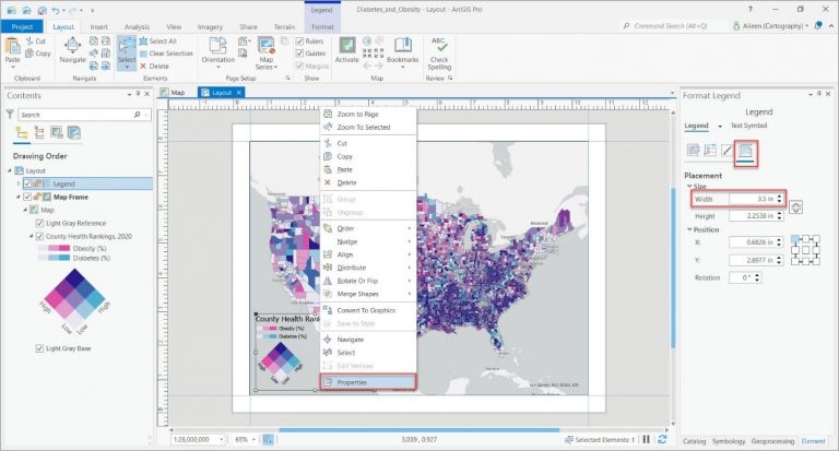
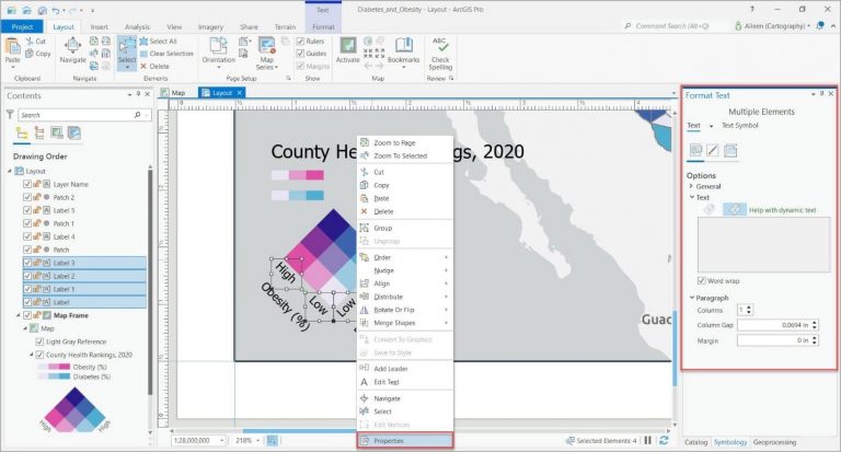
Step 7: Right-click the legend and then, in the context menu, click Properties . In the Format Legend pane, click the Placement tab and change Width to 3.5 in. This will ensure that the font sizes below will work for your legend.
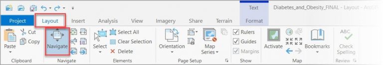
Step 8: On the Layout tab, in the Navigate group, click Navigate.
Step 9: Click while holding the Shift key to create a rectangle around the legend to zoom into that area.
The handles along the edge of the rectangle indicate that the legend is already selected.
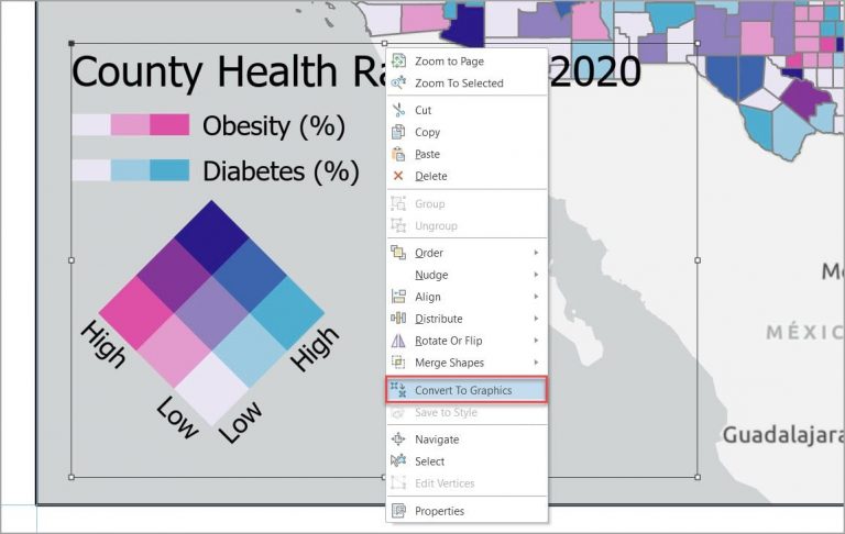
Step 10: Right-click within the selected rectangle and, in the context menu, click Convert to Graphics.
Step 11: Right-click within the selected rectangle and, in the context menu, click Ungroup.
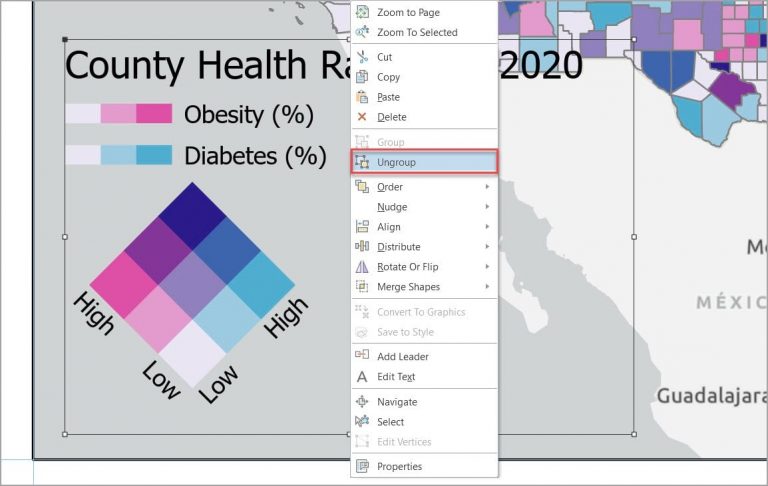
The legend is no longer linked to the map, and you can modify the individual elements that make up the legend. Note that these elements are also displayed in the Contents pane.
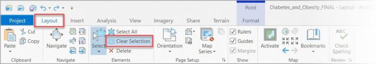
Step 12: On the Layout tab, in the Elements group, click Clear Selection.
Note: If at any time you need to select an element and the Select tool is not enabled, click the Select tool in the Elements group of the Layout tab.
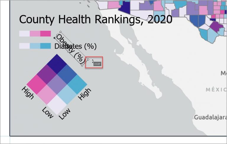
Step 13: Select the text for Obesity (%). Point near the upper-right handle to see the rotate control, then use the number indicator to rotate the text 315°.
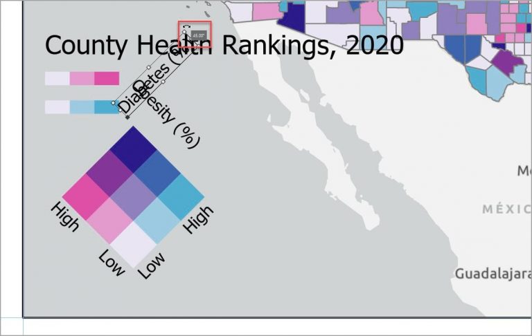
Step 14: Perform the same process on the text for Diabetes (%) to rotate it 45°.
Step 15: Move the Obesity (%) text to the left side of the legend and the Diabetes (%) text to the right side of the legend.
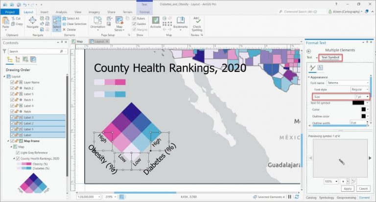
Step 16: Hold down the Shift key and select all four pieces of text for High and Low, then right-click and, in the context menu, click Properties. The Format Text pane will open, allowing you to modify the text and its appearance.
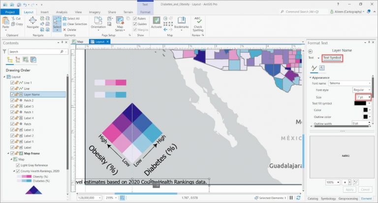
Step 17: Click the Text Symbol tab, expand the Appearance section, change Size to 7 pt, and click Apply.
Step 18: Deselect all text elements and reselect them individually to fine-tune the position of the each.
Note: The layout elements may be snapping to guides or existing page elements. You can temporarily disable snapping by pressing the spacebar while you are moving elements. To learn more, see the section on snapping in the online help topic Set Up Your Layout.
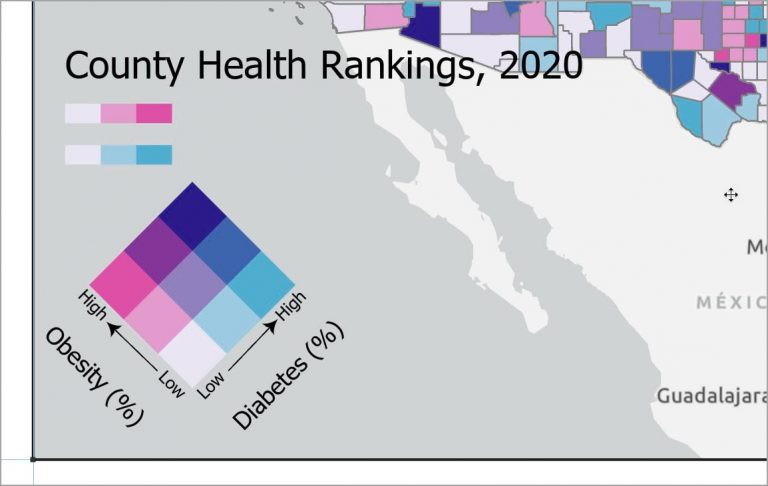
Step 19: See this ArcWatch tip, Giving Direction: Add Arrowheads to Line Features in ArcGIS Pro, and follow the steps to add an arrow pointing from Low to High on each side of the legend.
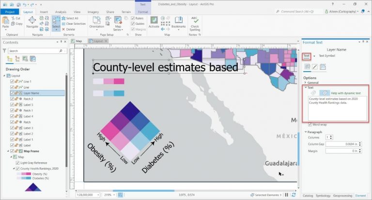
Step 20: Select the legend title. In the Format Text pane, on the Text tab, change the text to County-level estimates based on 2020 County Health Rankings data.
The full title does not appear because the text is too large to fit into the extent shown by the box around the text. You will take care of this problem in the next step.
Step 21: Repeat steps 16 and 17 to change the text size to 7 pt and position the text under the legend.
Step 22: Select the pink and blue color ramps and delete them.
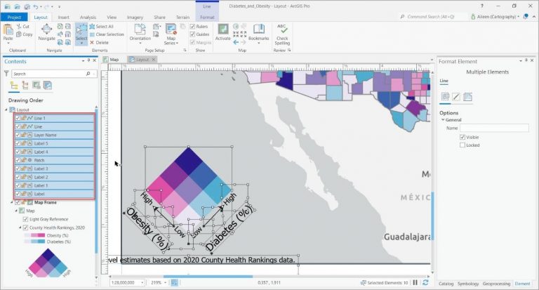
Step 23: In the Contents pane, hold the Ctrl key and select all the legend elements. Do not select the Map Frame element. If you inadvertently select it while the other elements are selected, hold the Shift key and click the Map Frame element to unselect it.
Step 24: In the Layout View, hover over the rectangle for any selected element; right-click; then, in the context menu, click Group.
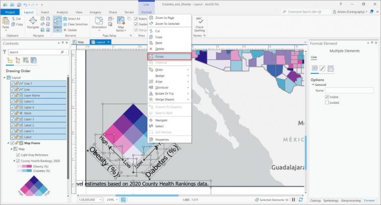
The grouped legend elements can be moved as a single page element.
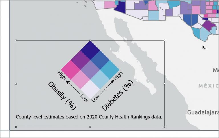
The layout now contains a custom legend for the bivariate colors map with text in different sizes, arrows, and a caption.
With the tools in the context menu and the options in the Element pane (as well as additional tools on the Format tab on the ribbon which were not discussed in this tip), the possibilities for modifying legends and other map elements are endless. Try making other modifications to your maps using all of these options, and you will find that you can take your maps’ layouts to an even higher level.
