In the following tip, you’ll map pink lakes around the world. You’ll make the map pink to match its colorful theme. Most pink lakes get their color from salt-loving algae and archaea. Your map will get its color from a blend mode.
Changing the color of a basemap is a fun trick that allows you to quickly change the tone of your map or create a custom look and feel. In this example, you’ll make a map with a fun and frivolous tone, but the same trick can be applied to give a map a somber, historic, or edgy feel or to match the colors of a brand or event.
Turn Your Map Pink
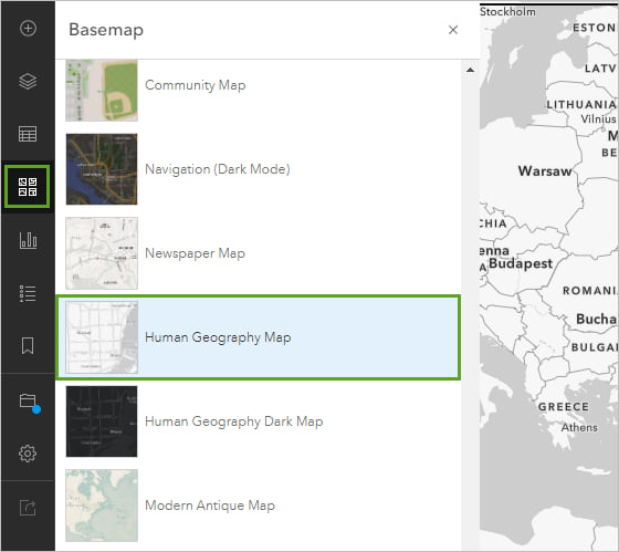
Step 1: Open Map Viewer in ArcGIS Online. Change the basemap to Human Geography Map.
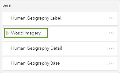
Step 2: At the top of the Basemap pane, click the Current basemap button. Move the Label and Detail layers into the Base part of the basemap.
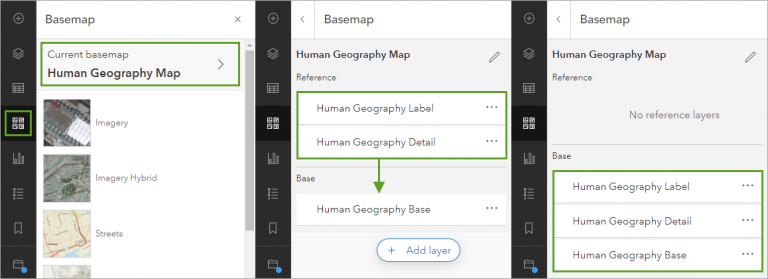
This doesn’t have any visual impact on your map yet. But it will be important later: layers in the Reference category draw on top of the map’s data layers, while layers in the Base category draw beneath. Only those layers in the Base category will turn pink.
Next, you’ll add the layer that will make things pink.
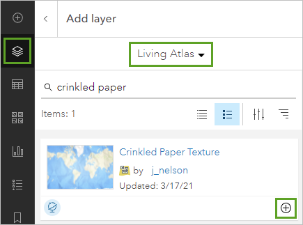
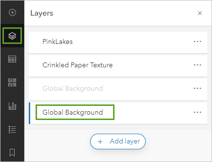
Step 3: On the Layers pane, click Add layer. Search for the Global Background layer from ArcGIS Living Atlas of the World and click the Add button.
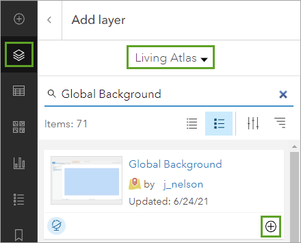
This is a giant rectangle that covers the entire world, currently colored black.
Step 4: Open the Styles options for the Global Background layer.
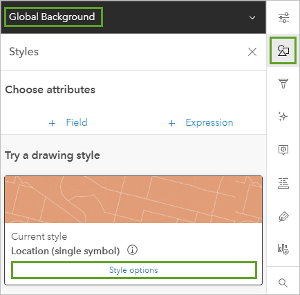
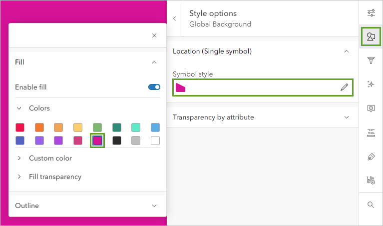
Step 5: Click Style options and then the box under Symbol style, and change the color to pink. Click Done.
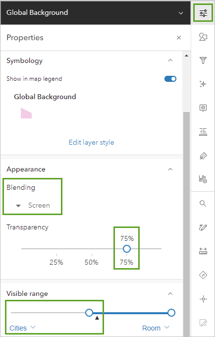
Step 6: In the Properties pane, change Blending to Screen.
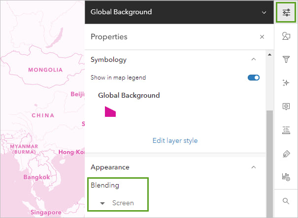
Now you have a pink map! Even the labels are pink because you moved them into the Base part of your basemap, sitting below the pink layer.
Step 7: For some additional fun, you can add the Crinkled Paper Texture layer, which is also from ArcGIS Living Atlas and created by Esri cartographer John Nelson.
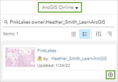
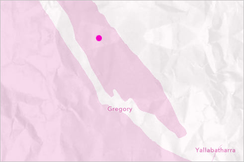
You’ll add one more layer—the thematic data for the map. This is a layer that you can use to map pink lakes around the world.
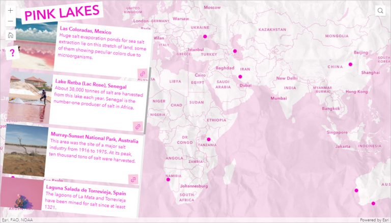
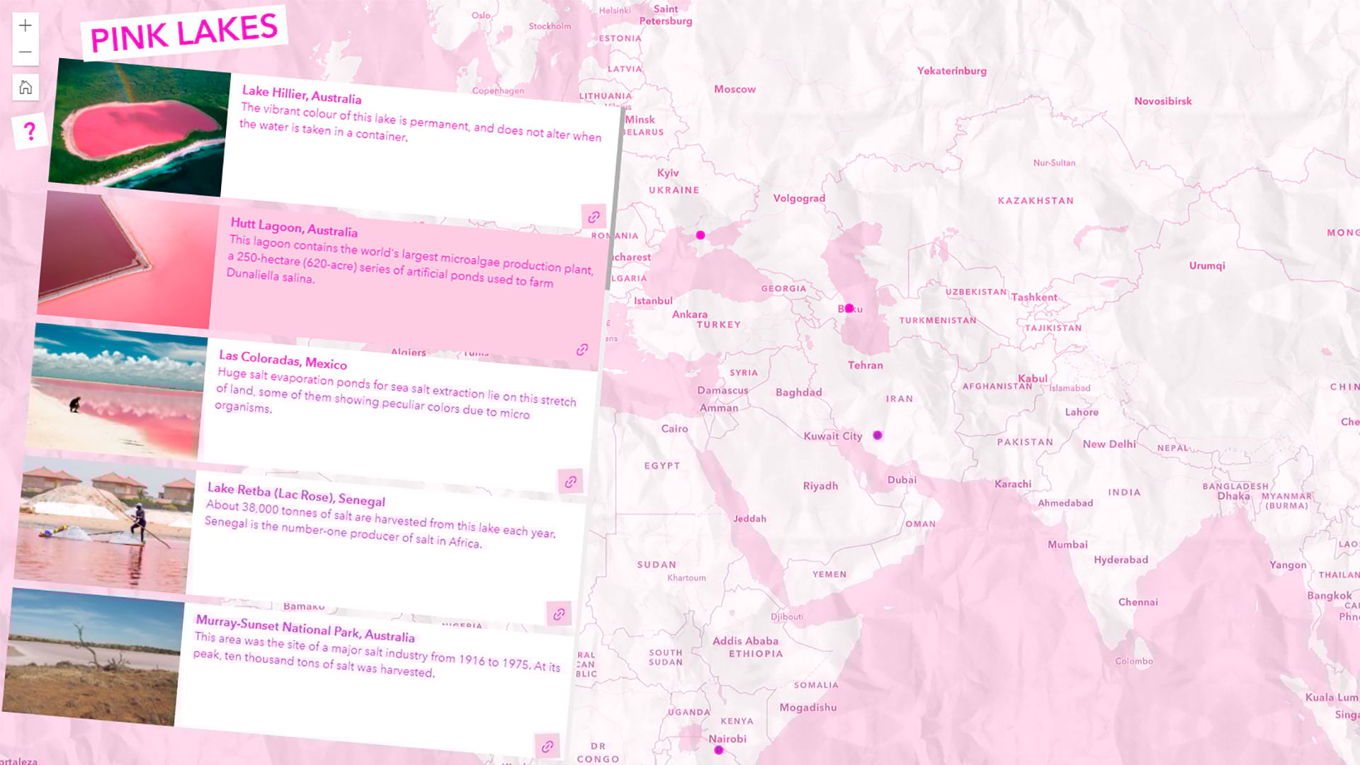
Step 8: Search ArcGIS Online for PinkLakes owner:Heather_Smith_LearnArcGIS or e7b526eed14a402cb509b5ba9119a0d2. Add the PinkLakes layer.
Make Your Pop-Ups
The pink lakes data on the map contains information about each lake in the attribute table, including links to photos and more information.
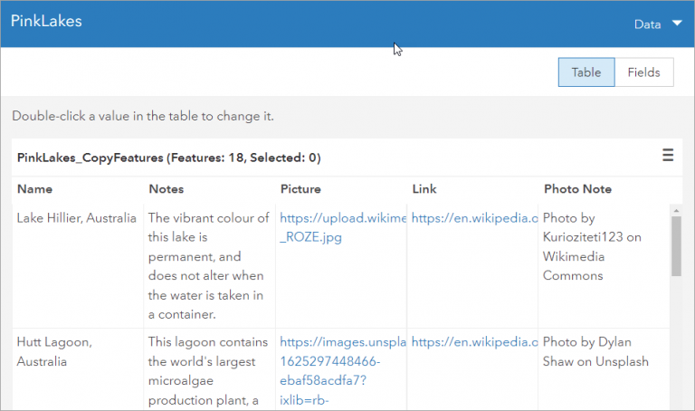
Now you can expose some of this information in the layer’s pop-ups.
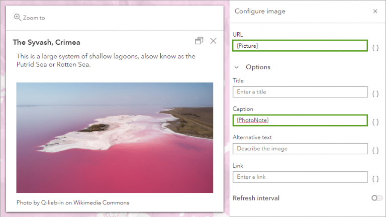
Step 1: Click Configure pop-ups. In the Pop-ups pane, click Title and then click the attribute button (identified by a pair of braces-{}), and choose the Name field.
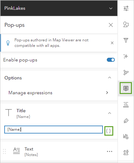
Step 2: Click Add content and choose Image.
Step 3: For URL, click the attributes button and choose the Picture field. For Caption, choose the Photo Note field. Click Done.
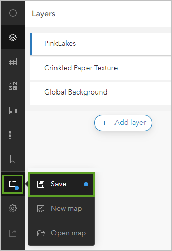
Step 4: Save the map.
Control What Appears at Each Scale
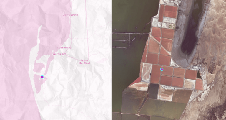
Human Geography Map is a great basemap, but when you zoom in to any of the lakes, you can’t see much.
So you’ll make the imagery basemap appear instead whenever people zoom in.
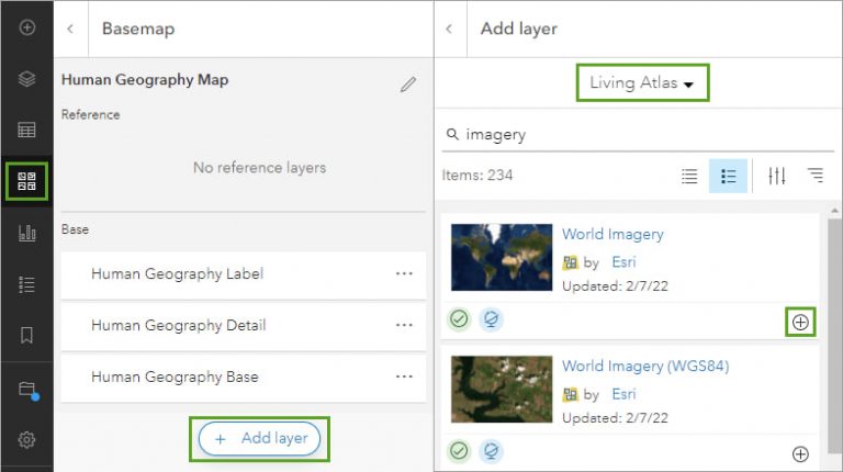
Step 1: Open the Basemap pane to the Current Basemap layers again.
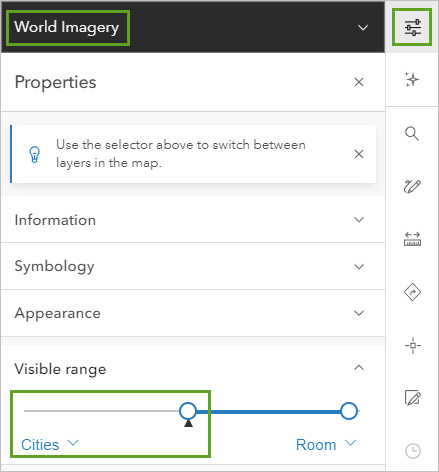
Step 2: Click Add layer and add the World Imagery layer from ArcGIS Living Atlas.
Step 3: Drag the World Imagery layer below the Label layer.
Next, you’ll make sure that the imagery layer only appears when you are zoomed in.
Step 4: In the Properties pane, for Visible range, change World to Cities.
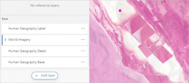
Now when you are zoomed in, you can see the lakes. However, the pink over the imagery might be a bit overwhelming.
Next, you’ll tone down the pink on the Imagery basemap, while leaving it vibrant on the Human Geography basemap.
Step 5: In the black bar at the top of the Properties pane, click the dropdown, and change World Imagery to Global Background.
Step 6: For Visible range, change Room to Cities.
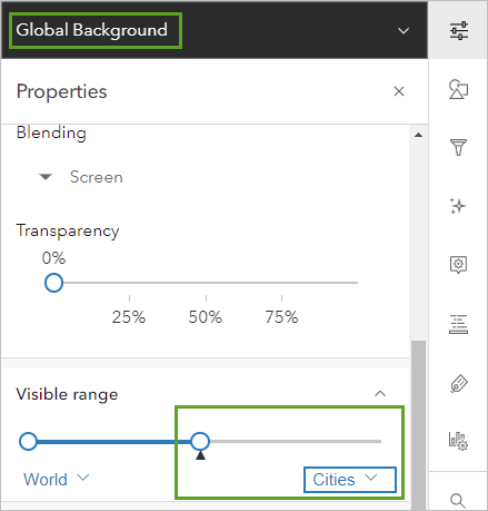
Step 7: In the Layers pane, click Add layer and add another copy of the Global Background layer from ArcGIS Living Atlas. Move it to the bottom of the layer list.
Step 8: For the new layer, open the Style pane and change the color to pink.
Step 9: Open the Properties pane and change Blending to Screen.
Step 10: Set Transparency to 75 percent. For Visible range, change World to Cities.
The idea is to have two copies of the pink Global Background layer. You set the visible ranges so one only appears for the Human Geography basemap, and the other only appears for the Imagery basemap. The one that goes with the Imagery basemap is also transparent, so the imagery can be seen more clearly. It still casts a pinkish tint.
Step 11: Save the map.
Your map is complete! Try mixing it up with different colors and basemaps to get other effects. If you want to compare your map to the one created for this tip, you will find it on this page.
Now that the map is complete, consider sharing it inside of a web app. Esri has several products for creating web apps that don’t require any coding. If you’ve never made a web app before, try ArcGIS Instant Apps in ArcGIS Online. If you want lots of customization control, try ArcGIS Experience Builder.
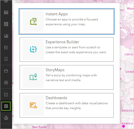
An app was built for the pink lakes map using ArcGIS Experience Builder. View the app.
You can read about how to make this app at esri.com/arcgis-blog/products/experience-builder/mapping/pretty-in-pink-2/.