The New Map Viewer’s Color Ramps Offer Color-Blind-Friendly and Other Options
As cartographer and geography professor Cynthia A. Brewer notes in Designing Better Maps, you can make your maps easier to read by ensuring that the colors on your map match the logic in your data. This involves choosing a set of colors—that is, a color ramp—that corresponds with the arrangement of the data you are mapping, such as unique values, values that range from high to low, or values above and below a critical value.
The new Map Viewer (formerly called Map Viewer beta) in ArcGIS Online and ArcGIS Enterprise provides access to more color ramps than were available in Map Viewer Classic (previously named Map Viewer). It also provides filtered sets of appropriate color ramps to use based on the color of the map’s background as well as the user’s desire to use specific color hues, preference for bright or subdued colors, or need for ramps that are accessible to color-blind users, as shown in the image below. The new Map Viewer makes finding the best color ramps for your map quicker and easier than ever.
Numerous Esri cartographers, with decades of experience in color theory and knowledge of how perceptual differences between colors work, created the Map Viewer color ramps. With over 370 color ramps, there are now almost 150 more than the 222 color ramps available in Map Viewer Classic. Visit this ArcGIS Developers website page to see the 340 unique color ramps. However, Esri also offers 32 color ramps for relationship mapping, also known as bivariate choropleth mapping.
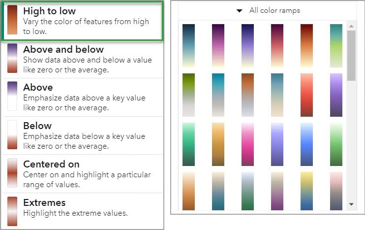
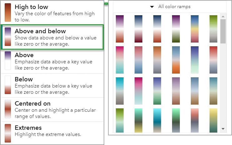
Choosing the color ramp to use from such a large set might seem daunting, but Map Viewer takes some of the guesswork out of the process by helping you select appropriate color ramps for your specific map. As with Map Viewer Classic, once you choose the basemap, the field(s) to map, and the drawing style to use, the new Map Viewer displays the map with a color ramp that is likely to be appropriate. If you change the theme—for example, High to low or Above and below—the color ramps to choose from will also change. Each drawing style—such as Counts and Amounts, Bivariate, or Predominance—also has a different set of ramps to choose from.
With the new Map Viewer, you now have the option to filter the color ramps by helpful categories, as shown in the first image (above at the right). In this tip, the focus is on the color-blind-friendly color ramps. According to the organization Colour Blind Awareness, color blindness, or color vision deficiency, affects approximately 4.5 percent of the population. That means 1 in 12 men (8 percent) and 1 in 200 women (.5 percent) are unable to distinguish between certain colors, most commonly reds and greens.
Fortunately, almost 80 percent of the color ramps available in the new Map Viewer are color-blind accessible. Each ramp was individually tested with a color-blindness simulator, such as Color Oracle, to verify that the ramp shows detectable color variation when the three most common types of color blindness are simulated. The result: more than 290 color-blind-friendly color ramps are available.
Follow the steps below to learn how to use the new Map Viewer to find the color-blind-friendly color ramps and use one to style a map. In this example, you will work with a map showing the percentage of US households that have a female head and children under 18.
Step 1: Open this link to find a map with a layer called Female Head of Household with Children.
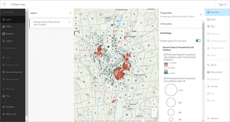
Step 2: To give the map some more screen space, click the X on the Layers pane to close it. Note that you can open this pane again by clicking the Layers button on the map contents toolbar at the left.
Step 3: Click the X on the Properties pane at the right. As with the Layers pane, you can reopen this pane by clicking the Properties button on the settings toolbar at the right.

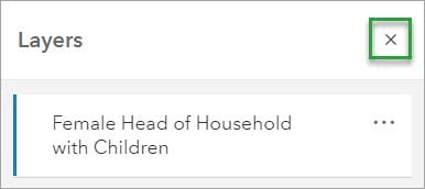
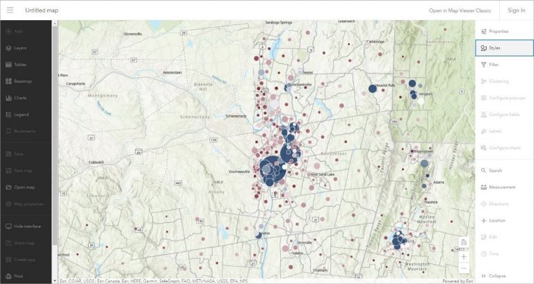
Step 4: On the settings toolbar, click the Styles button.
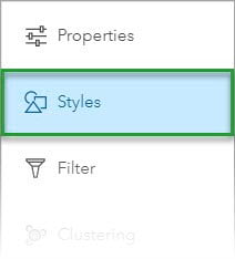
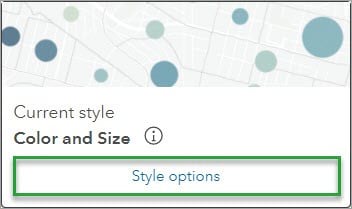
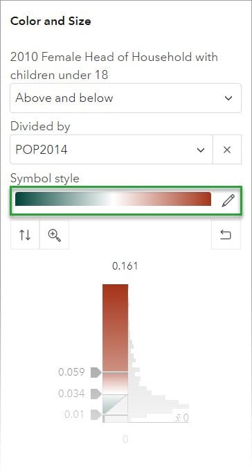
Step 5: For the currently selected style—Color and Size—click Style options.
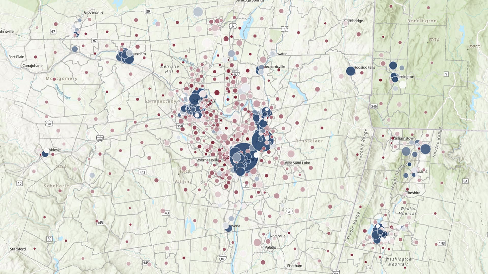
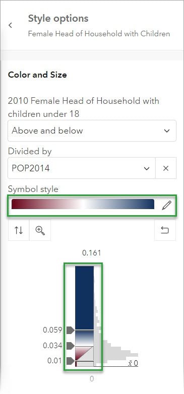
Step 6: Note that on the maps and in the image below, red colors show values above the national average and green colors show values below the average. Using these colors will likely cause problems for anyone with red-green color blindness. To select a better option, click the color ramp that is shown in the Symbol style box.
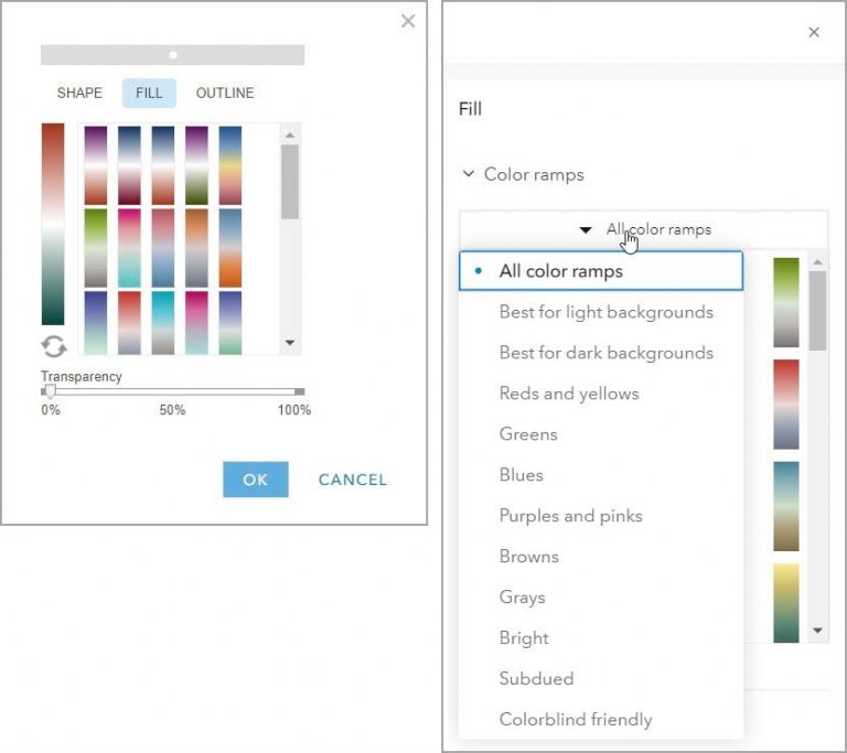
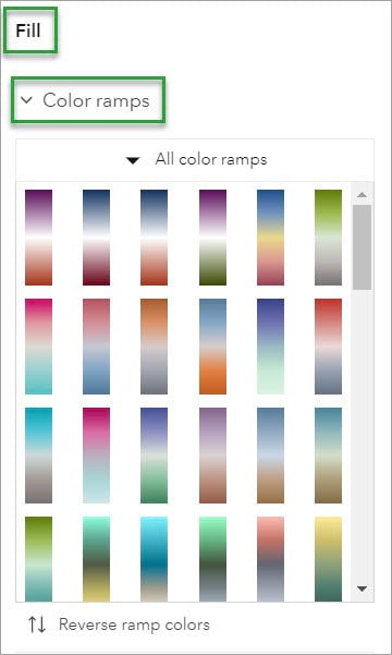
Step 7: In the Symbol pane, scroll down to Color ramps in the Fill options.
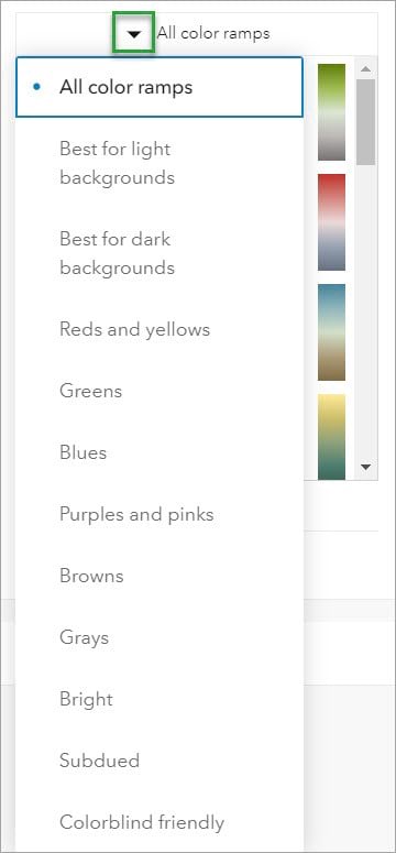
Step 8: Click the down arrow to the left of All color ramps . Here you can change the selection from All color ramps to a filtered set of color ramps. The filtered sets include All color ramps, Best for light backgrounds, Best for dark backgrounds, Bright, Subdued, and Colorblind friendly as well as specific colors, as shown below. The scrollbar at the right allows you to preview the ramps when an option is selected.
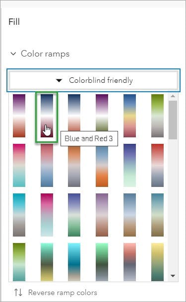
Step 9: Select Colorblind friendly and hover over the second ramp in the first row to see that its name is Blue and Red 3.
Step 10: Click this color ramp to see the newly selected colors in the Style options pane and to change the colors on the map.
Step 11. In the Style options pane, click Done.
Step 12: Click the X on the Style options pane to close it.
The map is now updated to show for each US county the percentage of households with female heads, with more than the national average in blue and less than the average in red.
The new Map Viewer makes it easy to find color-blind-friendly symbology options for your maps. Also, try experimenting with other categories of color ramps, such as Best for light backgrounds, Blues, or Bright. Choosing the best color ramps for your web maps is now easier than ever in the new Map Viewer.
To learn more, check out the following resources:
- Esri Accessibility, a website that contains Accessibility Conformance Reports (ACR)® for Esri products, solutions, and services.
- “The Tale of Two ArcGIS Online Map Viewers,” a blog post with a functionality guide to compare Map Viewer and Map Viewer Classic
- “New Color Ramps in Map Viewer,” a blog post describing the color ramp categories in the new Map Viewer
- “Better Colors for Better Mapping,” a blog post introducing the following two online help topics:
- Esri Color Ramps—Search and filter the color ramps based on tags, the number of colors, ease of use for the color blind, and more.
- Choosing a Color Ramp—Make an informed decision about which ramps may be most appropriate for your use case.
