The ArcGIS API for JavaScript documentation added two guide pages to help you make smarter color choices while designing your maps.
The Esri Color Ramps guide provides a simple UI that allows you to explore hundreds of color ramps designed by numerous cartographers with decades of experience in color theory. The cartographers involved in creating these ramps have knowledge of how perceptual differences between colors work and how the human brain interprets (or fails to interpret) certain patterns.
This page was designed specifically for developers who have data, know what they want to map, and want to spin up a quick, good-looking visualization all in code.

Explore the color ramps
The Esri color ramps page allows you to filter ramps based on criteria that is meaningful to you. The Visualization best practices guide will help you make an informed decision about which ramps may be most appropriate for your use case. For example, if you are looking for blue-themed color ramps then pick the blues tag.


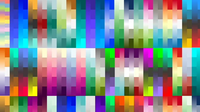
Are you a fan of dark backgrounds? There’s a filter for that as well. Just pick dark as illustrated below.


You can filter by other criteria, including the number of colors you need for your visualization, and the theme of it.


Is it a visualization of unique types or categories (categorical)? One that shows a sequence of high to low values (sequential)? Or perhaps a map that colors features based on whether they are above or below a particular value (diverging)? This page has you covered.

When you find a ramp you want to use, you can copy the hex values directly to the clipboard and paste them into your app.

If you prefer RGBA values, just click the information icon in the top-right corner of the card.
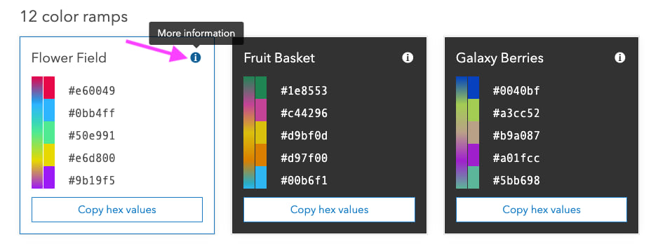
Then copy the values in the modal window to paste into your app. Notice this window also displays all tags associated with the ramp, along with its name.

Categorical example
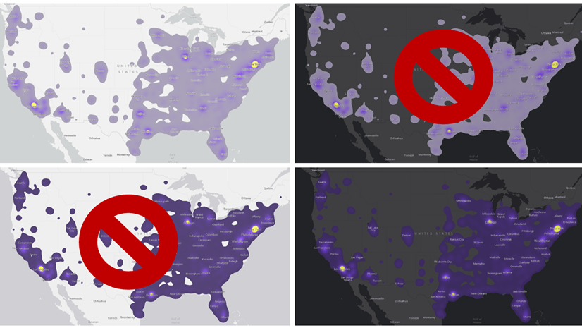
When mapping predominant crop yields, you may start out with a map that looks like this.
View the code
var fieldInfos = [
  {
    fieldName: "M172_07",
    label: "Wheat",
    format: {
      digitSeparator: true,
      places: 0
    }
  },
  {
    fieldName: "M188_07",
    label: "Cotton",
    format: {
      digitSeparator: true,
      places: 0
    }
  },
  {
    fieldName: "M193_07",
    label: "Soybeans",
    format: {
      digitSeparator: true,
      places: 0
    }
  },
  {
    fieldName: "M217_07",
    label: "Vegetables",
    format: {
      digitSeparator: true,
      places: 0
    }
  },
  {
    fieldName: "M163_07",
    label: "Corn",
    format: {
      digitSeparator: true,
      places: 0
    }
  }
];

function createSymbol(color){
  return {
    type: "simple-fill",
    color: color ? color : [0,0,0,0],
    outline: {
      color: [255,255,255,0.5],
      width: 0.5
    }
  };
}

const colors = [ "red", "blue", "green", "yellow", "purple" ];

const renderer = {
  type: "unique-value",
  field: "DOM_CROP_ACRES",
  legendOptions: {
    title: "Dominant crop in harvested acres by county (2007)"
  },
  uniqueValueInfos: fieldInfos.map(function(fieldInfo, index){
    return {
      value: fieldInfo.label,
      label: fieldInfo.label,
      symbol: createSymbol(colors[index])
    }
  }),
  defaultSymbol: createSymbol("gray"),
  defaultLabel: "No predominance"
}

It’s easy to pick a few colors at random to distinguish geographic patterns. However, it’s difficult to find colors that look good together. For example, this map uses a few familiar colors, but they don’t work well when used together.
const colors = [ "red", "blue", "green", "yellow", "purple" ];
By using the Esri colors guide page, I searched for categorical and light ramps. After trying a few by copying and pasting the colors directly into the app, I settled with Metro Movement.
const colors = [ "#ed5151", "#149ece", "#a7c636", "#9e559c", "#fc921f" ];
View the code
var fieldInfos = [
  {
    fieldName: "M172_07",
    label: "Wheat",
    format: {
      digitSeparator: true,
      places: 0
    }
  },
  {
    fieldName: "M188_07",
    label: "Cotton",
    format: {
      digitSeparator: true,
      places: 0
    }
  },
  {
    fieldName: "M193_07",
    label: "Soybeans",
    format: {
      digitSeparator: true,
      places: 0
    }
  },
  {
    fieldName: "M217_07",
    label: "Vegetables",
    format: {
      digitSeparator: true,
      places: 0
    }
  },
  {
    fieldName: "M163_07",
    label: "Corn",
    format: {
      digitSeparator: true,
      places: 0
    }
  }
];

function createSymbol(color){
  return {
    type: "simple-fill",
    color: color ? color : [0,0,0,0],
    outline: {
      color: [255,255,255,0.5],
      width: 0.5
    }
  };
}

// Metro Movement
const colors = [ "#ed5151", "#149ece", "#a7c636", "#9e559c", "#fc921f" ];

const renderer = {
  type: "unique-value",
  field: "DOM_CROP_ACRES",
  legendOptions: {
    title: "Dominant crop in harvested acres by county (2007)"
  },
  uniqueValueInfos: fieldInfos.map(function(fieldInfo, index){
    return {
      value: fieldInfo.label,
      label: fieldInfo.label,
      symbol: createSymbol(colors[index])
    }
  }),
  defaultSymbol: createSymbol("gray"),
  defaultLabel: "No predominance"
}

This looks much better.
Sequential example
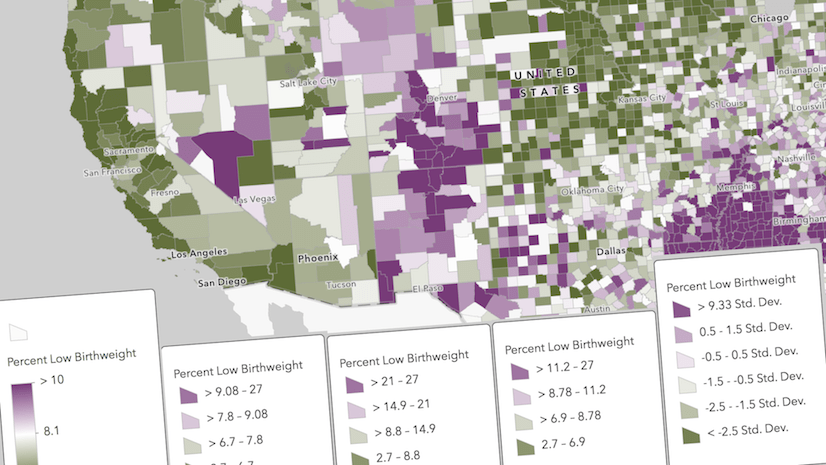
Similarly, when mapping sequential data, such as corn yield as a percentage of harvested acres, simply paste the color values in the stops of the color visual variable.
View the code
const renderer = {
  type: "simple",
  symbol: {
    type: "simple-fill",
    color: [0,0,0,0],
    outline: {
      color: [255,255,255,0.2],
      width: 0.5
    }
  },
  visualVariables: [{
    type: "color",
    field: "M163_07",  // harvested corn
    normalizationField: "TOT_CROP_ACRES",
    legendOptions: {
      title: "Corn yield as a percentage of harvested acres"
    },
    // Orange 2 ramp
    stops: [
      { value: 0.1, color: "#fee6ce", label: "< 10%" },
      { value: 0.4, color: "#fdae6b" },
      { value: 0.65, color: "#e6550d", label: ">65%" }
    ]
  }]
};

You can make the visual tell a more complete story by adding a size variable to show total corn yield.
View the code
const renderer = {
  type: "simple",
  symbol: {
    type: "simple-marker",
    color: color ? color : [0,0,0,0],
    outline: {
      color: [255,255,255,0.2],
      width: 0.5
    }
  },
  visualVariables: [{
    type: "color",
    field: "M163_07",  // harvested corn
    normalizationField: "TOT_CROP_ACRES",
    legendOptions: {
      title: "Corn yield as a percentage of harvested acres"
    },
    // Orange 2 ramp
    stops: [
      { value: 0.1, color: "#fee6ce", label: "< 10%" },
      { value: 0.4, color: "#fdae6b" },
      { value: 0.65, color: "#e6550d", label: ">65%" }
    ]
  },
  {
    type: "size",
    field: "M163_07",  // harvested corn
    minSize: "4px",
    maxSize: "30px",
    minDataValue: 100,
    maxDataValue: 700000
  }]
};

Of course, if you aren’t completely happy with the colors in the ramp, you can tweak them to your liking since you have full control of the styling of your layers.
Query color ramps
Version 4.14 of the ArcGIS JS API added a new colorRamps module making it easy to query these ramps. This module includes the following methods:
- all – Returns all color ramps available in the API.
- byName – Returns a color ramp matching a given name (e.g. “Orange 2”). These names are provided in the Esri color ramps guide.
- byTag – Returns color ramps containing (and/or excluding) a list of tags (e.g. “dark”, “reds”)
- names – Returns all color ramp names.
These methods allow you to query for specific ramps for direct use in your apps. This is particularly useful for apps designed for allowing users to style layers.
For example, I browsed through the color ramps and preselected several that I liked and added them to an app that allows the user to switch the colors in a sequential renderer.
View the code
// Pre-selected ramps given to the user
const rampNames = [
  "Orange 2",
  "Blue 6",
  "Green 4",
  "Pink 1",
  "Red 4",
  "Gray 1",
  "Purple 4"
];

const rampPicker = document.createElement("div");
rampPicker.classList.add("rampPicker");
rampPicker.innerHTML = "Select a ramp"

// get the colors associated with each ramp
// and render a preview in the UI
rampNames.forEach(function(rampName){
  const colorRamp = colorRamps.byName(rampName);
  const colors = colorRamp.colorsForClassBreaks[2].colors;

  const colorRampElement = symbolUtils.renderColorRampPreviewHTML(colors, {
    align: "horizontal",
    width: 100
  });
  const colorRampElementContainer = document.createElement("div");
  colorRampElementContainer.classList.add("ramp");

  // when the ramp preview element is clicked
  // update the renderer with the colors in the ramp
  colorRampElementContainer.addEventListener("click", function(){
    updateColorsInRenderer(colors);
  });

  colorRampElementContainer.appendChild(colorRampElement);
  rampPicker.appendChild(colorRampElementContainer);
});

function updateColorsInRenderer(colors){
  const renderer = layer.renderer.clone();
  const colorVariable = renderer.visualVariables[0].clone();
  colorVariable.stops.forEach(function(stop, index){
    stop.color = colors[index];
  });
  colorVariable.stops;
  renderer.visualVariables = [ colorVariable ];
  layer.renderer = renderer;
}
The app queries the color ramps and uses them as input to the
renderColorRampPreviewHTML method. This method renders a preview of the color ramp as either a continuous gradient, or as consecutive discrete colors.
The app below demonstrates how to query for all ramp names, and render a preview as a gradient and as discrete colors.
View the code
const maxWidth = 300;
const rampsContainer = document.getElementById("rampsContainer");

const colorRamp = colorRamps.byName("Blue 6");

const continuousColors = colorRamp.colors;
const discreteColors = colorRamp.colorsForClassBreaks;

discreteColors.forEach(function(ramp){
  // renders a color ramp discretely, each color in a square
  const colorRampElement = symbolUtils.renderColorRampPreviewHTML(ramp.colors, {
    align: "horizontal",
    gradient: false,
    width: maxWidth * (ramp.numClasses / 10)
  });

  const colorRampElementContainer = document.createElement("div");
  colorRampElementContainer.classList.add("ramp");
  colorRampElementContainer.appendChild(colorRampElement);
  rampsContainer.appendChild(colorRampElementContainer);
});

// renders a color ramp as a continuous gradient
const colorRampElement = symbolUtils.renderColorRampPreviewHTML(continuousColors, {
  align: "horizontal",
  gradient: true,
  width: maxWidth
});

const colorRampElementContainer = document.createElement("div");
colorRampElementContainer.classList.add("ramp");

colorRampElementContainer.appendChild(colorRampElement);
rampsContainer.appendChild(colorRampElementContainer);
Visualization best practices
The Visualization best practices page provides a guide about how to choose the most appropriate ramp based on the story you wish to tell.
I encourage you to read through this page and bookmark it for future reference. It contains the information discussed in this post along with more helpful details about choosing the best ramp for your map
Smart Mapping
If you’ve read some of my posts about Smart Mapping, you may recognize some of these color ramps. The color ramps exposed in the Esri colors guide page are internally used by the Smart Mapping APIs, which suggest color ramps appropriate for overlaying on top of a basemap.

While Smart mapping provides excellent tools and APIs for building powerful mapping applications, such as the new Map Viewer Beta, it isn’t intended to be used inside every app for styling layers.
That’s where the new guides and resources come into play. They make the color choices available to you in a more transparent way, without having to call any methods. Plus, the Smart Mapping methods create full renderers, including symbols with suggested outline widths and colors. When all you need is a ramp of colors, this guide will likely be your best option.
We welcome your feedback
Since these pages are brand new, we’re seeking your feedback for relevant content and UX/UI improvements. If you have any requests for enhancements, notice bugs, or have issues with the UX, please respond using the email feedback link at the bottom of the guide page. You can also create a more public post on GeoNet where collaboration from Esri staff and fellow users can help improve the content. We’re already aware of some room for improvement and will work to roll those improvements out as soon as possible.
Thanks for reading!

Commenting is not enabled for this article.