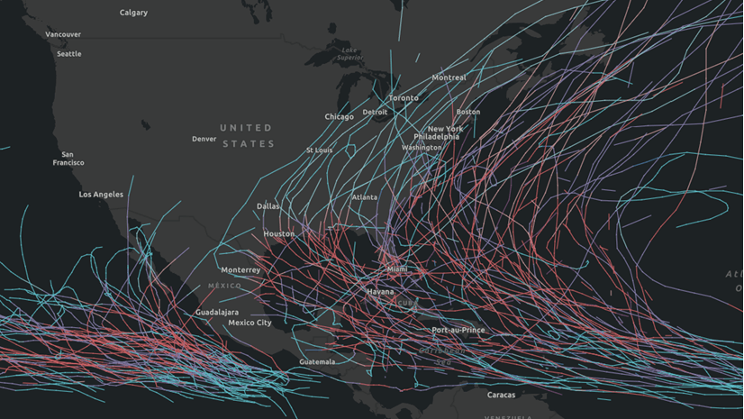
In the blog Our Four Favorite Ways to Map American Agriculture, four teammates from the ArcGIS Living Atlas team share four different approaches for mapping agricultural topics. This blog provides a tutorial for how to create the map Federal Payments toward Conservation/Wetlands vs Farming, which utilizes a relationship mapping style in ArcGIS Online. The data within this map is created by the United States Department of Agriculture (USDA), and comes from their 2017 Census of Agriculture.
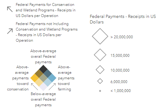
The map highlights where there are above-average amounts of Federal payments toward Conservation whereas areas in light blue have an above-average amount of Federal payments toward all other agriculture types. Areas in black have an above-average amount of both types of payments. The map uses size to emphasize which counties received the overall largest Federal receipts in US dollars.
Explore the map below to learn more about this pattern at the county level. Click on the map to see detailed Federal payments.
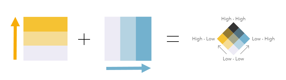
A relationship map is a powerful way to compare two different spatial patterns alongside each other within a single map. Instead of making two maps with two distinct patterns, we can overlay these to create a gridded legend which communicates how the two patterns intersect.
The steps to create a map like this in ArcGIS Online are:
- Add your layer to the map
- Choose two attributes to compare
- Map with Relationship and choose your colors
- Apply meaningful breakpoints to your map
- (Optional) Add another attribute to show with size
This bivariate mapping style is an interesting way to visualize and compare two topics, and can be a good way to explore new patterns in your data. This tutorial shows us how to accomplish the map above, but the same techniques could be used in your own maps.
Step 1- Add your layer to the map
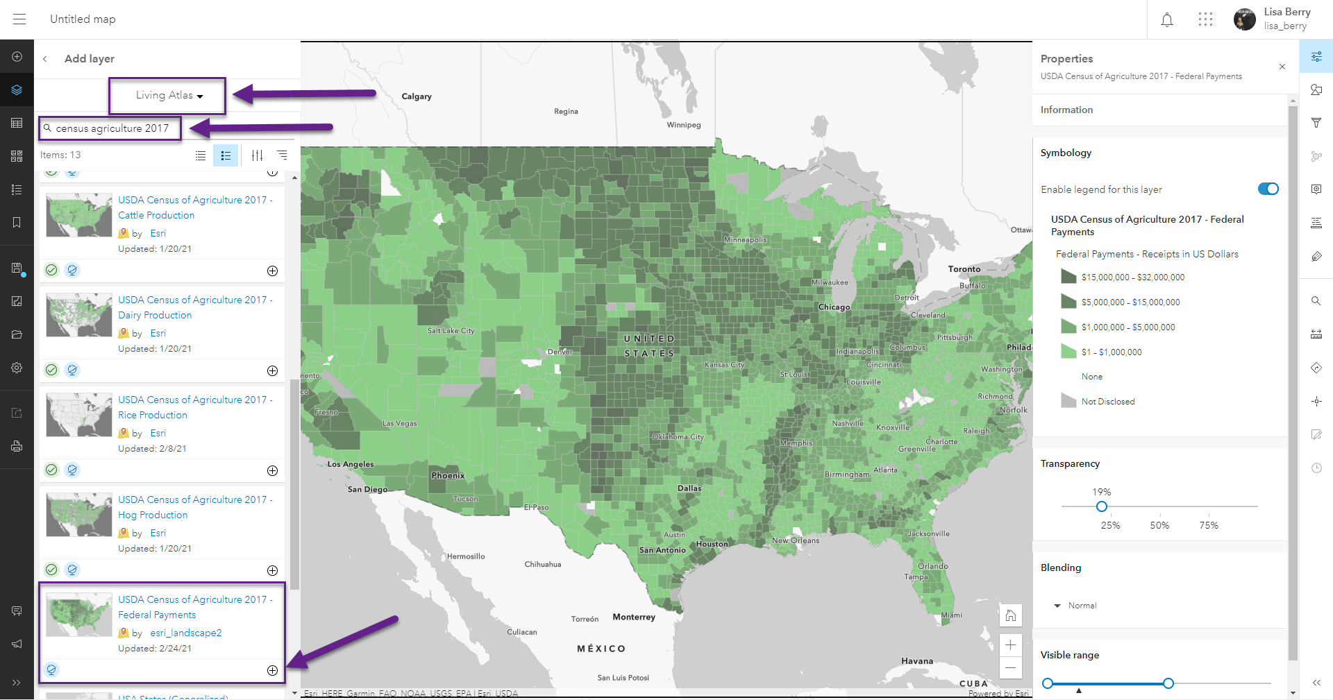
For the map we are making, we are utilizing one of the new ready-to-use Census of Agriculture layers from Living Atlas. These cover a wide range of topics such as production by crop type, sales, and more. The layer we are using is the Federal Payments layer, which summarizes payments made by the Federal government toward the agricultural industry.
This layer breaks down these Federal payments by the receipts in dollars, receipts in dollars per operation, and the count of operations receiving Federal money. These three breakdowns are available for all Federal payments, Federal payments for Conservation and Wetland Programs, and Federal payments not Including Conservation and Wetland Programs.
To add the layer to your map, search Living Atlas for “census agriculture 2017”. You’ll find all of the various USDA Census of Agriculture layers in Living Atlas, including the Federal Payments layer.
Step 2 – Choose two attributes to compare
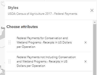
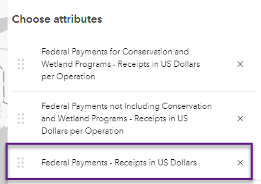
Within the Styles options on the right toolbar, select the two attributes you want to compare. In this case, I chose the following two attributes:
- Federal Payments for Conservation and Wetland Programs – Receipts in US Dollars per Operation
- Federal Payments not Including Conservation and Wetland Programs – Receipts in US Dollars per Operation
In more simple terms, this will compare Federal payments towards Conservation/Wetlands and all other farming.
I chose to map the amount per operation so that the numbers are easier to comprehend. Amount per operations helps us better understand “on average, how much does each farm get?” rather than “how much did all farms in this area get total?”. The distinction is that if one farm got a huge amount and all others got a small amount, the county would appear to have overall higher payments when in reality only one operation got a lump sum.
Step 3 – Map with Relationship and choose your colors
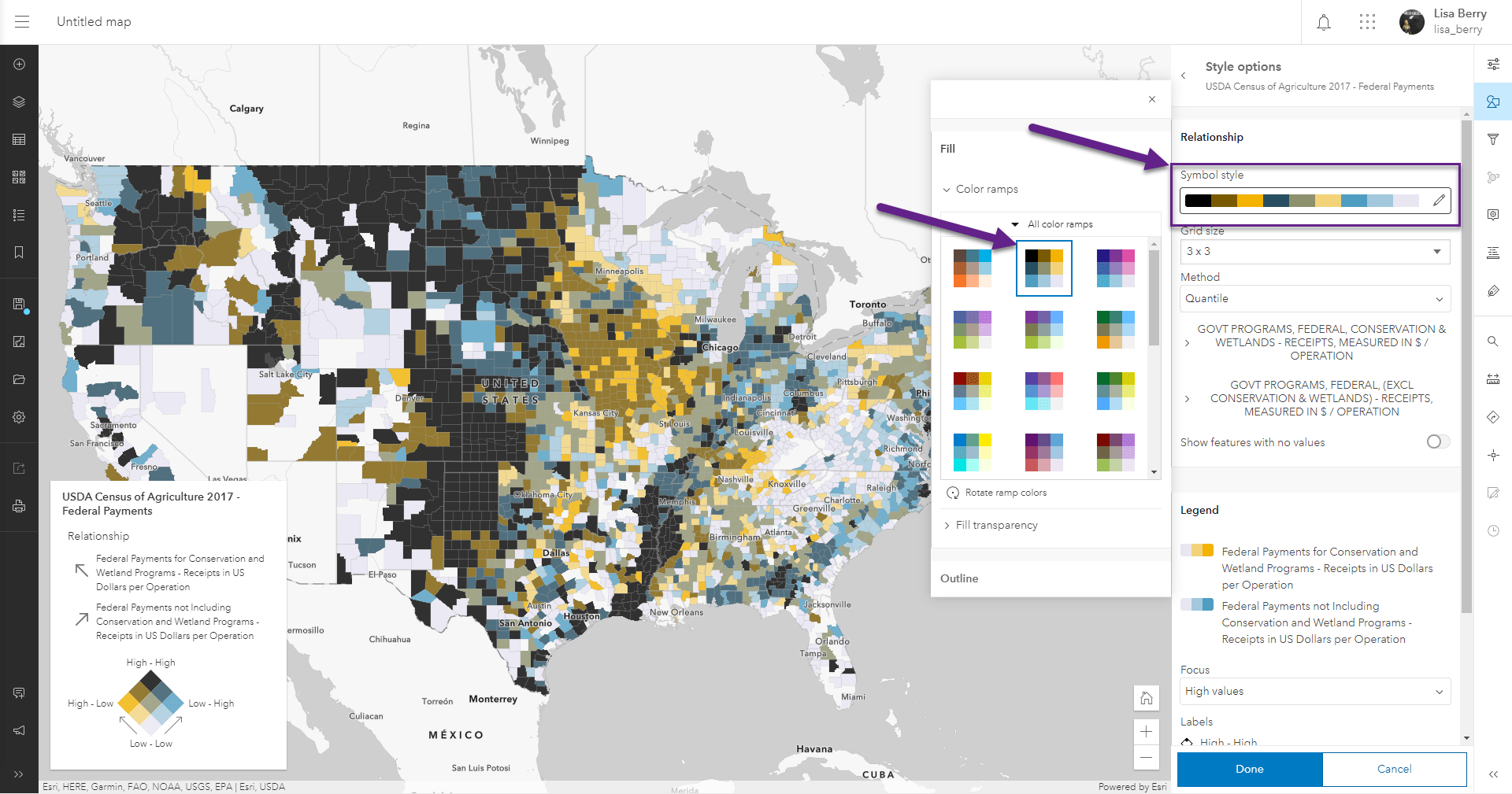
Scroll through the mapping styles until you find the Relationship style. Click on it to select it.
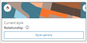
Many people would stop here and accept the map as-is, but so much of the map’s story would be lost. While the default settings give us a solid starting point, it is important to go one step further to explore your data and apply meaningful settings. Once you have selected the drawing style, choose Style Options to start customizing the map.
Under Symbol style, expand the options to see all of the different color ramps. I chose the yellow/blue/black ramp so that the two edge patterns would be distinct and the overlapping patterns would be a dark and bold color. This was a cartographic choice on my part, but try exploring the different ramps to see if they better suit your map’s topic.
Step 4 – Apply meaningful breakpoints to your map
Up until this point, we have let the software guide us through this mapping experience. Now, we can add our own knowledge/expertise to help give this map meaning. We already see some interesting patterns, but the default settings for this style use quantile breakpoints, which simply spread the data over enough colors to give a distinct pattern. Here is where we can add value to this map by using breakpoints that are meaningful to the topic.
In this case, we are investigating Federal spending, so we could ask ourselves, “How much money do farms or conservation programs typically get from the government?”
With just a few minutes of exploring the 2017 Publications from the USDA site, I was able to find the summary of Federal Government Payments. What this table tells us is that the average farm got $13,906 in 2017, and the average Conservation/wetlands program got $6,980 in 2017. These will help us anchor our map around the national average, rather than just accepting the defaults.
Using these as central points, and looking at the spread of data for each attribute, I choose new breakpoints to highlight which areas are above and below the national figures.
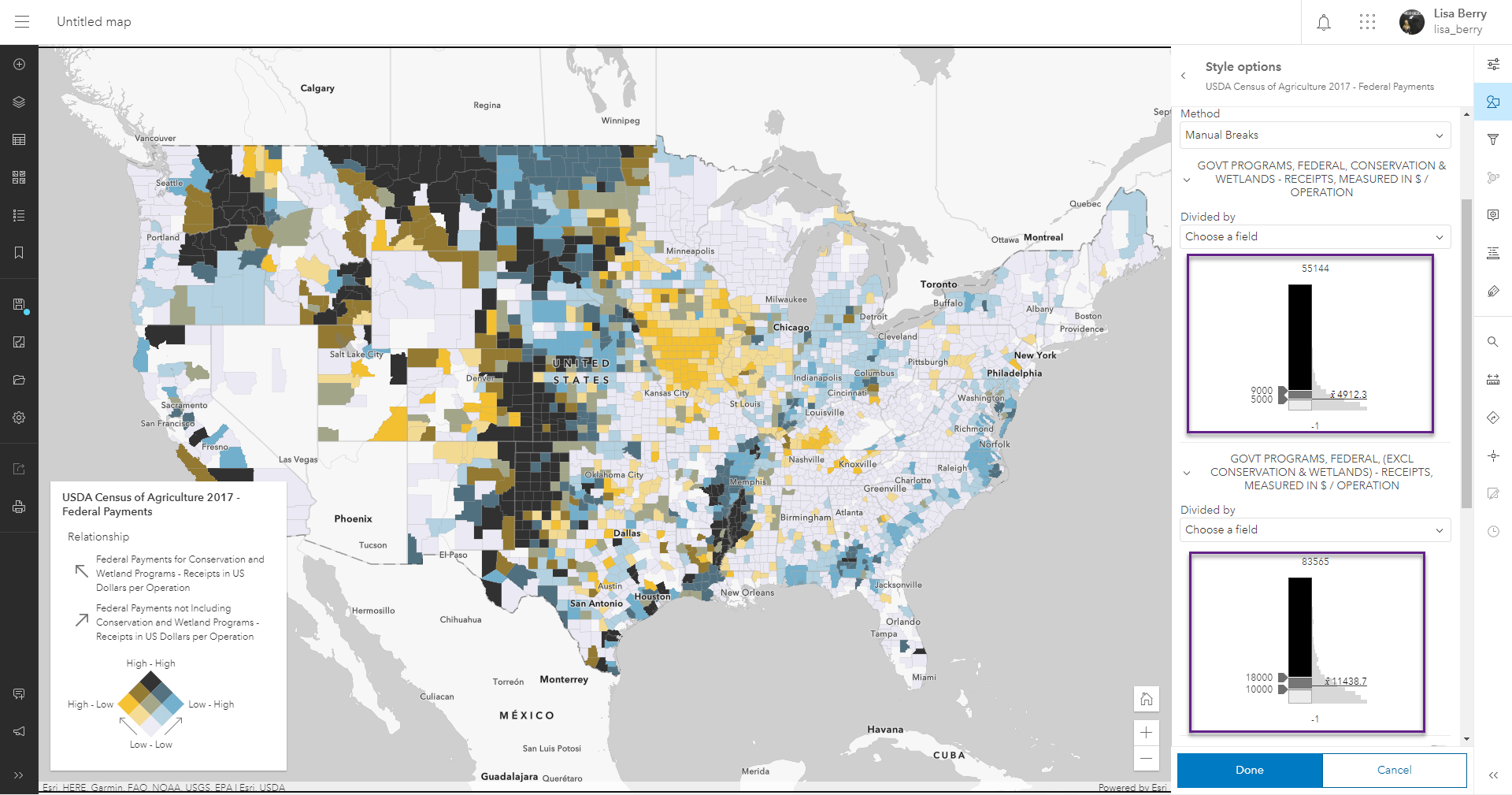
This map now tells us an interesting pattern about Federal spending for agriculture and how they compare to the national average. We can see distinct patterns in Iowa for Conservation, and pockets of high spending for farming in Nebraska. The areas in black stand out as areas where there is above-average spending for both.
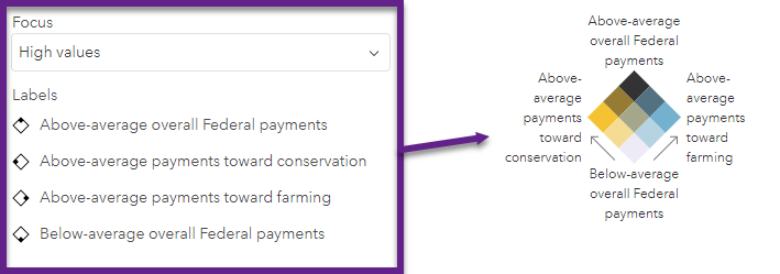
To help our map reader better understand the value we just added to the map, we can label the corners of our legend to make it easier to understand instead of just High-High, Low-Low, etc.
Step 5 (Optional) – Add another attribute to show with size
This step is not necessary since we already have a useful relationship map, but helps provide another layer to the story being told by our map. The map after step 4 already tells us where the spending is, but our eyes may be drawn toward larger polygons, simply because they use more pixels on the map. Adding a third attribute for size removes the arbitrary nature of county polygon sizes and also helps us see where the overall spending is going.
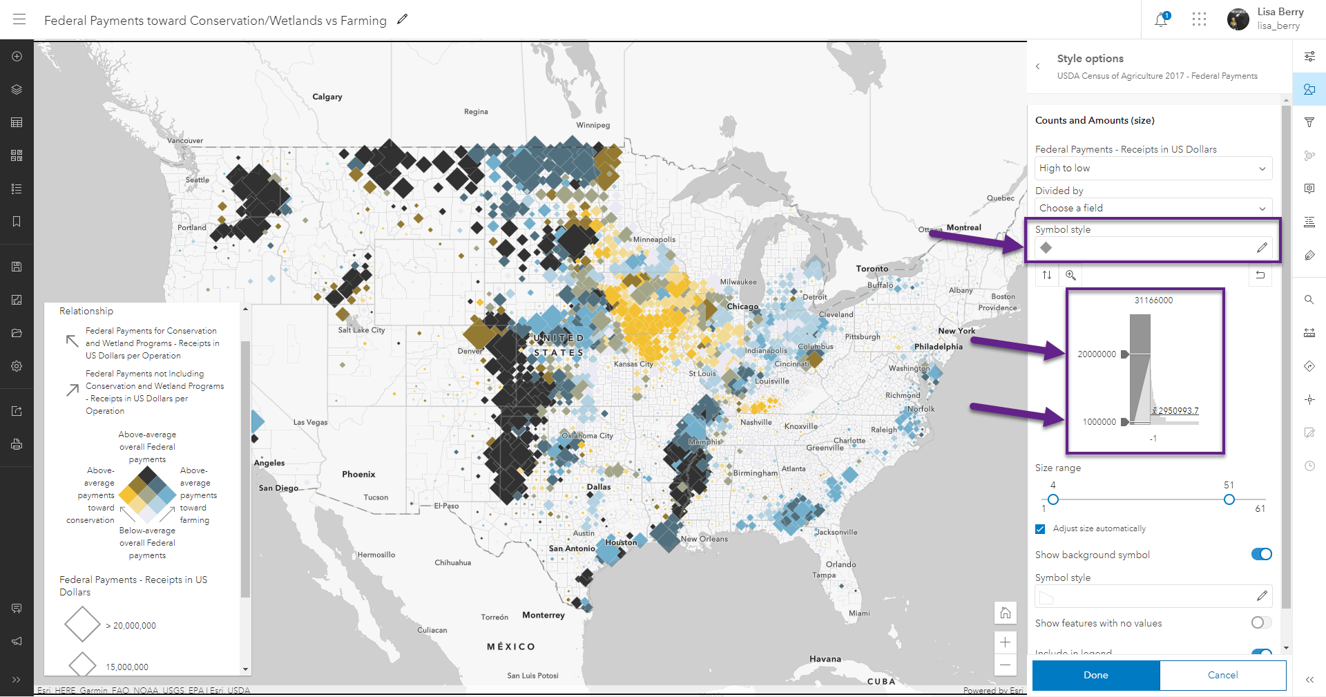
Click Done to save your settings so that you are back to where you choose your attributes. For this map, I am going to add a third attribute, Federal Payments – Receipts in US Dollars, so that we can emphasize total Federal spending.
Once you add the attribute, smart mapping will automatically adjust your map to use the Relationship and Size mapping style, and will maintain all of your color choices from before. Go into Style options to do the final customizations.
If you prefer the diamonds over the circles, go into Symbol style to make this change. I chose to use the diamonds because counties tend to overlap, and the diamonds can help them from covering each other in some cases.
Finally, adjust the size values so that the outliers of the data aren’t dictating the sizes of the entire map. Looking at the histogram within the interface, I chose 1 million as the lower range and 200 million as the upper range so that the sizes spread over the majority of the data, but with clean values for the map Legend.
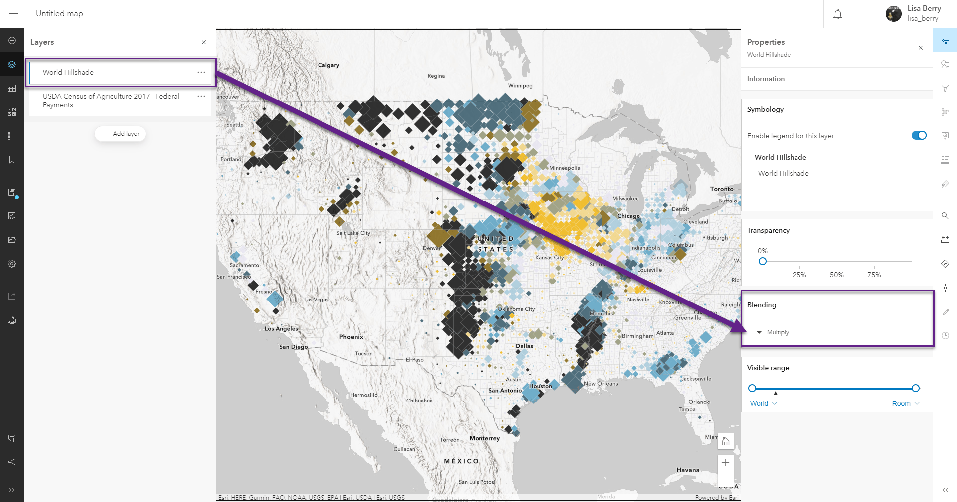
Extra Credit – Hillshade with Blending Modes
In the original map above, you may notice that the mountains appear in the map. This helps to add some additional geological context. Farming doesn’t tend to happen in mountainous areas (except a few crops such as grapes), so add the mountains can help bring additional meaning to the map.
To accomplish this look, add the World Hillshade layer by searching “world hillshade” within Living Atlas like you did in Step 1. Once the layer is in the map, select it on the left toolbar to see the layer Properties on the right toolbar. Within these properties, change the Blending setting to Multiply. This will allow the mountains and the data pattern to appear without fading the colors like you normally would see with transparency. Check out this blog for more information about using Blending modes with thematic data.
You are now ready to make your own Relationship maps with agricultural (or your own) data! This technique can be used to help you explore new patterns, and can be combined with techniques like Blending modes to bring new stories to life with your data.
We’d love to see the maps you make. Share them with us on Twitter or on Esri Community.
Happy Mapping!

Article Discussion: