Who are the people served by your city’s transit system? And who isn’t, but should be? How does transit change throughout the day? And what is the best way to analyze service areas? As urban areas are investing more time, money, and energy into creating public transit systems that increase accessibility and connect people to all the places they need to be, these questions are becoming more and more important. We’ll address these questions by exploring five new ways to view transit.
–
1. Use Service Areas instead of Buffers
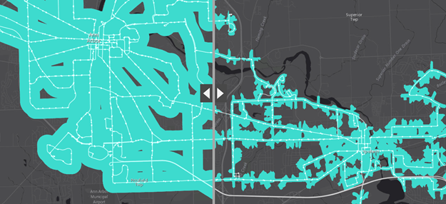
Suppose you would like to figure out what areas of your city are served by public transit. In this image, the map on the left shows a simple, 0.25-mile buffer around transit lines. However, simply having a transit line near you does not necessarily mean that you are served unless there is a stop or station there as well. Also, people depend on roads, paths, and sidewalks to reach transit stops; they can’t just walk in a perfectly straight line crossing over obstacles (rivers, construction, fenced-in areas, etc.) along the way. The map on the right, which displays a 0.25-mile service area around each stop using the city’s road networks, is preferred and more representative. Service areas around transit stops, as opposed to simple buffers around transit lines, are a much more accurate way to represent areas served by your transit system.
–
2. It’s About Time
A service area is a great way to start your transit analysis, but it’s also very important to include a time element in your assessment. Simply having a transit stop nearby does not mean you have good access to transit if that stop has infrequent service. On top of that, the frequency can also change drastically from weekday morning rush hours to Saturday afternoons to the wee hours of the morning. In this map, the brighter blue areas have a high frequency of over 20 trips made per hour. It is important to consider not just the areas of your city served by transit, but also how frequently they are served.–
–
–3. Public Transit is Dynamic
Even if you have frequent transit service available near you, you might still be poorly served by transit if it does not allow you to go where you need to go. What really matters is your ability to quickly and conveniently access the destinations you care about. Travel time between two places by transit can change rapidly throughout the day
depending on the transit schedule, particularly when service is infrequent. This line graph shows the travel time between two places in Cincinnati; the travel time ranges from around one hour to twenty-five minutes depending on the time of day and available transit service.
–
–4. Frequency Matters
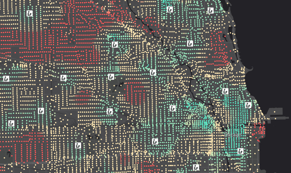
What if you wanted to understand how easy it is for people in your city to access important destinations such as jobs, healthcare, or other services? Travel time to those destinations matters, but the travel time may change significantly depending on the time of day. For this reason, it is important to factor in transit frequency into your analysis. But how can I do that? Good question. Here’s one idea: Determine the travel time to destinations at various times throughout the day and then calculate the percentage of those times that you can reach those destinations within a reasonable amount of time. For example, this map demonstrates the percent of times each Census block can reach a public library within fifteen minutes. Red areas have access to libraries within a short travel time only a small portion of the day while blue areas have a greater frequency of accessibility.
–
5. Understand the People
Knowing the people that are affected by transit is key to providing the optimal transit system. Which areas of your city or demographic groups are underserved by transit or have a high level of need for better access to certain types of destinations? This map combines the frequency of access from the previous map with Census demographic variables such as total population, low-income populations, and people without cars to determine which areas have a high level of need for better transit access to public libraries in Chicago.
–
–
5 New Ways to View Transit – A Story Map
This compelling Map Journal of new ways to view public transportation describes helpful best practices through examples of public library access in Chicago, Illinois and transit availability in Ann Arbor, Michigan. Click on the image below to explore this Story Map!
Thanks to Melinda Morang for contributions to this post.


Article Discussion: