The latest update of Community Analyst includes a number of improvements and enhancements. This release brings new customization options for infographics, more powerful suitability analysis, use of your own data across the app, data updates, performance improvements and much more. Here are the key highlights:
Create Infographics Like a Pro
Custom infographics help you present your analytics in a visually compelling and easy-to-understand format. Now you can:
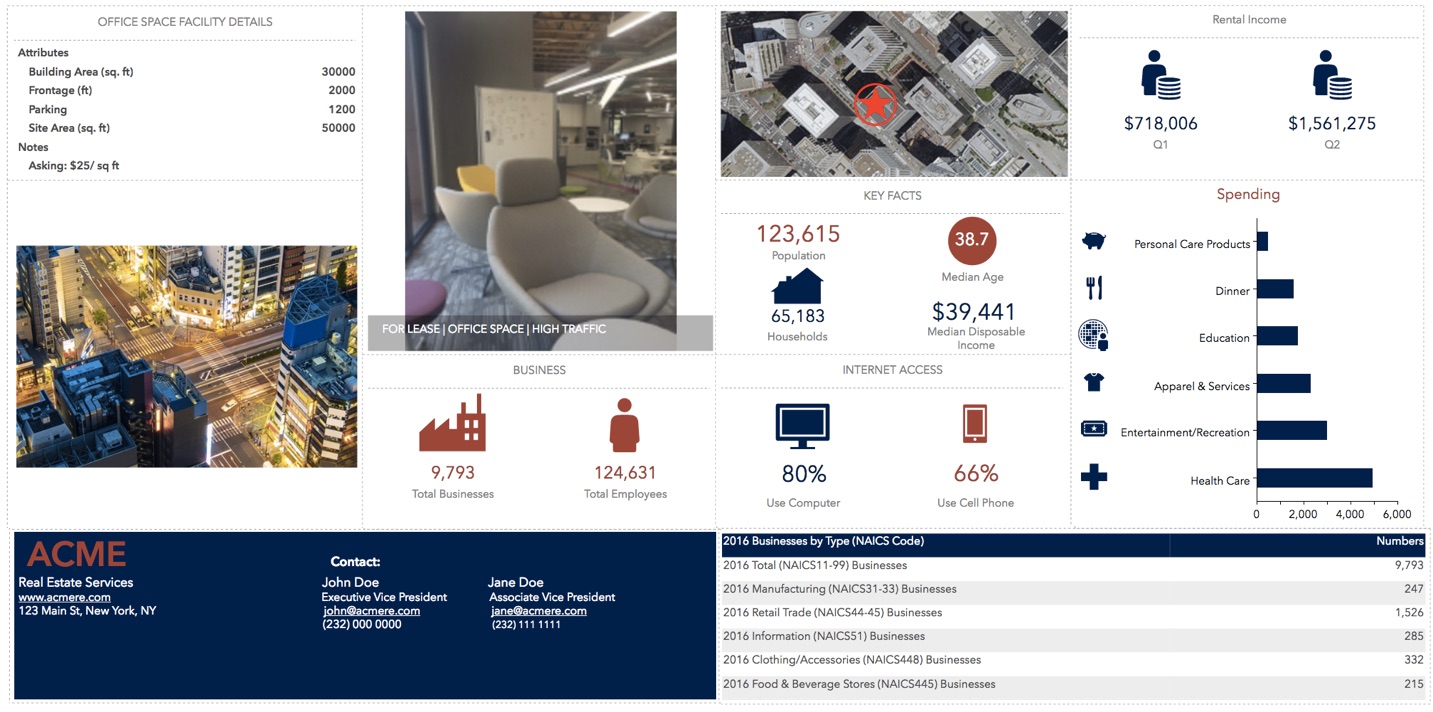
- Make more informative infographics by using location attributes such as number of parking spaces, rent, and more.
- Add site pictures and present community information with more visual infographics.
- Bring in your own data via the custom data setup workflow and use them in infographics.
- Design your amazing infographics exactly the way you want using a large number of new and improved customization options. For example, add floating text, shapes, and images to your charts, use sorting options for charts, set up dynamic logos and pictures, customize icons using your own SVG images, use printing options.
These are just a few examples and by no means justify the power of what is possible with infographics now. Login to Community Analyst today, check out the Build Infographics workflow, and take your creativity to the next level.
Use Competitive Locations and Your Own Data in Suitability Analysis
Suitability Analysis allows you to identify the locations most suitable for your community initiative. You can take a set of candidate locations, apply a set of weighted criteria, and rank them from most suitable to least suitable. Now you can:
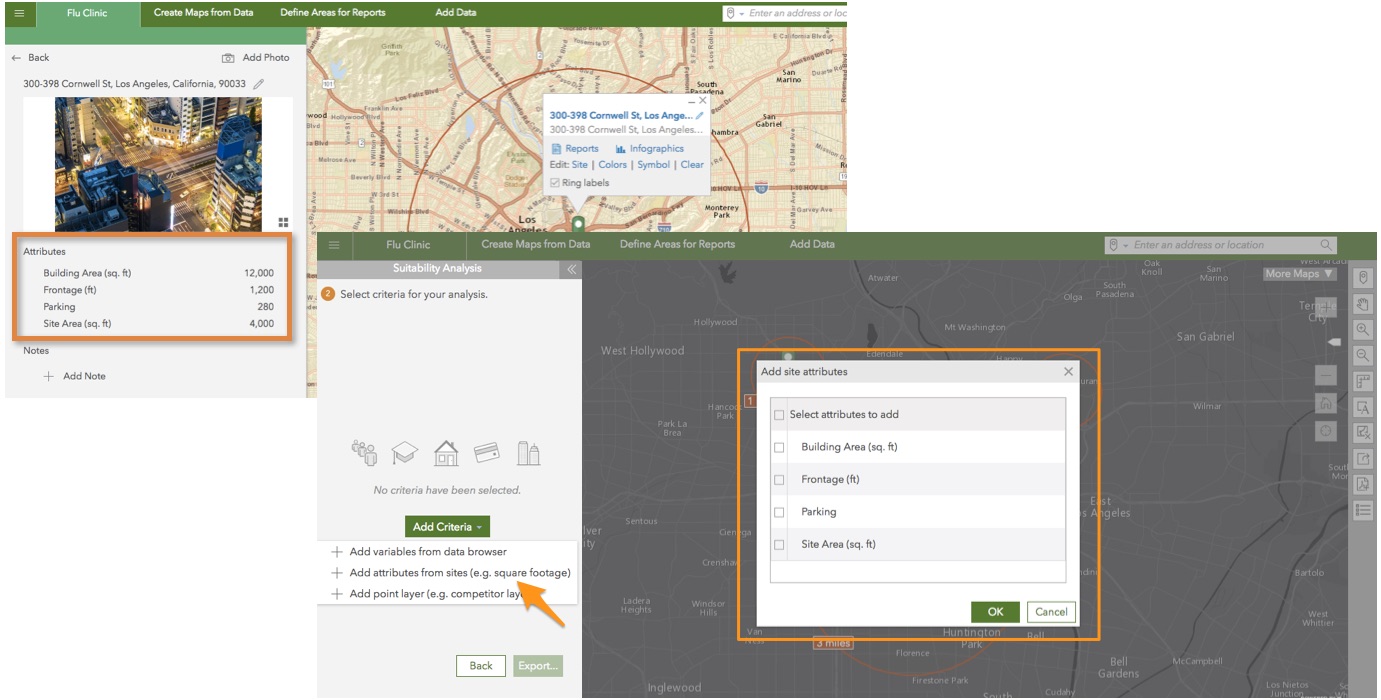
- Incorporate competitive and complementary locations to make better suitability decisions.
- Bring in your own data via the custom data setup workflow and use them in suitability analysis.
- Use site attributes added from the site details panel. Also, leverage the increased limit of using up to 1,000 locations in the workflow.
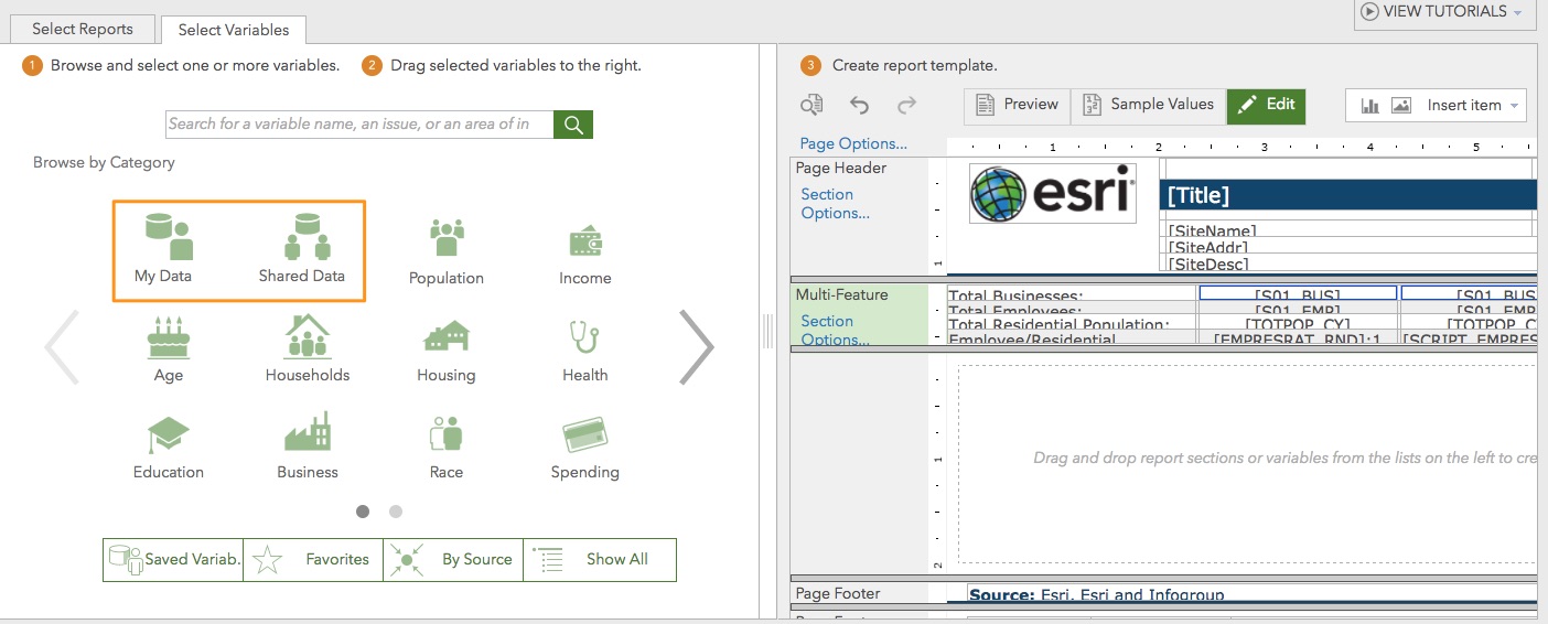
Bring in Your Own Data More Easily and Use It Across the App
Using your own data is a critical part of your analysis. Now, you can use custom data more comprehensively across mapping, analytics, and reporting workflows in the app. They are now available in custom reports, infographics, and suitability analysis in addition to their previous availability in color coded maps, Smart Map Search, and comparison reports. For example, you can easily bring in your community data by zip code and create a color-coded map, report, or infographic that includes your community data for a 5-minute drive time area. Additionally, you can experience an improved and more user friendly custom data setup workflow.
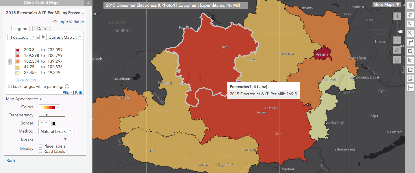
Access Latest Demographic Data for 32 European Countries
Use the 2015 MBR data for several eastern and western European countries including Austria, Greece, Iceland, Portugal, Turkey, and more. Leverage the 2010-2014 Esri’s ACS Tract only data for the U.S that includes population, ethnicity, ancestry, poverty status, and more. Run traffic count reports using Kalibrate Q4 2016 data.
Experience a Faster App
You will notice a significant performance improvement with this release. The application starts up in just a few seconds and creates drive time and walk time areas much faster.
Login and start using the latest Community Analyst today.


Commenting is not enabled for this article.