While the content of this article is still relevant, the Add GTFS to a Network Dataset toolbox mentioned below is now deprecated. You can now use tools available in core ArcGIS Pro to create a network dataset with GTFS public transit data and download some additional analysis tools compatible with that network to accomplish the workflows shown below.
In previous posts, we’ve seen how to map the location and frequency of transit service in your city. However, frequent, nearby public transit service isn’t useful if that service doesn’t take you valuable destinations, like your job, your school, the grocery store, the doctor’s office, the airport, etc. We need to understand where the transit service goes. If we can do this for an entire city, we can find out whether some areas have better access to important destinations than others, and we can use this information to understand other trends and to correct disparities.
Where does the transit go?
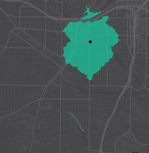
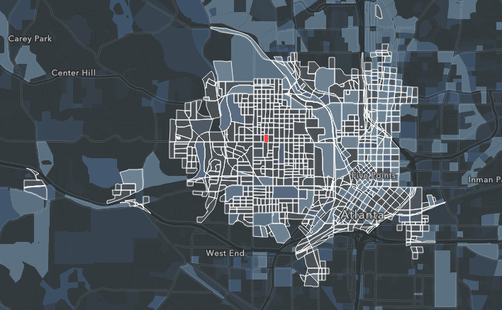
Recall that a Service Area shows the area reachable from a certain point within a particular distance or time limit. The map here shows a 15-minute walk time Service Area around a location in Atlanta. If you started walking from this location, you could reach any part of the highlighted area in 15 minutes or less.
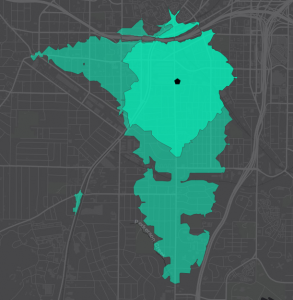
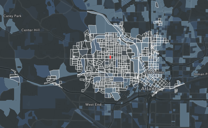
This area of Atlanta has a lot of transit service. We want to understand not just where we could walk to within 15 minutes, but where we could travel to if we used transit as well. See how the Service Area expands when we consider where we can reach within 15 minutes by walking and transit. The larger polygon is a walk + transit Service Area.
You can create walk + transit Service Areas like this using the Add GTFS to a Network Dataset toolbox and Network Analyst.
Time of day matters
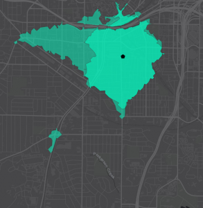
However, the available transit service changes depending on the time of day. The previous map showed the walk + transit Service Area if I left the location at 10:08 AM. But transit runs on a schedule, so the available transit service is different depending on the time of day I want to travel. Some buses might not be running, or I might experience different wait times. The next map shows the walk + transit Service Area at 10:09 AM, just one minute later than the previous map.
It looks very different! What happened? Why is the area to the south no longer reachable?
I just missed my bus.
The video here shows the walk + transit Service Area around our location for each start time between 10:00 AM and 11:00 AM. Where does the transit go? There is no single answer. It depends on the time of day.
You can make a time lapse video like this using the Prepare Time Lapse Polygons tool, part of the Add GTFS to a Network Dataset tool suite.
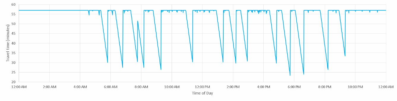
Consider a single origin (like your house) and a single destination (like your job). The time it takes to travel between the origin and the destination varies based on the available transit service. From this graph, you can see that the maximum travel time between this origin and destination is just under an hour. This is how long it would take if you just walked the whole way. However, at certain times of day, transit service is available that reduces the travel time to about 30 minutes.
Access to destinations
Let’s consider a large number of origins and destinations. For example, rather than just your house and your job, let’s consider every house and every job. Because the US Census provides us with the number of people who live in each census block and the number of jobs located there, we can use census blocks to represent both origins and destinations. We can use the Origin Destination Cost Matrix Network Analyst tool to calculate the travel time between sets of points. In our case, we want to calculate the travel time from each census block centroid to every other census block centroid.
This analysis is about to get complicated, so let’s work our way up to it with another simple example. Let’s take just one census block in Atlanta as the origin (the red block in the map below) and calculate the travel time to all other census blocks to determine which of these other blocks are reachable within a 30-minute travel time by transit and walking, with a start time of 6:30 AM. The result, shown in the map below, looks fairly similar to the Service Area map we examined previously, only here we’ve generated the map using block-to-block travel time calculations and just highlighted the reachable blocks (the ones with the white outlines).
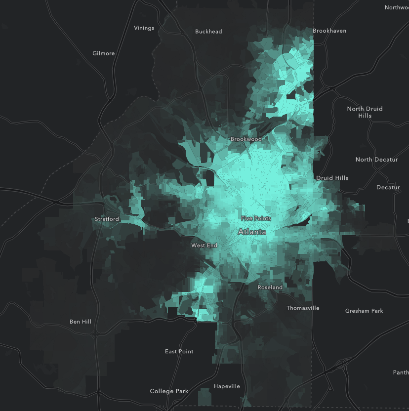
But we don’t care how many blocks are reachable. We want to know how many jobs are accessible. We can use the census data to sum the number of jobs located in the reachable blocks (the blue color scale in the map indicates the number of jobs located in each block). We find that someone living in the highlighted census block could reach 151,487 jobs within 30 minutes if they left the house at 6:30 AM.
As we know from our previous discussion, the available transit service differs based on time of day. If our commuter left at 8:30 AM, not as many blocks are reachable. For an 8:30 start time, they have access to only 105,187 jobs within 30 minutes.
The difference is easier to see in an interactive web map. Click either image to see one, and use the vertical swipe bar in the web map to switch dynamically between the two times of day.
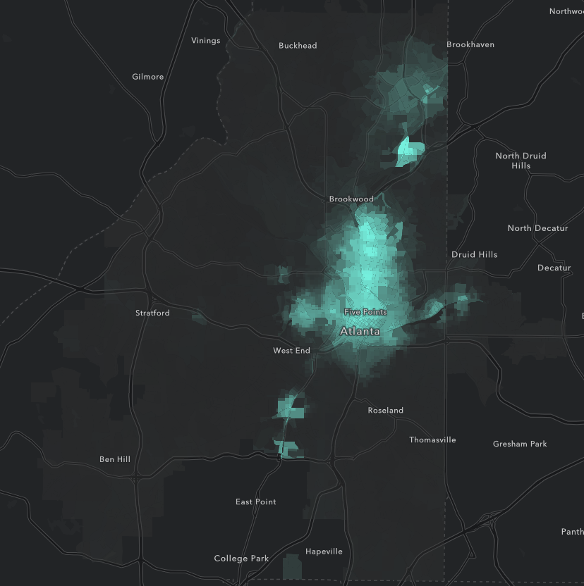
We can run this analysis for each start time during the morning rush period (6:30-9:30 AM) to determine that the 11 people who live in this block have at least one opportunity to access to 204,381 jobs (jobs reachable within 30 minutes for at least one start time). However, if we consider only the blocks that are reachable frequently (reached within the 30-minute travel time limit for more than 90% of possible start times), we see that the number of frequently accessible jobs is only 67,680. 111,189 jobs are reachable for at least 50% of start times.
The point here is that because the available transit service changes throughout the day, some jobs are easier or more convenient to reach than others because you have more opportunities to reach them. For some jobs, if you miss your bus, you can just catch the next one and still be at work on time. For others, if you miss your bus, you might not be able to get to work at all. Access to opportunities by transit may be intermittent.
Now suppose we run this same calculation for all census blocks within the city limits of Atlanta (note that we are considering jobs that fall outside the city limits). The maps below show the number of jobs accessible to each census block within a 30-minute travel time a) at least once within the time window and b) at least 90% of start times within the time window. The brighter the green, the more jobs are accessible. (Click either image to view an interactive web map.)
You can make maps like this using the Calculate Accessibility Matrix tool, part of the Add GTFS to a Network Dataset tool suite.
Not all blocks need access to jobs, however. Some blocks have no population. If we’re concerned about job accessibility in our city, we probably want to identify areas of the city which have both a high population and also poor access to jobs. The ratio of population to number of jobs accessible within 30 minutes is informative and is shown in the map below (higher ratio, brighter orange).
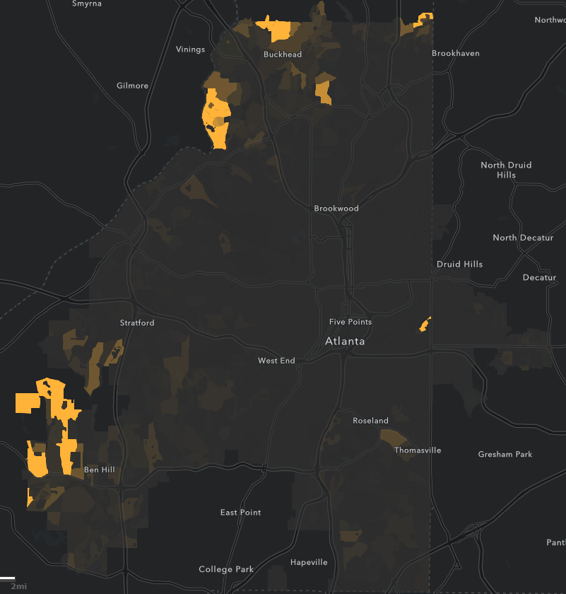
Most census blocks within the Atlanta city limits seem to have a pretty healthy ratio of population to job opportunities, but there are a few blocks that stick out and probably warrant some further investigation. Possibly we don’t expect people to commute to jobs by transit in the suburban areas, but we might be able to use this map to identify a few areas of town where we want to extend transit lines, increase frequency of service, provide better pedestrian infrastructure, or even pursue some transit-oriented development.
Of course, with all the above said, what really matters to someone is not the sheer number of jobs accessible but whether or not they have access to their job. This analysis does not give us that information. Nevertheless, the number of jobs accessible tells us something about the level of opportunity available to residents of different neighborhoods and could highlight disparities between neighborhoods. Depending on our goals, we could further refine this analysis by breaking down the jobs into job type categories or incorporating other demographic variables.
Transit accessibility is a complex and nuanced subject with lots of opportunity for interesting GIS analysis. Don’t forget to account for time of day when doing analysis. Check out the tools linked throughout this post to help you out with your analysis and be sure to send us your feedback. And we would love to see the results of your analysis!
The information in this post can also be seen in Story Map format here.

Commenting is not enabled for this article.