There are many opportunities to automate administrative tasks in ArcGIS Enterprise. In her plenary demonstration, Shuang shows how administrators can leverage ArcGIS Dashboards and ArcGIS Notebooks to create an automated option for monitoring the content created within their organizations.
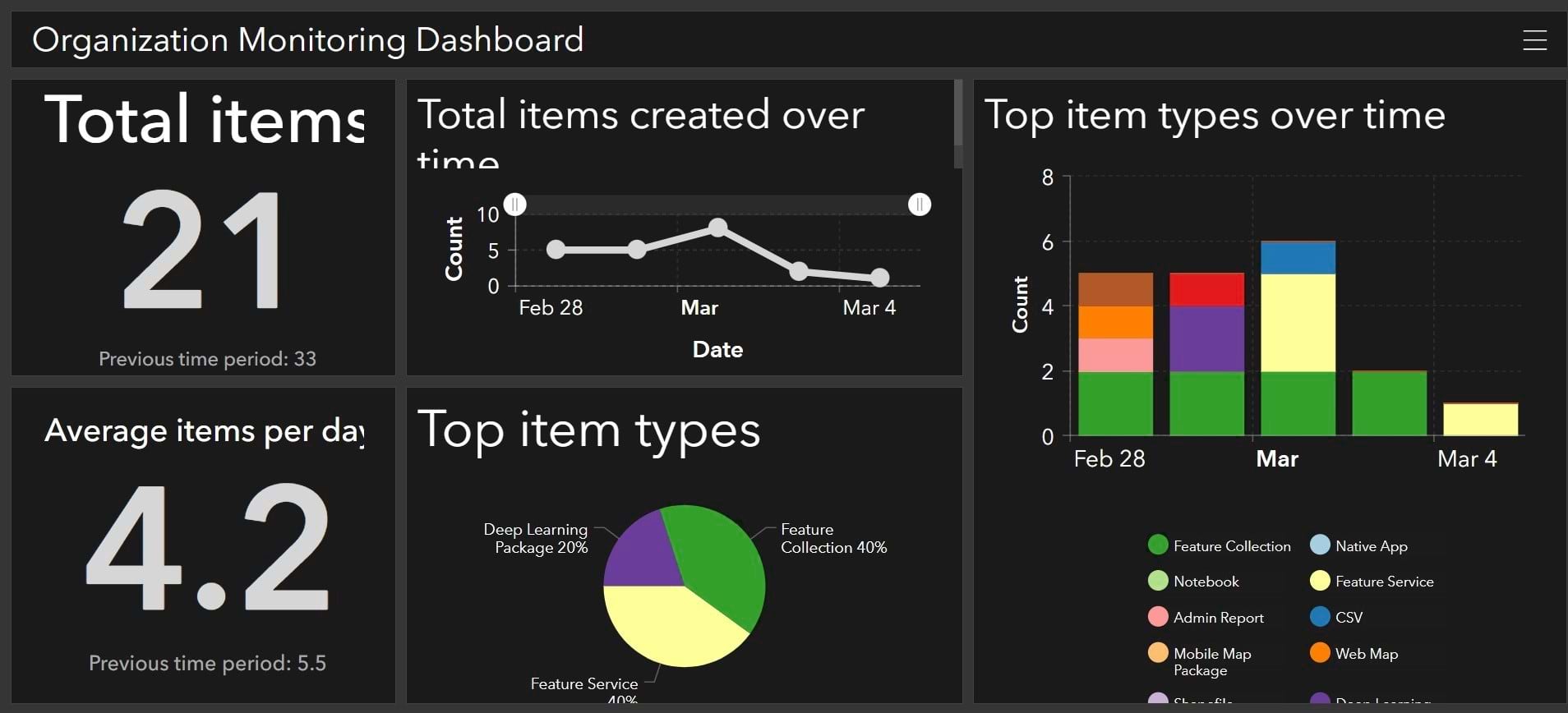
Shuang has created a dashboard that presents the total number of items created, the average number of items created per day, a breakdown of the dominant item types, and charts that show item creation trends over time in her organization from the previous week.
Shuang has created a notebook that extracts relevant data from the past 7 days and updates a hosted table on a schedule set by a notebook task. Her dashboard consumes the data in this hosted table. In her demo, Shuang will update her notebook so that it instead gathers data from the past 2 weeks.
Updating the date range
Shuang’s notebook uses the following workflow:
1. Import essential libraries and connect to GIS
2. Set variables for the days back we want to search
The search period was previously set to 7, but Shuang will update it to 14 for the demo.
3. Search content
The advanced_search API is used to gather all the content that has been created within the new date range.
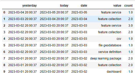
4. Convert result to pandas DataFrame “long”
The search result is converted to a pandas DataFrame, where the rows contain repeating dates representing different item types.
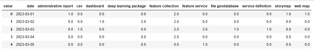
5. Pivot the DataFrame from “long” (stacked) to “wide” (unstacked)
This format is not desirable to calculate statistics, so Shuang applies the pivot function to flip the DataFrame so that the rows become timestamps and the columns become content types. Pivoting the table helps to create a summary table with additional statistics.
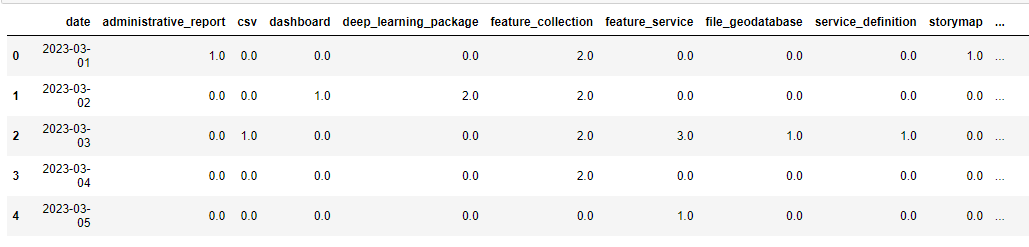
6. Create the final summary table with additional statistics
Shuang uses the Python API to load the DataFrame and update the hosted summary table.
Shuang now runs the notebook, and returns to her dashboard to see the result of her update.
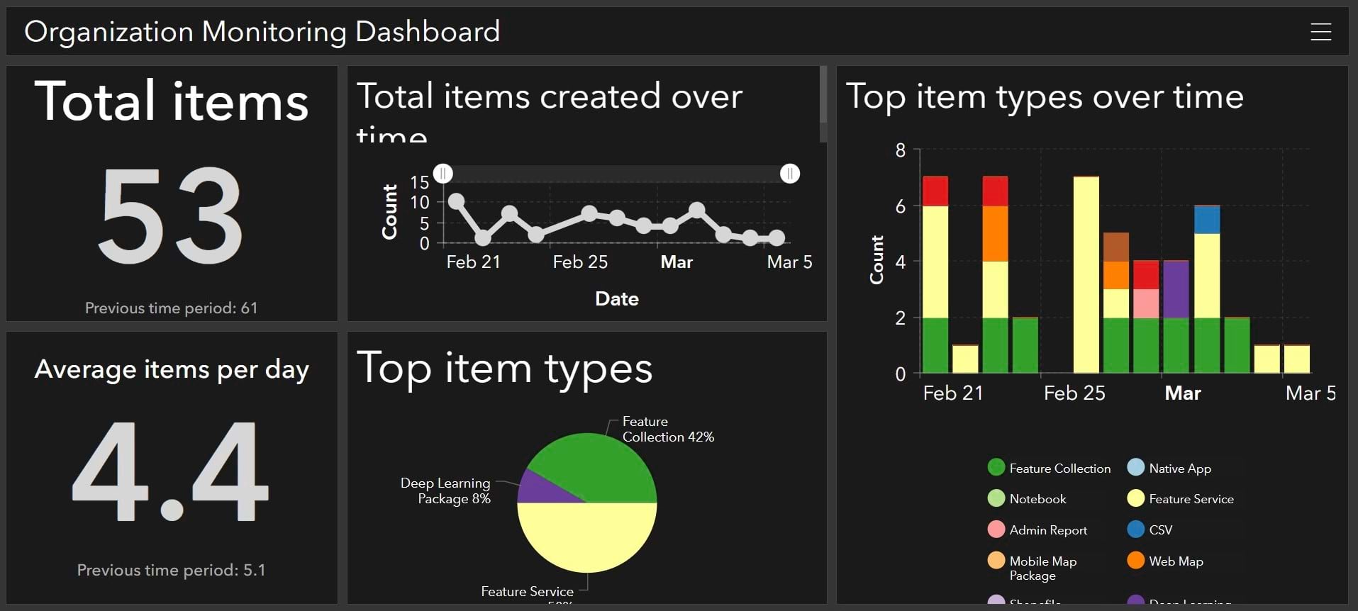
The hosted table has been updated, and the statistics shown on her organization’s dashboard now reflect a 2-week time period.
Conclusion
Creating a dashboard allows you to provide a comprehensive view of your organization’s data that can be used to inform stakeholders and make decisions. Leveraging ArcGIS Notebooks can provide you with an automated way to keep the data presented in your dashboard up to date and customized to your needs.
To learn more, see the following:


Commenting is not enabled for this article.