In this Blog post, I’ll show how ArcGIS for Excel, Python in Excel, Machine learning models and Excel can work together and turn Excel data into decision making. We’ll walk through a field-operations scenario, but the pattern applies anywhere you have location data.
ArcGIS for Excel
ArcGIS for Excel is part of the ArcGIS for Microsoft 365 family. ArcGIS for Excel is an add-in to Microsoft 365 that you can use to add ArcGIS mapping capabilities to Microsoft Excel. With ArcGIS for Excel, you can create an interactive map that includes data from Excel and ArcGIS services without leaving the Excel environment.
Python in Excel
Python in Excel is a Microsoft feature that lets you write Python directly in a cell. What makes this really powerful is that you can reference your Excel data as Pandas DataFrames – so that your rows and columns become something Python can immediately work with. From there you can build charts with matplotlib or seaborn, run statistical analysis, and run machine learning models, all without leaving the Excel spreadsheet.
Note: Esri’s Python libraries, for example – ArcGIS API for Python, aren’t currently supported in Python in Excel. Python in Excel runs in the Microsoft Cloud with a fixed set of Anaconda libraries and doesn’t allow third-party packages to be installed.

Dataset
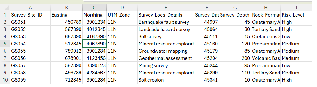
For the walkthrough, I’m using a set of geological survey locations – 30 sites, spread across 6 survey types. Five of the sites are flagged at high risk. Each record includes UTM 11N coordinates (Easting and Northing) along with attributes like survey details, risk level, and survey status. Sample dataset (not real survey sites) is attached to the blog article.
Introduction to Python in Excel
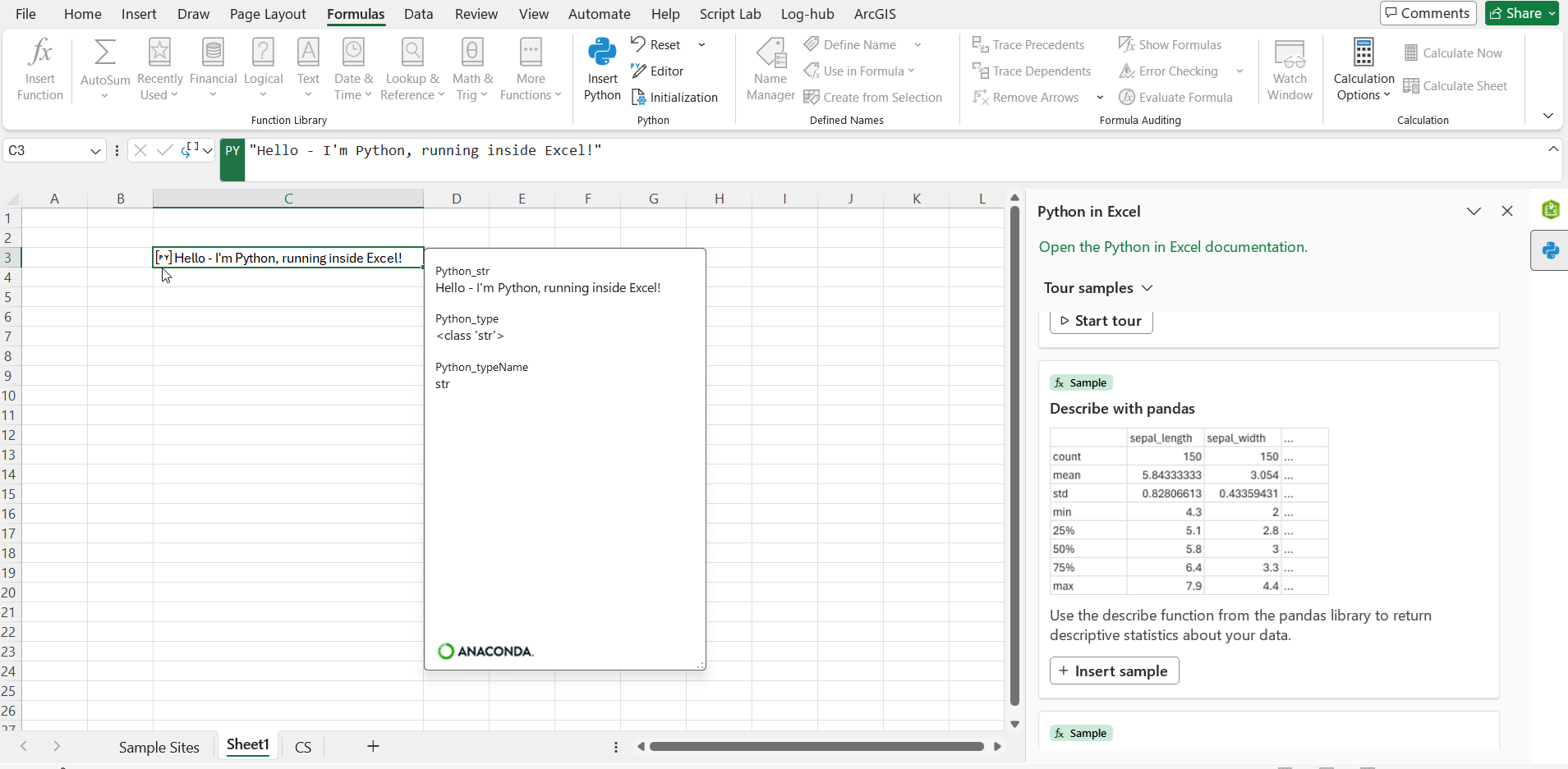
Let’s start simple, to invoke python in Excel, Go to Formula type -> Select Insert Python -> In the formula bar typing basic Python Statement
“Hello – I’m Python, running inside Excel!” and when I press Ctrl+Enter, the result appears right in the cell.
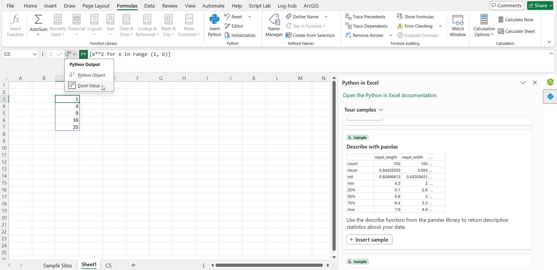
Now let’s try list comprehension, this is one liner generates the squares of the numbers 1 to 5, pure python right inside Excel
[x**2 for x in range (1, 6)]
Microsoft has also provided Editor for writing Python Code. In the Formulas tab, under the Python group, select Editor
Generating a Random Numbers Column in Excel Using Python
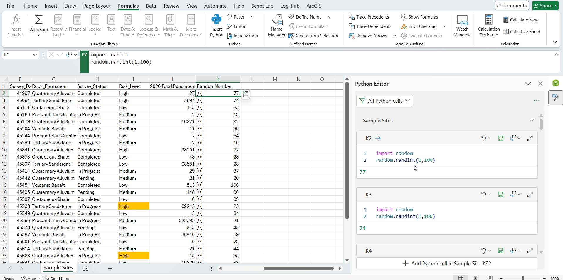
Loading the survey data into a DataFrame is a single call using the xl() function
data = xl(“A1:J31”, headers=True)
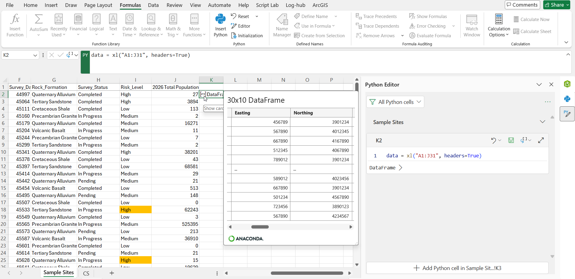
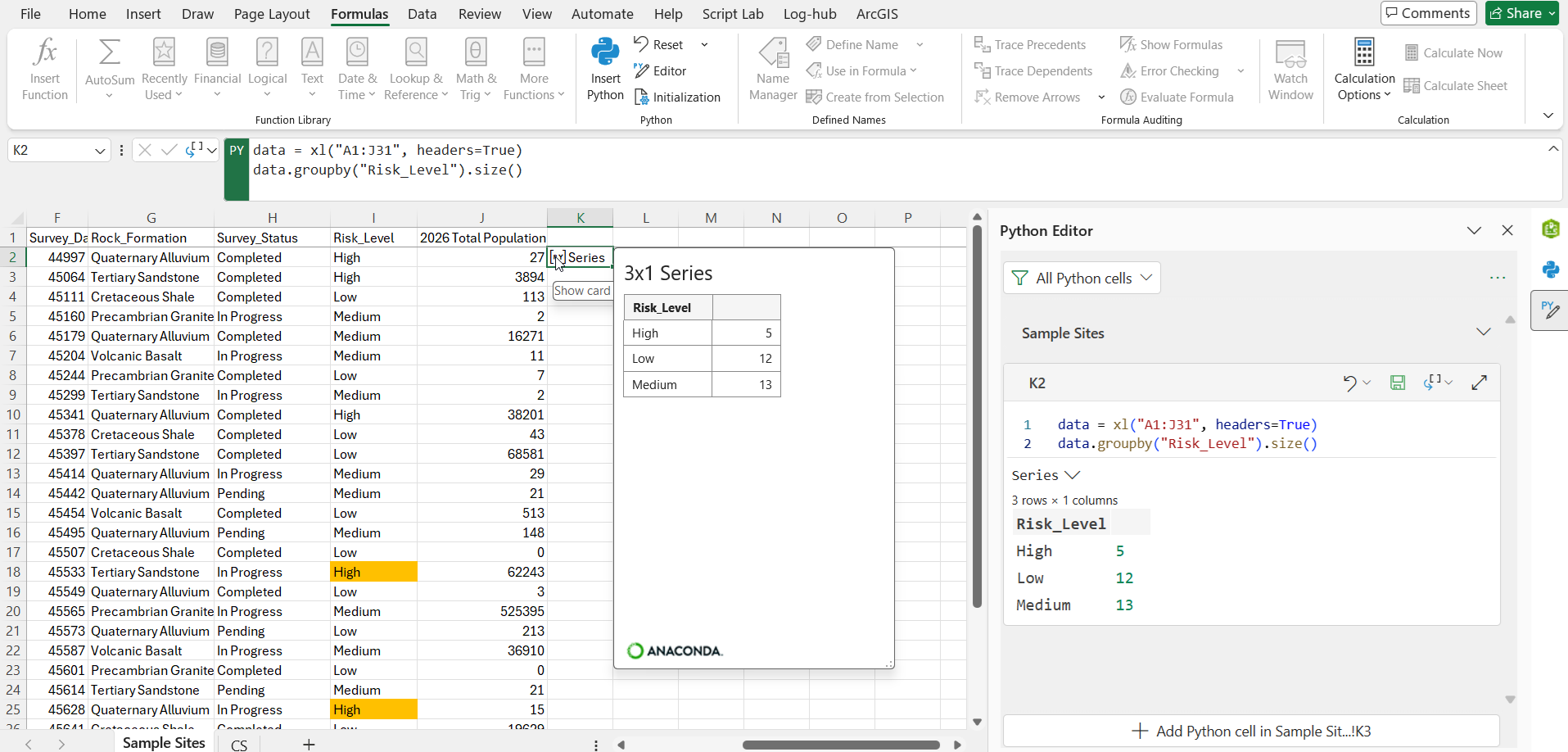
Let’s do a quick analysis. Let’s find out how many surveys are high risk, medium risk, and low risk. This is the one liner code –
data.groupby(“Risk_Level”).size()
To find out how many high-risk surveys are completed vs in Progress vs pending
data = xl(“A1:J31”, headers=True)
pd.crosstab(data[“Risk_Level”], data[“Status”])
No formulas, no pivot tables, just using Python we can find our answers right inside Excel.
Spatial Problem – Create the priority list for the Field team
We have seen how Python in Excel works. Let’s use Python in Excel to solve a spatial problem with ArcGIS for Excel. This example is not best answered with just a spreadsheet of data. In the dataset we have 30 survey sites and a limited number of field teams. The question is: where do we send them first?
When we look at our data, we’ll find that GS082 and GS089 are both High-risk sites and their surveys are still In Progress. They look high priority survey sites for the Field teams.

Well, it’s not that straightforward. What if a high-risk site has no people around it, but a medium-risk site is right next to a big city? We need more information to build a smarter priority list for the Field team.
The approach to solving the spatial problem
The plan is three steps:
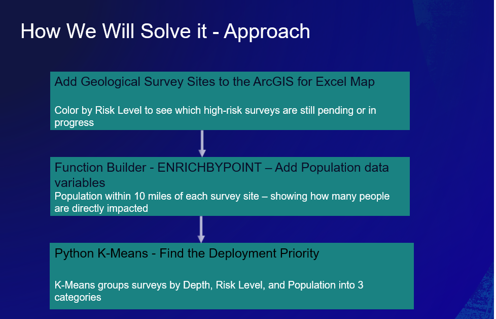
- Map the sites – Add the survey locations to the ArcGIS for Excel map and color them by risk level.
- Enrich with population – Pull total population for each site using the ArcGIS for Excel geoenrichment function.
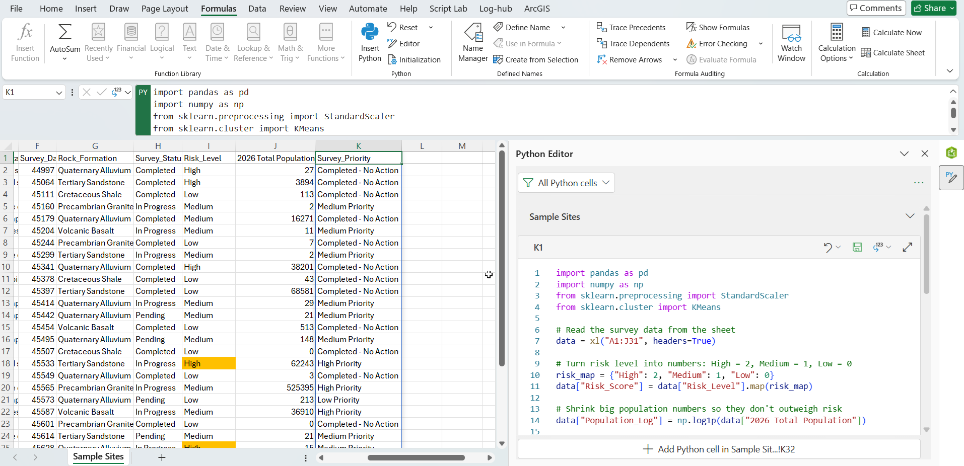
- Cluster with Python – Use K-Means to group the surveys by depth, risk, and population into three priority categories — high, medium, and low.
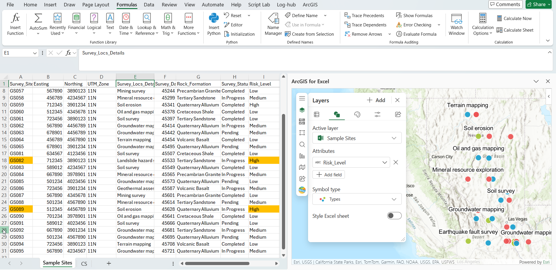
Step 1 – Map and symbolize
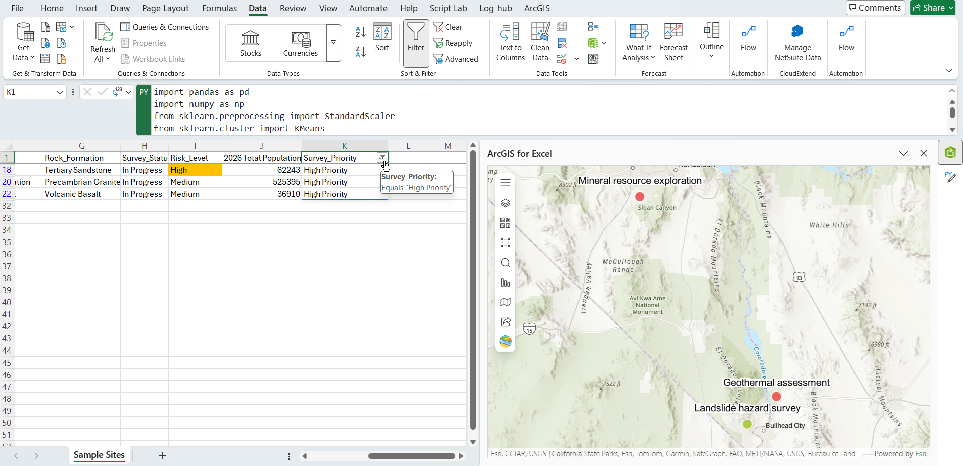
Add the survey sites to the ArcGIS for Excel map and symbolize them by risk level. The important thing to remember for later – the map and the sheet stay linked, so anything we do in the Excel sheet, for example applying filter in the Excel update the map accordingly.
Step 2 – Geoenrichment with ENRICHBYPOINT
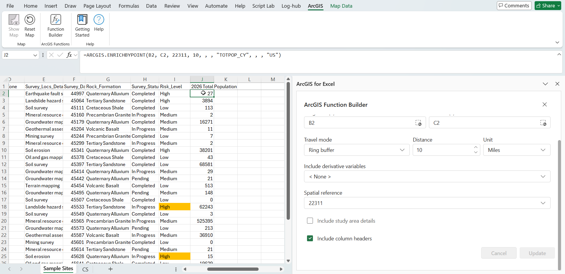
This is the ArcGIS-specific move that supplies the factor our table was missing. The ENRICHBYPOINT function is one of the ArcGIS functions available through the Function Builder. It takes a point location – one of our survey sites – and enriches it with data variables from ArcGIS. Here, we’re fetching total population for 2026 within a 10 mile radius of each site.
In practice, you open the Function Builder, select ENRICHBYPOINT, run it against the survey data, and apply the formula down the remaining rows. In the sample dataset, the 2026 Total Population column is already added.
Step 3 – K-Means clustering model in Python
With three variables in hand – depth, risk level, and population – we let Python do the weighing. The K-Means model groups the sites into three clusters, which we label High Priority, Medium Priority, and Low Priority
Apply an Excel filter for High Priority, and the answer comes back: sites GS082, GS084, and GS086 are where the field teams should go first. And here’s the payoff of doing this inside ArcGIS for Excel – when you filter the sheet, the map updates automatically to show the matching features.
Note – The K-means clustering sample code attached with this blog article.
What changed, and why it matters
Let’s put the two answers side by side:
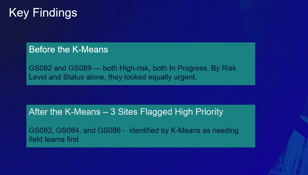
- Sorting by risk alone: GS082 and GS089
- After K-Means: GS082, GS084, and GS086
Two things stand out – GS089 dropped out of the top group, and GS084 and GS086 moved in. That’s because the model looks at risk and population together, instead of risk alone.
That’s the whole reason for combining these tools. ArcGIS supplied the population context a raw survey table never had. Python found the answer – three priority sites, not two. And using ArcGIS for Excel you can see exactly where those sites are on the map – all of them are in one spreadsheet.
Conclusion
ArcGIS for Excel and Python in Excel give you a fast way to explore location data and make smarter decisions inside Excel. We mapped the sites in the ArcGIS for Excel map, enriched them with population, and clustered them with Python, and the result went from two priority sites to the right three – all inside a single Excel sheet.

Article Discussion: