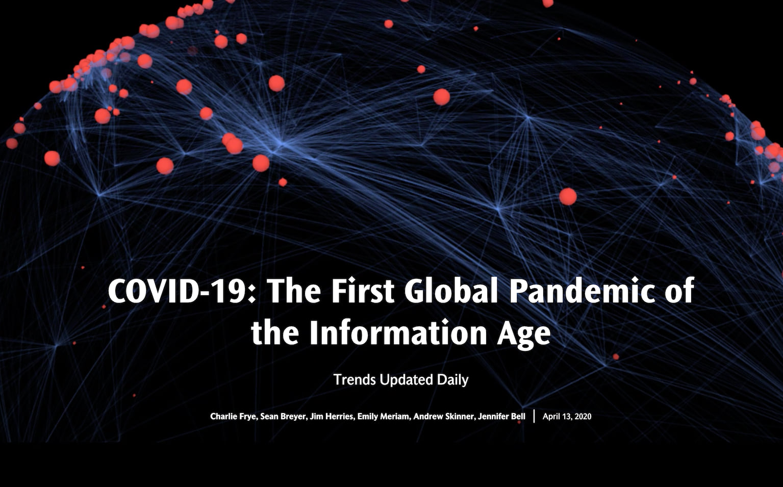
For the first time, we are experiencing a global pandemic and analyzing it as it happens. Using five-research based pandemic trends we describe how each country is doing. To explain the trends, we created the COVID-19: The First Global Pandemic of the Information Age Story Map. The story also has maps showing the key aspects of each country’s situation. We will update the maps each day with the previous day of data from Johns Hopkins University.
Our motivation
The process to develop these trends began with learning about the six phases of a pandemic as defined by the World Health Organization (WHO). The sixth phase is community level outbreaks occurring in two or more regions of the world. This phase describes the current situation our world is facing.
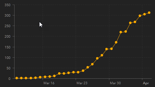
This is a good time to offer credit to Johns Hopkins University for inspiring what we did next. Their Coronavirus COVID-19 Global Cases Dashboard was our inspiration and shows where new cases occur in countries around the world. The Johns Hopkins team makes updates as information becomes available. We took a special interest in the graphs in the lower right corner of their dashboard. These illustrate the rate at which new cases occur. These graphs show the “curves” people talk about wanting to “flatten” by slowing or stopping the spread of COVID-19.
The five trends
We defined these trends using the number of new cases each day, but found we also needed the number of cases per 100,000 people in each country. Thus, we used estimates for 2020 population from the U.N. World Urbanization Prospects with the COVID-19 data to calculate the rate of cases in each country.
This example graph shows the five trends:
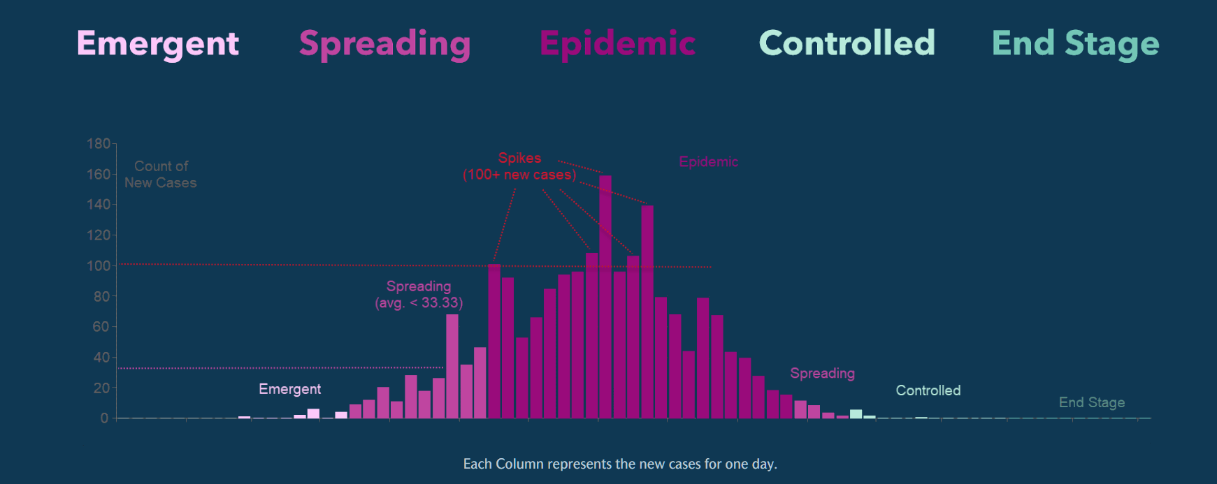
- Emergent: Early stages of outbreak.
- Spreading: Early stages and depending on an administrative area’s capacity, this may represent a manageable rate of spread.
- Epidemic: Uncontrolled spread.
- Controlled: Average less than 0.5 new cases per 100,000 people for 21 days.
- End Stage: Average less than one new case every five days for 42 days.
We chose to call these “trends” because there is not enough data to explain or defend a more confident designation such as “Stage” or “Phase.” Ideally, we would know how many people have been tested, the rates of positive tests, and the number of locales experiencing outbreaks within each country.
We have released the COVID-19: The First Global Pandemic of the Information Age Story Map to tell the story of these trends. These maps, updated daily from Johns Hopkins data, contextualize and describe the most recent trends of the COVID-19 global pandemic in each country. As you explore the maps, click on a country to learn specifics about its current trend.
We hope that this information is both interesting and useful to individuals, businesses and governments who wish to track the evolving pandemic and make decisions about next actions.
For those interested in the methodology we developed for determining each country’s trend, we include it as the description for the web map we used in the story map.


Article Discussion: