In Part 1 of this blog series, we learned about the importance of using Margins of Error (MOEs) within our thematic mapping projects. In Part 2, we learned about Effective ways to communicate margins of error through pop-ups. In Part 3 of this MOEs blog series, we learned how to Explore Labeling to Convey Margins of Error.
This blog digs into a simple approach to mapping numeric data along with their related error in a way that makes significant error quite visible, and insignificant error less visible (but still on the map).
Why Bother? Maps Seem Exact
Maps are interesting because they present themselves as exact, unless they are deliberately created to embrace the fuzziness inherent in life and data. People perceive a hand-sketched map as “inexact” or as “a rough sketch” because of its visual quality. On the other hand, people perceive a GIS map or a map in a printed atlas as “accurate” simply because the visual quality of these maps is much more precise. The lines are crisp, the colors are consistent and bold, the position of each element on the map is precisely drawn.
We like old, antique maps because they reflect our fuzzy understanding of life in those times. We like new, accurate digital maps because they reflect our modern approach to everything: data, data and more data!
As a result, any imprecision or error present in attribute data being mapped is washed away, because, historically, most thematic mapping methods focus solely on the value being mapped without regard for any known or unknown error present. Are the attribute data on your maps always deserving of such precision and trust?
The U.S. Census Bureau’s American Community Survey provides an opportunity for anyone to map imprecision (or, error) as its own topic, and also incorporate error into thematic maps. In this blog, I highlight just one of many possible approaches, because at heart I am an applied geographer always on the hunt for map styles that get the basic job done. It’s important to get the conversations going with one good example, and learn what others are also doing.
Before we get to mapping error, let’s see make sure we understand what margins of error are first.
What are Margins of Error?
Margins of Error, or MOEs, are a necessary byproduct of sampled data. For example, the American Community Survey (ACS) from the U.S. Census Bureau offers a margin of error for the data estimates they provide. This tells those who are using the data that the estimate is not an exact figure, but rather a range of possible values. The MOE helps us figure out that range. For example, if the estimate for a certain group of people for an area is 361 people, there will be an associated margin of error for that estimate. If the MOE is 158, the true number of people in that group there falls somewhere between 203 and 519.
.")
This range of values is known as the “confidence interval” and tells us that the Census Bureau is 90% confident that the count of population is between the upper and lower values. We will use these upper and lower “bounds” in our final map, so hang on to that concept.
Most people who map ACS data map only the estimate, without regard for the confidence interval surrounding it. Popups and labels help quite a bit in informing the user about where they should be confident in the data, and map symbology can help too.
How Do You Determine the Reliability of an Estimate, Given its Margin of Error?
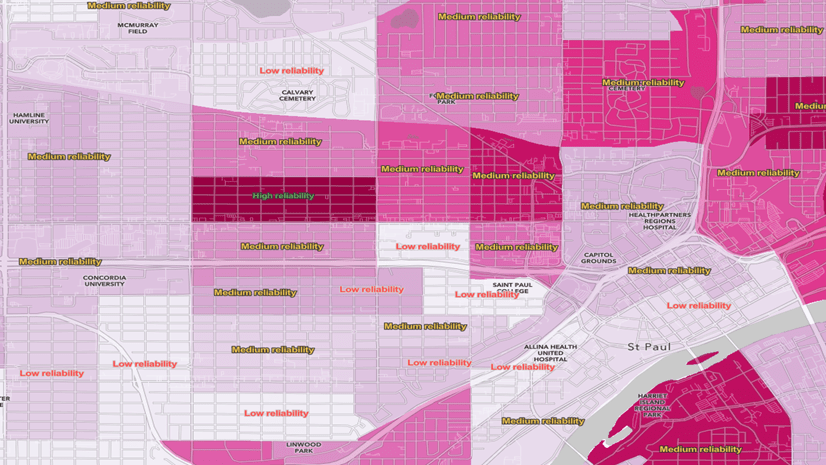
A useful way to understand the reliability of an estimate and its MOE is to calculate each feature’s coefficient of variation. This essentially tells us the error as a percent of the estimate. Here’s an example which turns the coefficient of variation into three levels of reliability: high reliability, medium reliability, and low reliability.
In this example, we use three categories, which are the thresholds for reliability used in Esri Business Analyst products for many years. If the MOE is under 12% of the estimate, it is considered highly reliable. If it is between 12 and 40% it is considered medium reliability, and anything over 40% is considered low reliability.
The equation below can be used to calculate the coefficient of variation at a 90% confidence level:

At 26.6%, this estimate would be considered to have medium reliability. If it were at 39.8% you’d probably lean away from “medium” reliability toward “low” reliability (and, your map should too, and can…details below…keep going!)
Note: To get a 95% confidence level, exchange 1.645 with 1.96.
Factor Reliability Into the Estimate’s Symbol
It is useful to start simple: map the estimate with a symbol, and apply transparency based on its coefficient of variation. This lets you subtly indicate which features are less reliable.
Here’s what the Arcade expression looks like to calculate the coefficient of variation in this sample map:

If we apply transparency on less reliable estimates, the result looks like the map below and the symbols, taken together, start to hint at which parts of the city have estimates which are less reliable. This is a map of Census tracts, showing the median household income by Census tract. Higher incomes are shown with proportionally bigger green circles. Smaller incomes are shown with smaller green circles. Less reliable estimates are partially transparent, to communicate that the data is not as reliable in those tracts as it is in surrounding tracts.
I like this style below because it keeps things simple.

The result is a bit too subtle however. You struggle to really see any features whose estimates are very unreliable.
The Map of the Estimate with Error Highlighted
What if a map could clearly show the estimates, and also show any significant margins of error? Could it be done in such a way that the reader sees what’s most important (the estimates) at a glance, but can also see where the estimates are not as reliable?
I call this the Confidence Interval map. The approach taken below in this map lets you see:
- the estimate of median household income (in green)
- the lower bound of the estimate (in white) based on its margin of error, and
- the upper bound of the estimate (in magenta) based on its margin of error.
By using the same symbol sizes and breaks on all three layers’ unclassed (proportional) symbols, whenever these three numbers are all relatively close to each other, the estimate (in green) wins out visually. When the margin of error is high, the upper/lower bounds take over the symbol for that feature.

The legend for this map is easier to read when you see it side by side to see what’s going on.
All symbols on this map are sized proportionally to their data value, and all three layers use the same symbol sizes and breaks. This style of map would be impossible to accomplish if the layers used classification methods like natural breaks, quantile or equal interval. By using unclassed (or, proportional) methods on the symbol size and transparency, the resulting map lets the data “breathe” on the page. View the settings for yourself in this map by choosing a layer, and hit the “Styles” button to see how the symbol sizes are set, and also the “Transparency by Attribute” settings in that Styles panel.

The map goes one extra step: it emphasizes what’s important and de-emphasize what is not. In this map, I wanted to emphasize trusted estimates. Trusted estimates have small margins of error, so I de-emphasized the upper/lower bounds for trusted estimates. For less reliable estimates, I wanted to do the reverse, and emphasize the upper/lower bounds while de-emphasizing the estimates.
If the coefficient of variation is small, the upper and lower bounds are de-emphasized in the map by assigning greater transparency when the CV is low, greater opacity when the CV is high. This has the effect of making the upper bound color (magenta) stronger when it needs to be seen, and weaker when it does not. The same method makes the lower bound color (white) stronger when it needs to be seen, and weaker when it does not. Whenever the coefficient of variation is large, the upper and lower bounds are emphasized. Check the settings to see what values are used: a CV of 12 merits highest transparency, and a CV of 40 merits highest opacity.

A key move here: set each layer’s legend to use the same values for the symbols’ minimum and maximum sizes. A value of $350,000 merits the same size symbol across all three layers, as does a value of $2,500. Most people spend literally years letting the mapping software pick their thematic map breaks and sizes. If you are not used to getting hands-on with these things, now is the time. It’s your map, and its story needs to be revealed.
To help the areas with less reliable estimates stand out even better, the map uses a background color for each feature. The map sets the background color of all tracts in the bottom-most layer, the Upper Bound Values, to a pale yellow. However, the yellow color is intensified based on the coefficient of variation. Check the settings to see what values are used: a CV of 12 merits highest transparency, and a CV of 40 merits highest opacity. Turn the background color off to judge whether it is needed.

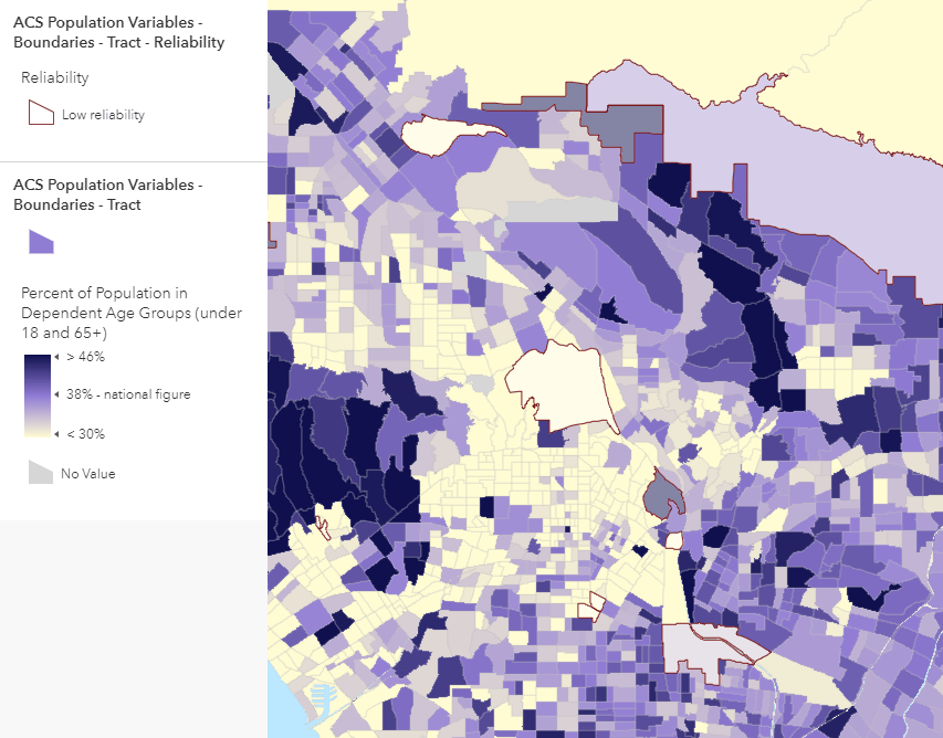
Use Outlines to Indicate Low Reliability Estimates
When symbolizing the data using polygons, you can duplicate your layer and apply a filter to symbolize only those features with low reliability, as shown in the example below. The challenge in this approach is in finding a highlight color that does not interfere with the overall pattern on the map. The varying sizes of polygons contributes to the challenge, in that large polygons with low reliability are easier to spot than small ones. That’s probably fine given that the main emphasis of this map is on the estimates, and the error indication is (hopefully) done in a subtle way.
A better option for polygons may be to simply label the features, as shown below. It works at very zoomed-in scales, but you can use the new scale-dependent label classes in ArcGIS Online Map Viewer to label only the unreliable features as you zoom out.

Final Notes
Smart Mapping map styles in ArcGIS Online help you easily create useful and eye-catching maps by simply matching your data a map style that reveals something special about that data. I am hoping that if there’s enough interest in map styles that embrace error that we can propose it as a Smart Mapping style for ArcGIS Online. What do you think?
All data is imperfect, whether we acknowledge it formally as with survey data, or we ignore it. When people can see which features’ data can be trusted in the map, and which should be treated with caution, it improves their overall understanding and confidence. It is a fine line to walk: if you over-emphasize the uncertainty, the entire map and its source data might become untrusted. The same can occur if you ignore uncertainty present in your data.
Share your thoughts and examples of other ways to map known, or unknown, uncertainty and error.
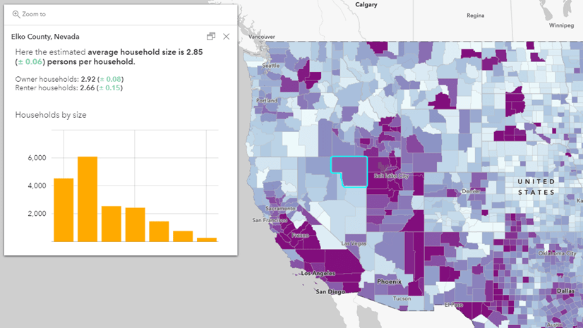
Many Living Atlas Layers Contain Margins of Error
If you often work with American Community Survey data in your projects, before you start downloading data, check ArcGIS Living Atlas first to see if the variables you want have already been published as a feature layer. An ever-increasing number of layers in ArcGIS Living Atlas contain data from the American Community Survey, and include the margins of error as fields. Some example topics are household income, educational attainment, race and ethnicity, veteran characteristics, health insurance, language spoken at home, transportation to work, housing unit characteristics, and poverty, just to name a few!
We also have an excellent Learn Path all about mapping with margins of error.
For more information about the American Community Survey, see the Esri White Paper or the Census Bureau’s ACS Handbook for Data Users.

Article Discussion: