Almost all quantifications in life are estimates. Your speedometer, your scale in your bathroom, the thermometer in your oven, the thermometer in your medicine cabinet, etc. Unless you’ve had these instruments calibrated recently, they are off by a bit. But you can still drive and cook and live without fear of these small errors you see on a daily basis (ex: your bathroom scale can still tell you which piece of luggage is heavier). The same concept applies to the data we map. We can still understand which communities are higher or lower overall population even though the data contains some level of error.
Many fields of science rely on samples for their studies. Physical scientists work with water and soil samples to learn about the larger ecosystems. Doctors and medical scientists work with biometric lab samples to learn about the whole body. Social scientists often work with data about a sample of the total population. This is particularly true of the U.S. Census Bureau’s various surveys which give us a representation of the population despite not surveying every single person in the United States about the topic. This is a cost-effective way to give insight about the population and is a common practice for demographic datasets of all types.
When we create maps of sampled data, commonly demographic/socioeconomic data, it is critical to understand the reliability of our data. It is also important to effectively communicate to our map audience that sampled data comes with built-in error without also scaring our map reader away from trusting the data.
Let’s explore Margins of Error and what they mean to our mapping projects.
What are Margins of Error?
Margins of Error, or MOEs, are an artifact of sampled data. For example, the American Community Survey (ACS) from the U.S. Census Bureau offers a margin of error for the data estimates they provide. This tells those who are using the data that the estimate is not an exact figure, but rather a range of possible values. The MOE helps us figure out that range. For example, if the estimate for a certain group of people for an area is 361 people, there will be an associated margin of error for that estimate. If the MOE is 158, the true number of people in that group there falls somewhere between 203 and 519.
.")
This range of values is known as the “confidence interval” and tells us that the Census Bureau is 90% confident that the count of population is between the upper and lower values.
Why use Margins of Error in your Maps?
As stated within the ACS Handbook, “Estimates with smaller MOEs—relative to the value of the estimate—will have narrower confidence intervals indicating that the estimate is more precise and has less sampling error associated with it.” This tells us that not all MOEs/confidence intervals are created equal.
In general, the larger the population, the smaller the MOE, and conversely, the smaller the population, the larger the MOE. Geographically, this means that states and counties typically have smaller MOEs than tracts and block groups because there are fewer respondents at smaller geography levels. Demographically, this means that estimates of a variable such as homeownership, education, health insurance status, or internet availability that has been disaggregated by age, sex, race/ethnicity, veteran status, etc. will have higher MOEs the more it is disaggregated, since the sample (and population) is getting smaller and smaller. Also, some population groups are harder to survey due to lower response rates, such as low-income areas, and such, MOEs tend to be higher. When using the 5-year estimates from ACS, the sample size is increased since there are 60 months of sample data pooled together, but even then, MOEs are often large.
There are a two main different types of survey errors: sampling and nonsampling.
Sampling errors are caused by the sole fact that the entire population was not surveyed. The fact that a survey is only a sample, or subset, of the population is the reason sampling errors are unavoidable. This is part of the reason why figures that come from a sample are known as “estimates”. ACS margins of error only reflect sampling error.
Nonsampling errors come from any reason besides general sampling errors. An example of a systematic nonsampling error, as mentioned by the Census, could occur if no one from a sampled housing unit is available during the time frame for data collection. This is known as unit nonresponse, and increases the chances of bias to appear in the final survey.
These are just a few examples of the many factors that can impact the reliability of our data. The fact that these errors exist and can come from so many places are why it is important to effectively communicate margins of error to our map audience. Your map reader could see a map and assume that the numbers are exact, when in fact they have sampling error. Being transparent about margins of error creates accountability for both the map’s creator and those making decisions from the data.
Evaluating Margins of Error
One way to evaluate the reliability of an estimate is to understand the relationship between the estimate and its associated margin of error. One measure of reliability uses the coefficient of variation, which is a fancy way of saying the error as a percent of the estimate. Our example above would have a 26.6% coefficient of variation.

If an error is large in relation to the estimate, this coefficient will be large which indicates a lower reliability. The higher the coefficient, the lower the reliability.
Note: 1.645 is used since the ACS estimates are provided by Census at a 90 percent confidence level, and under a standard normal bell curve, 90 percent of the area beneath the curve is between 1.645 and -1.645. To convert to a different confidence level, use a different constant here, such as 1.96 for a 95 percent confidence level. If the MOE is 0, the estimate is likely controlled to be equal to a fixed value and has no sampling error.
Ways to use MOEs and reliability within mapping
American Community Survey (ACS) data is available through various GIS workflows within ArcGIS. Here are a few examples of finding ACS data and different ways that their MOEs can be mapped and better understood.
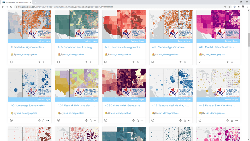
ArcGIS Living Atlas of the World
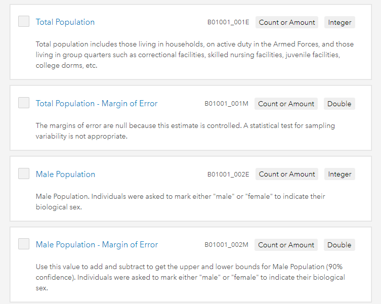
Access thousands of ACS variables and their MOEs through ready-to-use Census ACS layers from ArcGIS Living Atlas. These layers are organized by various topics and have one or many ACS tables included within each layer. Each estimate or pre-calculated percentage comes with the associated MOE.
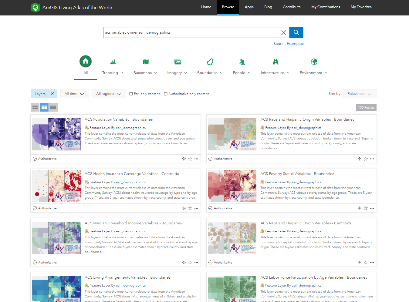
These layers can be easily customized within ArcGIS Online, ArcGIS Pro, or ArcGIS Enterprise for your mapping needs. They contain the following geographies: State, County, Census Tract.
A few ways that you can include MOEs within your maps of these layers are:
Symbology
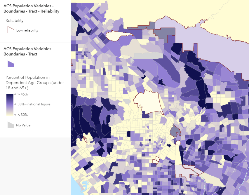
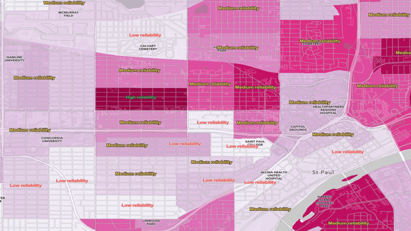
Symbology is one method for showing the margin of error. In the example above, an Arcade expression was used to calculate the coefficient of variation to extract the areas where there is lower reliability of the data. These areas of low reliability are overlayed on top of the map pattern to warn the map reader of these areas with higher MOEs. In this map, any area with a coefficient variance over 40%.
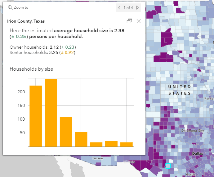
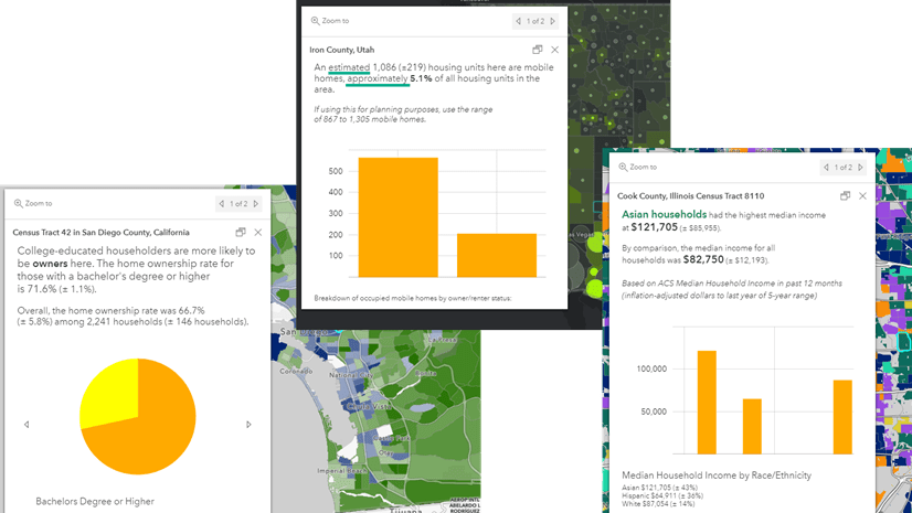
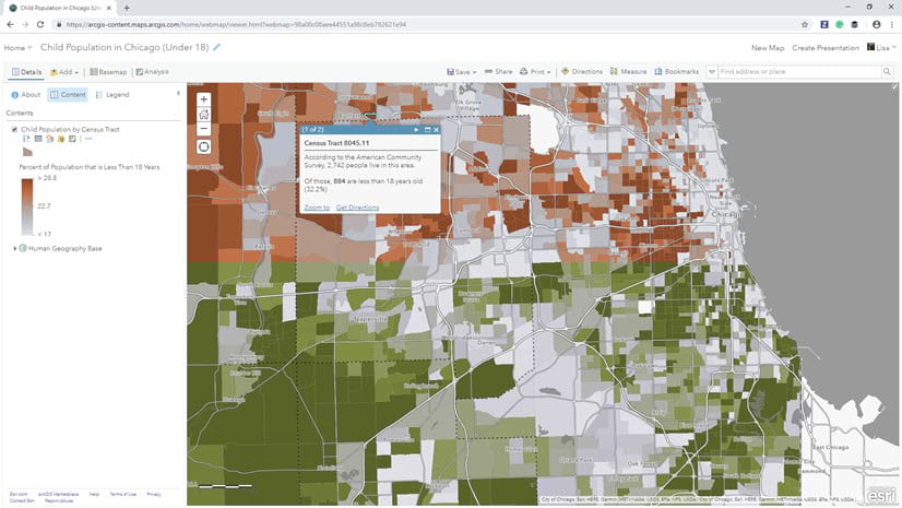
Pop-ups
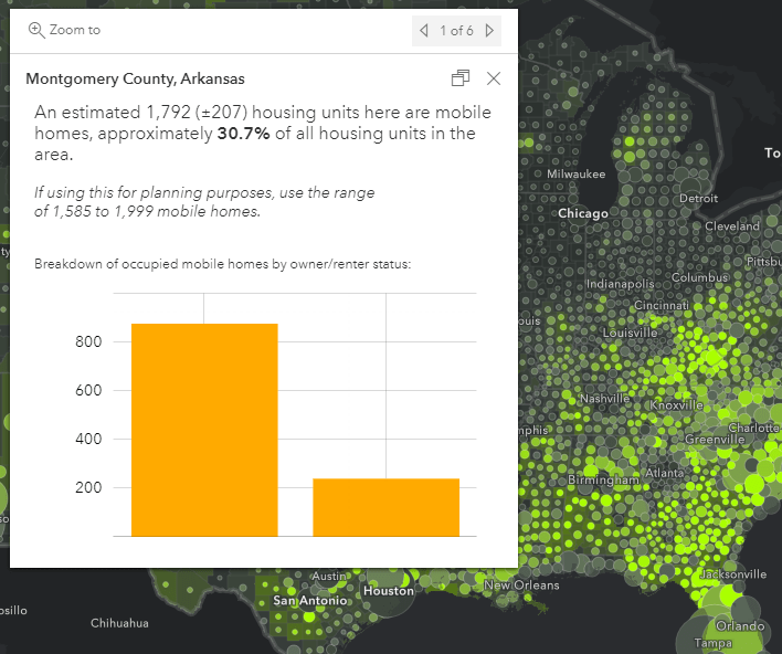
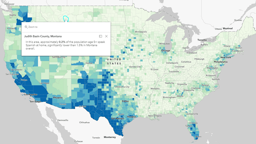
The map example above shows us how to communicate MOEs within a popup. This method is less alarming to the map reader than the symbology methods, but still effectively tells the person using the data that the data being mapped is an approximation. Notice the words such as “estimated”, “approximately”, and “range”. These techniques subtly highlight that the estimates contain some amount of error while not scaring the user out of trusting the data.
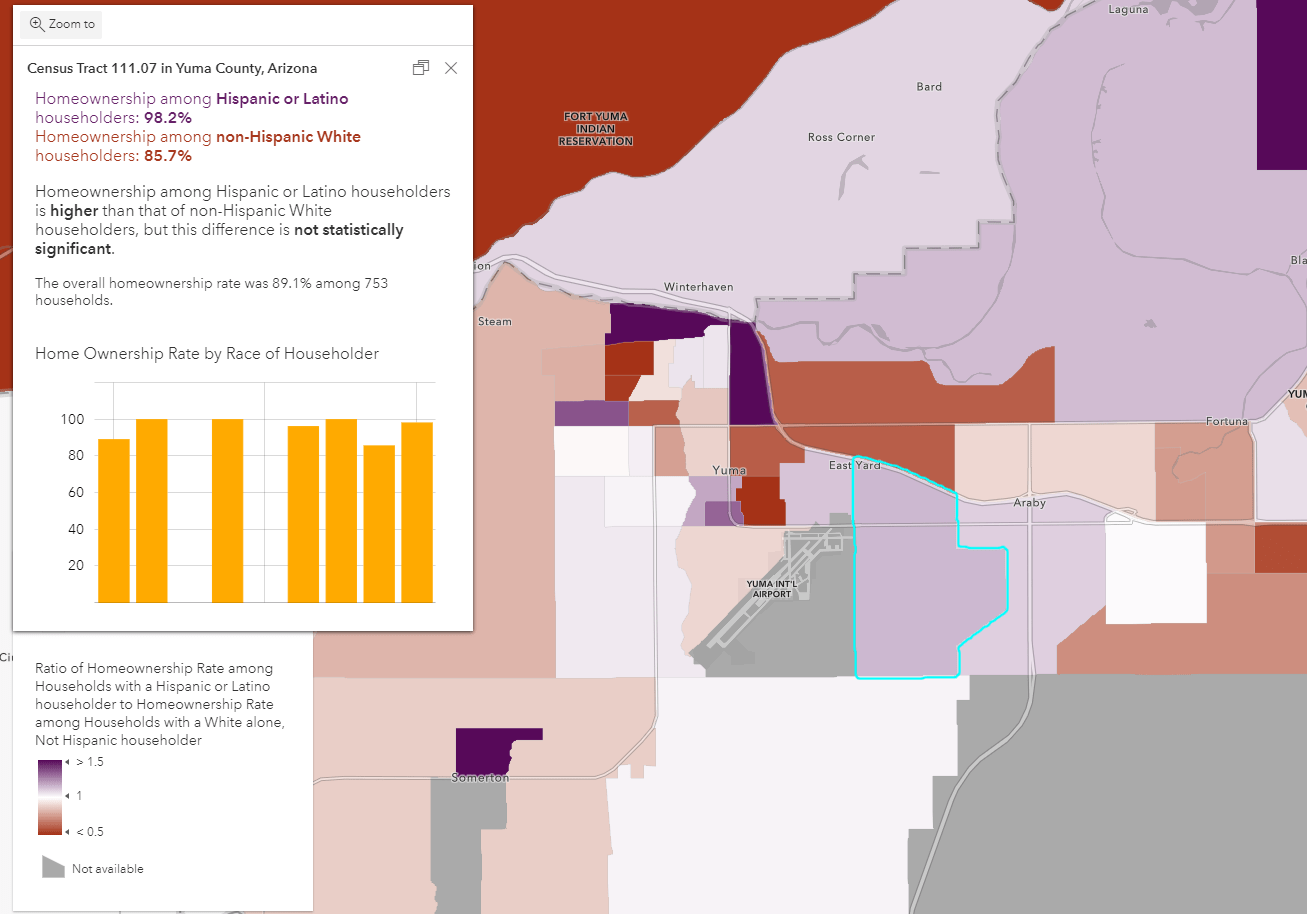
The example above uses some of the same techniques as the previous example, but utilizes an Arcade expression to create custom colors for the reliability of the estimate. The color is based on the MOE as a percent of the estimate (the coefficient of variation showed above). Arcade helps categorize this percentage into high, medium, or low reliability. The category thresholds are explained below in the Business Analyst section. A disclaimer is also included within the popup for those who may not be familiar with ACS data, and includes a link for those who want to learn more.
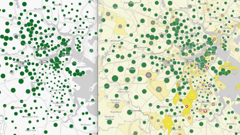
Labels

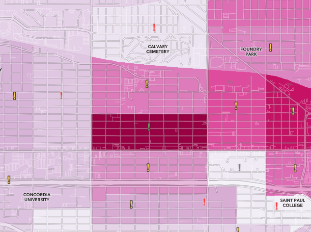
The examples above show us various ways that labeling can communicate the MOEs. Note that these labels are customized to only appear when zoomed into a neighborhood. When zoomed out, the map’s pattern is not obstructed. When the map reader zooms into an area of interest, they will then see if the estimate in that area is reliable or not. This method uses the same Arcade statement as mentioned above, along with label classes within the new Map Viewer.
Testing for Statistical Significance
Margins of error also help us calculate if two things are significantly different. By using a statistical testing method from the U.S. Census Bureau, two attributes can be compared while taking into account the margin of error. The example below uses this z-score method to compare the homeownership rates of White non-Hispanic homeowners and Hispanic or Latino homeowners. The popup uses an Arcade expression to perform the statistical test on-the-fly, and converts the results into an easy-to-read statement. In combination with the Compare A to B mapping style, the two patterns are compared both visually and statistically.
Note: the techniques shown above using Living Atlas layers are demonstrated in ArcGIS Online using Arcade expressions but can also be replicated in ArcGIS Pro with Arcade.
Esri Demographics/Business Analyst
ACS data is also available throughout ArcGIS Business Analyst, data enrichment, and the many other ways Esri Demographics can be accessed. There are thousands of ACS variables available for geographies such as states, congressional districts, ZIP codes, census tracts, block groups, and more. You can also enrich your own custom polygons by enriching them with the attributes of your choice.
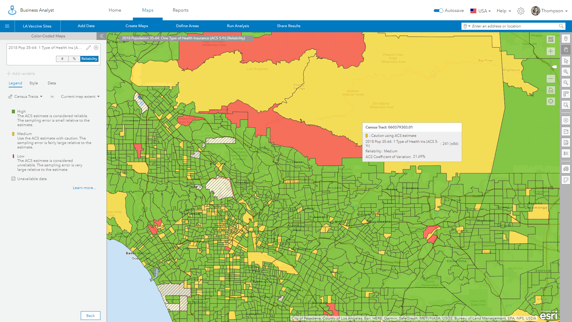
When choosing an ACS attribute within Business Analyst, the MOE is offered as a reliability estimate (REL).
This REL attribute is a reliability estimate which categorizes the MOE by the coefficient of variation. This reliability estimate is broken into three categories: high, medium, or low reliability. If the MOE is under 12% of the estimate, it is considered high reliability (REL = 1). If it is between 12 and 40% it is considered medium reliability (REL = 2), and anything over 40% is considered low reliability (REL = 3).
Learn how to use MOEs
The examples above are just a small peak into the ways that MOEs can be used within mapping. Keep an eye out for upcoming blogs which will provide an in-depth look at these methods and how to apply them to your own mapping efforts. Some of the methods that will be covered:
- Use Margins of Error within your map symbology
- Use Margins of Error within your pop-ups
- Use Margins of Error within your labeling
- Use Margins of Error to calculate statistically significant differences between two estimates
Additional Resources
ACS documentation: Understanding and Using American Community Survey Data: What All Data Users Need to Know
Census video: Assessing the Reliability of ACS Estimates
Blog: The Census Bureau Gives Your Margins of Error, We Help You Map Them
Help Documentation: ACS within Esri Demographics
ACS Methodology within Esri Demographics: 2014-2018 ACS Methodology
ACS layers within Living Atlas of the World: ArcGIS Living Atlas layers
Census webinar recording: Calculating Margins of Error the ACS Way
Special thanks to Helen Thompson, Jim Herries, and Steven Alives for map examples included in this blog. Also thank you to Kevin Krivacsy, Kevin Butler, and the Chief Demographer at Esri, Kyle R. Cassal, for providing valuable insight about margins of error and mapping.


Article Discussion: