In Part 1 of this blog series, we learned about the importance of using Margins of Error (MOEs) within our mapping projects. In Part 2, we learned about Effective ways to communicate margins of error through pop-ups. In Part 3 of this MOEs blog series, we will provide various techniques and instructions on how to create creative ways to label MOEs using ACS data. Each technique provides its own advantages and disadvantages, and we’ll discuss when it’s better to choose one over another.
What are Margins of Error?
Margins of Error, or MOEs, are an artifact of sampled data. For example, the American Community Survey (ACS) from the U.S. Census Bureau offers a margin of error for the data estimates they provide. This tells those who are using the data that the estimate is not an exact figure, but rather a range of possible values. The MOE helps us figure out that range. For example, if the estimate for a certain group of people for an area is 361 people, there will be an associated margin of error for that estimate. If the MOE is 158, the true number of people in that group there falls somewhere between 203 and 519.
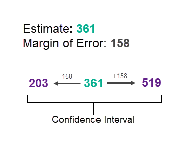
This range of values is known as the “confidence interval” and tells us that the Census Bureau is 90% confident that the count of population is between the upper and lower values.
ArcGIS Living Atlas of the World
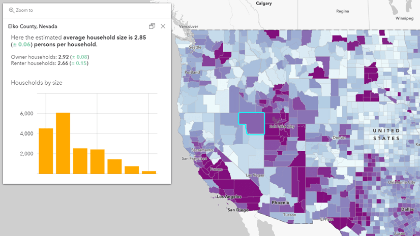
Access thousands of ACS variables and their MOEs through ready-to-use Census ACS layers from ArcGIS Living Atlas. These layers are organized by various topics and have one or many ACS tables included within each layer. Each estimate or pre-calculated percentage comes with the associated MOE.
The value of map labels
Map labels help to identify features, establish a visual hierarchy of important features, and focus the map audience’s attention on the purpose of the map. Labeling is often used to notify a map audience of the name of places, but it can also be used to reveal more detailed information, such as margins of error. And with new label capabilities in Map Viewer such as multiple label classes, and Arcade expressions, we’re able to create meaningful labels with varying techniques.
Labeling MOEs in general benefits from being able to set your scale of when labels will turn on or off. This makes sure only the right amount of information is being shared at an appropriate scale without being cluttered or distracting. We’ll show three techniques for labeling MOEs:
1. Labeling the estimate’s margin of error using values
2. Labeling the coefficient of variation using statements
3. Labeling the coefficient of variation using symbols
Label margins of error using field values
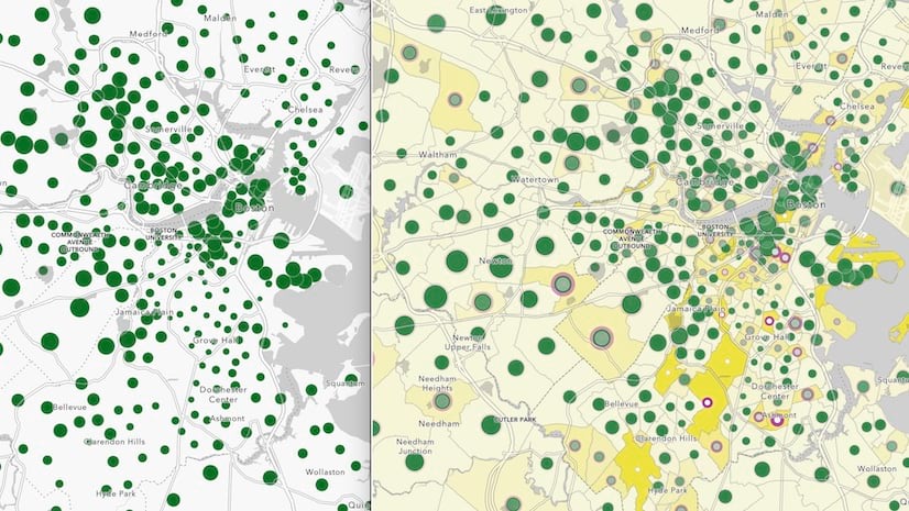
The first technique we’ll introduce is labeling the estimate’s margin of error using field values. In the example web map below we are mapping the Percent of Population with No Health Insurance Coverage and labeling both the percent estimate and the percent margin of error in order to create context. Labeling the values of the percent margin of error helps see the range that the estimate could be. This technique is great for when you want to show more precise MOEs information, but isn’t a suitable choice if you want to aim for simplicity.
The steps to create these labels are:
- Add your layer to your map
- Select your layer
- Select the Labels button
- Create a custom Arcade expression using your field of choice
- Apply label styles
- Set visible range


Label reliability thresholds using statements
The next technique we’ll introduce is labeling MOE using statements for reliability thresholds. Using the coefficient of variation (CV), we’re able to understand the MOE as a percent of the estimate. In the example below, we use three levels of reliability based that are used in Esri Business Analyst products: high reliability (CV <= 12%), medium reliability (CV > 12% & CV < 40%), and low reliability (CV > 40%).
The equation below can be used to calculate the coefficient of variation at a 90% confidence level:

Note: 1.645 is used since the ACS estimates are provided by Census at a 90 percent confidence level, and under a standard normal bell curve, 90 percent of the area beneath the curve is between 1.645 and -1.645. To convert to a different confidence level, use a different constant here, such as 1.96 for a 95 percent confidence level. If the MOE is 0, the estimate is likely controlled to be equal to a fixed value and has no sampling error.
Labeling reliability thresholds using statements is a great technique to help our map reader understand how reliable the data is in different areas. By having the label turn on at an appropriate scale, the map stays readable. One thing to consider when using this method is the map’s readability. When setting your scale and sizing, ensure your words do not compete with the pattern being shown in the map. Try turning on the labels at a neighborhood scale, and adjust the colors/halo to work with your map’s colors.
Using the new Map Viewer’s multiple label classes, we’re now able to create three different label classes for each of these reliability levels. And with the power of Arcade, we can quickly create labels on the fly with a little code.
The steps to create these labels are:
- Add your layer to your map
- Select your layer
- Select the Labels button
- Add 3 classes, one for each reliability level
- Create custom expressions for each label field.
- Apply label styles, make each class its own color such as green, yellow, red
- Set the same visible range for all 3 classes


These are the expressions used for each label class (high, medium, and low). Click this link to explore the Arcade statements in the Map Viewer or view the screenshots below.


Label reliability thresholds using symbols
The next label technique we’ll introduce is labeling reliability thresholds using symbols. This uses many of the same configurations, steps, and Arcade as the previous example, but replaces the words “low/medium/high reliability with any keyboard symbol. In this case, we’ve chosen to use an exclamation point as our symbol, as it gives a sense of warning that the underlying data might be unreliable.
Keeping the label styles the same from the previous example with green, yellow, red colors, we’re able to show which areas have more or less reliable data. Rather than using statements, an ! symbol saves room on your map to highlight your symbology while conveying a need to caution depending on the data’s reliability. Keep in mind that this technique doesn’t include the labeling within the legend, so your map audience may not understand these symbols right away. This technique could be the most useful when used within an app or story map where context could be provided about the labeling.
The steps to create these labels are:
Follow the above steps from the “Label reliability thresholds using statements,” but replace the Arcade Expression with an “!” rather than the words high/medium/low reliability.

Choose the labeling techniques that best suit your needs
These are just a few ways to effectively label MOEs in ArcGIS Online. Choose a technique that provides the right level of information, while weighing which drawbacks will be appropriate to best communicate with your audience. Labeling margin of error provides a visual representation of your data that pop-ups cannot offer, but have limited visual options compared to using symbology.
Get Started
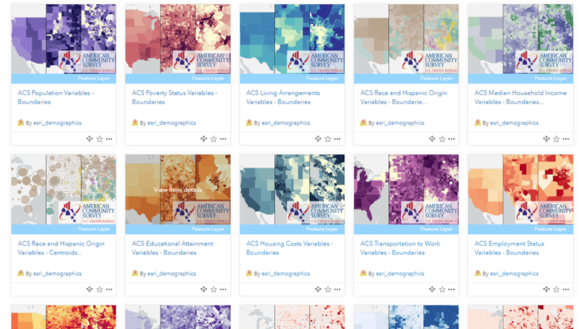
Get started by browsing the Current ACS layers which always contain the most recent estimates, as well as the 2010-2014 ACS layers, all available at your fingertips through ArcGIS Living Atlas. See our FAQ site for more information. Post any questions or share your work by posting on GeoNet’s Living Atlas community.

Article Discussion: