One of the things I promised myself that I would do last summer was write about some of the key design solutions used in the World Topographic Base Map. Our symbolization of the hillshade is one of the design characteristics that most distinguishes this map. The design intent was two-fold: 1) show shading similar to how hachures were used on hand-drawn maps [to see what I mean one of my favorite 18th century maps depicting the Battle of Bunker or properly Breeds Hill is a good example], and 2) display the low slope areas in white because this creates a ”non-competitive” background for data that is mashed up on this base map.
How default hillshade symbology works
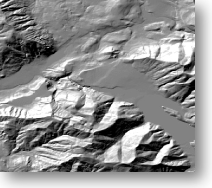
The image at the right shows the default hillshade symbology, which is displayed by default with a black to white color ramp. The darkest part of the ramp is used on the high slope areas that are in shade, while the lightest portion of the ramp is applied to the highest slope areas that are illuminated. The result is that flat areas are in the middle are displayed in gray.
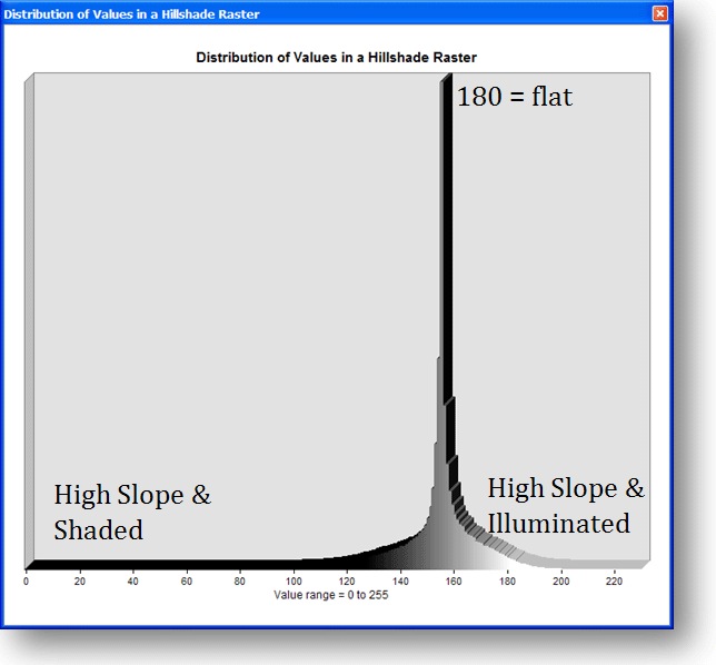
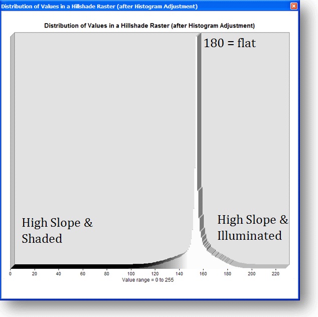
The image below shows the distribution of values in a hillshade dataset and how they relate to the colors of the default black to white hillshade. If you look at the shading under the histogram, you can see that colors that relate to the hillsahde values. 0 relates to the highest slope/most shaded areas and the black end of the color ramp while 255 relates to the highest slope/most illuminated areas and the white end of the color ramp. The important thing to note is that the value of 180 is flat, and that these areas are shown in gray if the default color ramp is used.
Creating Distinctive Hillshade Symbology for the World Topographic Base Map
Because most of the cultural information that would be displayed on this basemap would likely occur in flat areas, we modified the hillshade color ramp. We made thia decision based on our assumption that humans tend to build, live and work in areas of flatter terrain. Our goal was therefore to reduce the gray and increase the white in the flat areas. Here is what the World Topographic Base Map’s hillshade layer looks like:
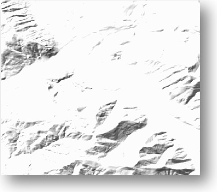
When other geographic content, such as roads, boundaries and buildings, are drawn on this hillshade, the flat white areas do not compete with the cultural feature symbology. Unadorned, you might rightfully criticize it for looking like an overexposed photograph of the default hillshade layer. However, it is not meant to be viewed in isolation, and it is meant to be viewed as a basemap for other and potentially multiple layers of information.
Here is what the histogram looks like for the hillshade symbology of the World Topographic Map:
Notice that the white end of the color ramp extends further into the values for the flatter areas. In order to make the color ramp and have it be applied this way, we had to do two things:
- We customized the color ramp by turning it into a multi-part color ramp with three ramps. Middle ramp was our normal warm gray (RGB: 189, 167, 155) to white (RGB: 255, 255, 255) color ramp. The first color ramp was a single color ramp using the warm gray. The third color ramp was a single color, using white. (The illustration above uses black instead of warm gray to visually emphasize this technique).
- We customized the display histogram as shown below:
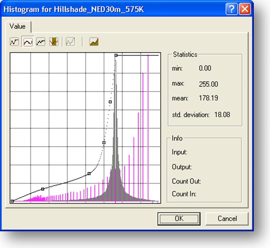
The histogram for every hillshade dataset has a slightly different shape, based on the character of the local relief that it represents. The main point is to force the color ramp values that relate to white to the right of the peak that represents the values in the hillshade. The peak indicates values for the flat areas. To force the white values to the left of the peak, move the topmost point of the line with the vertices just to the left of the peak. Then, using the curved line tools, edit the line to follow the shape of ascending limb of the original histogram. The curve can be adjusted so that it is closer to the histogram or further away than what is shown here. Moving the line closer will make more pixels lighter, while positioning it further away will result in a darker depiction.
It takes experimentation to achieve the final effect–it took me 20-30 minutes for this example.
Also, note for large hillshade datasets, we converted the hillshades to 8-bit unsigned integer raster datasets because the time required to generate the histogram was prohibitive. I wrote a post on this and other tips for hillshade datasets earlier this year.

Commenting is not enabled for this article.