In Part 1: Increasing accessibility and internationalization in your apps we shared techniques to automate accessibility and localization with your data. During survey collection of squirrel observations we can automate translation, how the data is structured, and content format to reach wider audiences. With these foundations implemented through a ArcGIS Survey123, ArcGIS Notebooks, and a Microsoft Power Automate workflow, the dashboard does not need to compensate for missing translations or inconsistent formatting. Instead, ArcGIS Dashboards can focus on its presentation, resolving locale and rendering content dynamically at runtime.
Next, let’s explore how to integrate your data into a single dashboard to serve multiple locales and support assistive technologies. We will focus on consuming the automated outputs from the data workflow without duplicating your data or dashboard and how to integrate usability into your dashboard to serve more individuals.
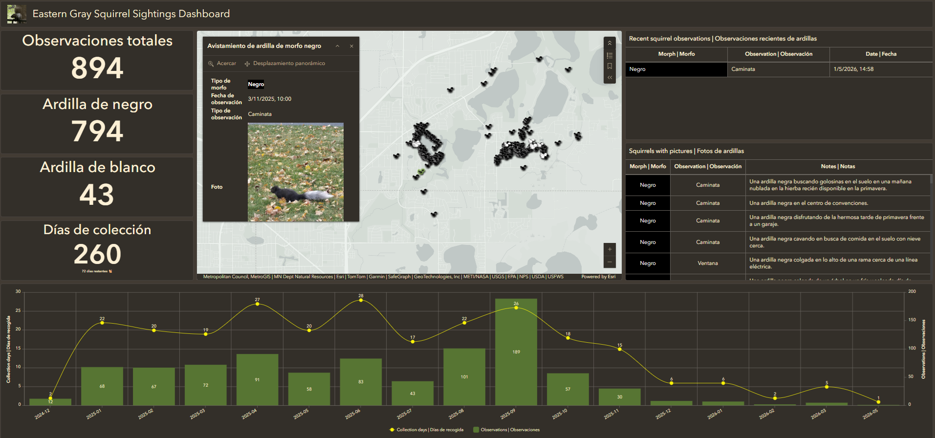
Designing one dashboard for multiple locales
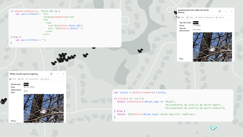
A single ArcGIS Dashboard can adapt to multiple locales without duplicating its data or configuration. Dashboards resolve locale at runtime through the user’s defined browser language settings or URL parameters. Based on the browser’s locale, the dashboard dynamically references the appropriate localized fields and applies localized-aware formatting for dates, numbers, and labels.
In addition to the default browser locale interrogating the dashboard’s content, a locale can be set through a dashboard using a URL parameter. The parameters are appended to the end of a dashboard URL using a hash symbol, #, and follow a key‑value pattern where param=value. URL parameters provide more control in how the dashboard is displayed at runtime, including language and regional formatting preferences:
// Default browser locale
https://www.arcgis.com/apps/dashboards/21159e6135bc40158c4314782fc20f5c

// Specify the English locale
https://www.arcgis.com/apps/dashboards/21159e6135bc40158c4314782fc20f5c#locale=en

// Specify the Spanish locale
https://www.arcgis.com/apps/dashboards/21159e6135bc40158c4314782fc20f5c#locale=es
Handling locales in Dashboards
The following workflow highlights how a locale is handled when a dashboard loads:
1. New survey responses are processed using the squirrels automation notebook that generates localized attributes and validates accessibility requirements.
2. When the squirrels dashboard loads, the user’s preferred locale is resolved using ArcGIS Arcade:
// Get the browser locale
var locale = GetEnvironment().locale;
3. Arcade expressions reference locale-specific fields and apply appropriate formatting across the dashboard’s elements. For instance, you can set the topText, topTextMaxSize, middleText, and middleTextMaxSize properties of a dashboard’s indicator element based on the browser locale.
// Set the Indicator's title based on the locale
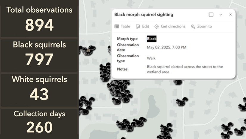
var squirrelText = IIF(locale == "es", "Ardilla de negro", "Black squirrels");
return {
  topText: `${squirrelText}`,
  topTextMaxSize: "medium",
  middleText: $datapoint.COUNT_OBJECTID,
  middleTextMaxSize: "large",
};
To learn more about the Arcade expressions provided in this section, visit the Eastern Gray Squirrels GitHub repository.
Localized formatting for dates and numbers
Designing for accessibility and internationalization ensures data is not just translated, but displayed based on a defined locale, which optimizes date formats, number separators, and currency conventions for a given region. ArcGIS Arcade allows you to dynamically format data to create localized display by determining locale settings and applying conditional formatting.
For instance, the Text() function formats dates, which can adapt to locales such as D/ M/ YYYY for the Spanish locale:
// Get the browser locale
var locale = GetEnvironment().locale;

// Get the feature layer's date field
var dateField = $datapoint.date_field;

// Format the date based on the locale
var formattedDate = When(
  locale == "es",
  Text(dateField, "D/M/YYYY"), // Spanish locale
  Text(dateField, "MMM DD, YYYY") // English locale
);

return formattedDate;
Another Arcade expression retrieves the locale from the environment, formatting the value using a localized pattern, and adjusts the number format for the Spanish locale:
// Get the browser locale
var locale = GetEnvironment().locale;

// Set the indicator value
var dataValue = $datapoint.value;

// English formatted numbers (e.g., 1,000.00)
var enFormat = Text(dataValue, "#,##0.00");

// Spanish formatted numbers (e.g., 1.000,00)
var esFormat = Text(dataValue, "#.##0,00");

// Return the formatted indicator text for each locale
return {
  middleText: When(locale == "es", esFormat, enFormat)
};
Authoring dashboards for assistive technologies
Accessibility does not stop at the map. Dashboards should also:
- Provide meaningful accessible names and descriptions
- Avoid repetitive announcements
- Include data tables as accessible alternatives to charts
- Consider support for multiple locales
- Support keyboard navigation across widgets
Plus, clear labeling and structure make dashboards usable without relying on visual cues.
Configure accessible names and text alternative for visual elements
When designing a dashboard’s elements, such as a serial chart, an accessible name can accompany the element. When available the text is communicated to assistive technologies using an aria-label, to provide additional context for data visualizations. When editing the element, navigate to the Accessibility tab and enter text into the Accessible name input.
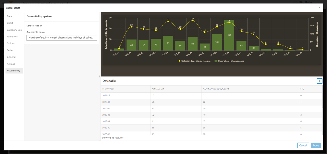
Accessible name considerations
When creating accessible names for dashboard elements, it is recommended to craft names with the following in mind:
- Describe the purpose of the image, rather then each visual detail. If the element failed to load, what would be the key purpose and takeaways of the element?
- Avoid repeating surrounding paragraph text verbatim; the accessible name should provide supplemental information in addition to surrounding content.
- Avoid relying solely on sensory characteristics, such as shape, color, size, position, or sound to ensure that even those who may not be able to see visual elements can understand the supporting text.
Under the hood
If an accessible name is provided, the aria-label is added to the element, which can be found when inspecting the element using a browser’s developer tools:
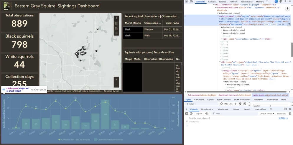
The following is an example of the dashboard’s serial chart element, which includes the provided accessible name using an aria-label to communicate the chart’s textual context to assistive technologies.
aria-label="Number of squirrel morph observations and days of collection per month."
Supporting data exploration with tables
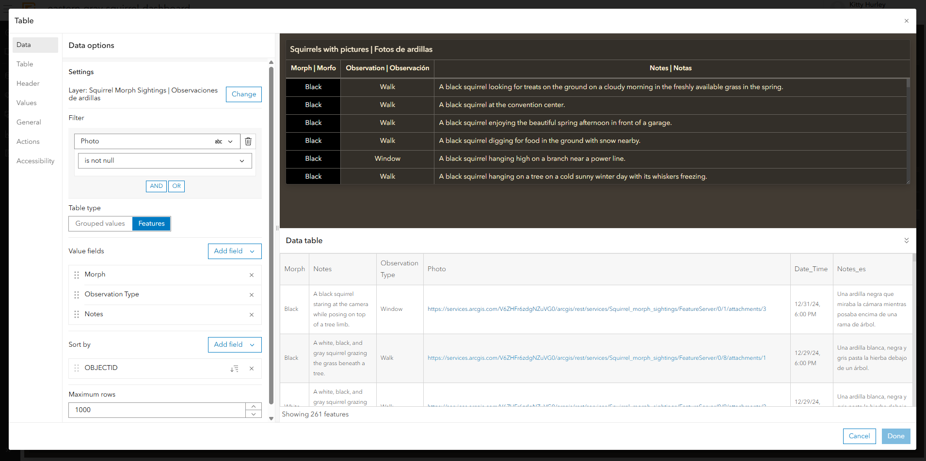
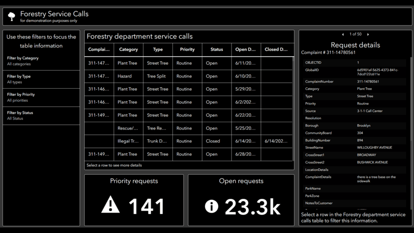
Discerning information directly from a map can be challenging, especially when datasets are dense or interactive. ArcGIS Dashboards offers table elements that enable individuals to sort, filter, and review data in a structured format, allowing for additional context. For instance, in our squirrel dashboard, observations containing photos can be sorted by their collection date. Offering both maps and tables in your dashboard supports multiple methods of data navigation while also improving accessibility for users who rely on assistive technologies or who may interpret information in different ways. While maps are essential for showing spatial relationships and geographic patterns, tables provide a more effective and accessible way to examine the underlying data, while improving usability for a wider range of audiences.
Summary
Accessibility and internationalization are not edge cases; they are indicators of how well an application scales. Designing with accessibility in mind means thinking ahead. By focusing on structure, semantics, and data quality, ArcGIS applications can adapt to different languages, locales, and access needs without multiplying maintenance effort. Design once to reach a more diverse audience.
- Do not retrofit accessibility, design for it early
- Structured content supports both accessibility and localization
- Enforce inclusive requirements at data entry
- Avoid duplicating data, maps, and dashboards
- Use automation thoughtfully to scale inclusive practices
By focusing on structure, semantics, and data quality, your ArcGIS applications can adapt to different locales and accommodate more individuals without additional maintenance efforts.
Explore further
Join us next month at the 2026 User Conference in San Diego to learn about ArcGIS: Automating and Enhancing Apps for Accessibility and Localization. Check out accessibility at the User Conference to read further on accessibility sessions offered at the upcoming conference.


Commenting is not enabled for this article.