Raw counts are the cornerstone of cartography. But often it’s easier to get our heads around the data if we speak of relative proportions, for example, “renters outnumber owners 3 to 1 here” or “there are roughly equal amounts of corn and wheat harvested here.” It’s even better if we can see those proportions directly.
Comparing proportions helps us because it is both unitless and turns big numbers into simple-to-compare ratios. It also helps us to compare places that might have wildly different total values because it focuses on proportions not raw counts.
In the June 2022 release, Map Viewer offers Charts and Charts + Size map styles to help us compare the relative proportions of things. These two new styles open-up some great mapping opportunities.


Getting Started
You will need data which has counts of different categories of things, such as,
- renters vs home owners
- total number of incidents by crime type
- total acres of different crop types
- counts of people by age group
The data can be attached to areas or to points. Once you add two or more categories to Smart Mapping you’ll see these new map styles light up as options.
Put another way, any map you made previously using Predominant category, Predominant category + Size, or colored Dot Density could be used.
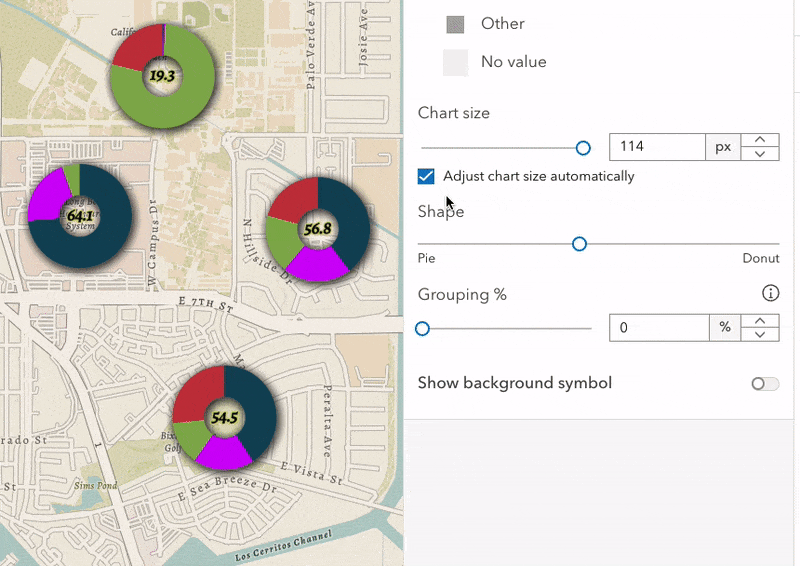
Pro Tip: Work with a range of 2-10 categories. If you have more than 10 categories, they will be grouped together into an Other category.

Once you add two or more attributes in Step 1 of Smart Mapping the new styles light up. They nicely compliment the other multivariate mapping options.
Four Tips
1: Donuts or Pies?
Both are wonderful, so use the Shape slider to find your happy place.
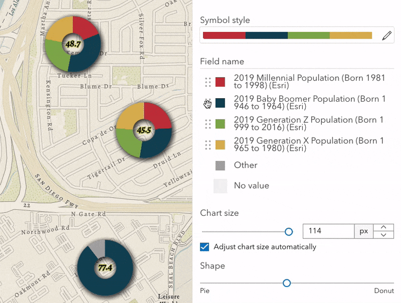
2: Re-order your segments
To do this, just grab and drag the list of fields to re-order the segments of the pies.
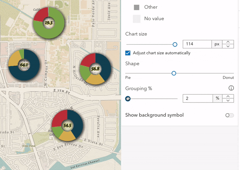
3: Grouping Slider
This is easily my favorite feature. Anyone who has used pie charts knows you sometimes end up with very small, hard-to-read slices. The ArcGIS API Team came up with a great solution: Use the Grouping % slider to dynamically group small values into an Other category. No need to calculate new fields, or write an Arcade expression to clean-up those small values.
This is a great way to do on-the-fly data filtering.
4: Use a color ramp or individual custom colors
Click the color ramp to pick one of Esri’s perceptually-graded categorical color ramps. Or click on the individual color chips to select just one new color manually.
Pro Tip: Don’t forget that adding a dropshadow from the Effect pane can really help make your pies pop! Or use a Feature Effect to selectively highlight some pies and mute others.
Next Steps
If you’ve already made a Predominant category map or a colored Dot Density map, take 15 seconds and recast those maps as pie or donuts and see what happens. I’m willing to wager new details will emerge when you do. If you’re new to multivariate cartography, why not started with a finished map from the Living Atlas of the World—like this popular one that uses the Predominant category style—and convert it to a pie chart map. The same data work beautifully for either map style. Modifying a finished map is often the fastest way to test a new capability, rather than starting from scratch.
Lastly, there is no “best map style” for multivariate cartogaphy; they’re all great choices that have different strengths. Which is why we are working to expand Smart Mapping in the Map Viewer. But next time you need to show the breakdown of categories definitely consider a Chart or Chart + Size map.
Happy Mapping!

Really appreciate this feature, is there a way to add it in web appbuilder? I added a map with “charts and size” symbology to a new app, but the symbology disappeared in the app view.
Web AppBuilder is powered by the legacy 3.X API which cannot do these new map styles (like pie charts), which is one of the reasons it will be retiring. Esri’s newer app are all powered by the current 4.X JS API, which can support this map style.
Thank you! I transitioned to the Experience Builder, but it looks like I cannot now embed the app, since I have to embed via Map Viewer Classic, which doesn’t support this symbology. Is there any way around this? Or are there any updates on when we could see a compatible option for app embedding with this symbology?
I’m not the best person to answer questions about Experience Builder, but generally I’m curious if there a reason you can’t simply use Map Viewer to make these maps? Is there some reason that you *must* use MV Classic? I ask since MV Classic won’t be getting pie charts on maps and in fact will be retiring soon.
Sure, this is because according to this page doc.arcgis.com/en/arcgis-online/share-maps/embed-maps-groups.htm (“Embed maps, apps, and groups”) apps currently must be embedded via Map Viewer Classic
Got it! I just asked my collagues who said this is how they do this: (1) make the pie chart map you want in MapViewer, style the pop-ups, color schemes, etc, then (2) use Instant Apps, specifically the Media Map template which has the controls for how the embed itself should look/work. This was you can use the newest mapping tech and still do embeds.
details here: doc.arcgis.com/en/instant-apps/latest/create-apps/media-map.htm
hope that helps
Looks like I can’t add the app widgets I need (attribute table, filter etc.) with the Media Map approach. Thanks so much for your help though and I will keep an eye out for future options for embedding from Experience Builder!