Web map pop-ups are a powerful and all-too-often underappreciated storytelling device. They’re unobtrusive but can reward readers’ curiosity by enriching maps with additional context, information, and perspectives. But when pop-ups are implemented without careful thought or intention — or are left unconfigured — they can do more harm than good, interrupting the flow of a story or overwhelming readers with extraneous information.
Like many narrative and cartographic elements, pop-ups should be structured to serve the needs of the reader — and in many cases, this means less is more.
Here are six practical tips for transforming your web map pop-ups from unstructured attribute tables into effective narrative elements that add color and context to your map and strengthen your story’s main messages. The good news is that many of these suggestions are easy to implement, regardless of whether you’re building a pop-up from scratch or sculpting a pre-configured pop-up from a Living Atlas layer.
1. Consider whether they’re necessary at all
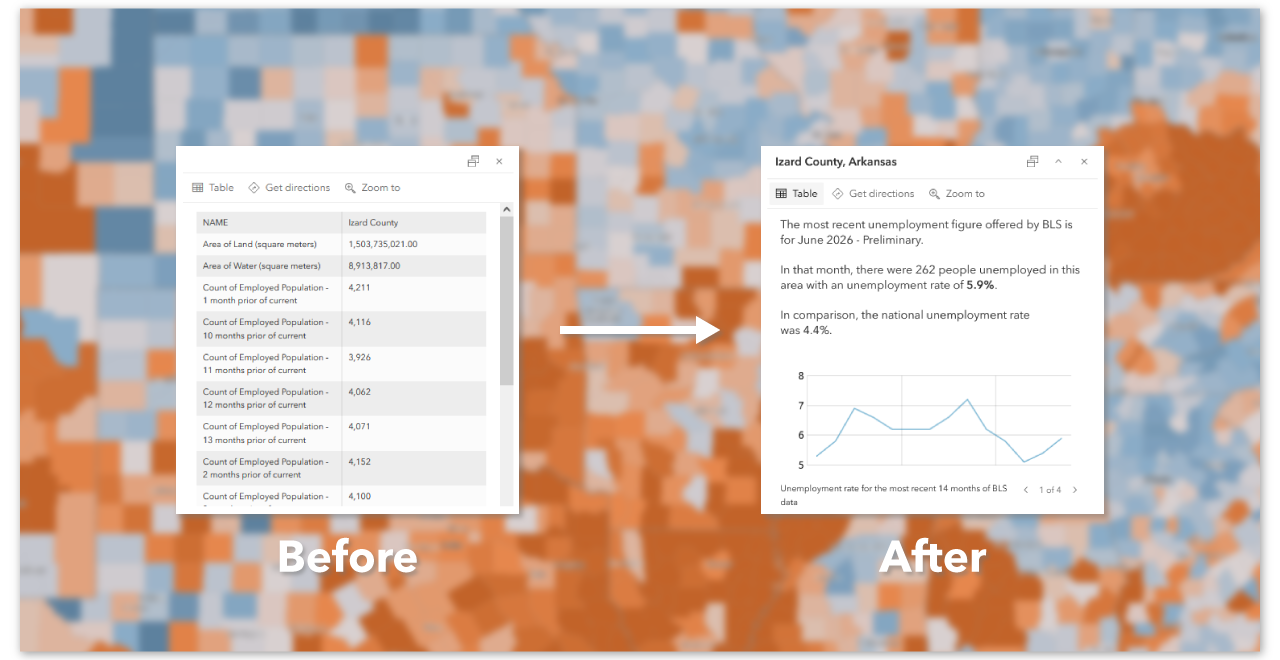
Not every map needs a pop-up; sometimes labels, annotations, or narrative text can communicate a map’s message more effectively. Because pop-ups are typically displayed only as the result of intentional user interaction, they should add value to the experience and deepen readers’ understanding of the map’s core themes and messages. By default, pop-ups are enabled on feature layers, so be sure to disable them if they’re unnecessary.
2. Remove the noise
Web map pop-ups should be optimized for quick, at-a-glance interactions. Keep your content focused and resist the temptation to turn every pop-up into a miniature report. If a reader needs to spend several minutes parsing a pop-up, consider whether some of that information would be better suited to the surrounding narrative. Similarly, avoid enabling pop-ups on more than one layer at a time.
Just because pop-ups can contain a wealth of information doesn’t mean they should. It’s almost always a good idea to prune your pop-ups to include only the attributes or information that are directly relevant to the theme and purpose of your map. Removing extraneous fields such as object IDs and other metadata will ensure that your readers don’t need to hunt for the information they seek when they select a feature on the map.
Put yourself in the reader’s shoes: If you decide to click on a feature, what pieces of information are you most likely looking for? Start with those — and then remove everything else.
Learn more: Configure pop-ups (Map Viewer documentation)
3. Speak like a storyteller
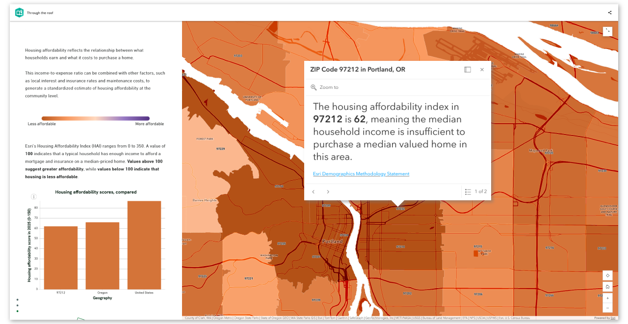
By default, feature layer pop-ups include a rudimentarily formatted table of attribute fields and values. Not only can this be an overwhelming amount of data — see the previous point about removing the noise — but it can also be difficult to interpret, especially when a layer uses abbreviated or coded field names.
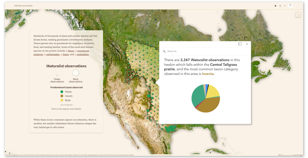
Instead of relying on default attribute tables, consider reformatting your pop-ups to use natural, human language. This is especially important if your story is written with a distinct narrative voice. The language in your pop-ups should feel like it belongs to the same story as the rest of your content.
Learn more: Pop-ups: the essentials
4. Provide context
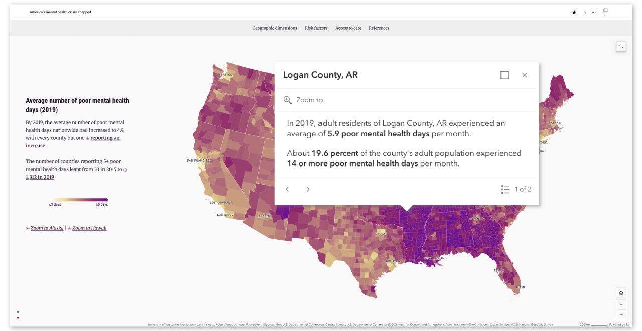
Without appropriate context, data can lose its meaning — or worse, mislead. Rather than show isolated values in your pop-ups, try to give readers some context for what those values mean. This may be as simple as appending appropriate units or clarifying what a number represents.
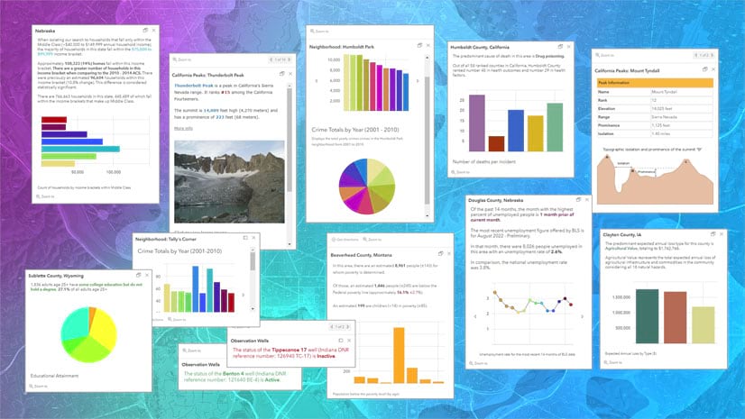
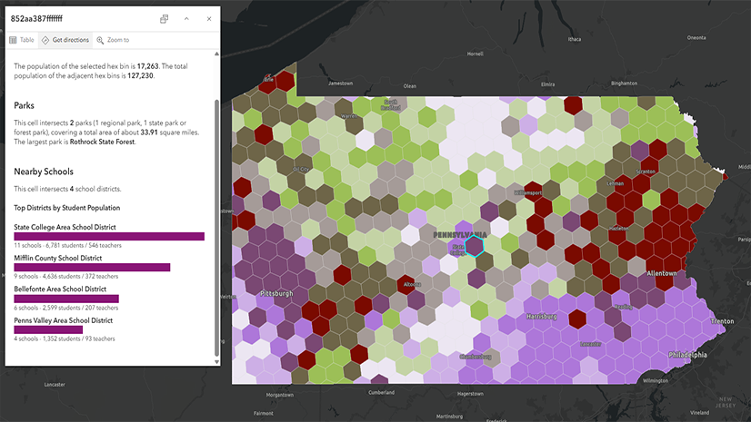
With Arcade, you can go even further by comparing a selected feature’s values with meaningful benchmarks, such as regional or national averages, rankings, thresholds, or historical trends — or even combining values from multiple layers in a single map. You can also use Arcade to add dynamic, location-specific charts, tables, or simple graphics to your pop-ups to add even more detail and context to your map.
Learn more: Enhance your pop-ups using Arcade + Living Atlas
5. Reinforce the visual language
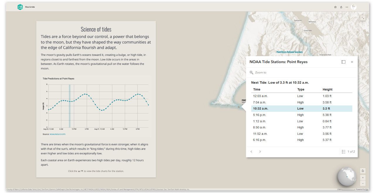
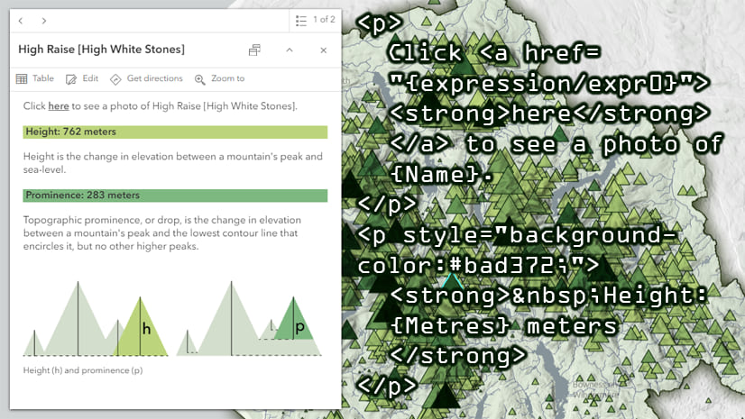
Connect pop-up information to the map by intentionally reusing colors, text styles, labels, and other visual conventions. If your choropleth map uses purple to represent low values and green to represent high values, for example, consider recoloring pop-up values to match the map’s symbology. This can reduce the cognitive effort required to interpret the map and its corresponding pop-up.
This doesn’t mean that pop-ups should simply repeat everything the map already communicates. But reinforcing a pattern or value represented visually on the map can help readers connect the map’s visual language with its underlying data — particularly readers who may have less experience interpreting thematic maps.
Learn more: Beginner steps for adding color to pop-ups with HTML
6. Guide the reader’s eye
Pop-ups aren’t exempt from basic principles of layout and design. If your pop-ups include complex information or visuals, establish a clear visual hierarchy that guides the reader’s eye through the information in an intuitive manner. Use headings, text styles, and spacing to distinguish the most important information from supporting details.
Be sure to take into account the limited real estate available in a pop-up. If you’d like to include an image and dynamic text, for example, you might want to position the text first so that it isn’t hidden below a scroll.
Well-designed pop-ups should feel like a natural extension of the map, rather than an afterthought. Pop-ups should reward curiosity with information that is relevant, meaningful, clear, and easy to interpret. They don’t need to be fancy — again, less is often more — but they do need to be designed with intention. By treating pop-ups as important storytelling elements rather than containers for unconfigured data, you can deepen your readers’ understanding of the messages you aim to communicate with just a few clicks.


Article Discussion: