From the beginning, the new ArcGIS Online Map Viewer has had powerful capabilities not available before, but the list of exciting features continues to expand. With the December 2021 release, there are three notable features that are worth calling out. All three have been requested by the user community, and the development team has been listening to those requests carefully.
Check out these three awesome things you can now do with Map Viewer:
- Source HTML within pop-ups
- Feature-specific effects
- Custom clustering pop-ups with Arcade
Customize your Pop-ups
Source HTML editing now available in pop-ups
While this feature is not new to online mapping, it has recently been added into the popup configuration options in Map Viewer. You can now alter the source HTML of your pop-up text in order to customize how the text appears.
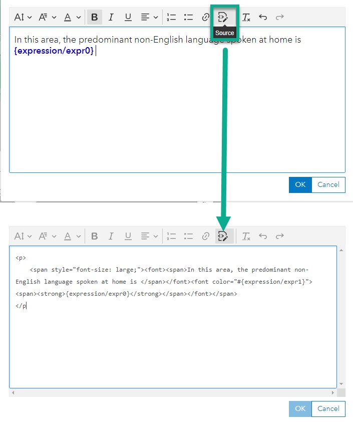
You might notice the default HTML being stored is slightly different or that your existing HTML has changed slightly from what you are used to seeing in Map Viewer Classic. There are two reasons for these changes. The first is to better align with HTML5 standards, and the second is reduce the likelihood of your presentation style attributes being overridden by the app showing the pop-up. But don’t worry, if your previous maps used HTML customization from Map Viewer Classic, these will automatically be converted.
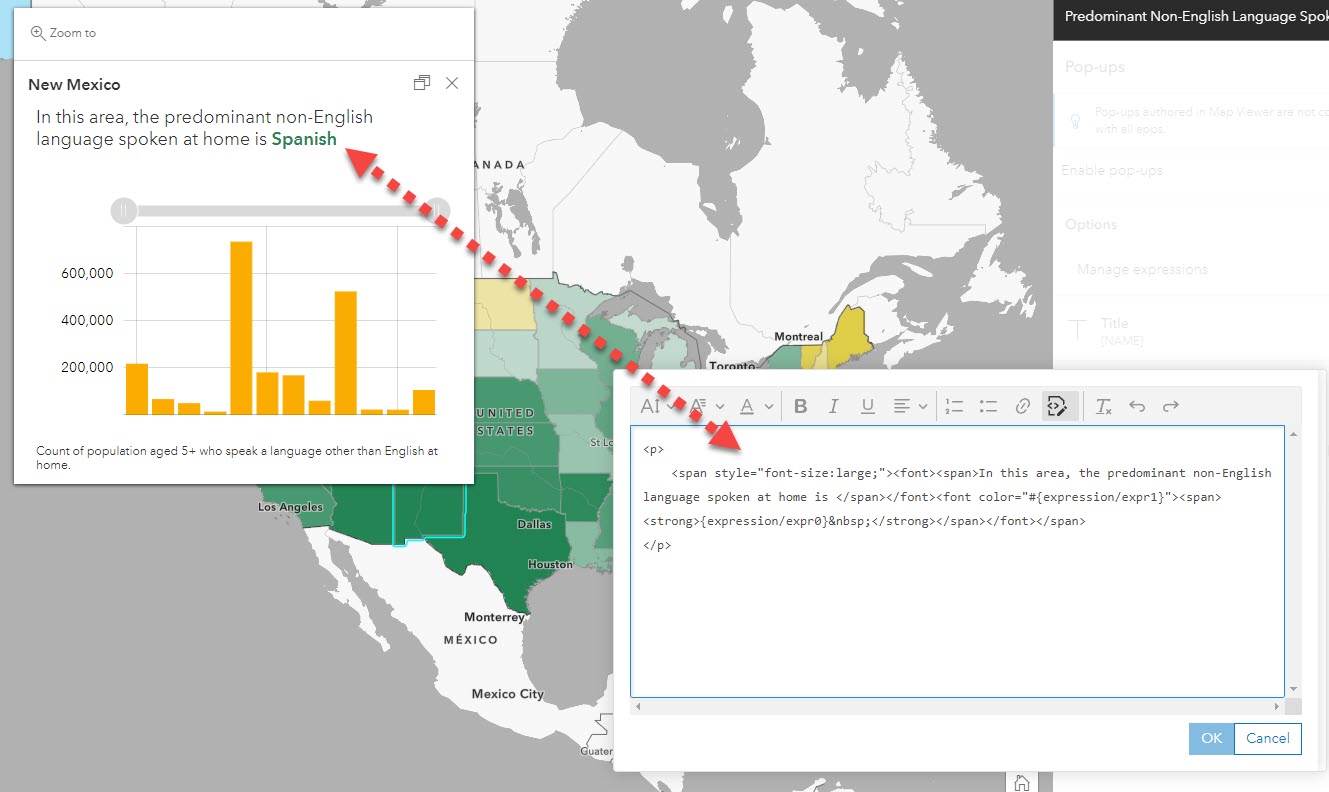
View the supported HTML documentation for more information about the tags and attributes you can use in your maps. Use HTML to customize colors, tables, sizing, and more in your map pop-ups!
For more information about this enhancement, visit this detailed blog by Lauren Ballantyne.
Emphasize important parts of your map
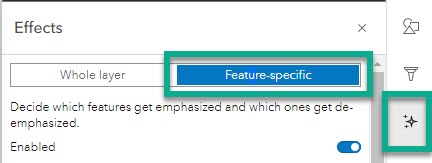
Feature-Specific Effects
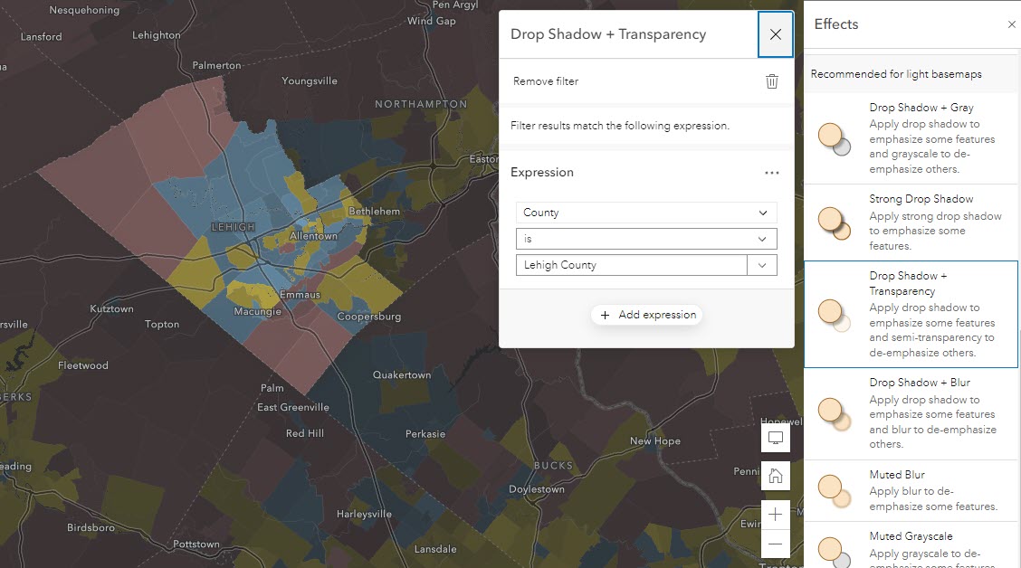
Layer Filtering has always been a way to highlight specific features within maps, but there is now another way to emphasize these features visually: feature-specific effects. With easy-to-apply combinations, the pre-set options allow you to quickly choose specific parts of your data to appear more prominently in your map.
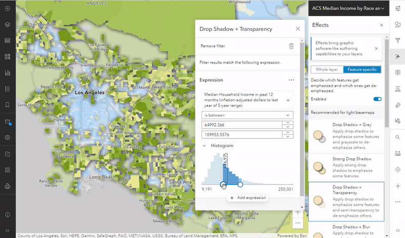
For example, if you are mapping an ACS layer from Living Atlas, it contains nationwide coverage, but you may want to emphasize the tracts within your county. This example uses Drop Shadow + Transparency to highlight Lehigh County while still enabling us to see the patterns of nearby counties for comparison:
Another way to emphasize values is by using a numeric attribute and threshold. For example, if we want to emphasize low-income communities in Chicago, we can use the Drop-Shadow + Blue feature-specific effect to highlight areas below the 2019 national median average of $62,712. The histogram allows us to type a specific value or range of values important to the map and data:
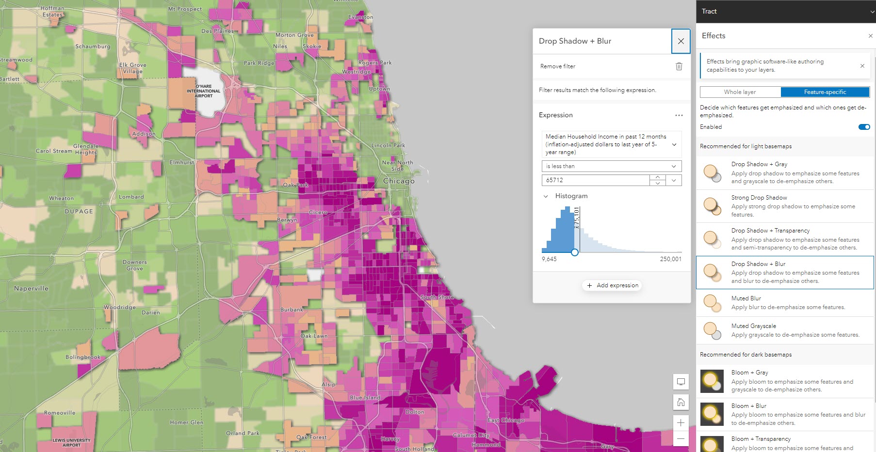
You may have noticed in the above examples that Map Viewer recognizes if your basemap is dark or light, and offers suggested effects that work best with your map.
To get to the feature-specific effects, enable the layer you want to apply them to and choose the effects option on the right. Choose “feature-specific” to specify the effects and expression. Easily adjust your expression to emphasize different parts of your data like values above or below an important threshold.
For more information about this new feature, visit this blog by Mark Harrower: Feature-Specific effects: the next enhancement for Map Effects
To get inspired, or to find more map examples, check out this group of maps.
Include more information in your Cluster Pop-ups
Arcade-driven Clustering Pop-ups
Since the introduction of clustering, people have wanted a more robust popup experience for the clustering pop-ups. The development team at Esri has listened to these requests and has implemented a new way to summarize clustered data with the power of Arcade.
For maps that clustered numeric attributes, you used to only be able to see the average value of that field within a pop-up. Now, with a few lines of Arcade, you can extract additional fields or statistics such as the maximum/minimum values like the example below:
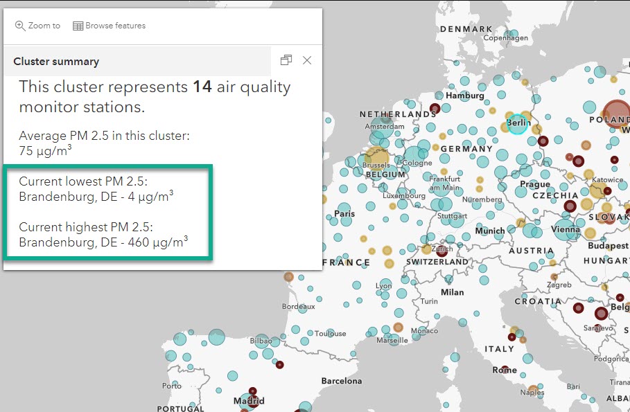
To see the Arcade used in the map above, go into the clustering pop-up and explore the expressions.
When clustering categorical data, you used to only see the predominant value of that cluster based on the mapped field. Now, you can show more contextual information about the cluster like a list of all features within the cluster:
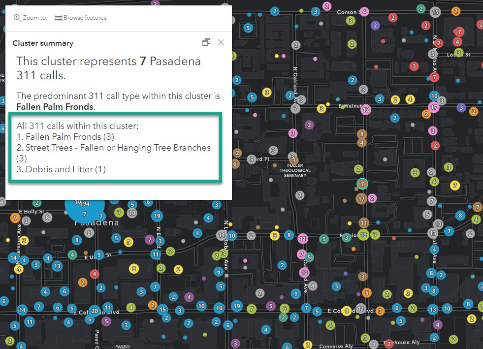
To see the Arcade used in the map above, visit this web map and go into the clustering pop-up settings to explore the expressions.
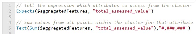
This new Arcade capability uses $aggregatedFeatures, which acts as a FeatureSet (the set of features within the cluster). You can access the data behind the clustered points and communicate them within your popup using simple or advanced Arcade statements such as the one below:
For more information about this enhancement and how to apply it within your maps, a new detailed blog is coming from Kristian Ekenes soon!
Try Map Viewer
Still new to Map Viewer? Check out the following resources:

Article Discussion: