Time adds a new dimension to maps, helping you reveal patterns, communicate trends, and tell clearer stories about how your data changes over time.
Even if your data isn’t configured as time-enabled, recent Map Viewer enhancements that add support for time series and time-based layer visibility make it easier than ever to create these visualizations.
This post demonstrates how to create time-based visualizations in Map Viewer and highlights several practical use cases. Each example below includes a link to the web map where you can explore how the content was configured.
Mapping migratory species
Migratory species move with the ebb and flow of the seasons. Driven by temperature and instincts, these creatures make annual journeys between their seasonal ranges. Migratory birds are especially emblematic of this behavior, often traveling vast distances across countries and continents.
Mapping the movements of these species can help conservationists identify the habitats, migration corridors, and stopover areas they depend on throughout the year. These insights support more targeted conservation actions, from protecting key habitat and feeding areas to prioritizing restoration work and coordinating management across the countries and regions that migratory species move through.
In this example, GPS tracking data from two tundra swan studies was aggregated into global hex bins and mapped by the number of observed points in each bin.
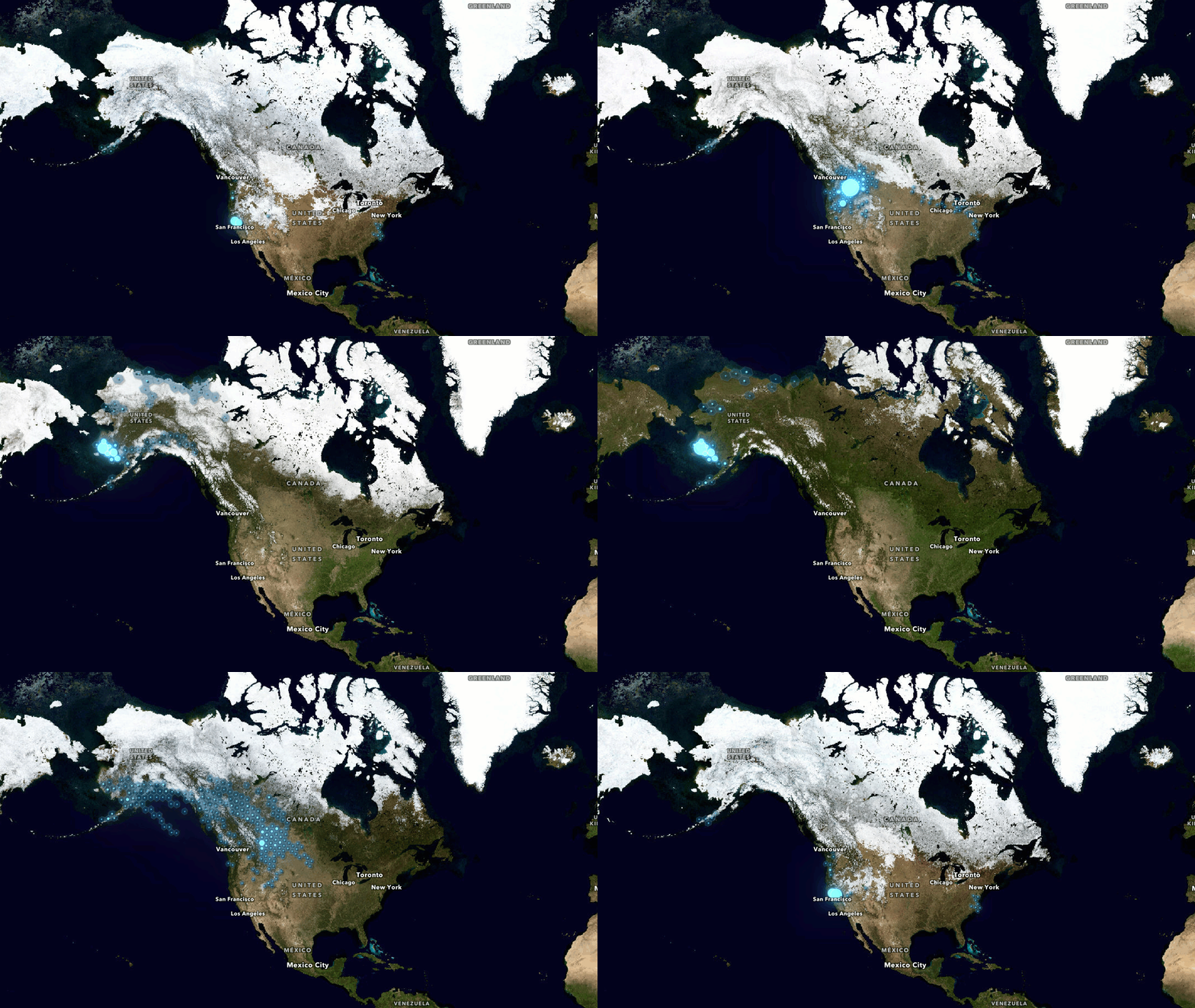
Visualizing GPS activity
To prepare the data for visualization, the GPS observations were summarized by the week of the year when they were recorded. These points were then grouped by this week attribute and spatially aggregated to the global hex bin where they occurred.
The resulting data structure contains a row for each hex bin and stores the counts of GPS point activity as a value across a series of columns for each week, creating a simplified measure of seasonal presence for birds within the studies: higher values indicate areas where there was more GPS activity observed in each week, while empty or low-value bins show places with little or no recorded activity.
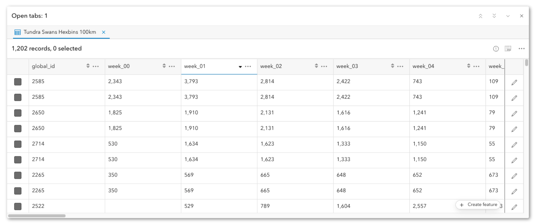
A time series in Map Viewer is built for this kind of column-based time structure: it reads change over time from multiple fields on the same feature, where each field represents the same attribute captured at regular intervals, such as hourly, weekly, or monthly observations. Meanwhile, the feature geometry remains constant while the values change, making it useful for sensor readings, monitoring stations, reporting areas, or other datasets where one feature stores a sequence of time-based values.
By keeping the geometry in a single row and storing repeated observations across columns, this approach can improve performance and reduce the need to duplicate the same feature geometry for each time step.
Configuring time series
To create this time series, open the layer’s Properties pane in Map Viewer and scroll down to the Time section. Click Time series with field values and Add a time series.
From there, name your time series, add the fields containing your values, and configure the time period and intervals.
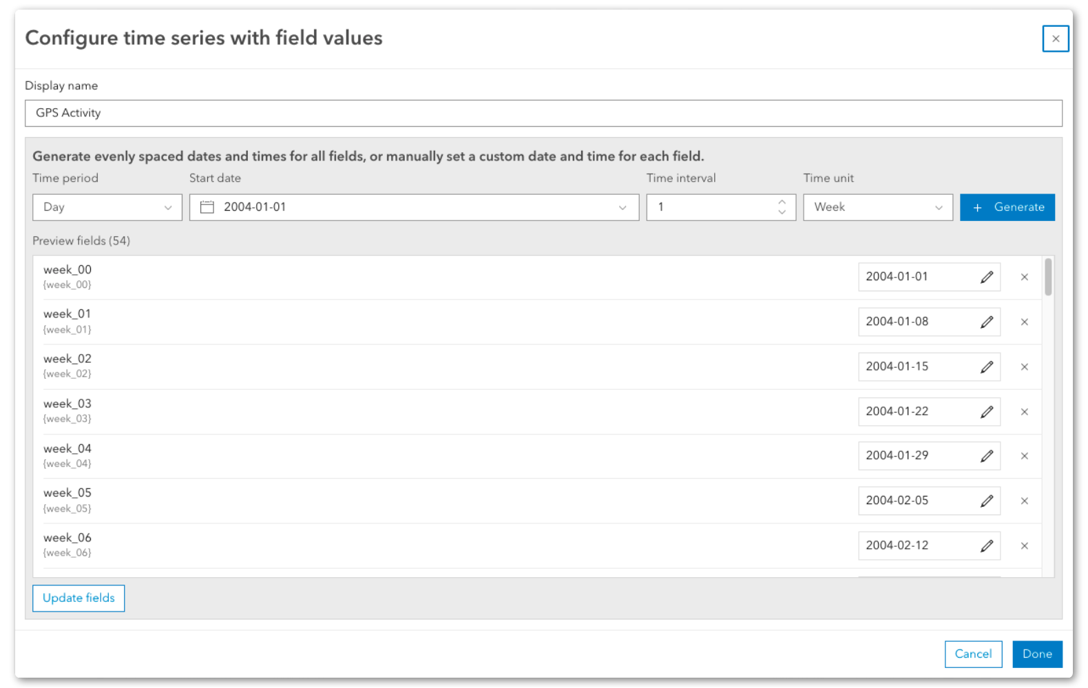
Once complete, you can apply this time series to the map’s time slider.
Seasonal imagery
The movement of migratory species is driven by the seasons, so it seems only natural to support this map with NASA’s Blue Marble: Next Generation imagery. Built from 500-meter-resolution imagery from the MODIS satellite, these monthly images reveal seasonal changes in the land surface and provide a perfect backdrop for the tundra swans, which breed in the Arctic and overwinter in North America, Europe, and Asia.
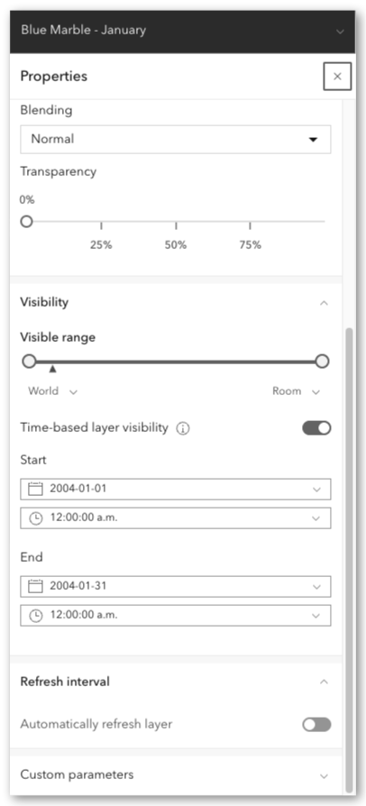
The choreography of these imagery layers uses time-based layer visibility in Map Viewer. By configuring this layer visibility, each layer will automatically be toggled visible or invisible based on the position of the time slider.
Configure time-based layer visibility
To configure this setting, open the Properties pane for any layer in Map Viewer and scroll down to the Time section. Toggle on time-based layer visibility and set a start and end date for when you would like your layer to be visible on the map.
Together these layers tell a richer story of tundra swan migration. The hex bin layer shows where swans were observed throughout the year, revealing broad patterns of movement, concentration, and seasonal presence. The monthly imagery adds environmental context, helping viewers connect those movements to the changing landscapes the birds move through.
As a time-based visualization, these changes are easier to see and understand, but migration is only one example. The same approach can also help communicate other dynamic phenomena.
Wildfires and air quality
Canada’s 2026 wildfire season has been fueled by a combination of lightning strikes, human activity, and unusually hot and dry conditions across several provinces. The smoke from these fires has spread across Canada and the U.S., triggering health advisories.
Using the archival data behind the OpenAQ Recent Conditions in Air Quality and National Weather Service Smoke Forecast in the ArcGIS Living Atlas of the World, it’s possible to create a time-based visualization to replay a specific time span and analyze the effects that wildfires and smoke had on air quality.
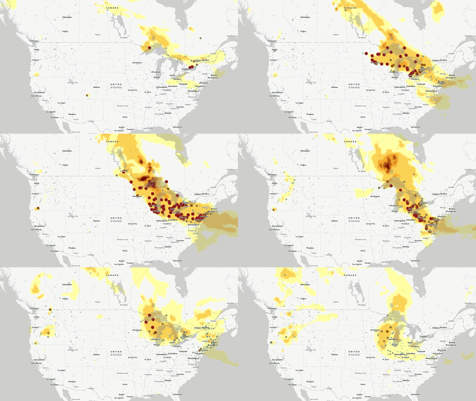
In this example, each air quality sensor was represented by a single row in the data, with recurring measurements stored as multiple time attributes across columns for the temporal window. This column-based structure was then configured as a time series in Map Viewer, allowing the time slider to animate changing sensor readings at each station.
The underlying smoke polygons were already time-enabled based on a timestamp encoded in the data.
When played back, the time configuration aligns the layers together and the effect of the wildfire smoke on air quality becomes abundantly clear.
Hurricanes and stream gauges
Like wildfires, time-based visualizations can also be used to create novel maps of weather phenomena, such as hurricanes, by showing how heavy precipitation moves through a region and how stream gauges respond as rainfall turns into rising water levels and potential flooding.
Again, retrieving archival data from Live Stream Gauges in the ArcGIS Living Atlas of the World and the Historical Hurricane Tracks this example reconstructs the effects of hurricane Helene in 2024 on the Southeastern United States.
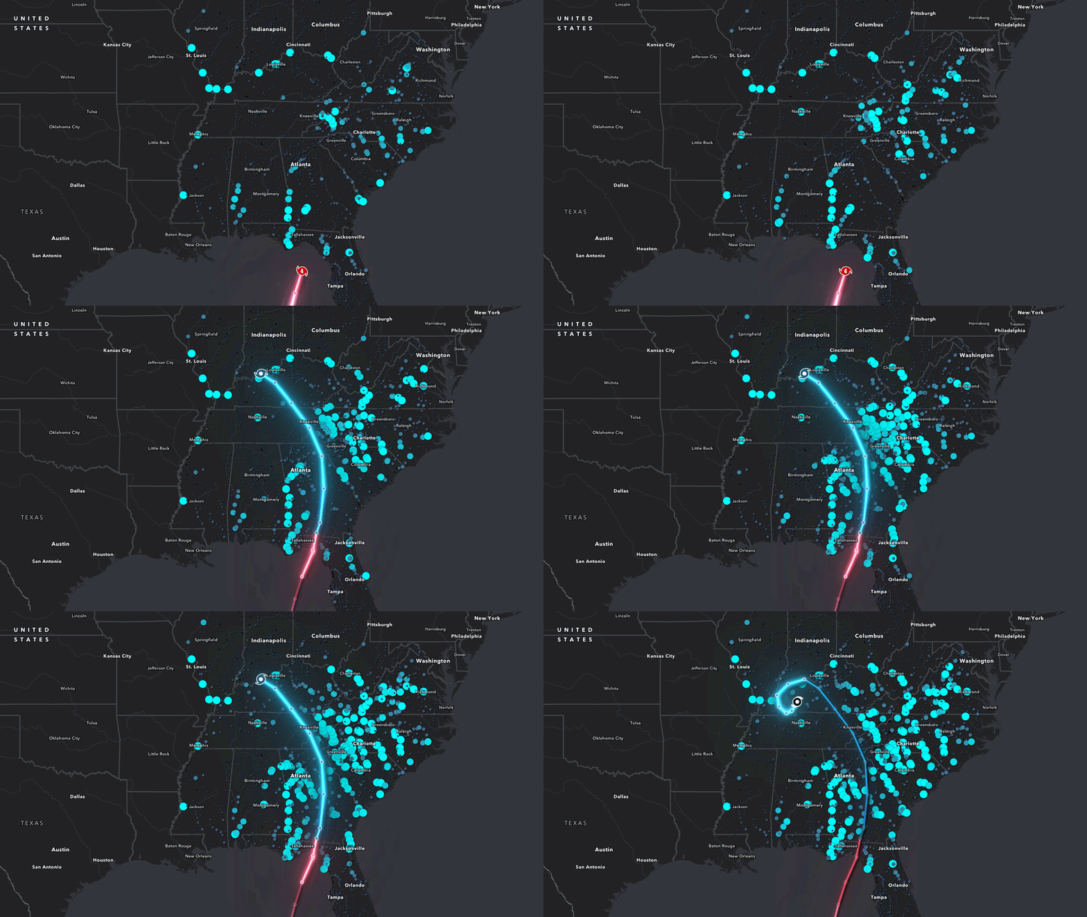
For this example, the stream gauges were configured as a time series with their hourly readings stored as a series of columns in the data and the tracks were segmented with a combination filters and feature-specific effects in order to highlight the most recent section of the storm track.
The resulting time-based visualization reveals the rising stream levels brought about by the increased precipitation of the storm as it progresses inland.
Tides
One last example also focuses on changing water levels, but this time along the coastline. Tides create a predictable rise and fall in coastal water, yet the timing and height of those changes vary by time and place. By animating water level station readings over time, a map can show how water levels progress along a shoreline or into a bay, making it easier to compare local patterns, identify periods of high and low water, and understand the rhythm of coastal change.
This example uses the Water Level Prediction Stations in the ArcGIS Living Atlas of the World and pulls related water level measurements from NOAA’s Center for Operational Oceanographic Products and Services (CO-OPS) to reconstruct water levels in and around the San Francisco Bay.
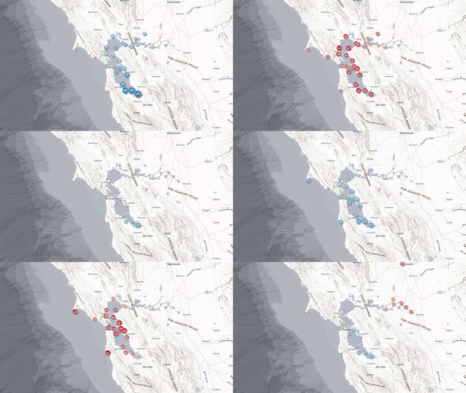
The water level stations were again configured as a time series with hourly readings stored in a series of columns. Over the course of the visualization, the station locations ‘pulse’ with high and low water levels as the tides flow in and out of the bay.
Visualizing time in maps
Time series and time-based layer visibility in Map Viewer give you flexible ways to build maps that do more than show where something is—they show how it changes over time.
After being configured in Map Viewer, these maps are ready to tell a larger story. Their time settings persist across the ArcGIS platform, allowing authors to maintain the same dynamic narrative in an Instant App for an interactive experience or integrated into ArcGIS StoryMaps with additional maps and explanatory text to enhance audience exploration of patterns.
- Instant App: Tundra swan migration
- Instant App: Wildfire smoke and air quality
- Instant App: Tidal water levels
- Instant App: Hurricane Helene and stream gauges
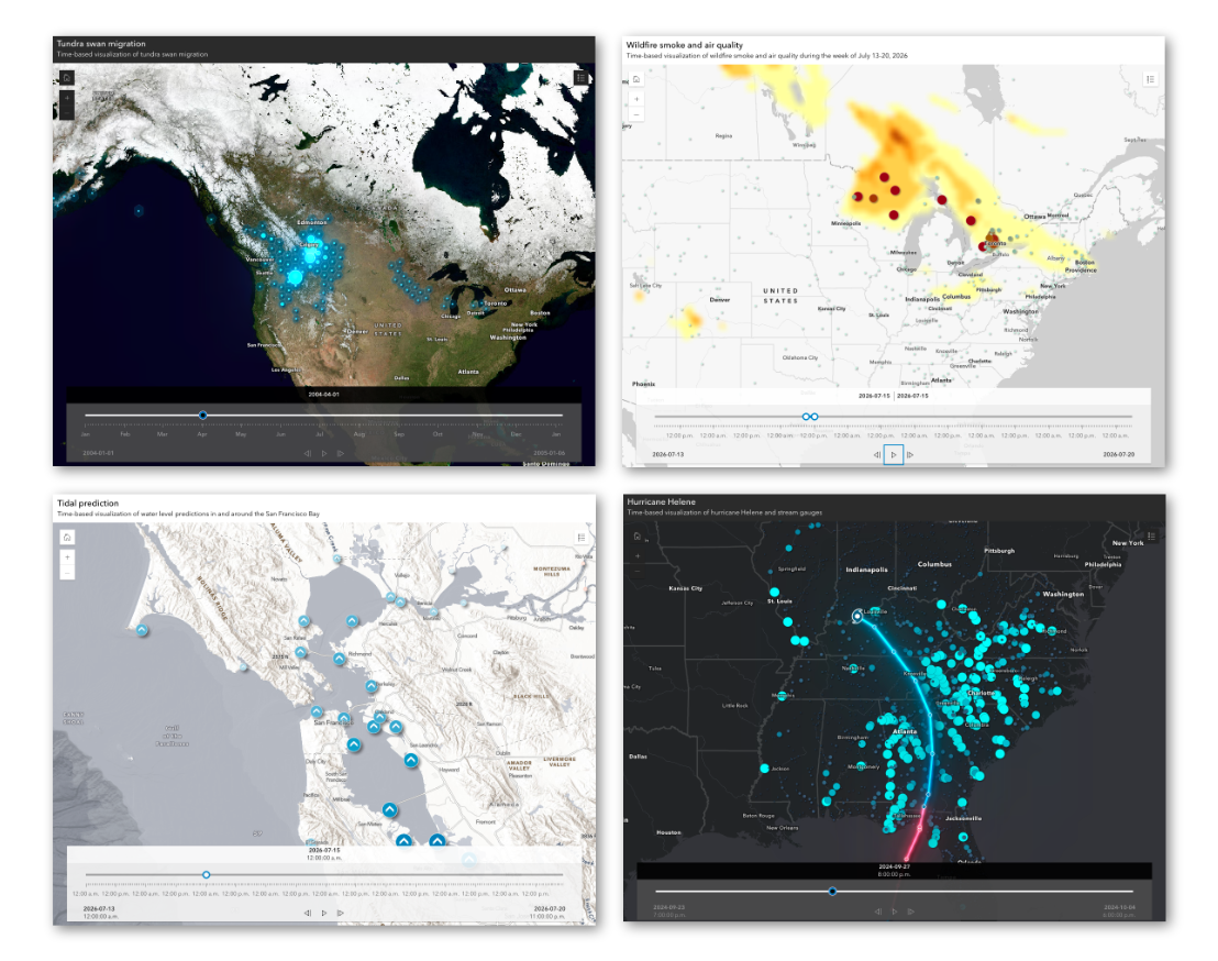
These examples serve as a starting point. The same methods could also uncover other seasonal or event-related patterns, such as:
- Wildlife telemetry paired with temperature, precipitation, or other environmental variables, where animal movement data can be animated alongside changing habitat conditions to show how species respond to vegetation, weather, and seasonal climate patterns.
- Demographics, such as population growth, age distribution, household change, or migration patterns, where the same census geographies can be animated across multiple years to reveal how communities evolve over time.
- Political voting patterns, where repeated election results, turnout, vote share, or margins of victory can be stored across consistent boundaries to show how electoral geography changes from one election to the next.

Article Discussion: