Map Viewer continues to evolve with powerful new capabilities that enhance how you style, explore, edit, and share your maps. The June 2026 update brings additional pro-level cartographic control, richer time‑based insights, expanded support for large and diverse data such as Parquet, and improved sharing and output with features like custom print layout templates—helping you create, analyze, and communicate maps more effectively.
Here’s a look at what’s new, and how these updates can help you create more dynamic maps and deliver greater impact with your data.
Quick Links
- Time Series Enhancements
- Animation Along a Line
- Symbol Layer Locking & Top-Level Color Styling
- Set Symbol Layer Draw Order
- New Fonts
- Alternate Symbols for Scale-dependent Rendering
- Flow Renderer
- Display Annotation and Dimensions (Beta)
- Parquet Feature Layer (Beta)
- Sketch
- Forms
- Arcade
- Expanded Layer Support for Field Formatting
- Imagery Layer Interactive Charts
- ModelBuilder
- 80-20 Analysis Tool
- Detect Target Using Spectra Tool
- Resample Library Spectra Tool
- Detect Image Anomalies
SHARE AND COLLABORATE
Review Map Tool
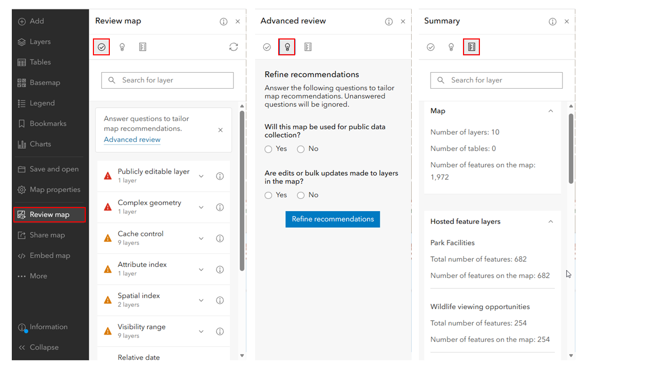
As part of this update, we’re introducing Review map, a new tool that evaluates web map configurations against established best practices for high‑traffic maps and generates a report showing which practices are already in place and where improvements can be made. Review map analyzes the hosted feature layer items in your web map and shows you where small changes can make a big difference in the map’s ability to scale. For example, editable layers and layers with complex geometries are likely to introduce latency during high traffic conditions. Review map will identify these in a list of recommended configuration changes displayed in order of severity. From here, authors can navigate to the relevant setting to address the recommendation or jump out to documentation to learn more about the setting. Recommendations can be refined based on the intended use of your map and layers by answering questions in the Advanced review panel. An overview of the map and its hosted feature layers can be found on the Summary panel. Here you can easily discover the number of layers and features powering your map as well as understand geometry complexity through vertex counts. Initially focused on hosted feature layer items, Review map brings ArcGIS best practices for building scalable web maps directly into the Map Viewer experience and lays the groundwork for broader quality and governance workflows.
Custom Print Layout Templates
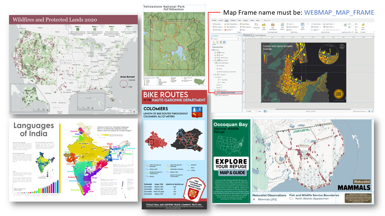
Custom print layout templates are now fully supported in Map Viewer, enabling greater flexibility for organizations to apply their own branded layouts to web maps. While the default layouts have always provided production‑grade output, this enhancement allows users to bring in templates authored in ArcGIS Pro and apply them directly in web workflows. Authors can incorporate standardized elements such as titles, legends, logos, and page sizes, ensuring consistency across outputs while meeting specific organizational requirements. This capability streamlines the creation of polished, presentation‑ready maps in the browser and supports scalable, repeatable print workflows that align with established cartographic standards. To learn more, see this blog.

Visualize and Style
Time Series Enhancements
Time-based visualization has long been possible in Map Viewer through time-enabled layers, Arcade expression to create animations from sequential temporal fields. What is new is the ability to configure time series animation as a first-class capability directly in Map Viewer.
Time series in Map Viewer provides a performant way to visualize change over time by using column‑based data, where multiple time values are stored as attributes on a single feature rather than repeated across many rows. By pivoting the data in this way, the visualization engine can dynamically switch which attribute is displayed as the map’s time changes, enabling smooth, GPU‑driven animation without duplicating geometry. This approach integrates directly into the web map, supporting styling, labels, and pop‑ups, and allows users to animate and explore temporal patterns alongside other context, such as time‑aware sketch layers. This capability supports richer temporal storytelling in Map Viewer, such as tracking gas prices across days, monitoring environmental change, or showing trends across weeks. By making attribute-based time animation easier to configure and fully integrated into the map authoring experience, Map Viewer helps users explore patterns, communicate trends, and tell clearer stories about change over time.
Animation Along a Line
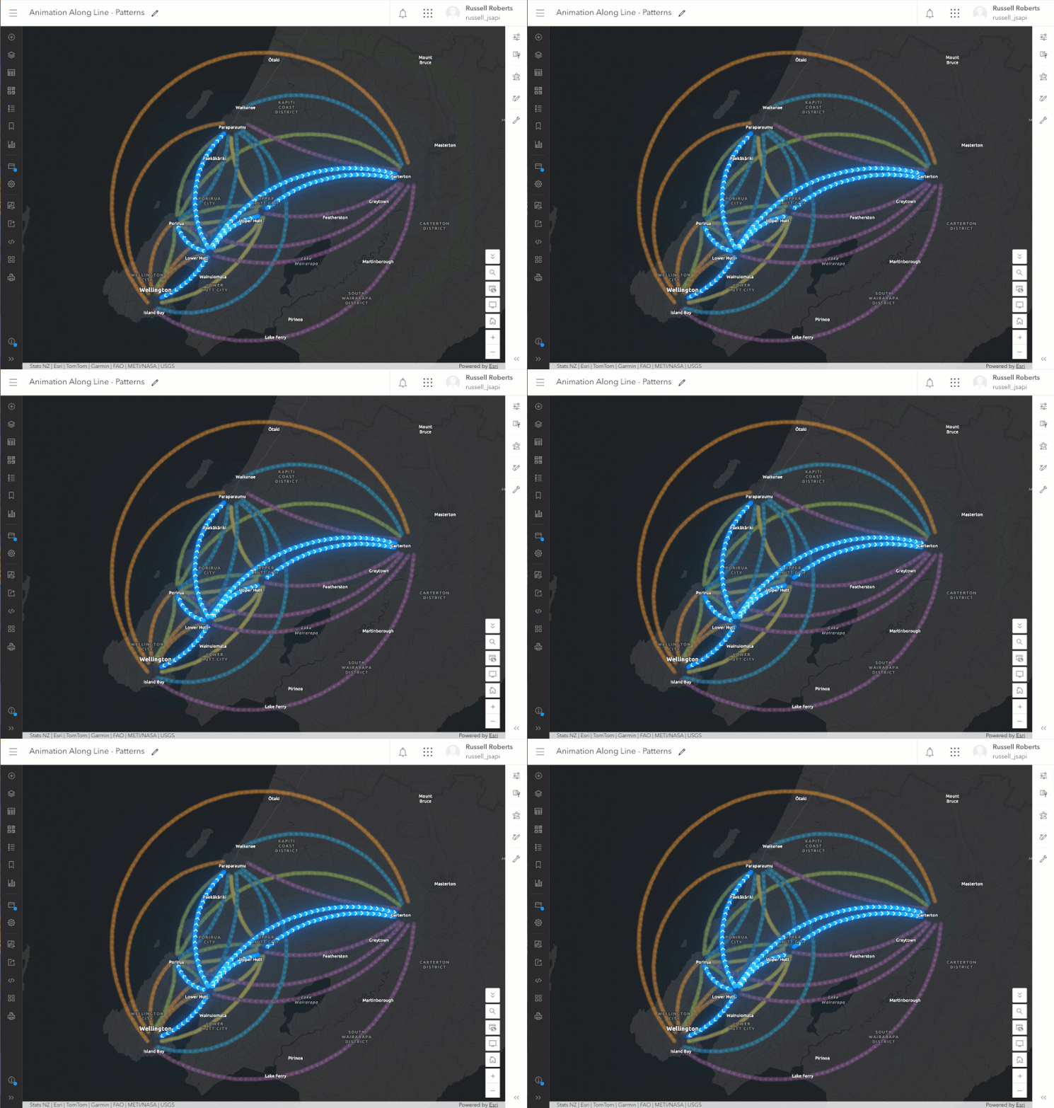
Animation Along Lines in Map Viewer brings line features to life by animating a symbol or pattern moving along a path, making movement and direction immediately intuitive. This allows users to clearly communicate routes, flows, or journeys—such as traffic, pipelines, or travel paths—without needing complex data models. By adding motion to otherwise static lines, it significantly enhances storytelling and user engagement, helping audiences quickly understand how things move across space.
New Fonts
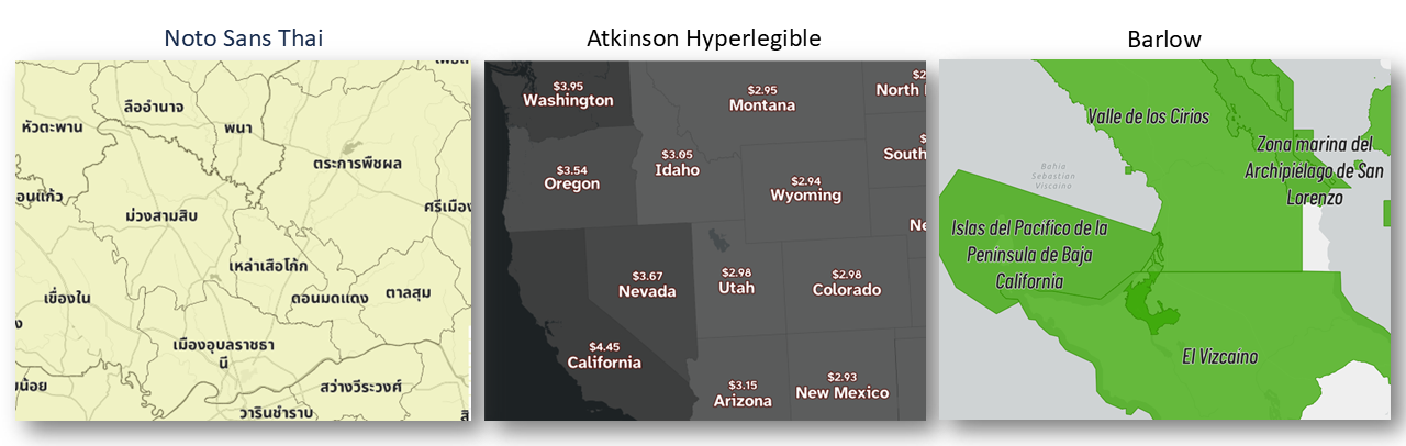
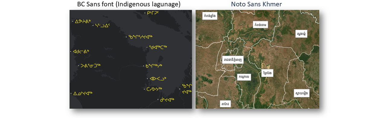
New fonts in Map Viewer expand cartographic flexibility while improving readability and accessibility across maps. They reflect a meaningful step forward in how maps communicate across languages, contexts, and audiences. By introducing fonts like Noto Sans for Thai, Khmer, Lao, and Myanmar, Map Viewer now supports complex character sets that were previously difficult to render, enabling labels to display accurately as part of a cohesive web map designed for specific language contexts. The addition of accessibility‑focused options such as Atkinson Hyperlegible, along with widely requested fonts like Barlow and BC Sans, helps improve readability and inclusivity while enabling closer alignment with organizational branding. Behind the scenes, a shift to modern web font technology ensures these fonts work seamlessly from ArcGIS Pro to Map Viewer—so users can design with confidence, knowing their typography will carry through without extra effort.
Symbol Layer Locking & Top-Level Color Styling
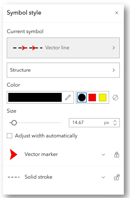
This release also introduces refinements to symbol styling in Map Viewer, giving you greater control and efficiency when working with complex vector symbols. You can now apply top‑level color changes that affect only unlocked symbol layers, while locked layers remain unchanged—making it easier to restyle specific parts of a symbol without impacting the whole. Additionally, symbol layers are collapsed by default to provide a cleaner, more streamlined interface, allowing you to focus on high-level adjustments before diving into layer-level edits. These improvements are also reflected in the broader Styles and Smart Mapping experience, ensuring a more consistent and intuitive styling workflow across Map Viewer. This is also available to sketch.
Set Symbol Layer Draw Order
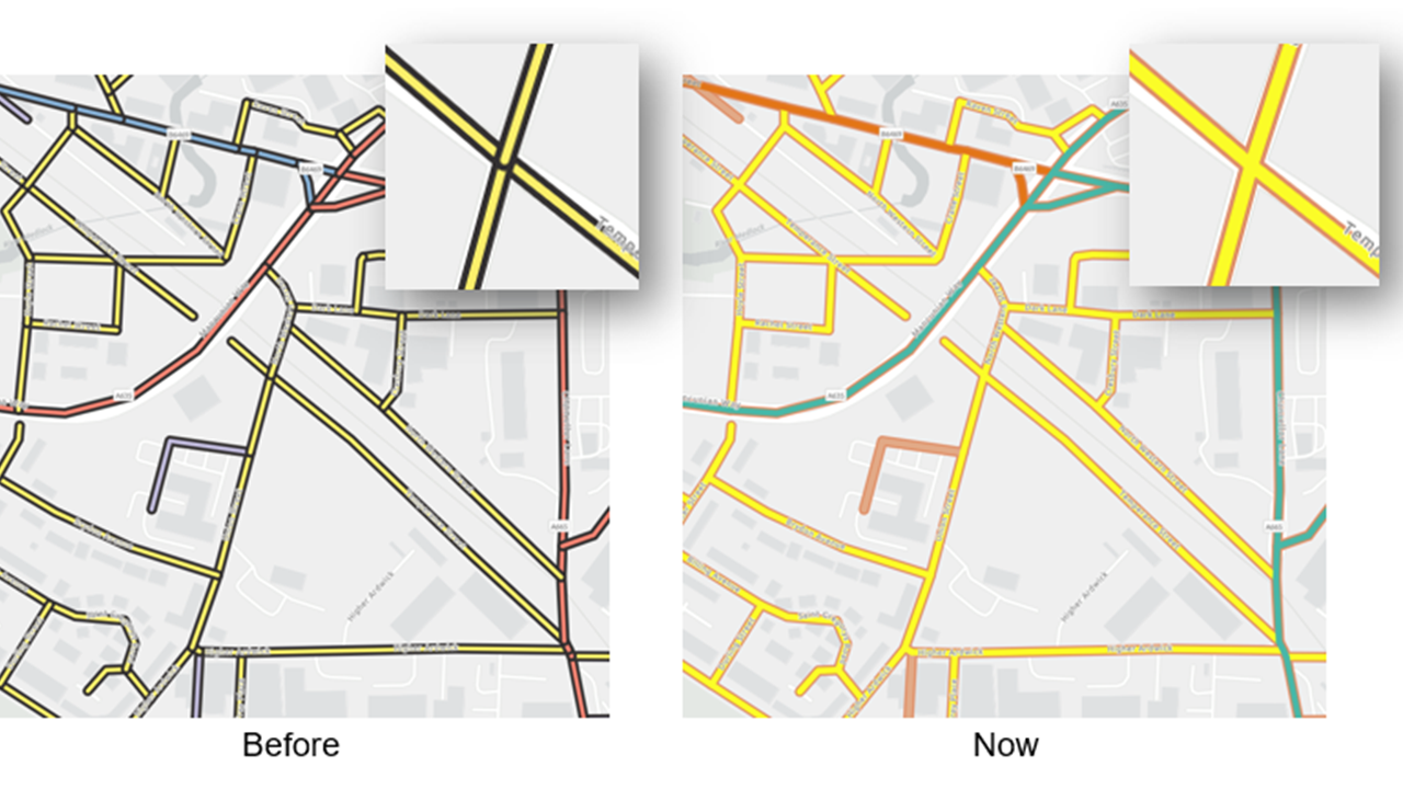
Symbol Layer Draw Order in Map Viewer gives you precise control over how multi‑layer symbols render when features overlap—critical for clean cartography like cased roads. It ensures elements such as road outlines and centerlines stack in the correct order, producing clear, professional intersections rather than overlapping incorrectly. This brings high‑quality, Pro‑level cartographic accuracy directly into web mapping workflows.
Alternate Symbols for Scale-dependent Rendering
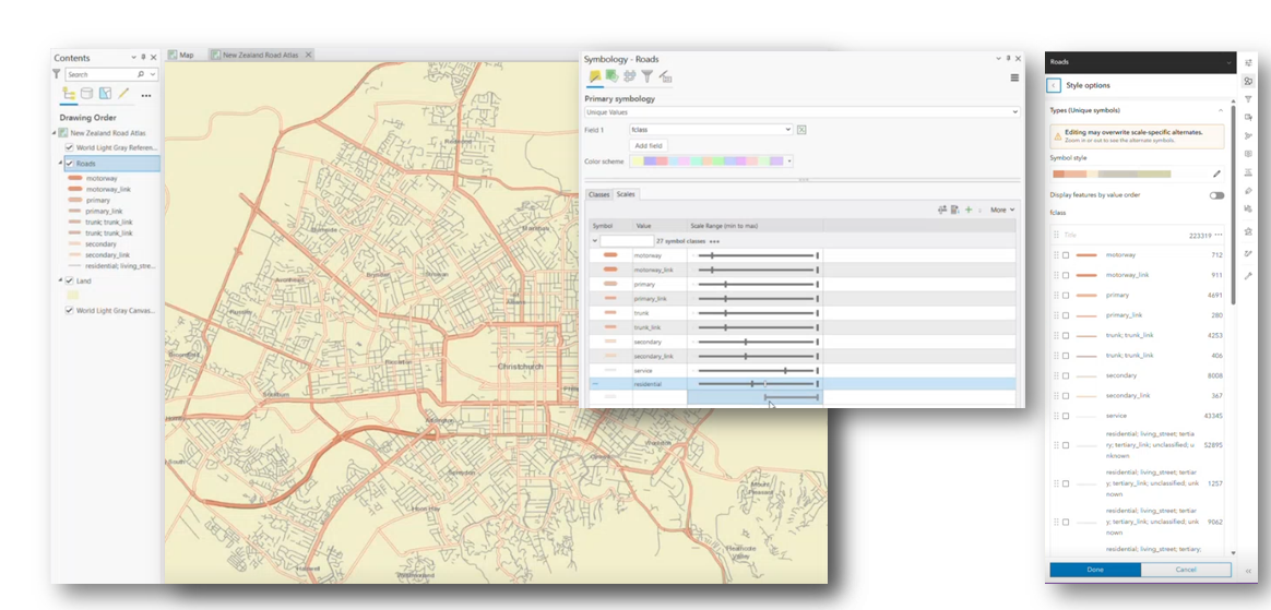
Map Viewer adds support for alternate symbols, enabling maps authored in ArcGIS Pro to maintain scale-dependent symbol behavior in the web. This allows symbols to change dynamically as users zoom. For example, transitioning from simple lines at smaller scales to more detailed cartographic representations at larger scales. While authoring is not yet available in Map Viewer, this release ensures these symbol configurations are preserved and rendered correctly when reading maps from ArcGIS Pro, helping maintain visual fidelity across platforms and strengthening the desktop-to-web cartography experience.
Flow Renderer
Flow Renderer is an advanced visualization style that brings dynamic data—like wind or ocean currents—to life through smooth, animated flow patterns. It helps users quickly understand direction and intensity of movement, which would be difficult to interpret from static symbols alone. Recent improvements make these animations more seamless and visually cohesive, delivering clearer, more engaging representations of complex environmental data.
EXPLORE AND EDIT DATA
Display Annotation and Dimensions (Beta)
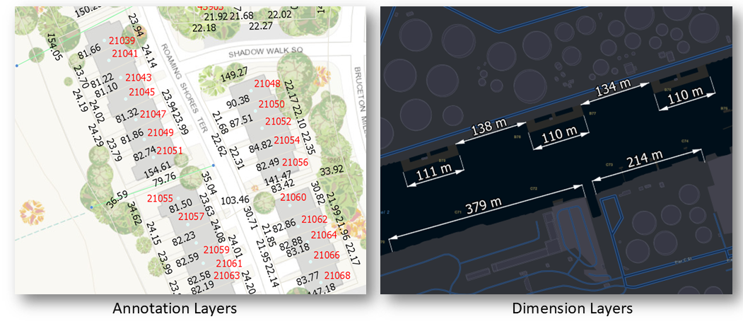
Annotation Feature Layer (beta) and Dimension Feature Layer (beta) are added in this release for displaying annotations and dimensions in a 2D map, showing them in layer list component, and saving them to a web map. The functionality is currently in beta with more complete rendering capabilities, selection and pop-up support, and more coming in future releases.
An annotation is a type of feature that consists of text with position, layout, and style attributes. This release supports displaying feature-linked and standard annotations, without displaying leader lines.
A dimension may indicate the length of a side of a building or land parcel, or the distance between two features, such as a fire hydrant and the corner of a building. Dimension feature layer is for displaying dimensions in 2D maps.
This is the initial beta release of annotation feature layer and dimension feature layer. The layers are not yet intended for production use. More complete rendering capabilities, selection and pop-up support, and more are coming in future releases. We invite you to test with your data and provide feedback as we continue to refine and extend the experience.
Parquet Feature Layer (Beta)
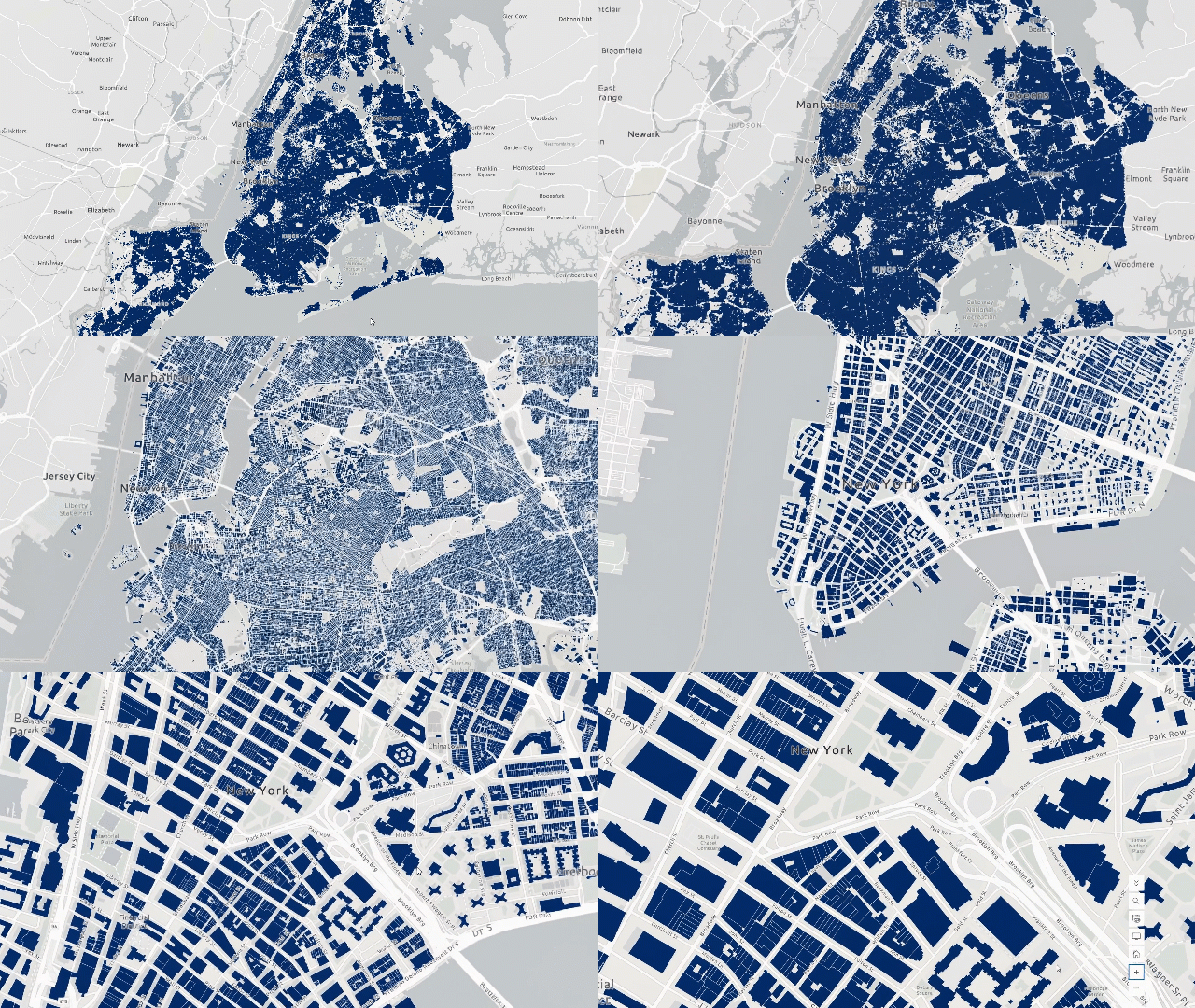
Parquet is a powerful, open-source data format, built to make working with large datasets faster, more efficient, and more scalable. Designed with analytics in mind, it introduces a modern approach to data storage that optimizes how information is accessed, compressed, and processed, making it an ideal foundation for high-performance data workflows and for many types of data in the cloud.
Parquet feature layers—available in beta—are a spatially optimized layer developed by Esri to bring the performance and efficiency of Parquet directly into your maps. Parquet feature layers can be added directly to Map Viewer and are currently created through ArcGIS Data Pipelines. They are purpose-built for high-performance visualization, enabling responsive mapping experiences while maintaining support for familiar capabilities like symbology, filtering, aggregation, pop-ups, and labeling.
While Parquet feature layers bring many familiar capabilities there are some important considerations to keep in mind. Currently, Parquet layers are read-only and cannot be taken offline. Data is stored in WGS 84, meaning it can only be viewed on Web Mercator or WGS 84 basemaps. In this release, creation and overwriting of Parquet feature layers is limited to ArcGIS Data Pipelines, and they are not yet supported in analysis tools or ArcGIS Pro. Despite these limitations, Parquet offers a strong foundation for efficient, scalable data access, especially for large datasets in cloud-native workflows.
Sketch
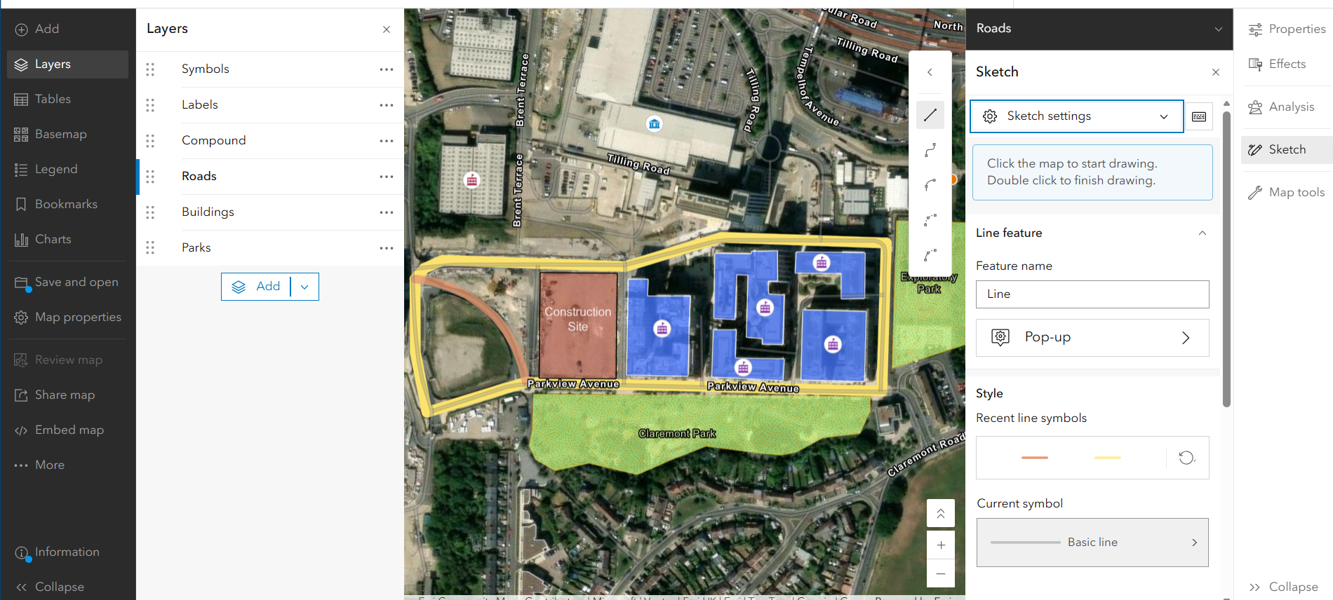
The June 2026 update significantly enhances the Sketch experience in Map Viewer by expanding curve support and improving drawing flexibility. Building on the original single curved line option, Sketch now includes the full range of curve types available in the editor—such as bezier, tangent, and arc segments—and allows users to seamlessly switch between curved and straight segments while drawing lines or polygons. This provides greater precision and control when creating complex geometries. Updates to the drawing toolbar make it easier to access these tools, while new improvements such as segment length labeling and enhanced symbol locking further streamline the editing workflow, helping users create more accurate and informative sketches directly within Map Viewer. To learn more, see this blog.
Forms
New elements Add and Update New Fields in Forms
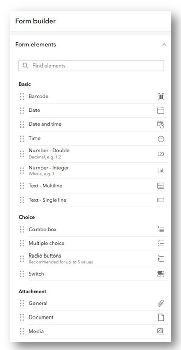
This update introduces exciting new capabilities to enhance your forms in Map Viewer. You can now add new fields to a layer right inside Map Viewer form builder. Simply choose from supported field types like number, date, or text, drag the element onto the form canvas to add it to your layer. Configure it on the spot with properties like field name, default value, pick lists, and constraints such as field length or numeric ranges.
New Elements
Prior to the June 2026 update of forms in Map Viewer, you could pick one attribute option from a pre-defined list of choices using input types like combo box or radio buttons. Now, authors can allow editors to select more than one option by configuring the Multiple Choice input type. Simply populate choices by manually entering, detecting existing values, or uploading choice options from a CSV file.
As a form author, you will also notice a new section for attachment elements in the forms builder. Although you have previously been able to add, update, and delete attachments in the form, support for attachment elements allows the form author to tailor the editing experience specifically for their workflows. Customize properties such as keywords, acceptable file types, minimum & maximum attachment limits, and arcade driven expressions. These updates ensure you have more customizability and quality control over attachments.
Arcade
Greater Control Over the Test Feature
This enhancement improves the Arcade authoring experience by automatically using the feature the user is actively working with in the map as the test feature when authoring the expression. When a feature pop-up is active that feature is now used by default as the test feature in the Arcade editor—making it easier to write, test, and debug expressions in real context. If no pop‑up is open, the editor will use a selected feature from the table (if present). By providing meaningful, in-context test data, this update gives users greater control and confidence when building and refining their Arcade scripts.
New Debugging Capabilities
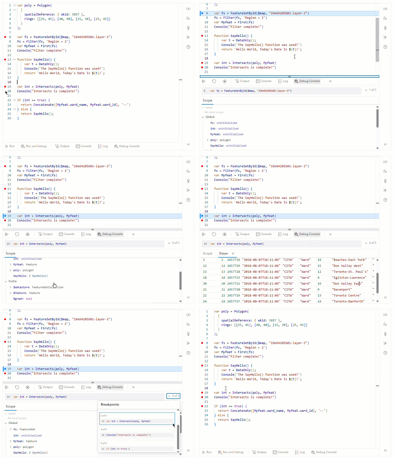
The Arcade editor in Map Viewer now includes a built-in debugger experience, making it easier to write, test, and troubleshoot expressions. Available anywhere the Arcade editor is used in Map Viewer, the debugger introduces a new Run and Debug option that allows authors to step through their logic with greater clarity. This provides immediate insight into how expressions are evaluated, helping users quickly identify and resolve issues. By bringing consistent debugging capabilities across all Arcade authoring experiences, this update significantly improves efficiency and confidence when working with complex expressions. To learn more, see this blog.
Expanded Layer Support for Field Formatting
Building on field formatting capabilities introduced in October 2025, this release expands support to additional layer types and strengthens consistency across the Map Viewer experience. Formatting defined at the layer or web map level—such as date, time, and number formats—is now automatically honored in the attribute table, with no extra configuration required. With this update, support has been extended beyond individual service-backed feature layers to include oriented Imagery Layers, Catalog Footprint Layers, and Subtype Sublayers (within SubtypeGroup Layer). These enhancements further unify formatting behavior across tables, pop-ups, and labels, making it easier to present clean, consistent, and locale-aware data across a broader range of layer types.
Imagery Layer Interactive Charts
A chart is a visual representation of your layer’s data that helps quickly understand patterns, relationships, and trends directly within your map. In Map Viewer, you can create one or more charts from raster data. This update of Map Viewer brings the following chart types supported for raster data:
Bar Charts
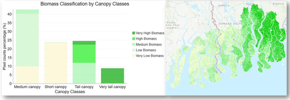
Bar charts for imagery layers are a straightforward way to explore and compare categorical data within imagery layers—especially when your data includes a raster attribute table (RAT). They help turn pixel values into something much easier to interpret at a glance. Bar charts are one of the most effective ways to compare categories at a glance. They visualize data using horizontal or vertical bars, where each bar represents a category and its length reflects the value behind it. Whether you’re analyzing survey results or showcasing product comparisons, bar charts make complex data more intuitive and accessible for your audience.
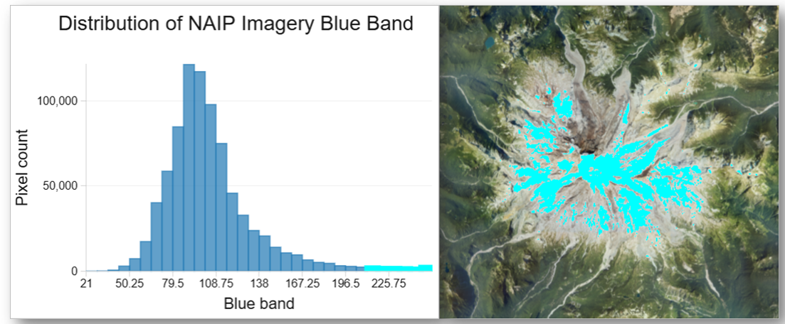
Histograms
Histograms for imagery layers are a powerful way to explore what’s happening beneath the surface of your imagery data. Rather than showing individual values, they reveal how those values are distributed, helping you quickly understand patterns, ranges, and outliers. The result is a clear visual snapshot of your data’s distribution—whether values are clustered, spread out, or skewed in a particular direction. Understanding this distribution is a key step in data exploration, helping you make more informed decisions about how to style, analyze, and interpret your imagery.
Scatterplots
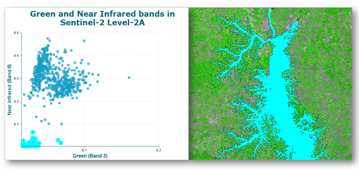
Scatterplots for imagery layer are great way to uncover relationships in your data, especially when working with imagery. They let you compare two variables side by side, helping you spot patterns that might not be obvious at first glance. If the points appear scattered randomly, there’s likely no strong relationship between the variables. But when they form a clear pattern—such as a line, curve, or cluster—it signals that a meaningful relationship exists. This can help you identify features of interest, such as vegetation, water, or built environments, based on how bands interact. You can also take this a step further by introducing a third variable, where the size of each point reflects an additional value. This variation, often called a bubble plot, adds another layer of insight without complicating the visualization. Overall, scatterplots are a powerful tool for exploring relationships in imagery data, helping you move beyond individual values to better understand how different variables interact. To learn more, see this blog.
ANALYZE SPATIAL DATA
Map Viewer’s spatial analysis tools allow you to quantify patterns and understand relationships in your data. Feature and raster analysis tools and raster functions are available to all members with the appropriate privileges.
ModelBuilder
ModelBuilder is a visual way to build and automate your analysis workflows in Map Viewer. With ModelBuilder you can create multi-step workflows, ranging from routine tasks like managing spatial data to complex analysis workflows. ModelBuilder enhancements in this update focus on making it faster and easier to turn your models into reusable web tools. One of the biggest improvements is the ability to publish models without running them first, removing a long‑standing friction point and enabling a more intuitive save‑then‑publish workflow. You can now also overwrite existing web tools and publish models even in view‑only mode, giving you more flexibility to iterate, update, and manage your workflows without unnecessary setup or repeated connections. In addition, you now have the ability to cut, copy, and paste model elements, allowing you to easily reuse elements to speed up diagramming and maintain consistent settings. Finally, fields are now supported as a variable, enabling you to build more dynamic and configurable models and web tools. Together, these updates streamline the end‑to‑end experience, from authoring to publishing, so you can more easily share powerful analysis workflows across your organization. To learn more, see this blog.

80-20 Analysis Tool
The new 80-20 Analysis tool in Map Viewer applies Pareto analysis to help you quickly identify where incidents are most concentrated, revealing the small subset of locations that account for the majority of activity. This is done using the 80-20 rule, which posits that a disproportionate number of incidents (80 percent) occur at a small subset of locations (20 percent). By aggregating point data into clusters or associating incidents with nearby lines or polygons, the tool calculates cumulative incident percentages and highlights priority areas for action. The result is an enriched hosted feature layer that supports deeper spatial insight—whether identifying high‑impact street segments, hotspot clusters, or priority service areas.

Detect Target Using Spectra Tool
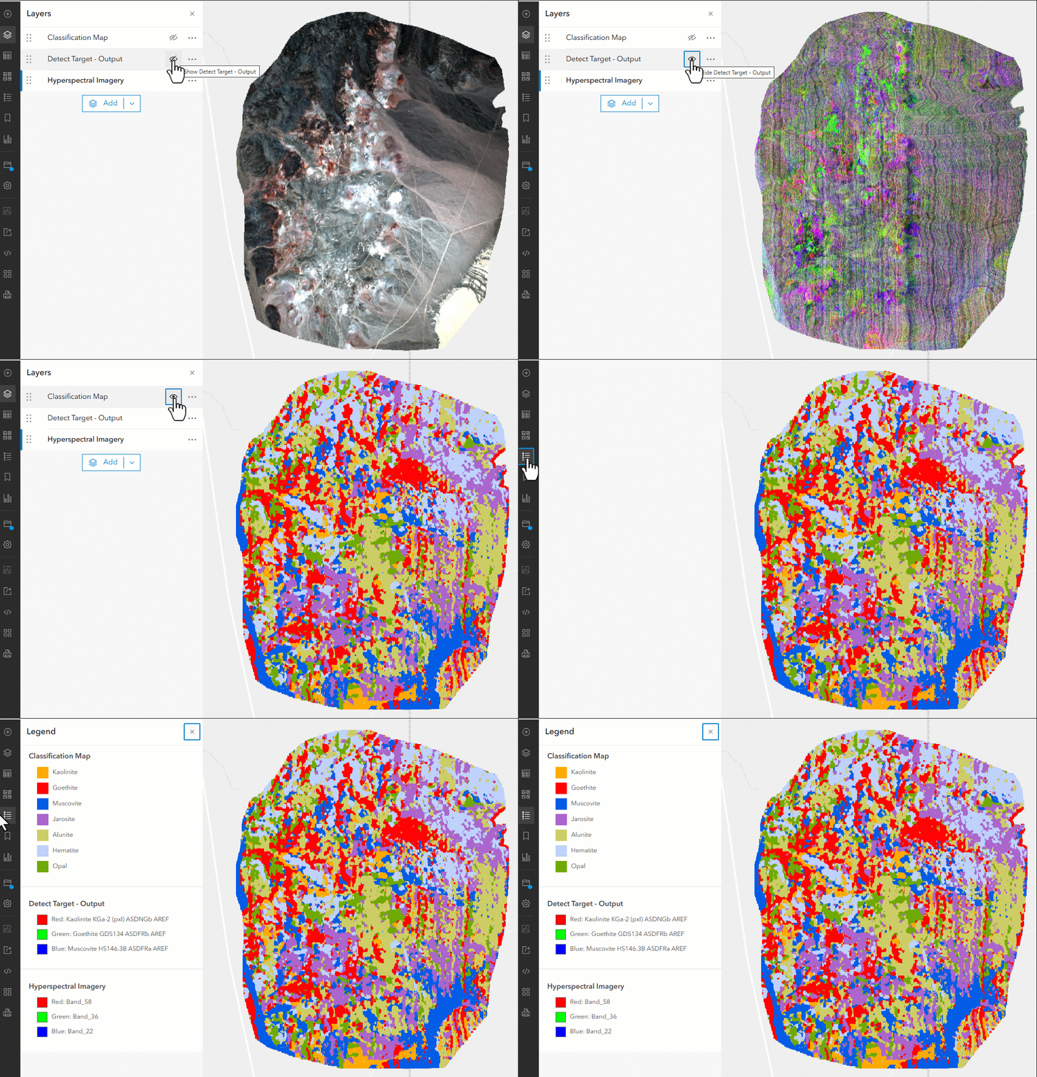
The Detect Target Using Spectra tool enables you to identify specific materials or features in imagery by matching their unique spectral signatures. The tool analyzes a multiband raster and computes a similarity score for each pixel, indicating how closely its spectrum aligns with a defined target spectrum from a spectral library or feature-based input. With support for multiple detection methods—such as Spectral Angle Mapper (SAM), Spectral Information Divergence (SID), and adaptive approaches for noisy or mixed pixels—you can tailor analysis to different data conditions and use cases. Optional continuum removal helps normalize spectra for more consistent comparison, improving detection accuracy across varying data ranges. The result is a hosted imagery layer that visualizes matching scores, making it easy to uncover patterns such as locating clay minerals in hyperspectral imagery or detecting subtle material differences across a landscape.
Resample Library Spectra Tool
The Resample Library Spectra tool helps ensure your spectral data is aligned and ready for analysis by matching it to the characteristics of a target sensor or dataset. The tool takes an input spectral library and adjusts it to the same band count and wavelength range as a specified sensor, such as Landsat or Sentinel, or a custom image or spectral library. By using resampling methods like band averaging or Gaussian convolution, you can accurately translate high-resolution spectral signatures into formats compatible with real-world imagery, improving the reliability of downstream workflows such as classification or target detection. The output is a refined Esri spectral library file that integrates seamlessly into analysis, making it easier to compare, detect, and interpret materials across different sensors and datasets.
Detect Image Anomalies
The Detect Image Anomalies tool helps you quickly uncover unexpected patterns and subtle outliers in multispectral or hyperspectral imagery. The tool analyzes each pixel relative to the overall scene and generates an anomaly score raster, where higher values highlight pixels that significantly differ from the background. With flexible methods such as RXD for detecting deviations from typical conditions, UTD for isolating background variations, and K-means clustering for identifying pixels that fall outside natural groupings, you can tailor detection to different types of imagery and analysis goals. This makes it easy to surface features that are otherwise difficult to distinguish—such as identifying ships against an ocean background or spotting unusual land cover—delivering results as a hosted imagery layer that can be further filtered, explored, and integrated into your workflows.
Looking ahead
Several additional enhancements are planned for future release —such as custom color ramps, configure and author display filters, raster integration into ModelBuilder, basemap item and many more. Stay tuned as Map Viewer continues to grow.

Thank you to the following teammates for their contributions to this blog article:



Article Discussion: