On August 20, 2010, lightning ignited a fire in the Salmon-Challis Nation Forest in Idaho. Fueled by heavy loads of bug-killed fir and pine, the fire encompassed 970 hectares before it was contained on September 16 (Fig. 1). Using instrument packages on a fixed-wing aircraft, the Joint Fire Science Program captured airborne measurements of smoke dispersion and plume rise via vertical and horizontal flight profiles. These data provide a unique opportunity to explore the real-world dispersion of a smoke plume. The videos in this blog, all created with ArcGIS Pro 2.6, show how voxel layers can help you explore and discover complex 3D patterns of atmospheric measurements.

A fixed-wing aircraft sampled the plume by flying vertical spiral profiles centered on the plume and horizontal transects perpendicular to the plume (Fig. 2). A nephelometer measured light backscatter which was used to estimate the concentration of particulate matter (PM 2.5) in the plume.
Smoke plume dynamics and its impacts on air quality have traditionally been explored using computationally-intensive numerical models on regularly spaced 3D grids. The in-situ measurements collected by the Joint Fire Science program can help validate these numerical models. Visualizing smoke dispersion using GIS-based voxels allows researchers and practitioners to explore smoke dispersion behavior in context. Meaning the plume behavior can be explored in a realistic, georeferenced 3D scene. Smoke plumes visualize above base maps that provide valuable information on topography and land use, potentially impacting plume behavior.

Exploring the data
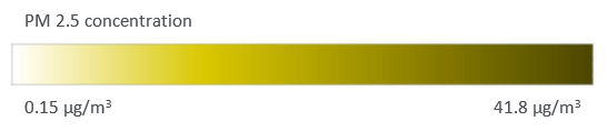
Smoke dispersion measurements were obtained on August 25, five days after the start of the fire. The points in the video below show the concentration of PM 2.5 (micrograms per cubic meter) at each 3D sampling location. Darker, brown colors indicate higher PM 2.5 concentrations. Coloring the sampling locations by PM 2.5 concentration allows you to see the general shape, orientation, and trends of the sampled points of the plume.
Figure 3 – Distribution of PM 2.5 values within the plume.
To better identify the geographic center, dispersion, and any directional trend of the plume, you can create a standard deviational ellipsoid using the Directional Distribution tool. The purple ellipsoid (Fig. 4) represents two standard deviations of the spatial distribution of the data weighted by the PM 2.5 concentration. The standard deviation is weighted by the PM 2.5 concentration to better center around the highest PM 2.5 concentrations at the center of the plumb. When the underlying spatial pattern of features is concentrated toward the center with fewer features toward the periphery (following a Rayleigh distribution), a two standard deviational ellipsoid contains approximately 98 percent of the features.

3D Interpolation
While symbolizing and summarizing the sample locations is helpful, it does not allow a complete 3D visualization of the smoke plume. To create a full 3D visualization, PM 2.5 values can be interpolated to a spatially contiguous set of voxels using Empirical Bayesian Kriging 3D. The result of the interpolation is a geostatistical layer that shows a horizontal transect at a given elevation. The current elevation can be changed with the Range slider, and the layer updates to show the interpolated predictions for the new elevation. You can export rasters and feature contours at any elevation, predict to target points in 3D, and export to a netCDF file that can be displayed as a voxel layer.
Figure 5 shows the interpolated surfaces at various altitudes. The layer is displayed as filled contours intended to present a simplistic and fast representation of the interpolation results.
Figure 5 — Interpolated surfaces at various altitudes.
Voxel Visualization
The geostatistical layer in the previous section was exported to a netCDF file using the GA Layer 3D To NetCDF tool. The primary purpose of this tool is to prepare 3D geostatistical layers for visualization as a voxel layer in a local scene. Figure 6 shows the default visualization; however, the nontransparent exterior voxels obscure the view of the plume within the interior.

Voxels layer support exploration of the interior of the volume using sections and isosurfaces. A section is a two-sided vertical or horizontal plane cutting through a voxel layer (analogous to meteorological tomography). An isosurface is the 3D equivalent of a contour line, a 3D surface representing a specific value of a continuous variable, in this case, PM 2.5. Figure 7 shows isosurfaces of various PM 2.5 values. The value of the isosurface is controlled using an interactive slider. Exploring the voxel layer with isosurfaces can reveal the complex patterns of the plume and potentially help researchers better understand diffusion behavior.

Voxel layers are dynamic and can be explored from any angle. Figure 8 shows a fly-through animation of the isosurface with a value of 35 μg/m3. A fly-through animation simulates the camera moving through a map or scene and mimics what it is like to be physically present in the view.
Figure 8 — A fly-through animation of the isosurface with a value of 35 μg/m3.
Integrating meteorology and GIS
Meteorology and GIS are inextricably linked through cartography. The first widely distributed weather map appeared in The Times (London) on April 1, 1875, and its structure would be familiar to a modern reader. Unlike the cartographer creating that early weather map, modern meteorologists must assimilate massive amounts of observational and modeled data into the forecasting process. They, like most scientists, research, and practice in an era of information overload. One way to mitigate this overload and leverage the valuable 3D information products available to meteorologists is through interactive visual analytics – coupling the computational power of computers with humans’ perceptive and cognitive capabilities. The explicit 3D nature of voxels and the capabilities of thresholding, slicing, and immersive fly-throughs unite the visualization powers of computers with the meteorologist’s understanding of atmospheric processes and informed intuition.
Where to go from here
Here are three ideas for how you might further explore the science of where by integrating GIS and meteorology with ArcGIS.
- Learn more about voxel layers in ArcGIS Pro, and their application in human geography with the lesson Visualize social distancing across California.
- Reproduce the visualizations shown in this blog on your own. The data used in this blog are available from the U.S. Department of Agriculture’s Research Data Archive.
- Analyze other wild and prescribed fires. While this blog focused on the Banner fire, the Research Data Archive contains data for a total of 11 fires.
Acknowledgments
Thank you to the Joint Fire Center for making this rich data set freely available. Also to Eric Krause, Esri, for patient guidance as the author, who is not of the video game generation, explored voxels.
Urbanski, Shawn P.; Kovalev, Vladimir A.; Hao, Wei Min. 2013. Airborne and Lidar measurements of smoke plume rise, emissions, and dispersion. Fort Collins, CO: USDA Forest Service, Rocky Mountain Research Station. https://doi.org/10.2737/RDS-2013-0010


Article Discussion: