After going through the data preparation with ArcGIS Notebooks in ArcGIS Pro in part 1 of this blog series, in part 2 we will do some visualization, exploration, and forecasting with the 7-day moving average for daily new confirmed cases of COVID-19. Both Exponential Smoothing Forecast and Forest-based Forecast are great for dealing with complex time series like this. Check out the demo below from the UC 2020 plenary to get a quick overview of these forecasts and analysis, if you haven’t got a chance.

Data Visualization with Visualize Space Time Cube in 2D
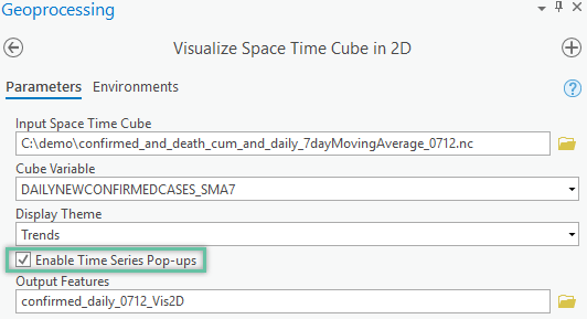
Plotting out the time-series data and learning about the patterns in your data is always recommended as the first step before you start building forecast models. Since ArcGIS Pro 2.5, new pop-up charts have been built into the Output Features generated by the Visualize Space Time Cube in 2D tool. We can start exploring the data by running this tool by checking the Enable Time Series Pop-ups parameter, see Fig 1. If you skipped part 1 of the series, you can find a sample space-time cube to run inside the ZIP file.
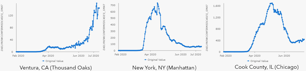
As shown in the pop-up charts in Fig 2, there is a big variety of types of trends shown in the 7-day moving average for daily new confirmed cases of COVID-19 across different counties in the US.
Data Exploration with Time Series Clustering
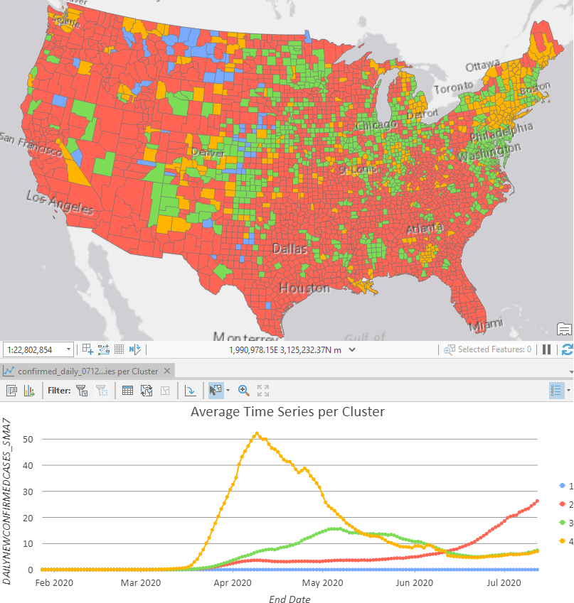
We can also go one step further and run the Time Series Clustering tool to discover the various types of stages for all the US counties: many counties (in red) still see surging cases like Ventura County, CA. Some counties (in yellow and green) have already flattened the curve after hitting a plateau at various time periods, like New York City and Cook County, IL where Chicago locates. Some counties (in blue) has never seen any confirmed cases yet.
Forecast with Exponential Smoothing Forecast tool
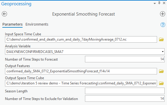
First, let’s try Exponential Smoothing Forecast. In the tool’s UI, we point to the space-time cube we created in the previous article (or can be downloaded here) as Input Space Time Cube, use DAILYNEWCONFIRMEDCASES_SMA7 as Analysis Variable, and choose 14 days as Number of Time Steps to Forecast, which gives us a 2-week forecast. The parameters above will be shared across the three forecast tools, and there is an optional parameter called Season Length that is unique to the Exponential Smoothing Forecast tool. For Season Length, We can:
- Leave it blank to let the tool automatically evaluate the seasonality at each location. Remember, the cube should have at least 3 full seasons to have the seasonality detected.
- Set it to a certain number of time steps,
- by setting it as 1, you indicate that there is no cyclic pattern (aka seasonality) and let the tool build a non-seasonal model (aka double exponential smoothing) for all locations, or,
- by setting it as 7, for example, you indicate that there is a weekly repeating pattern that you observed during your data exploration and let the tool build a seasonal model using 7 as the season length for all locations.
We suggest starting with leaving it blank and letting the tool to find the optimal season length, then adjusting the season length and rerunning the tool later. Finally, we set the Number of Time Steps to Exclude for Validation to be 14, to use the last 2 weeks of data to validate the model. Now the parameters are completed (as shown in Fig 4), you can run the tool to decompose the time series into three components: trend, season (if using a seasonal model), and residual. You can learn more about these components in part 4 of this blog series to get a deeper dive into the Exponential Smoothing Forecast tool.
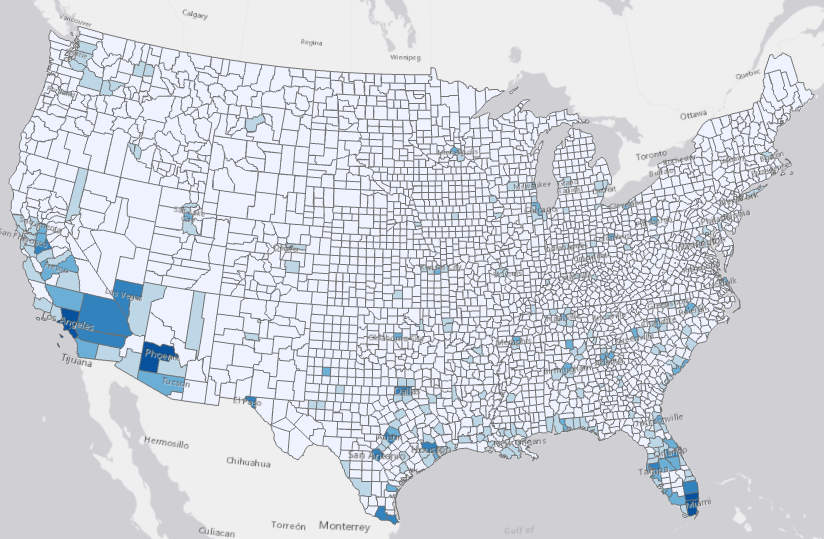
We can examine the results using the diagnostics and Output Features. The Output Features are symbolized with the forecasted value of the last forecasted time step, and this is the case for all the four tools in the toolset. With the darker shade of blue showing higher forecasted, we can forecast the most daily new cases will be shown in California, Arizona, Texas, and Florida. Counties taking a conservative approach in reopen plan, like New York and Chicago, are in a lighter shade of blue, meaning that reopening slowly do work well in controlling a potential second wave of COVID-19.
Clicking the features on the map shows one of the most important visuals of the tools, the pop-up charts. As shown in Fig6, these show the original observed data in blue, the fitted and forecasted values in orange, 90% confidence intervals shown as the orange transparently shaded area around the forecasted values. Details for season length in the model is also listed as Forecast Method above the chart. You can also hover over and move along the lines to check the values in the tooltip. These charts will give you an incredibly valuable sense of how well the model fits, location by location across the country.
If you want to learn more about the details of using the Exponential Smoothing Forecast tool with more charting and visualization functionalities, check out part 4 of this blog series as well.
Forecast with Forest-based Forecast tool
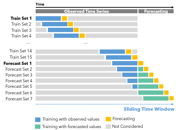
We can also use the Forest-based Forecast tool to deal with complex time-series data. If you’re already familiar with our Forest-based Classification and Regression tool, think of the original explanatory variables as the previous time steps here. How many previous time steps will be used is defined by the Time Step Window parameter. As shown in Fig.7, this tool uses this Time Step Window as the length of a sliding time window, which contains all the explanatory variables (in blue) to forecast the next step (in yellow), and as the window moves or sliding to the right, we can get all the Training Sets. And once the sliding time window moves to the end of the observed time-series, the Forecast Sets start. Assuming the Time Step Window is set to 14, in Forecast Set 1, we will use the last 14 observed data to make the first forecast (in yellow). Then in Forecast Set 2, we use the last 13 observed data (in blue) and the first forecast data (in green) to make the second forecast (in yellow). So on so forth.
To set the Time Step Window parameter, we can:
- Set 7 as the Time Step Window, if we want to use the previous one-week of data to forecast the next day for this daily space-time cube. Or,
- Leave it blank and let the tool to find the optimal window size. What happens behind the scene is the tool runs the algorithm to find whether there is seasonality in the time-series data. If there is, the season length is used as the Time Step Window for that location, otherwise, there is no season and the tool will use 25% of the total time steps in the space-time cube as the Time Step Window for that location.
Although the auto-detected window size is the season length for seasonal data, it doesn’t mean you can’t use other window sizes to get ideal results. If the detected season is short, say 5, you could also use any larger window size to model the seasonality in your data. Especially when your data is experiencing some recent trend changes, you may want to use a larger window to let your model consider not only recent changes but also longer-term overall patterns. For example, for the COVID-19 data, we might try some larger window sizes like 28 days due to the dramatic emergence of daily new cases in the recent one or two weeks for some counties. If the detected season is very long, say 365 for a yearly pattern, we should expect the tool to take several hours to run a forest-based model with 365 explanatory variables. If this is the case, here are several suggestions to increase the speed:
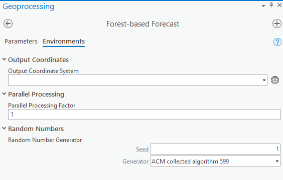
- Utilize the Parallel Processing Factor in the Environment tab to increase how many cores are used in your computer to distribute the job.
- Start with using 30 or 100 as the Time Steps Window to check if it’s necessary to use a full season as the window size.
Similarly, be strategic when dealing with cubes with long time series. For example, if there are 1000 time steps in our cube, 25% means 250 previous time steps so running a forest-based model with 250 explanatory variables will be very time-consuming. In this case, also consider trying the two options above.
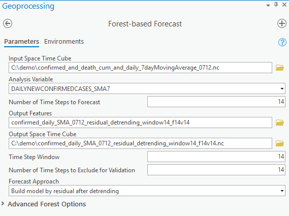
See Fig 8 for how parameters and environments can be set up to forecast based on the 7-day moving average for daily new confirmed cases.
You will also notice there are four options for the Forecast Approaches parameter, and which one will perform best is based on the nature of the time-series data you’re forecasting:
- Is there a global linear trend or is there an overall non-linear trend like exponential or S-shaped trend?
- Is there a seasonality added to such trends?
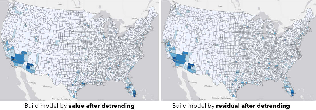
Basically, if your data has some overall trend and you want to carry the overall trend to the future, not to choose the building model by value because it cannot do extrapolation. Instead, you can start with the two approaches with detrending. The option building model by value after detrending considers mostly whether the trend is increasing or decreasing overall. The option building model by residual after detrending considers whether the rate of increasing or decreasing is changing recently compared to previous data, and assumes the recent change in the increasing or decreasing rate will continue to the future, so visually this method can give a more dramatic result than the previous option. When checking the output features of the two approaches (see Fig 9), we can see the overall patterns are quite similar.
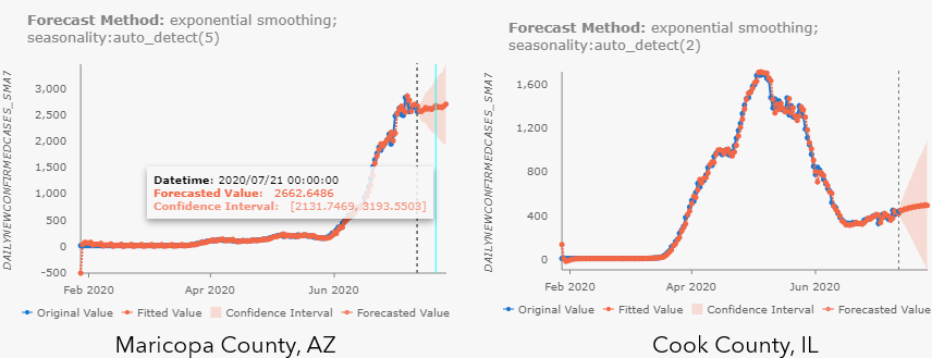
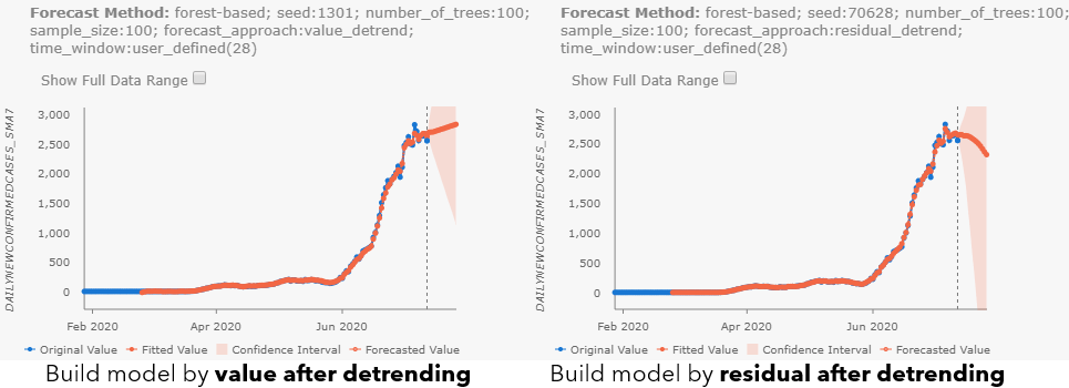
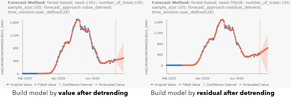
By checking the pop-ups at Maricopa County, AZ (see Fig 10.a), and Cook County, IL (see Fig 10.b), we can notice the different results with different forecast approaches. Besides, as you may have noticed, all parameter choices for Forecast Approach, Time Step Window, and parameters in Advanced Forest Options are also included in the Forecast Method field. When the confidence interval is large, you can also check the Show Full Data Range checkbox above the chart to see the entire confidence interval.
Time-series data is complicated and there is no one-fit-all forecast approach, that’s why we have opened all the options here in the tool for you to explore. Check out the doc talking about Building and training the forest model as well.
In the next article, part 3 of this series, we will switch gears to forecasting cumulative confirmed cases and introduce the Curve Fit Forecast and Evaluate Forecasts by Location tools.

Article Discussion: