On the Esri Community pages many of you expressed interest in learning more about improving the quality of your data and the tools you can use to use to achieve this.

To bring more light on data quality and quality assurance, we’ve created a story map called Data Design in ArcGIS Pro. The story map follows a GIS Specialist tasked to improve the street light data in White Rock City. The goals of the project are:
- Reduce user error during data entry.
- Increase data accuracy among the types of street light assets.
- Maintain data consistency across the street light data.
- Quickly identify and clean existing data issues.
- Automate the editing experience for pole maintenance processes.
As you probably know, there is no straight path to a solution. The specialist will go through testing and implementing different solutions as data issues arise.
To achieve the project goals the specialist will make use of the following data design tools:

The story map uses example data, graphics, and videos to show the data creation and editing experience using these tools. It also highlights the benefits of using one over the other, offering specific use cases as examples. The analysis concludes with a table summarizing the main takeaways and more information about functionality to app compatibility.
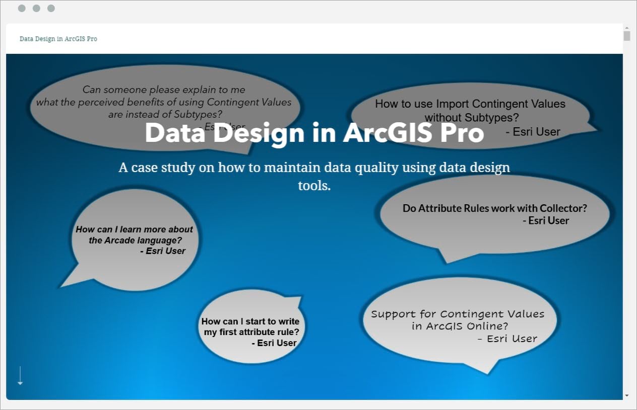
Want to find out more details? Click on the image below and start exploring the story map!
The story map idea was inspired by the interest you expressed on the Esri Community pages. We hope this content will answer some of your questions and help you in your workflows.
Photo by Patrick Tomasso on Unsplash


Commenting is not enabled for this article.